
I have a few ‘coffee table’ art books on the subject of jazz record covers. And whilst all of them contain great stuff, none of them quite capture or distil the real magic of the best album covers as I wish they would.
I think to do that they’d have to be bigger than LP-sized, and reproduce all the covers at full size. Ideally with room to spare. There’s naught worse than beautiful images that run into the gutter/spine of a book! Well, I admit, there’s a lot that’s worse. But you know what I’m saying.

This post isn’t meant to be in any way comprehensive. For starters I’m limiting it purely to one record label and one artist: Art Blakey on Blue Note. But isn’t it amazing how great these covers are? For my money they elevate the packaging to a plane very much akin to the music.
And when both music and art are sublime, that kind of sympathetic synergy is a wonderful thing, to be savoured, treasured, and just plain enjoyed/appreciated… so feast your eyes. And, ideally, put on some Blakey, and feast your ears as well!
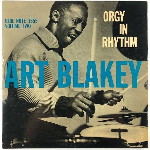
In Art Blakey Reid Miles and Francis Wolff found someone who had the musical spirit they loved, plus seemingly unbounded energy and charisma, and really striking looks to boot. He’s a funny looking dude, in some ways. But he’s incredibly photogenic with it.

Wolff would be busy, snapping away at recording sessions. And then later Miles would work his hyper-aesthetic design magic. The resulting package is on a par with the music, as art in its own right. And it helps lend the era/genre a hard to define but instantly recognisable vibe, both rootsy and yet sophisticated.
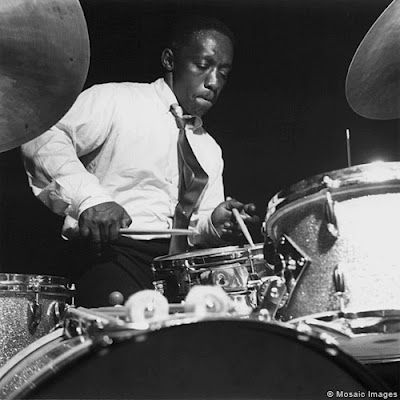
Above is the kind of raw material Wolff would provide Reid Miles with, a fantastic studio shot of the artist at work. Interestingly Wolf’s photographic estate is handled (at least in part?), by the specialist jazz label Mosaic, who might very well have taken their name – they certainly share it – from a Blakey track.
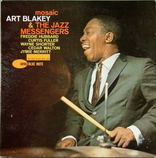
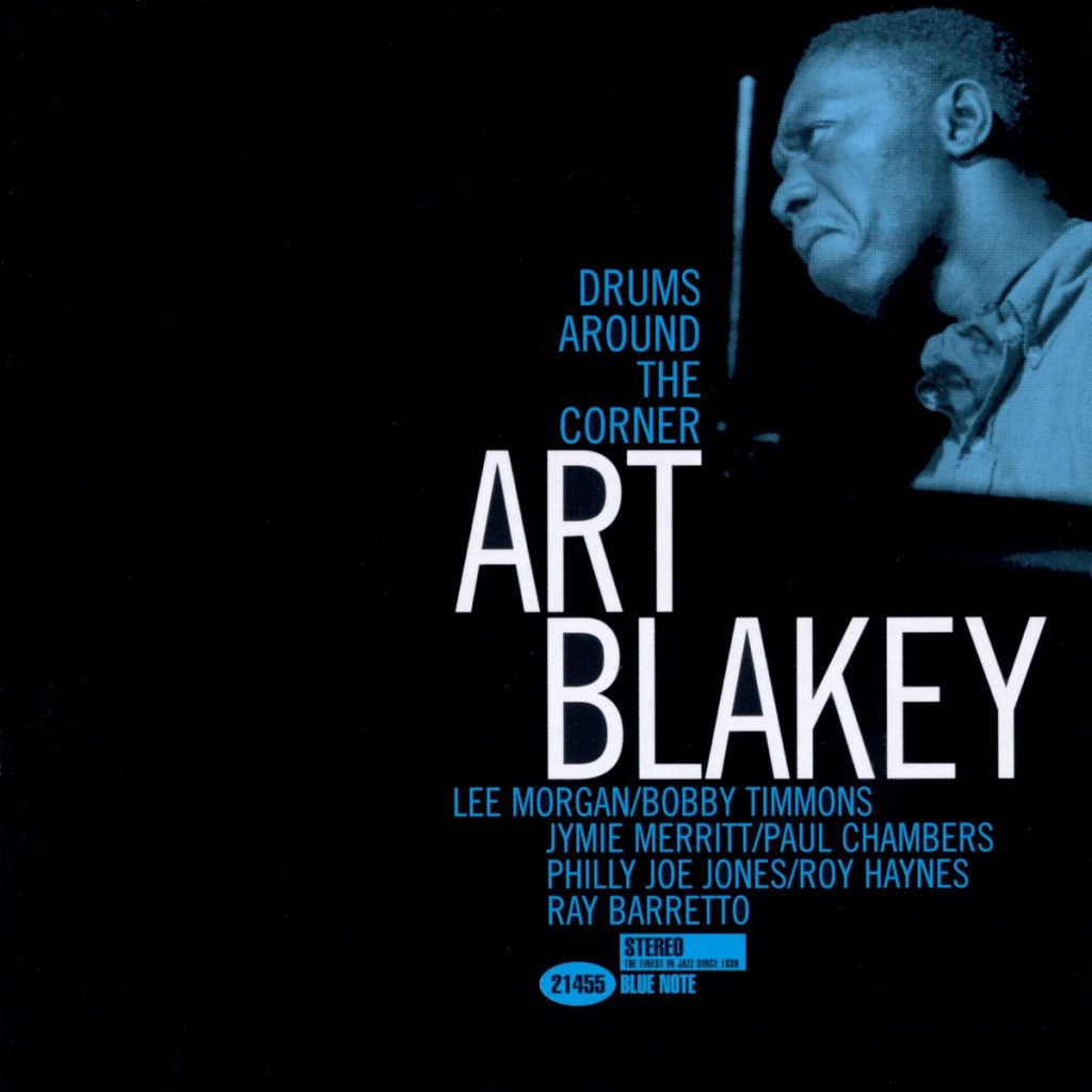
A lot of the covers use black and white photos with single colours as screening tints. And the use of typography is just phenomenal. But as the images directly above and below demonstrate. Miles could still weave his spells with full colour imagery, and more colourful font palettes.
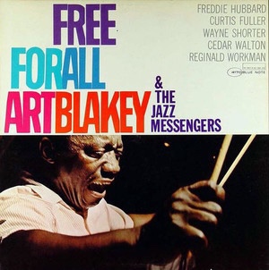
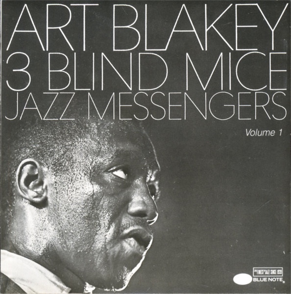
Whether using a fuller range of colours, or going super stark and minimalist, as on Three Blind Mice (below), these covers have a tremendous power. I absolutely adore them!
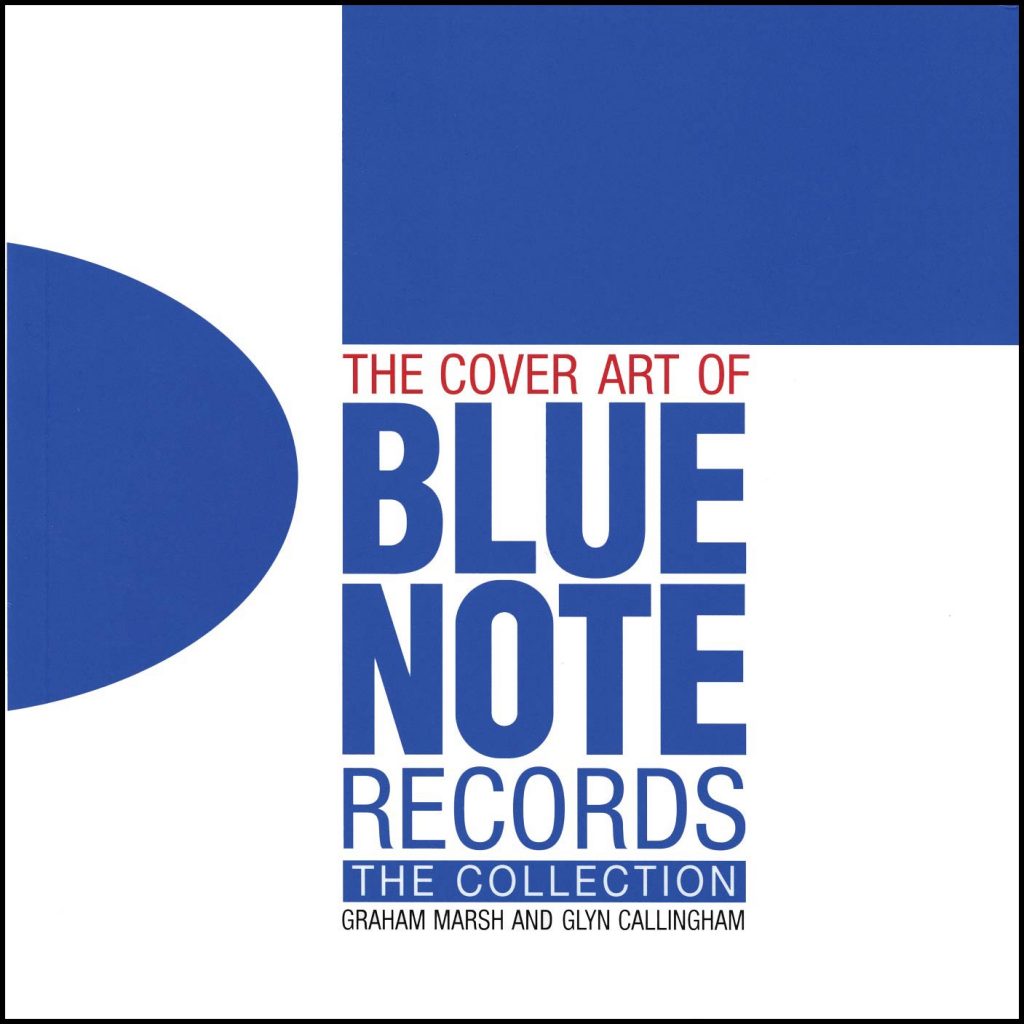
Pictured below is one of the books mentioned at the top of this post.
Also worth noting is how the Wolff/Miles house style lives on. The following images are all later non Wolff/Miles productions that clearly owe a debt to and seek to emulate (with varying degrees of fidelity/success) the classic Blue Note house style.

The above is, by normal standards, a great cover. But frankly it’s not in the same league as the real deal. The effort below is a lot better.

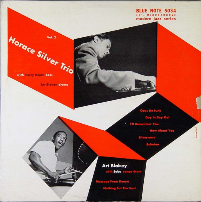
I intend to get a body of these and similar record covers decently printed, and then frame and display them myself, both in my office/home studio, and around our home. To finish, a very early example, from back when Blue Note issued 10” discs. And this last one finds Blakey sharing the billing with another Blue Note legend, Horace Silver.
* I’ll prob do another separate post on the sub-category of Blue Note album covers that favour semi-abstract photos, often either out of focus, or treating imagery in almost purely textural terms.