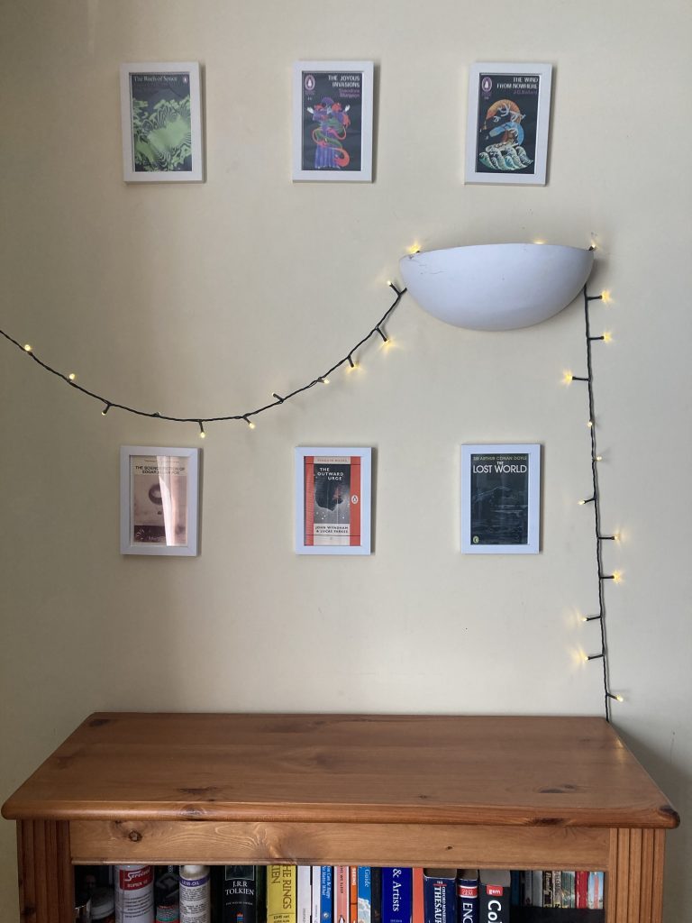
I’ve been trying to gradually make our home look more attractive and at the same time less cluttered. It is quite a difficult balancing act. Putting up pictures, whilst not over cluttering the space visually.
There’s also a slight irony in the choice of images. I’m not a massive sci-fi, reader/fan. And most of these postcards are chosen purely on the aesthetics of the postcard book covers. And even then I was actually quite disappointed with the covers that Penguin chose for the set of postcards I bought. 80 or 90% of which I don’t like enough to want to use at all.
So I might reproduce some other book-covers, and frame and hang those? Stuff that better reflects my actual reading habits. Or that I like more on a purely aesthetic level. An example of the latter might be so-and-so’s cover for the 1970sBallantine Books paperback edition of The Worm Ouroboros.
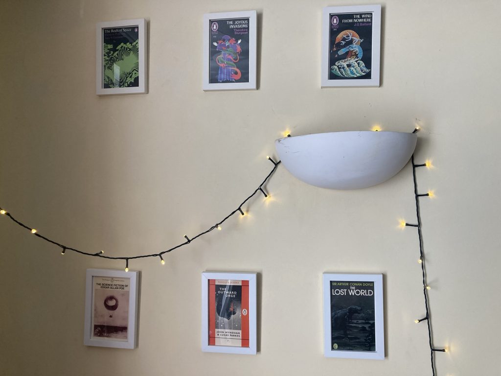
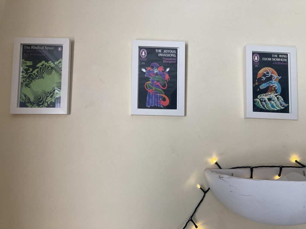
I might describe this top row as a slightly psychedelic selection.
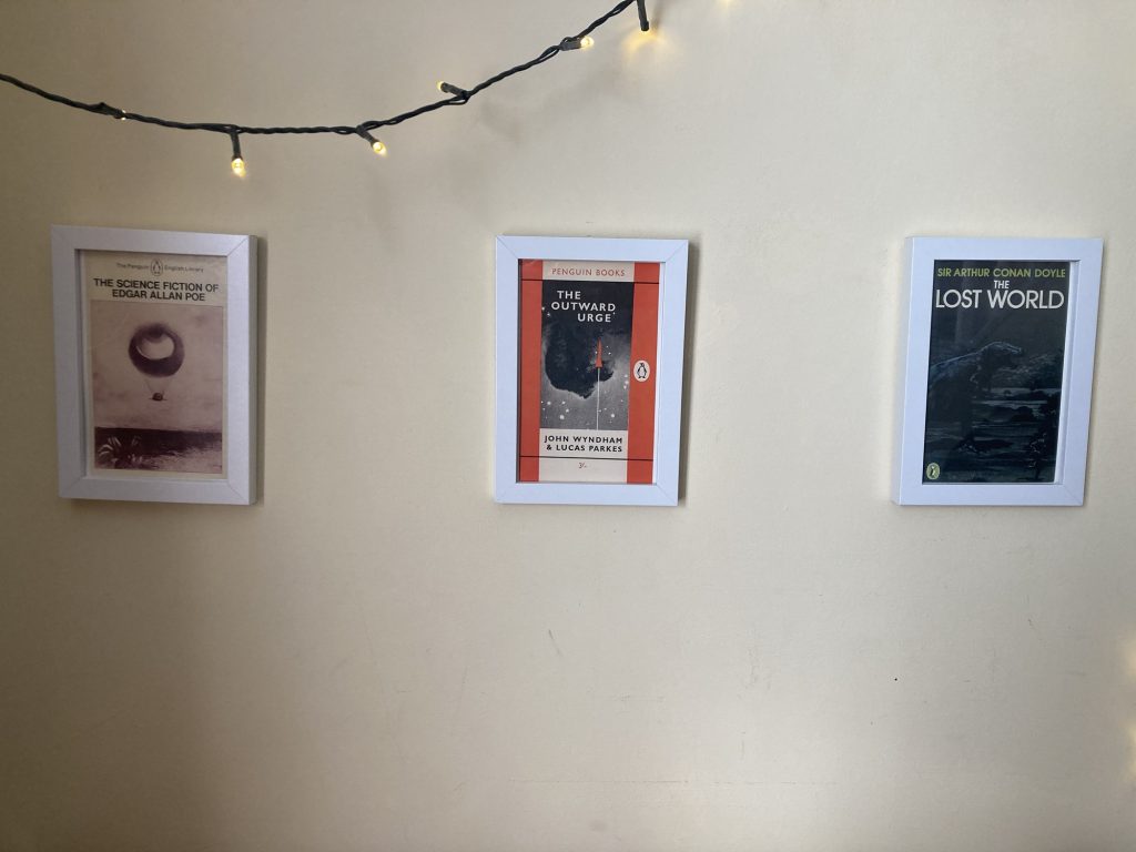
The lower or bottom row, meanwhile, is more in the ‘classic’ vein.
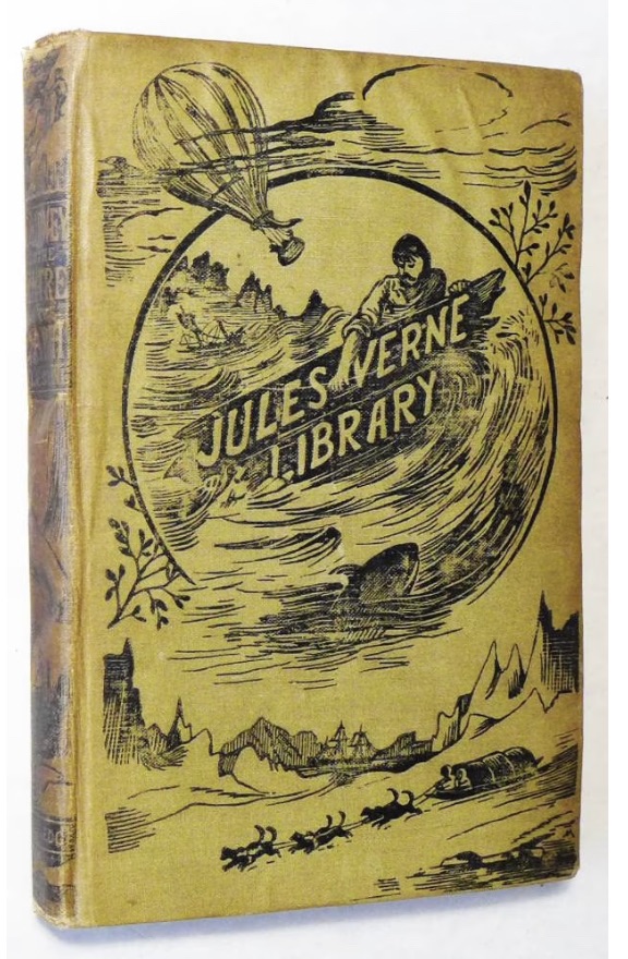
* Which I don’t own. This cover is from an edition for sale on Oxfam’s website. For £75!
I have read some of the old sci-fi classics, like Journey to the Centre of the Earth (this one several times, including on a honeymoon in Italy!), and The Time Machine. Not sure if I’ve read 20,000 Leagues under the Sea?