I’m not sure if St Giles was open or not, on my last visit. I think not? But I can’t be sure…
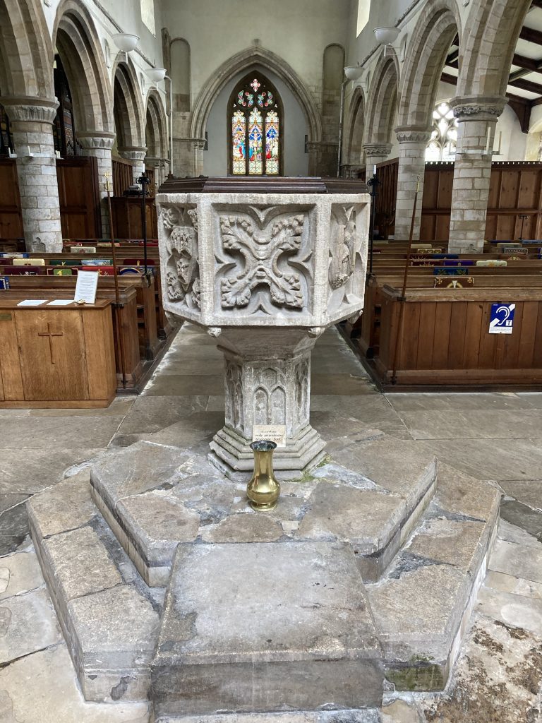
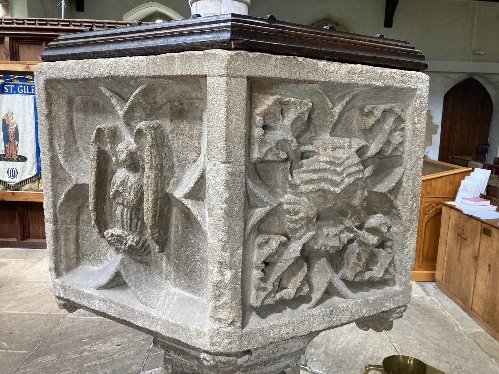
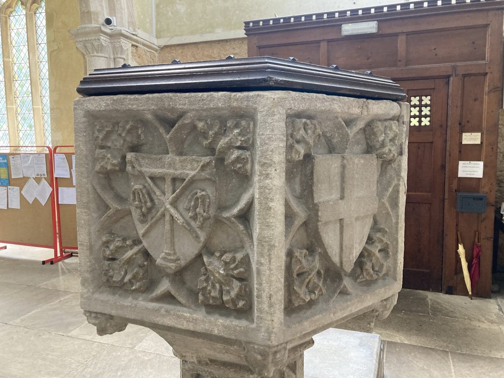
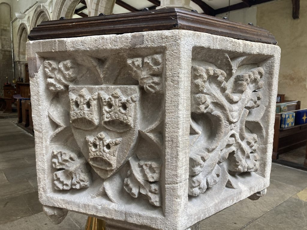
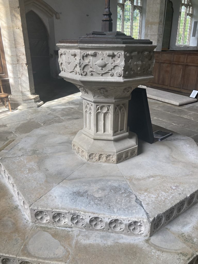
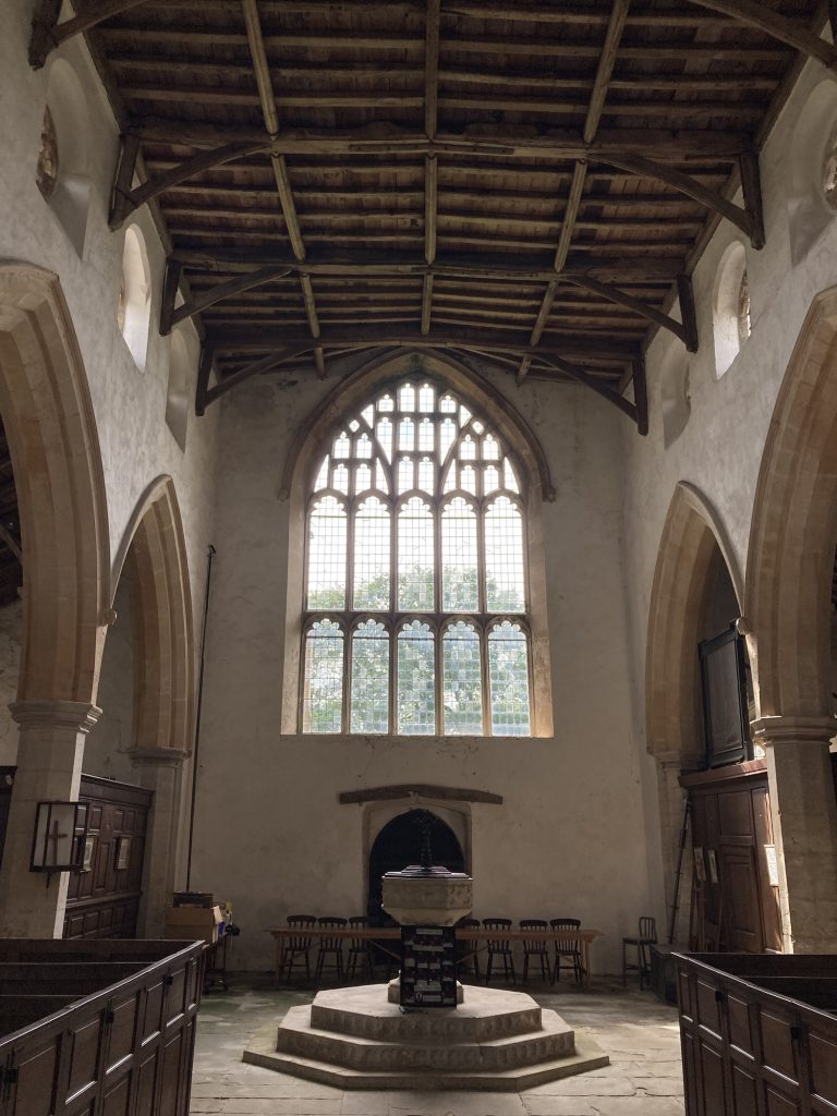
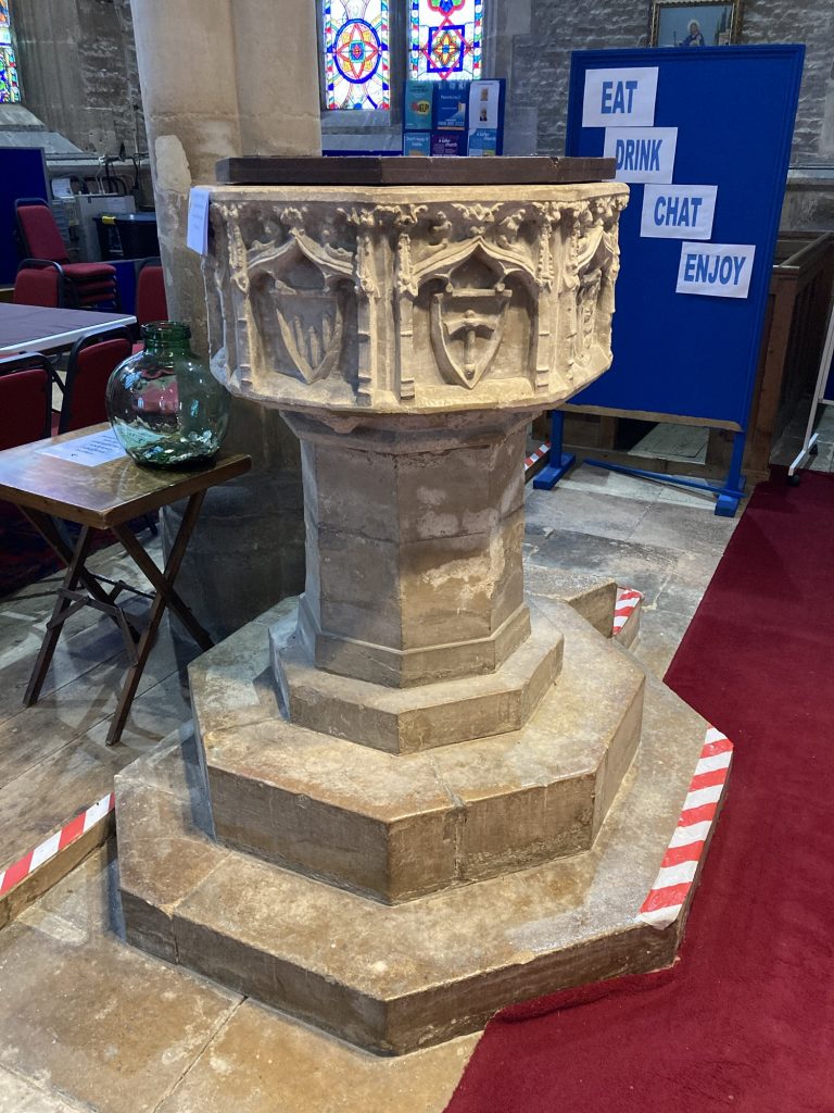
The font is particularly attractive. Nicely and differently carved on each face.
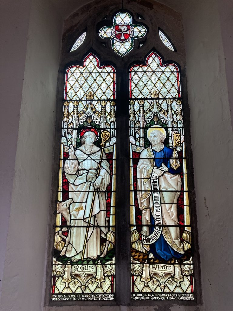
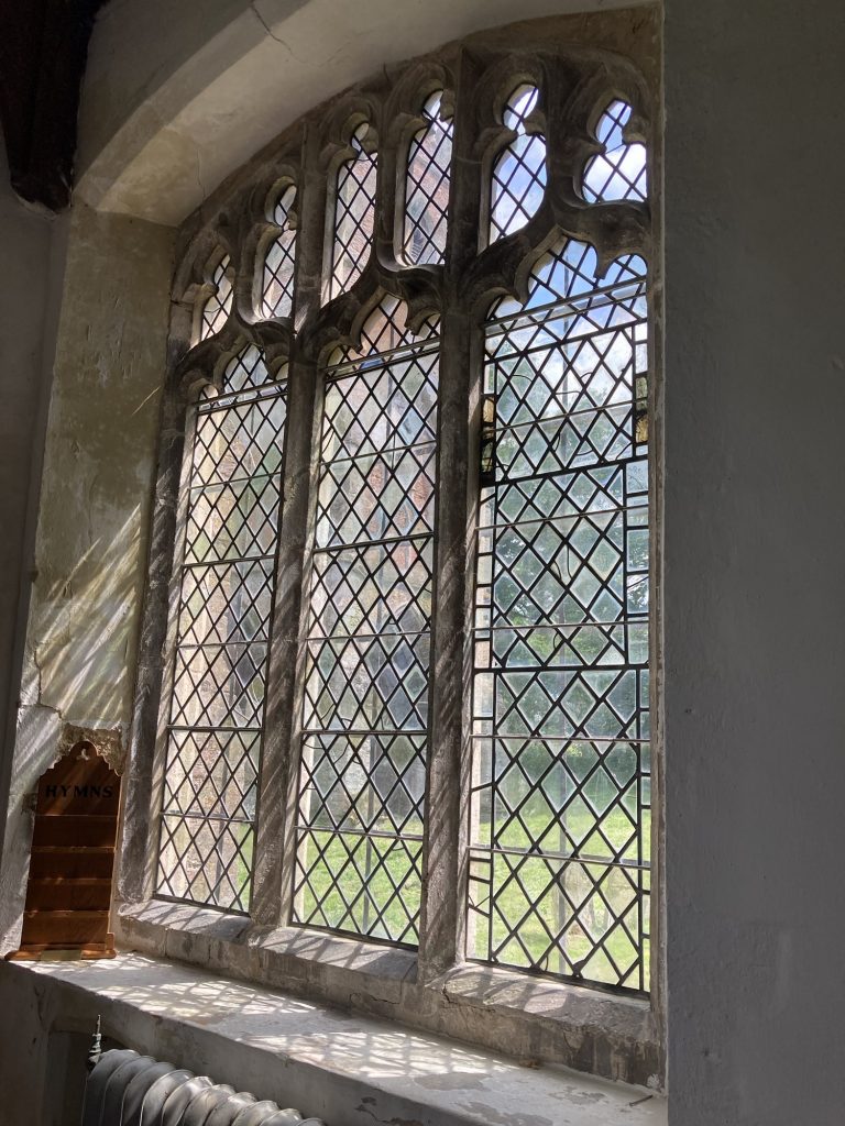
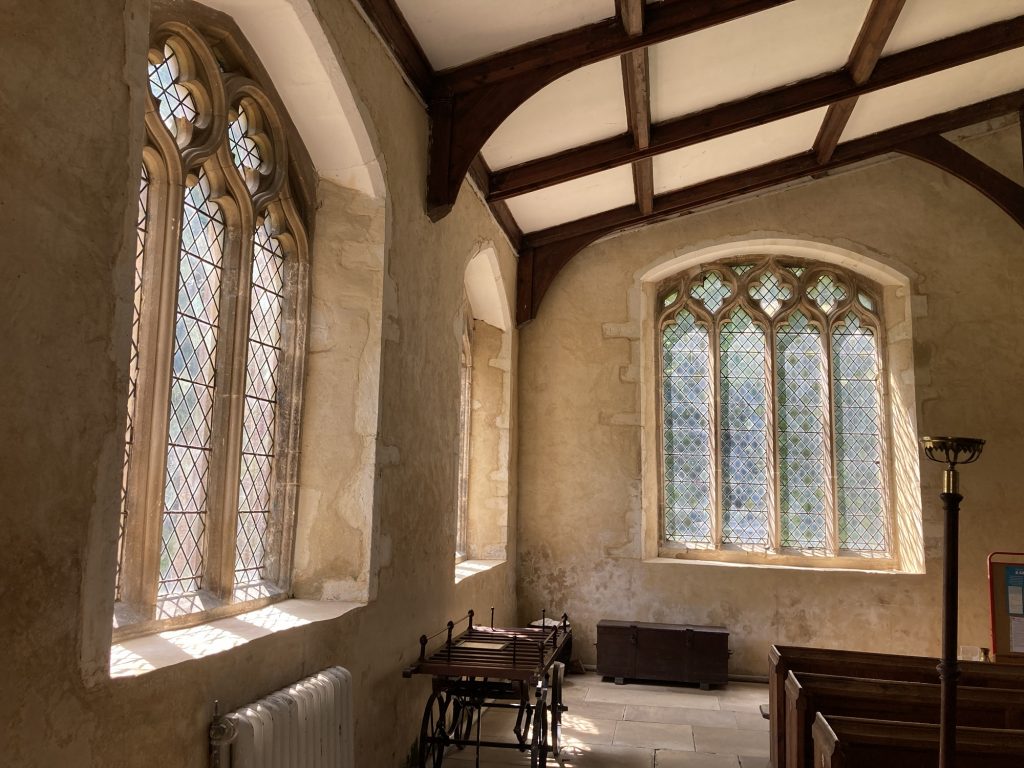
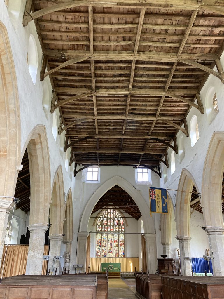
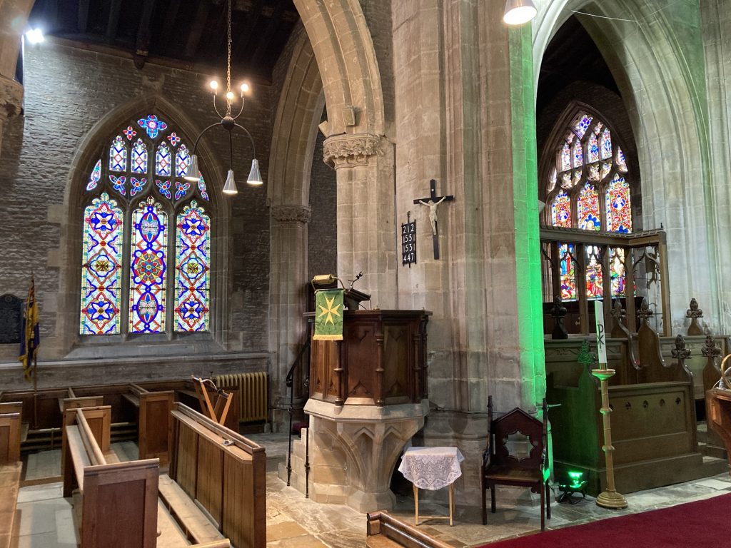
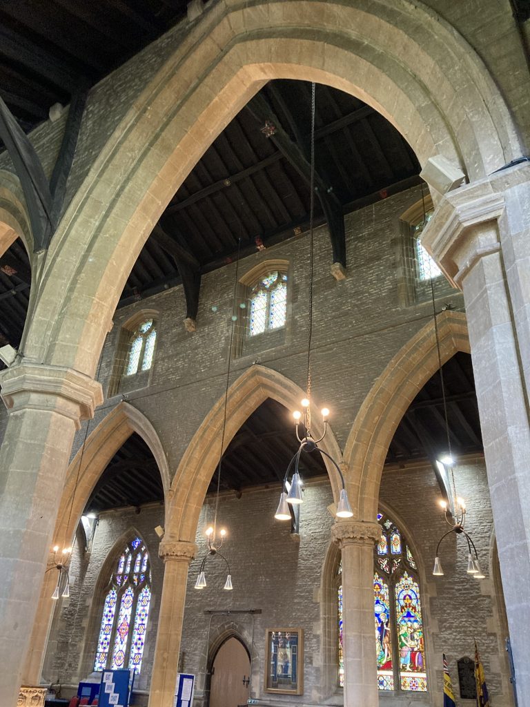
There’s some nice stained glass. Even the plain glass windows are very attractive.
I didn’t have time to linger. And my iPhone was running low on memory, so this had to be a brief and minimalist stop. Didn’t even go look at the separate tower.
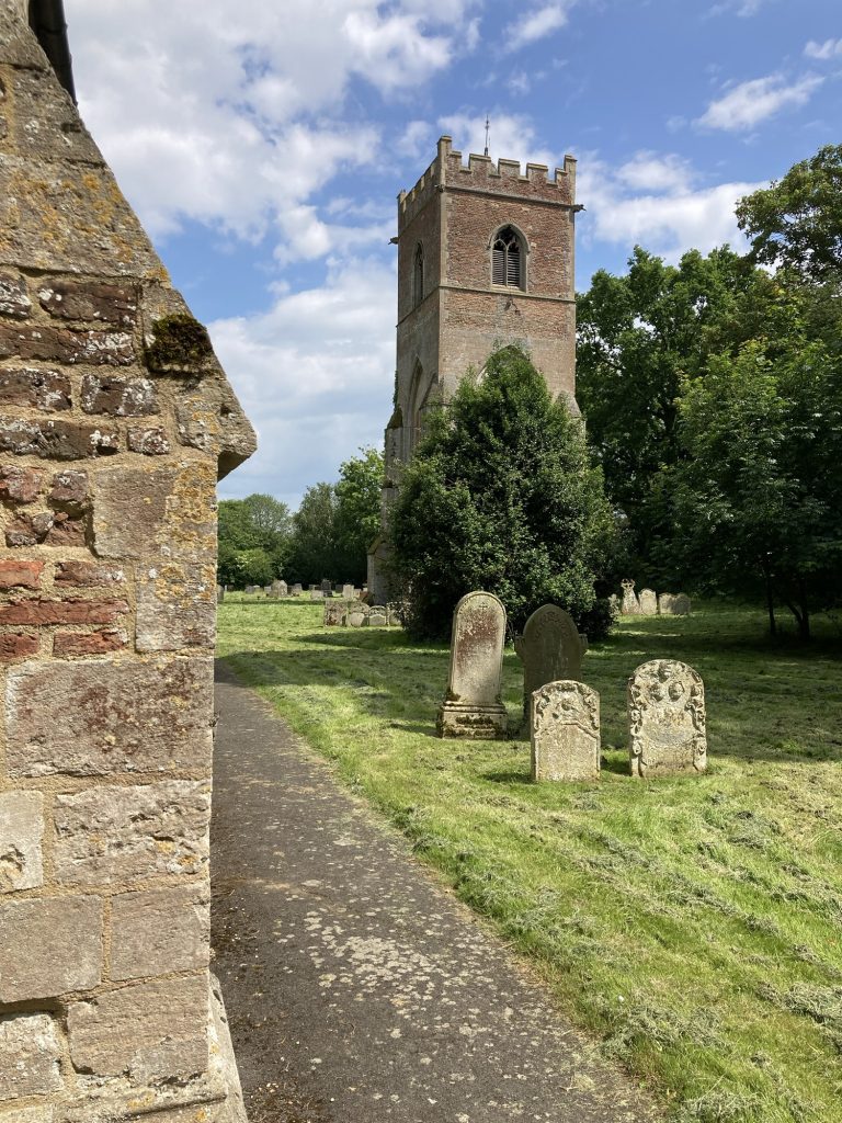
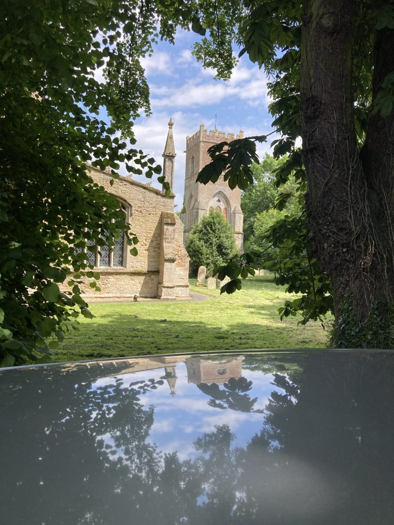
I’ve passed this church numerous times of late. Always meaning to stop and take a look. But never yet doing so. And so today, I did. It’s down a little track, of a B-Road.
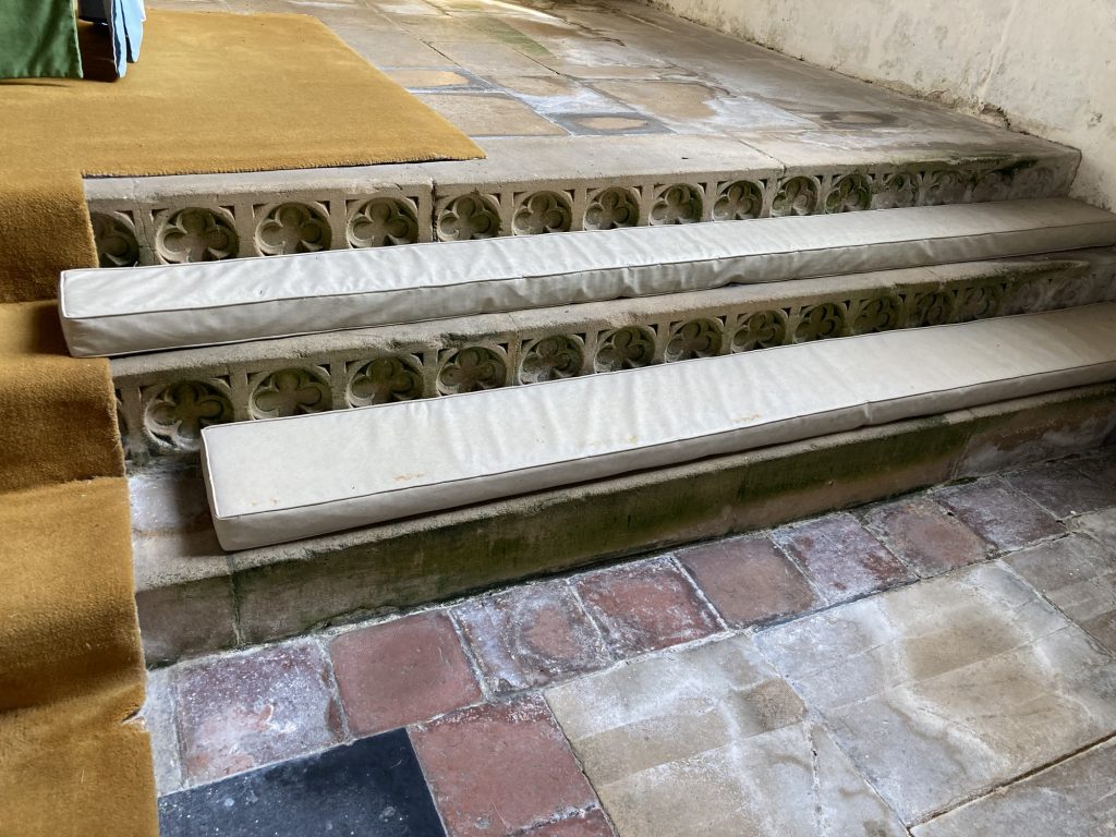
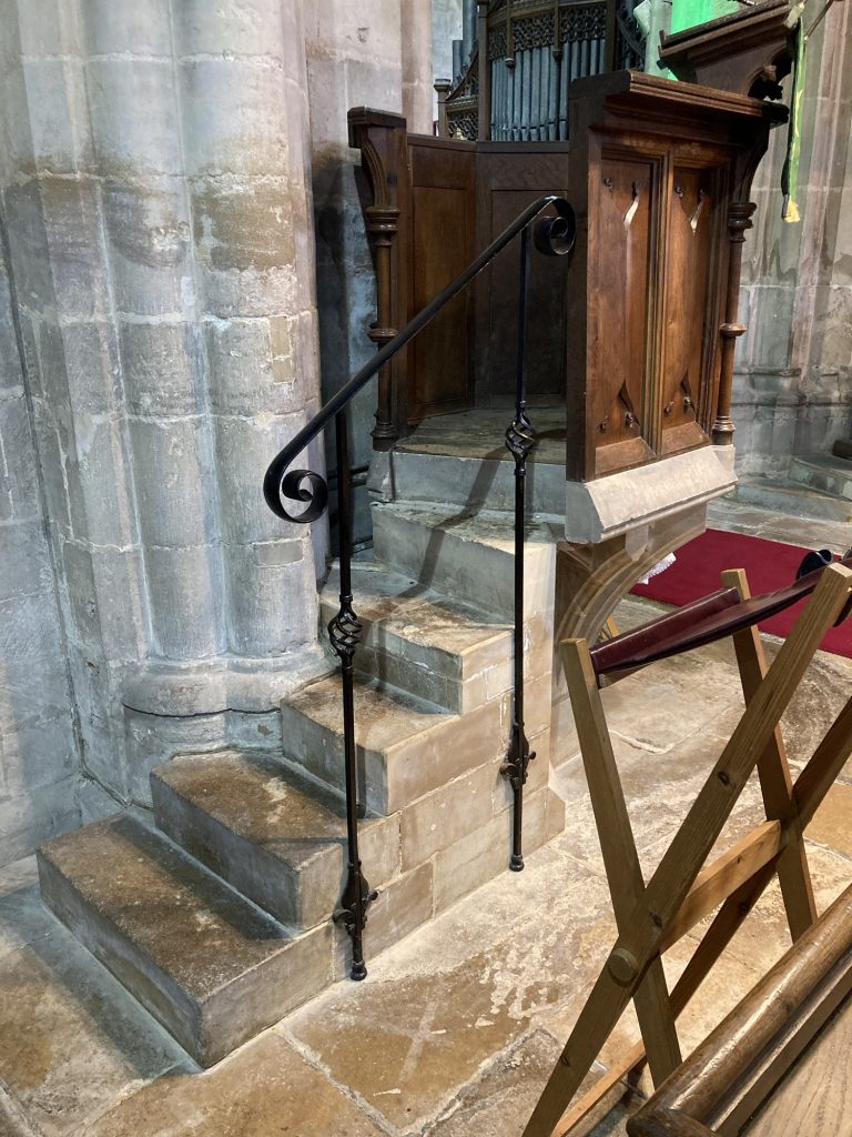
I didn’t clock as much interest or detail as some other recent churches. One thing I did like is the repeat pattern carved into the stone steps leading up to the altar.
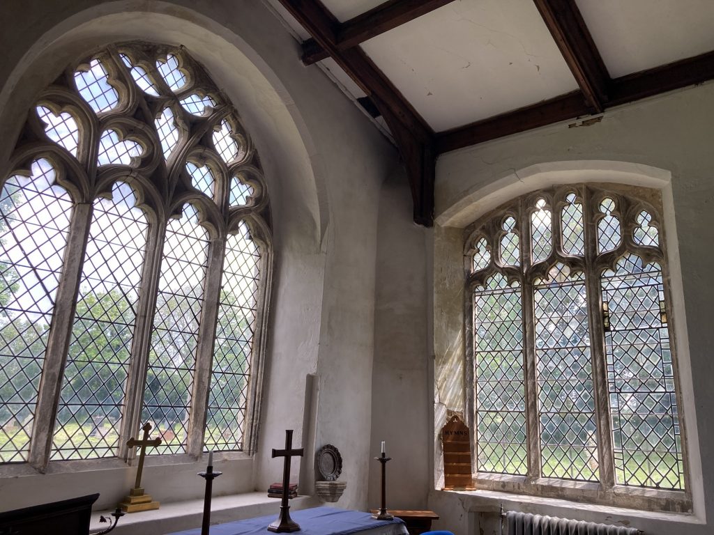
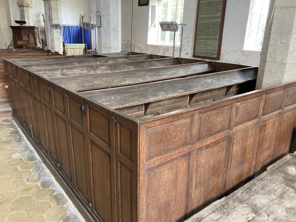
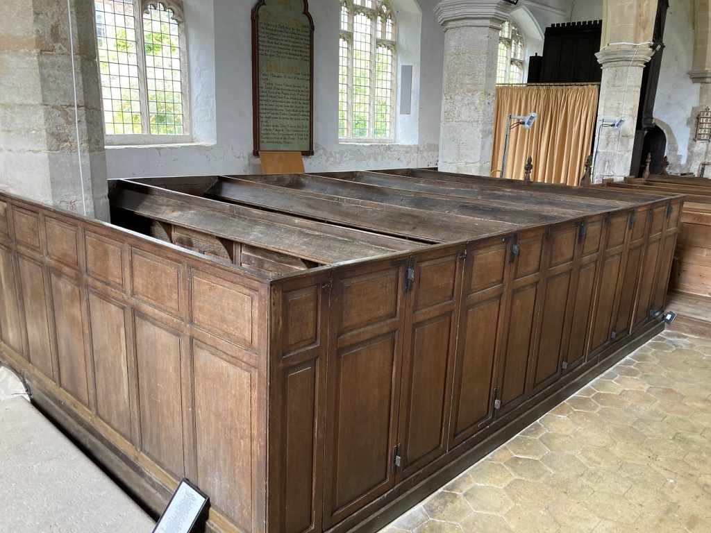
Not a podium placing church, perhaps. But in its own humble way very nice. I like the ‘box’ pews. And the main window is great.
… and out.
As I left St John’s, I felt blessed. What is about church visits? It’s certain that for me I prefer to be alone. The peace, the solitude, the aesthetic wonderland. It’s always best on a sunny day, as both nature and human artefacts really sing in the sunshine.
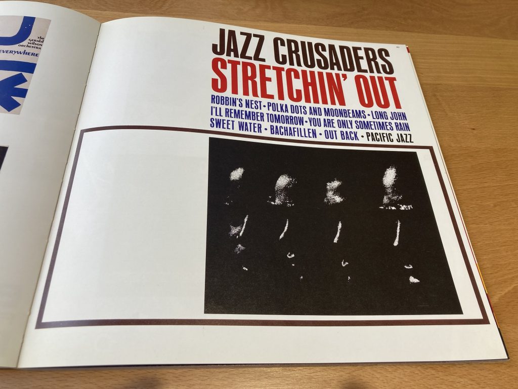
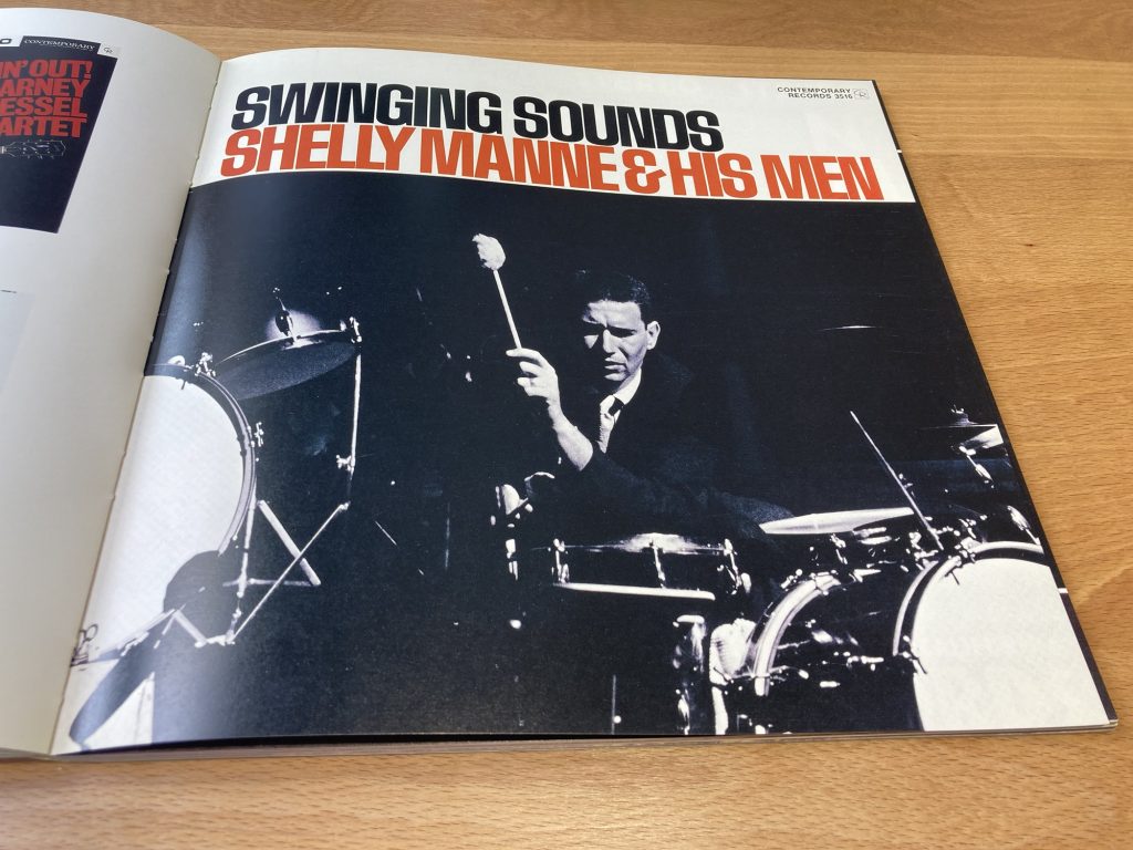
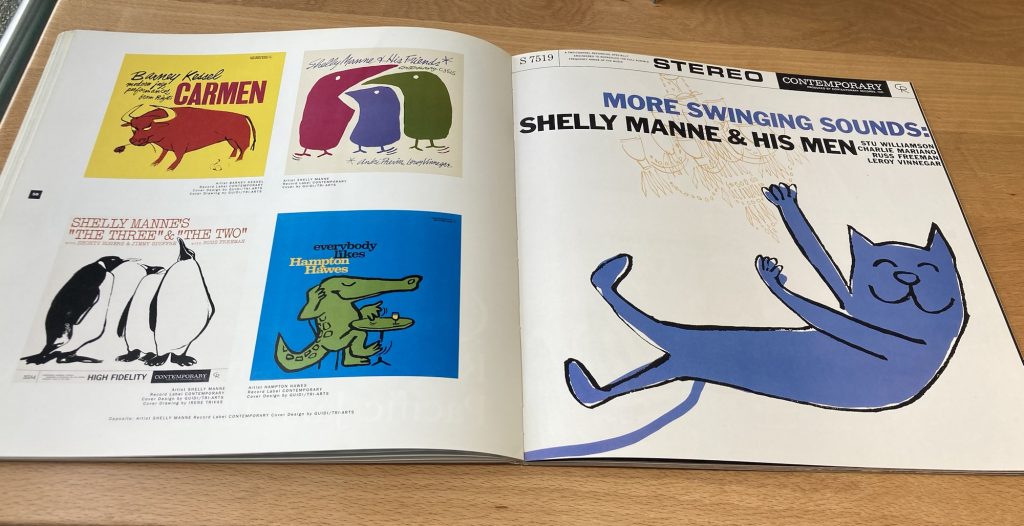
Having something of an orgy of Blue Note appreciation right now. And really loving it. This has put me in the mood to explore more jazz, esp of the ‘50s-through-‘70s era.
And not just the music, either. The whole shebang. Record cover design, clothes, and whatever else!
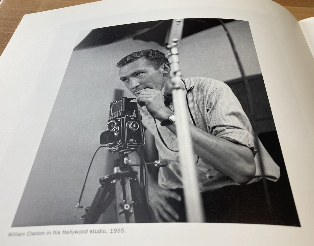
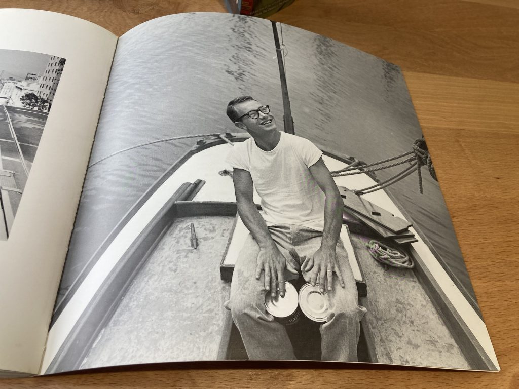
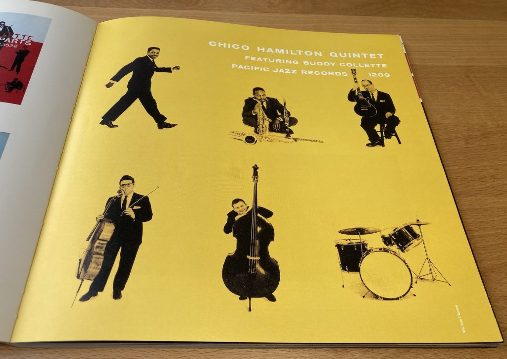
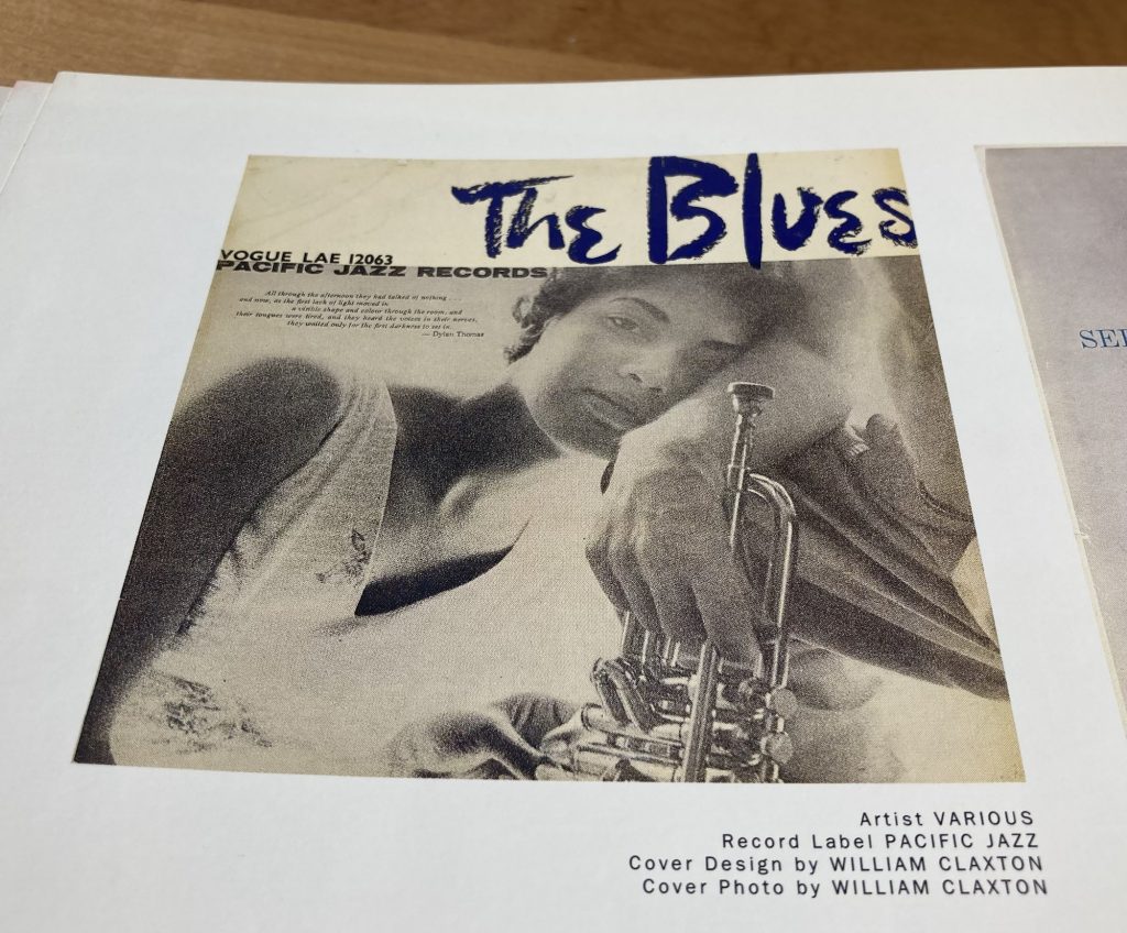
I’ve grouped the above black and white photos together in a way they’re not in the book. They’re all by William Claxton. Claxton also contributes an intro, and is the subject, in part, of ‘Clickin’ with Clax’, an intro by Leonard Feather.
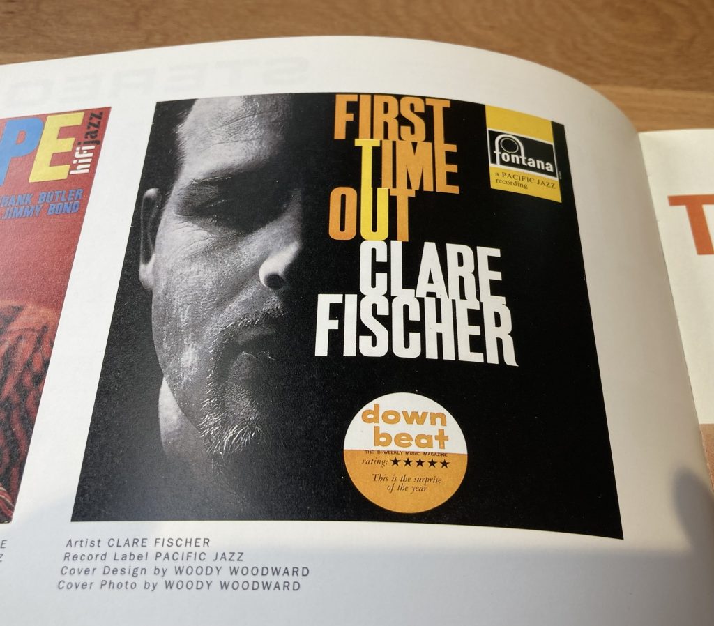
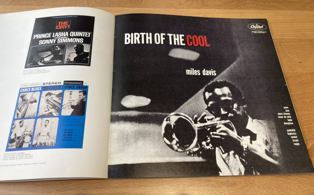
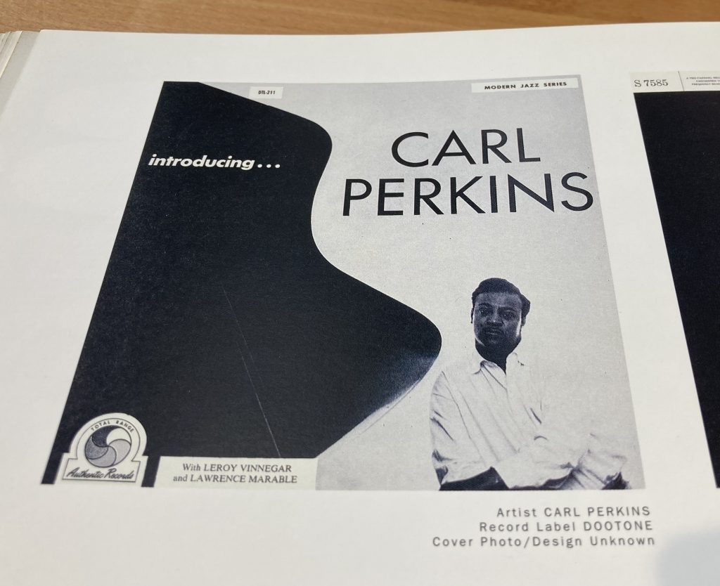
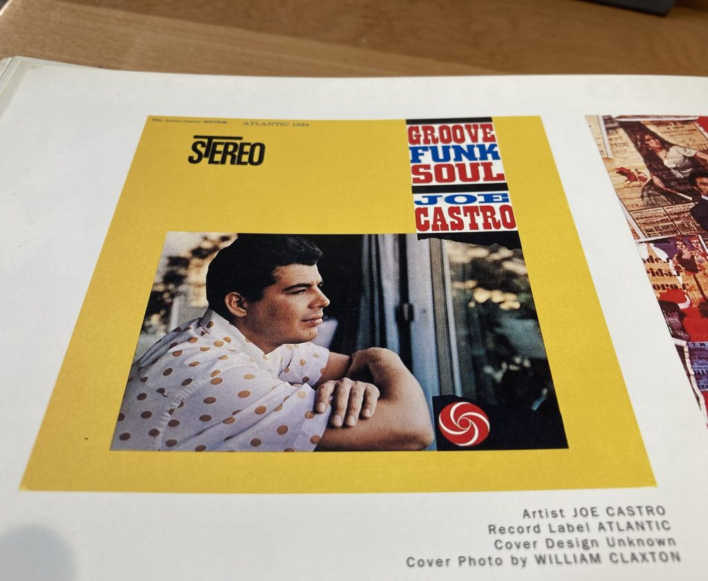
Many of the covers features herein also feature is photography. Anyway, here are a few selections that I either love, or find intriguing.
I have quite a lot of the music represented here. But there’s also a lot – both in these selections – but even more so across the book as a whole, I haven’t heard. Exploring the visual side of these recordings can lead one into trying out the sounds.
This is a must for a framed bit of wall art!
David Stone Martin was a terrific artist. So much so that early Blue Note album covers are clearly indebted to his style.
Later it could be argued – altho’ Clax emphasises a different ‘West Coast’ tradition (both in terms of musical and visuals aesthetics) – the influence would flow the other way.
For me, another must have for our walls.
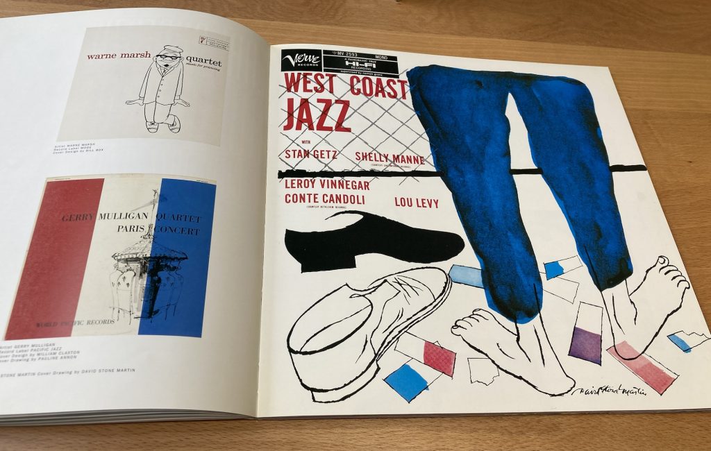
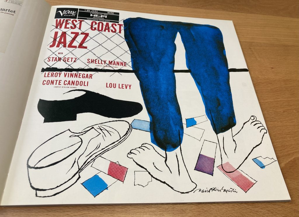
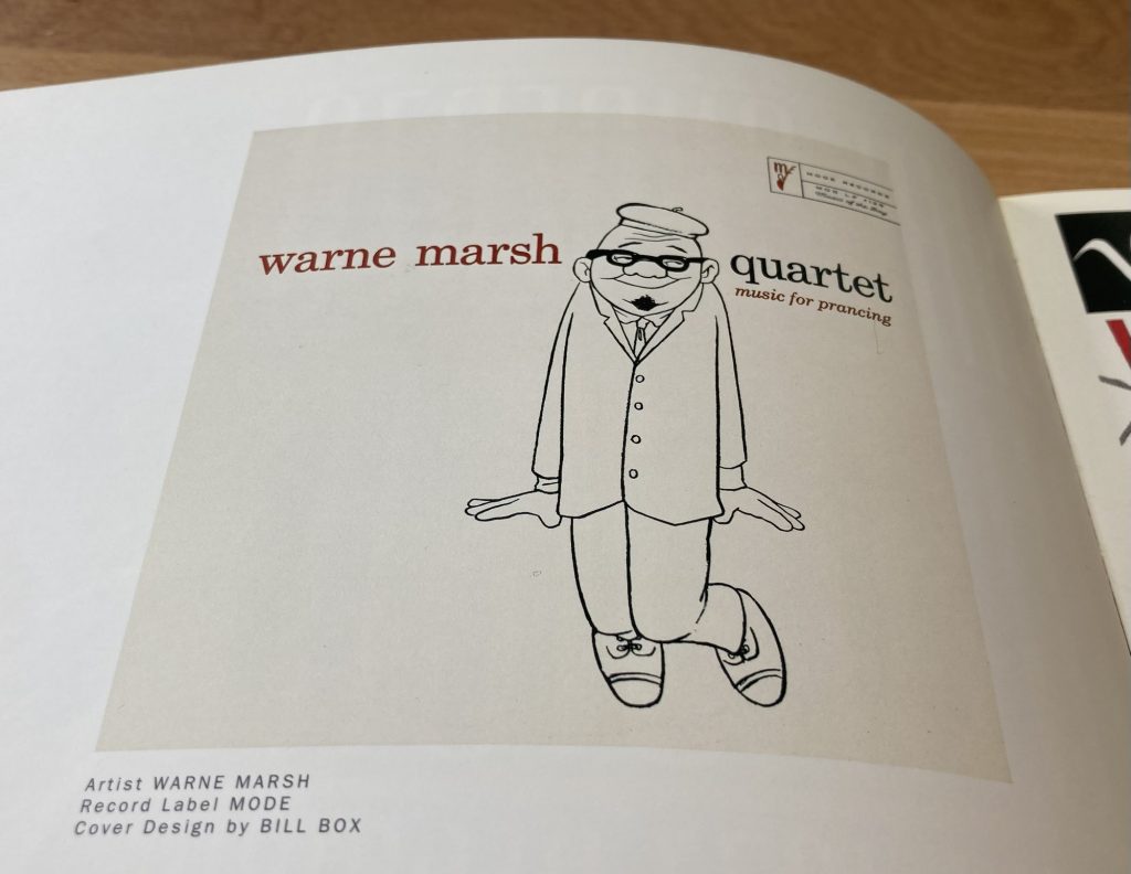
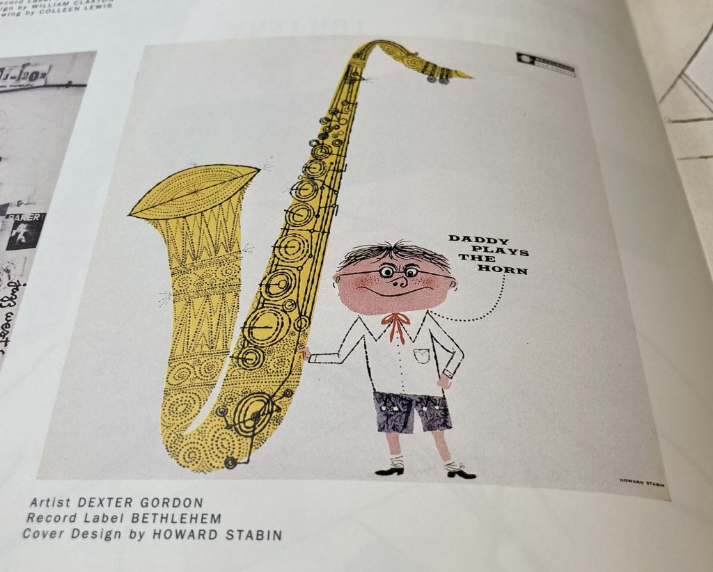
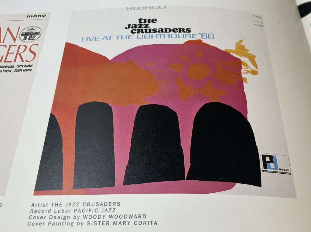
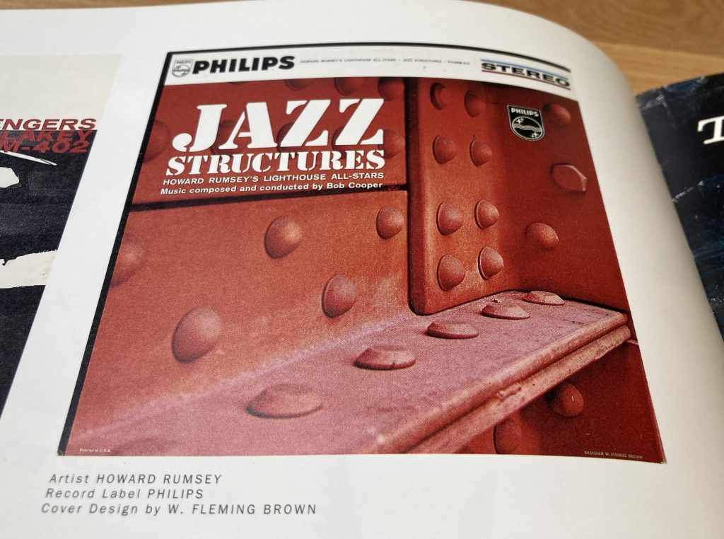
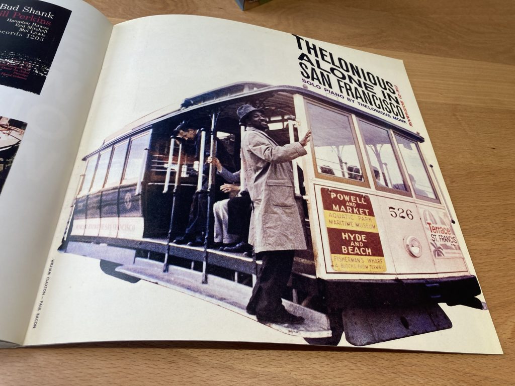
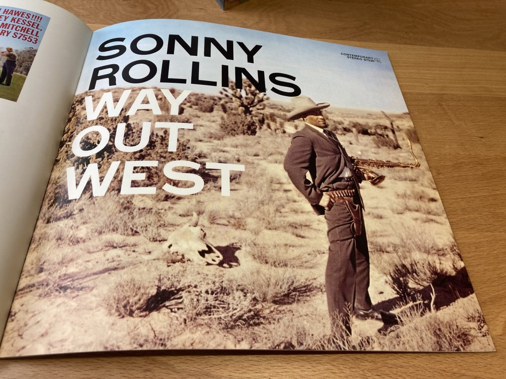
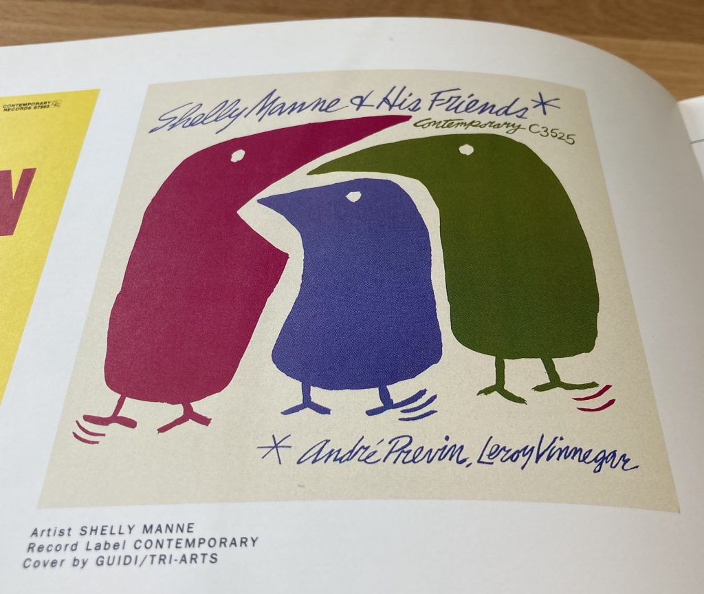
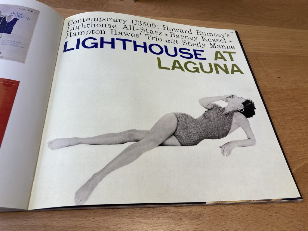
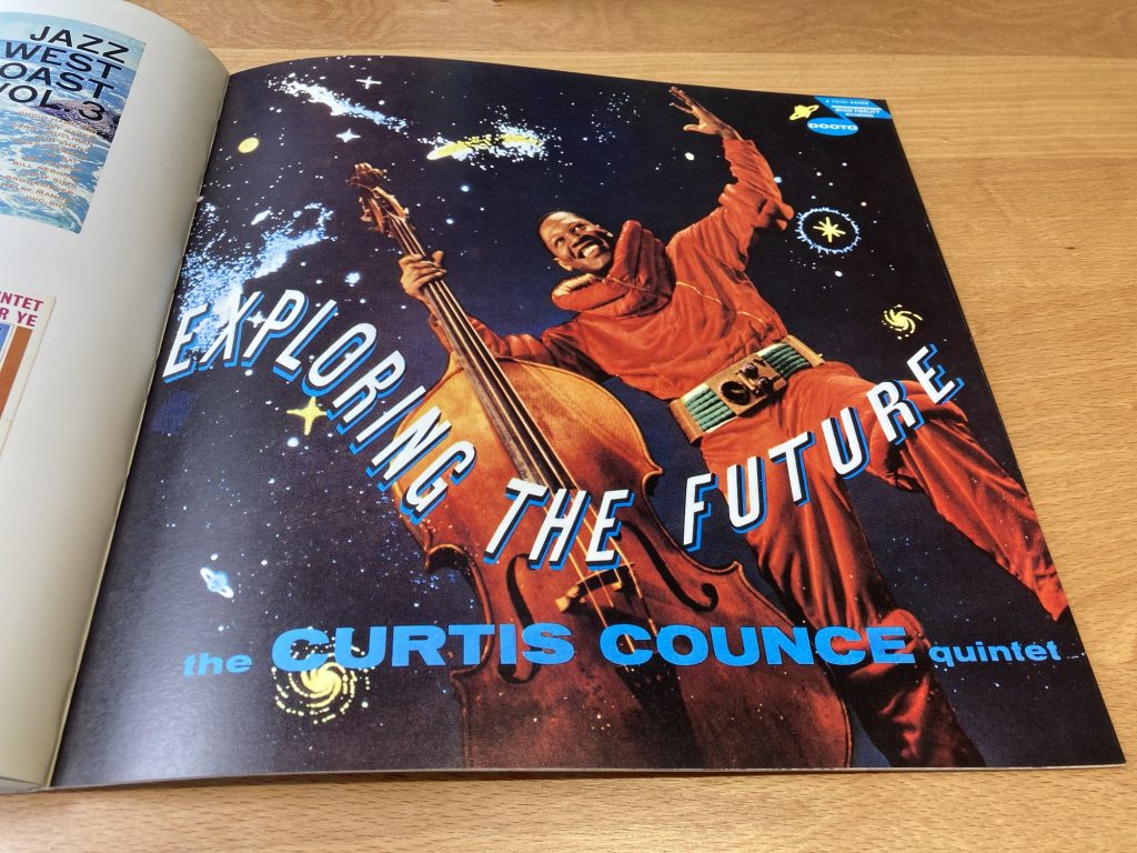
This final gallery of images, below, is to show that it wasn’t always super-cool and über hip. Altho’ maybe that was the feeling at the time? They are all – save one or two, perhaps? – good covers. Some fun, some more serious. But I’d argue this lot – esp’ Exploring The Future – haven’t aged as well as the stuff in the foregoing galleries.
And to finish? Another essential cover for the framed wall art category:
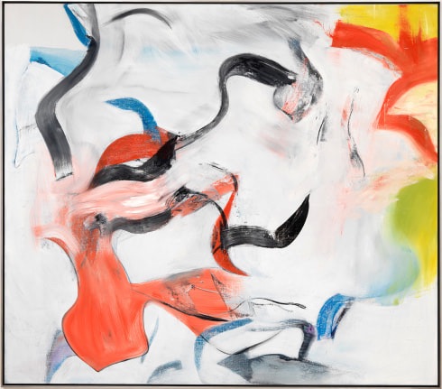
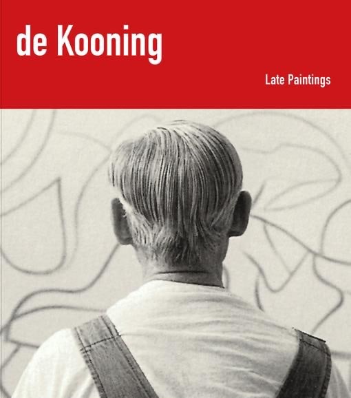
As is so often the case, stuff I’m interested in happens without my being aware of it. In this case I’m talking about a London exhibition of Late Paintings, by Willem de Kooning.
The show itself took place in Autumn, 2017, at the London gallery Sarstedt. See more on that here. There was an exhibition catalogue, now sold out. Which I’d love to have.
What a great cover!
Most of Skarstedt’s publications are on artists I rather dislike, po-mo’ art wank. But there are a couple of others I’d love to see:
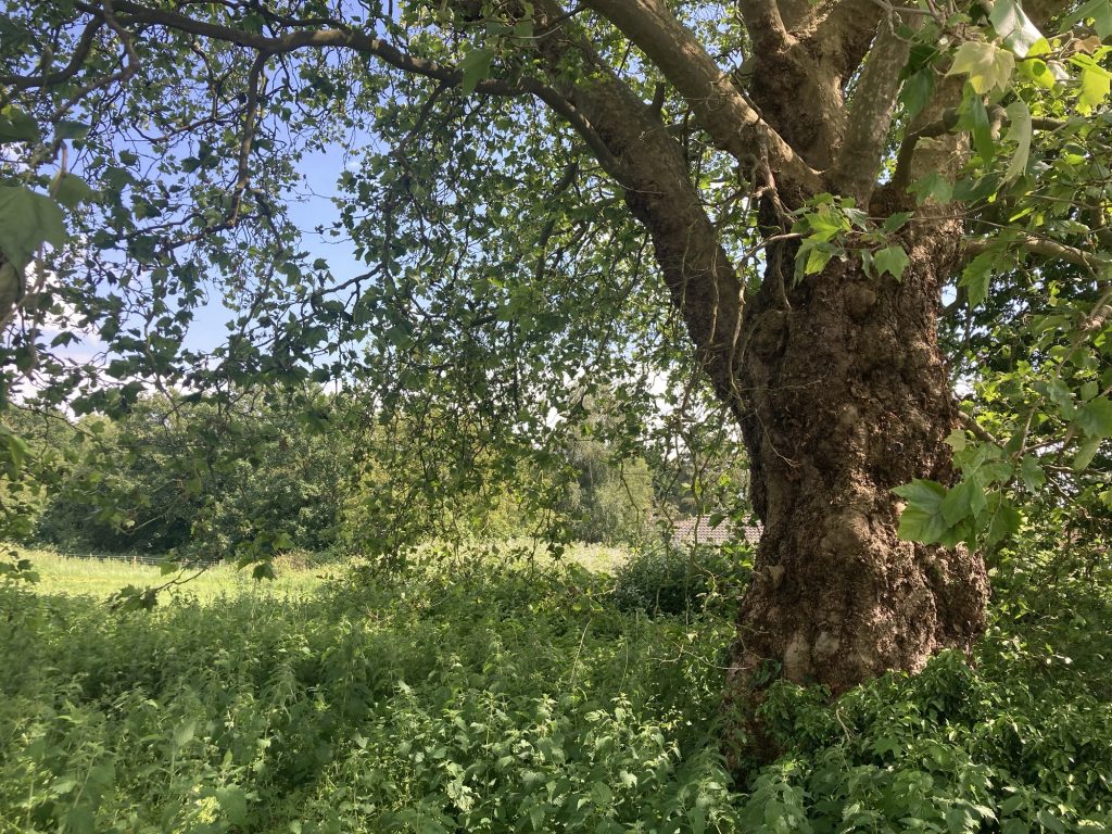
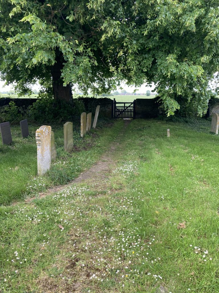
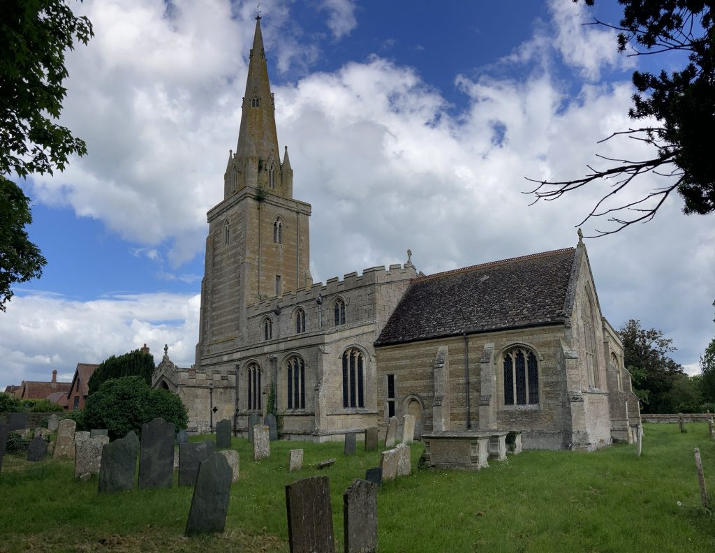
I was in the rather delightfully named Wiggenhall St Mary, down Church Lane. There must be a church here, I surmised. There’s certainly a chapel. I was right by it. Now turned into a domestic residence. But the road, or track, to be more accurate, carried on. So off I went, for a look see…
Hidden away.
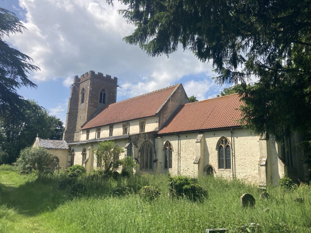
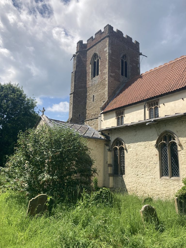
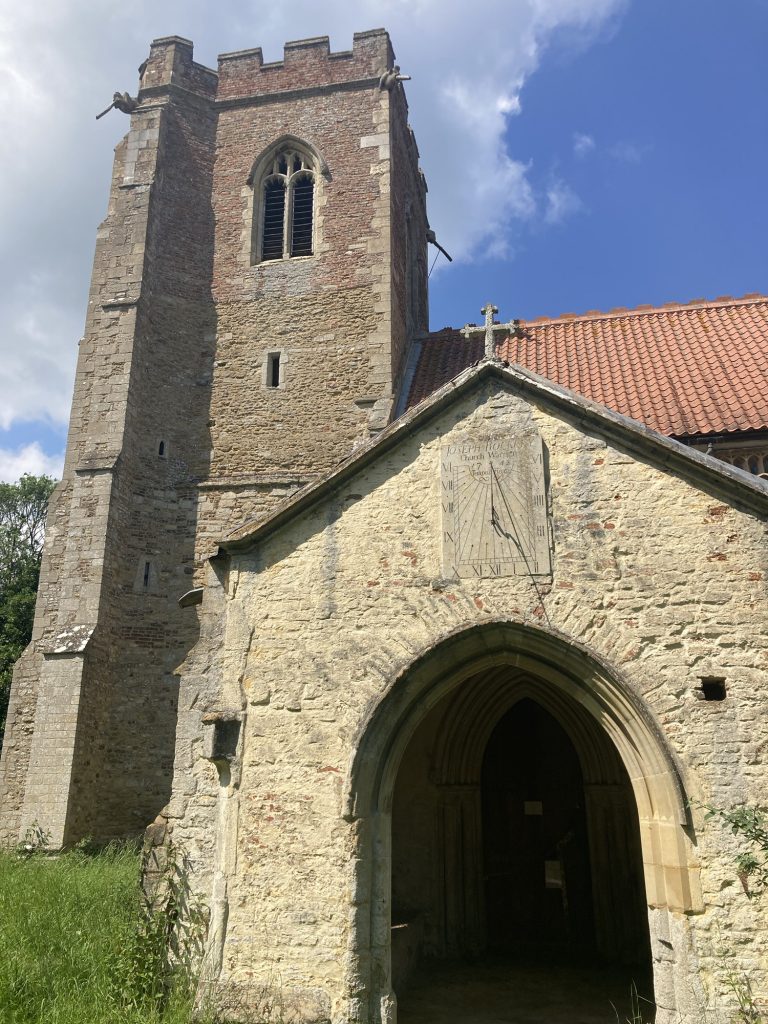
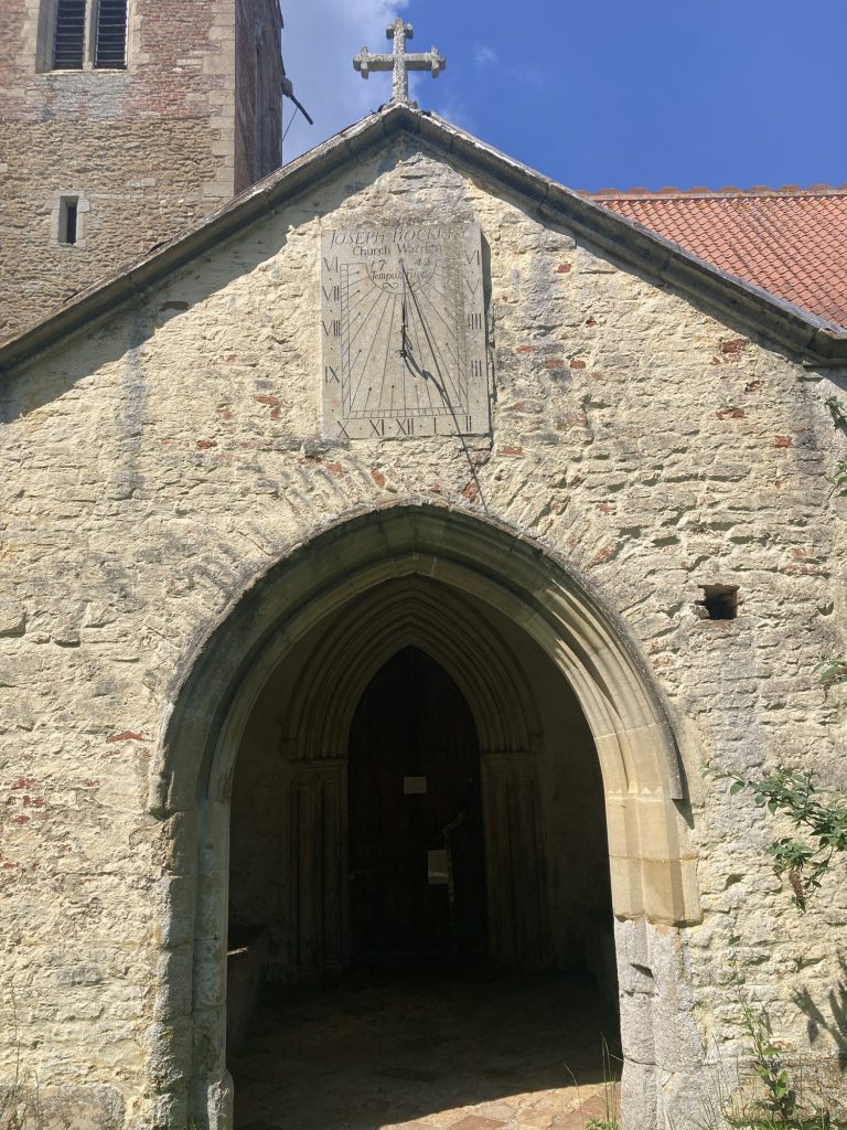
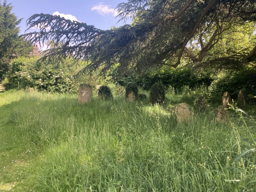
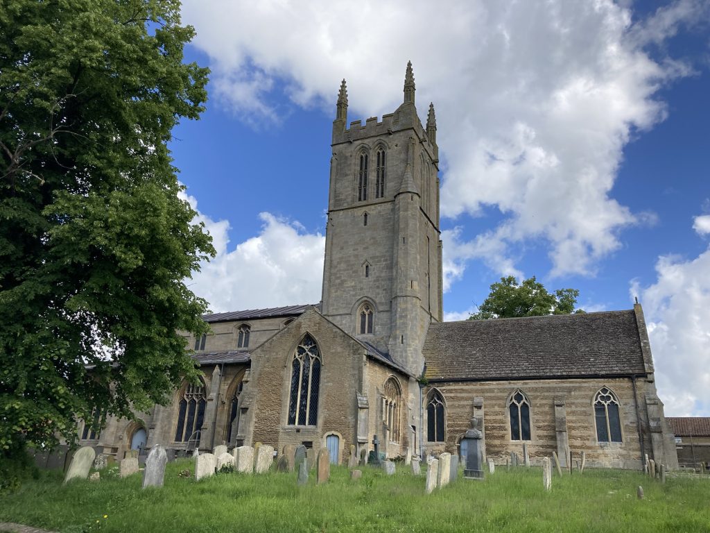
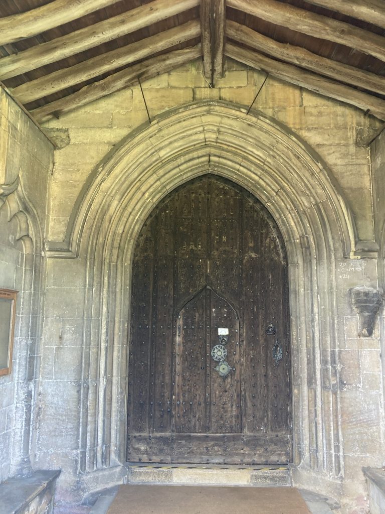
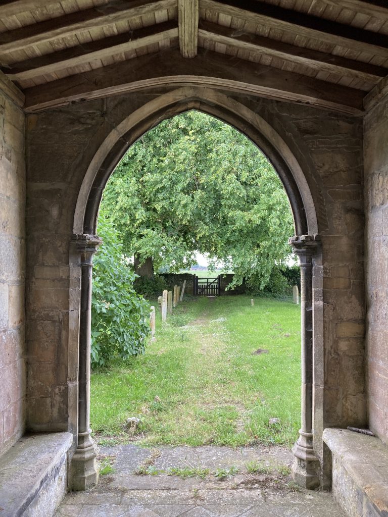
And lo, there is a church. Hidden away, accessible only on foot. And, sadly, closed. And in this case, properly closed. For repairs, due to falling masonry. No calling a churchwarden for the key in this instance, alas.
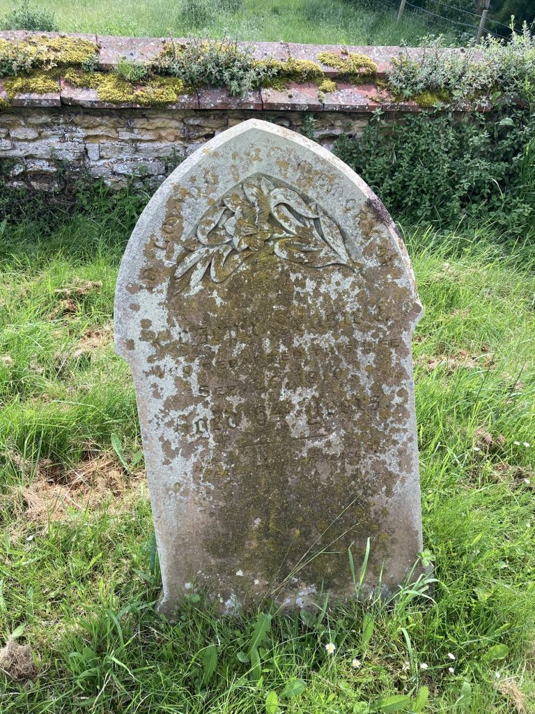
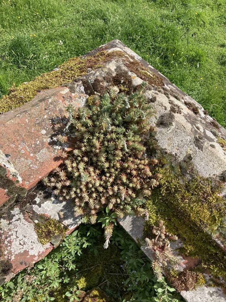
Nature is fecund here.Tower and porch clearly differ in age.Nice sun dial.The graveyard is slowly being reclaimed by nature.
I’m keen to revisit this church, as and when she’s made ready. She’s in the care of the CCT. I hope it’s not too long, afore we can get inside her? She’s in a fabulously pretty and secluded location. Just my cup of tea!
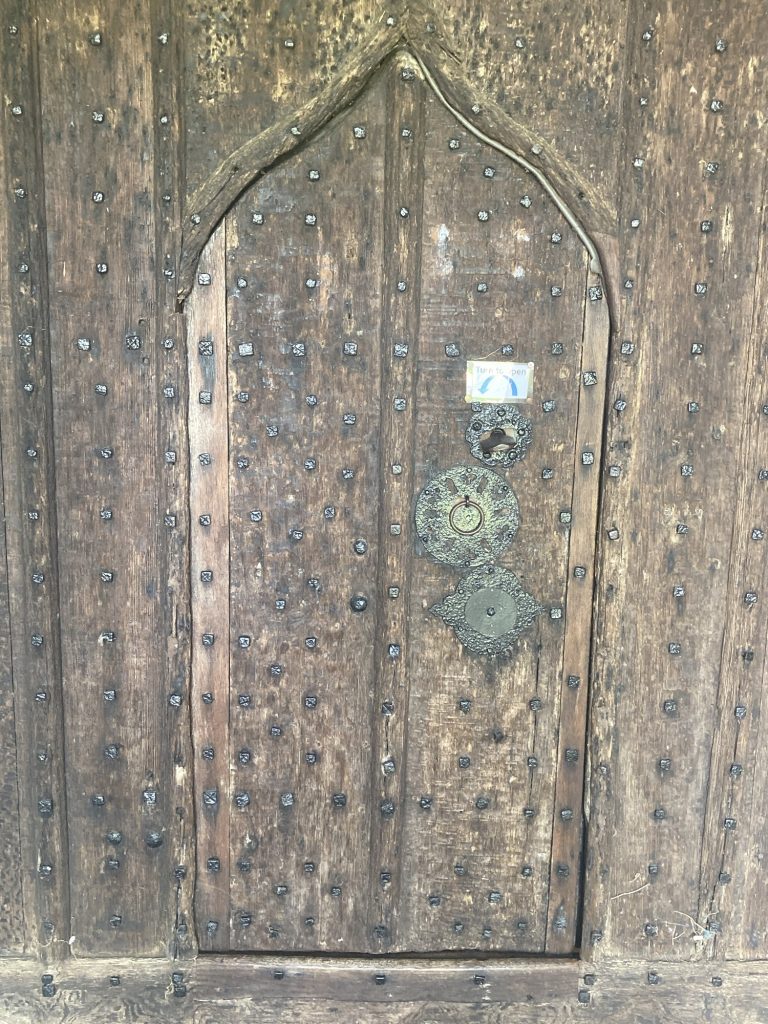
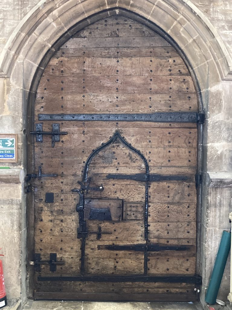
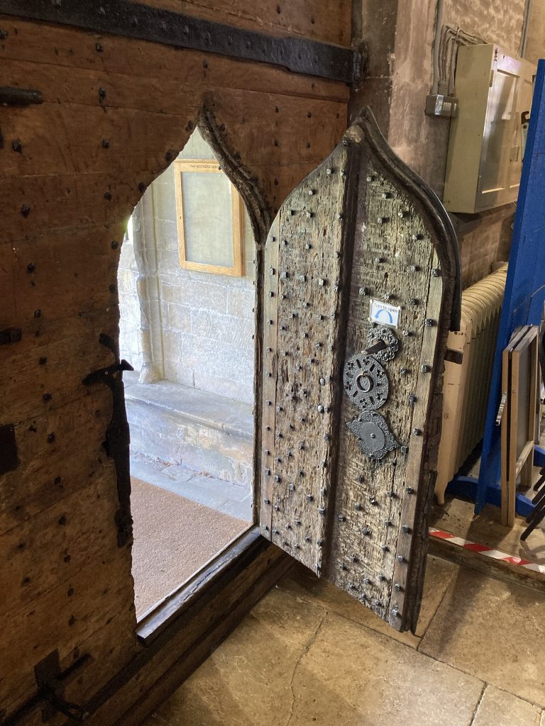
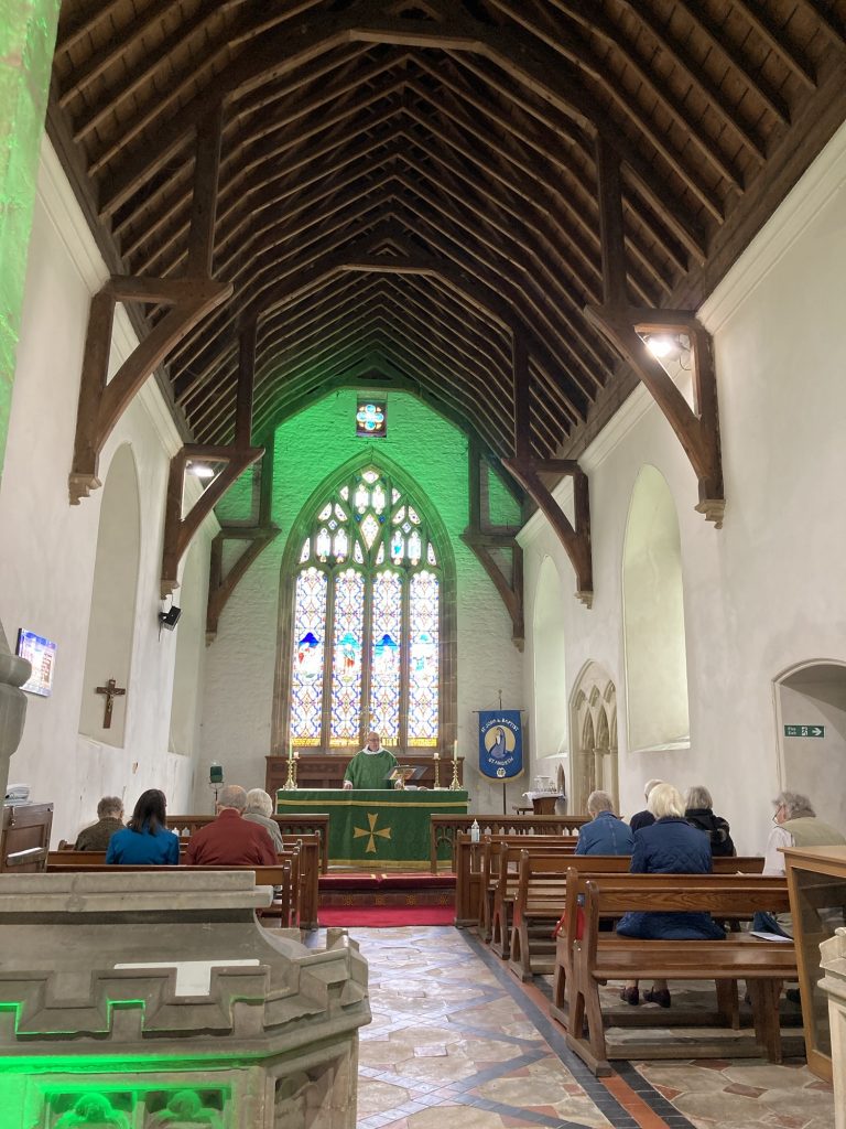
I chanced upon this church just as some folk were going in. So I thought, I’ll stop; I know she’s open! And she was. For a service! This is the first time in all my church visits that I’ve coincided with active religion!
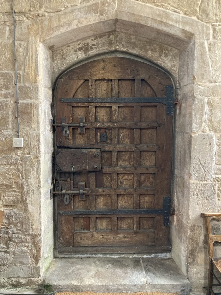
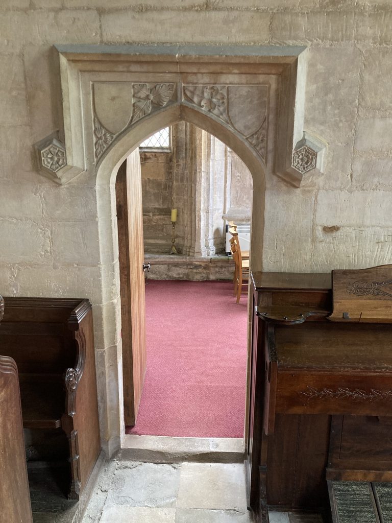
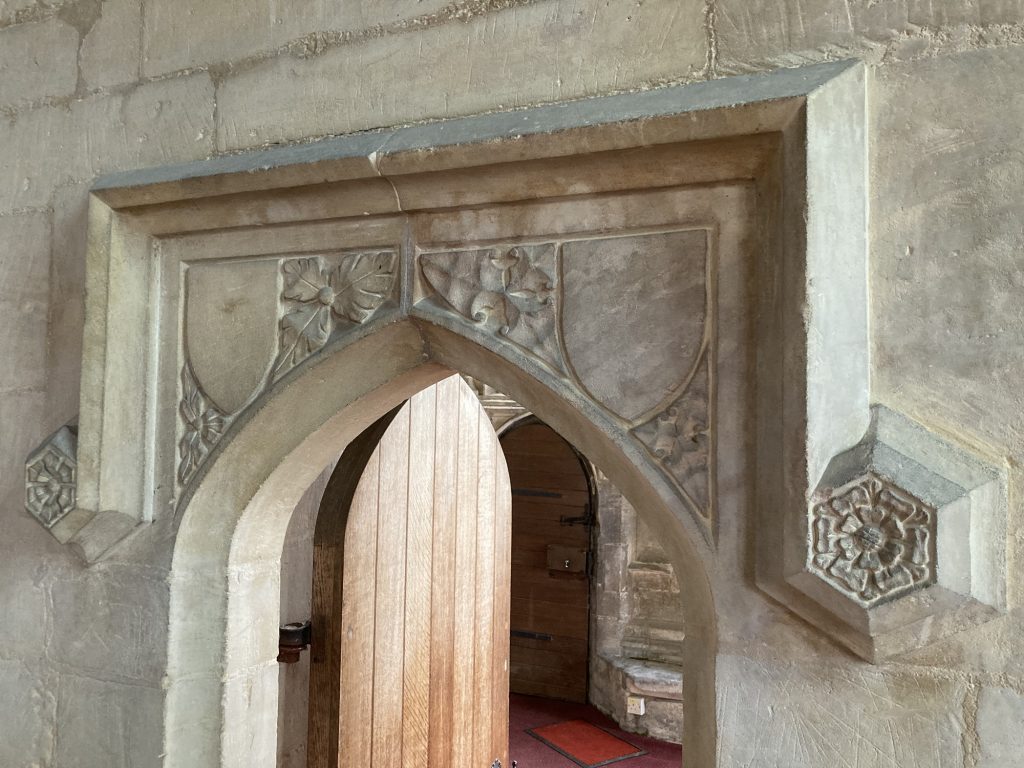
The best thing about the porch is the mini door-inside-a-door. Very cute!
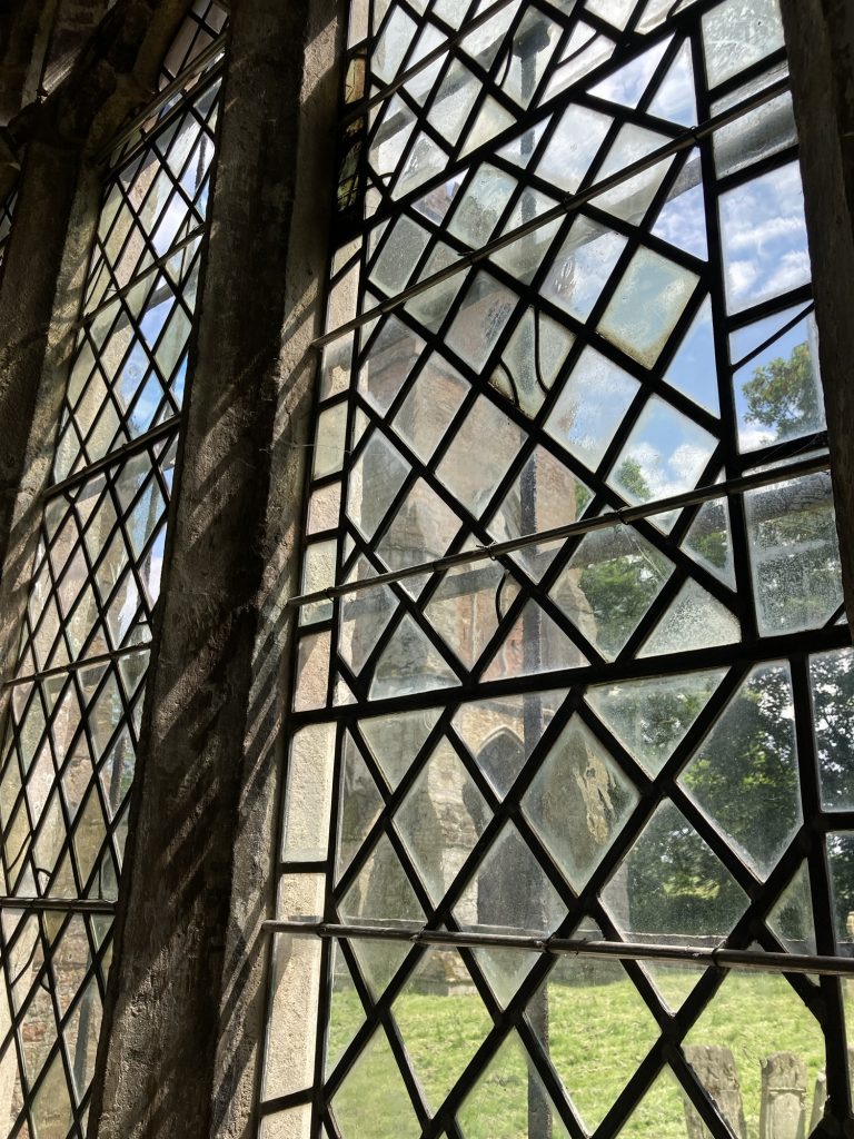
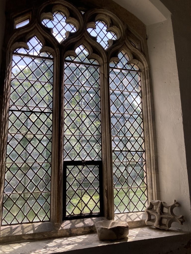
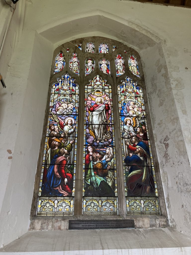
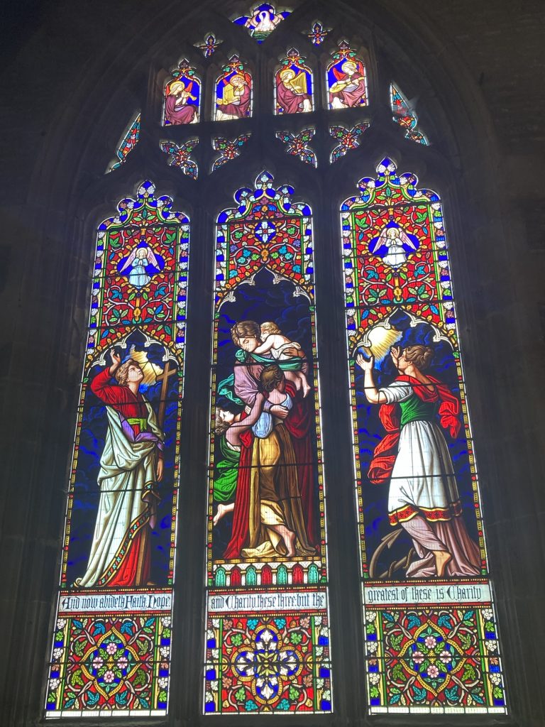
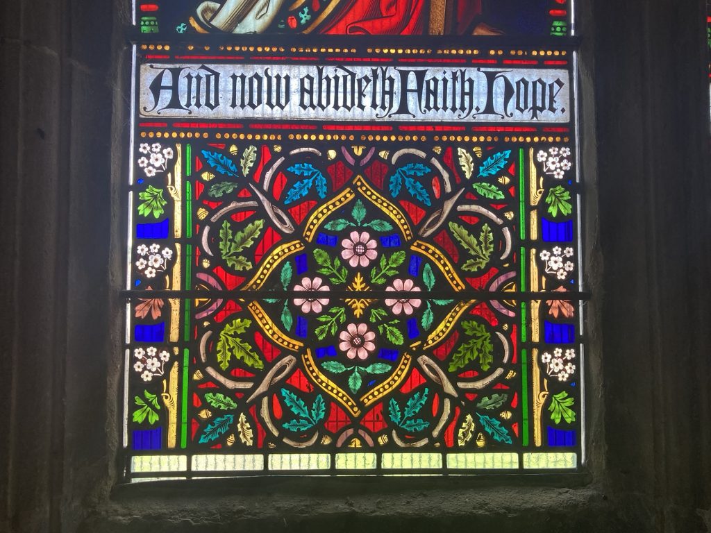
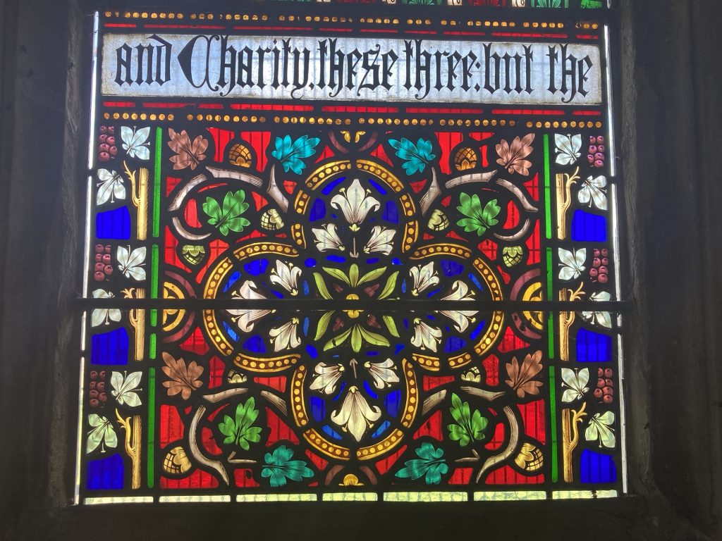
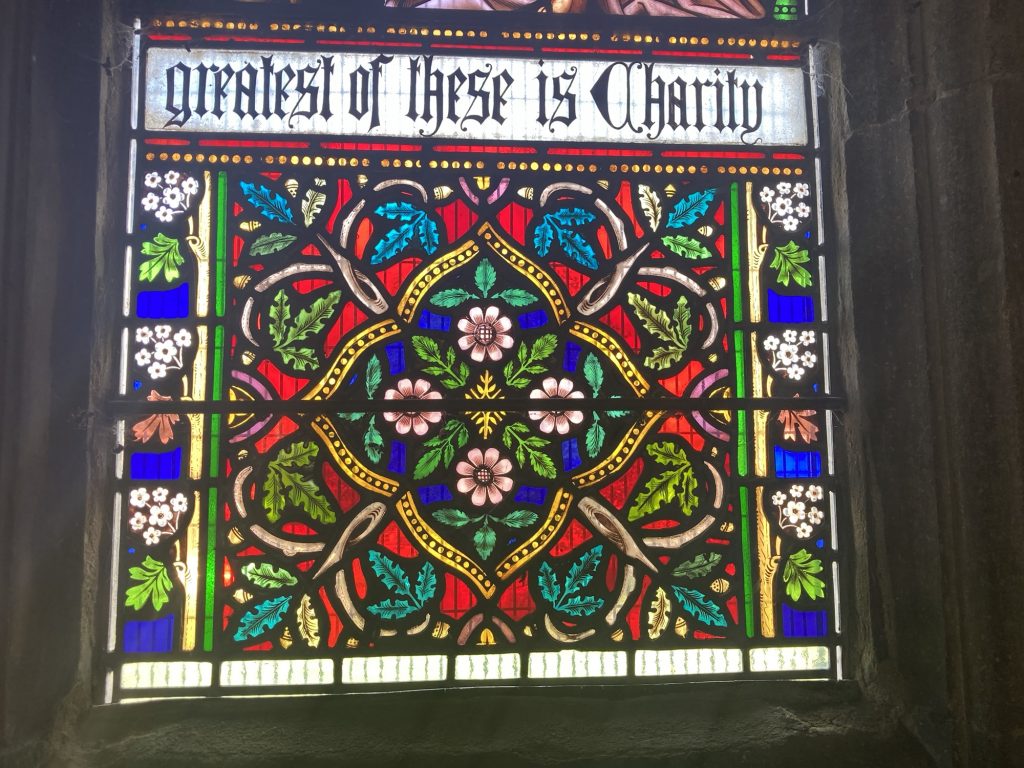
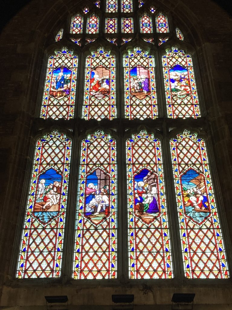
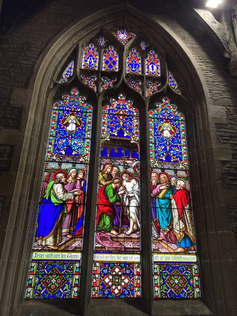
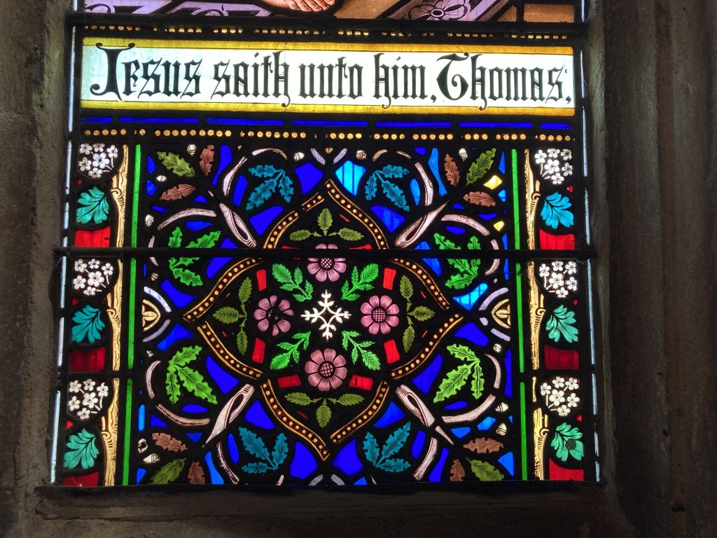
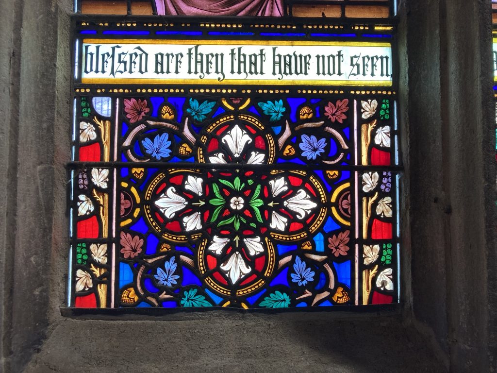
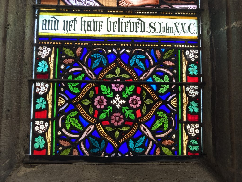
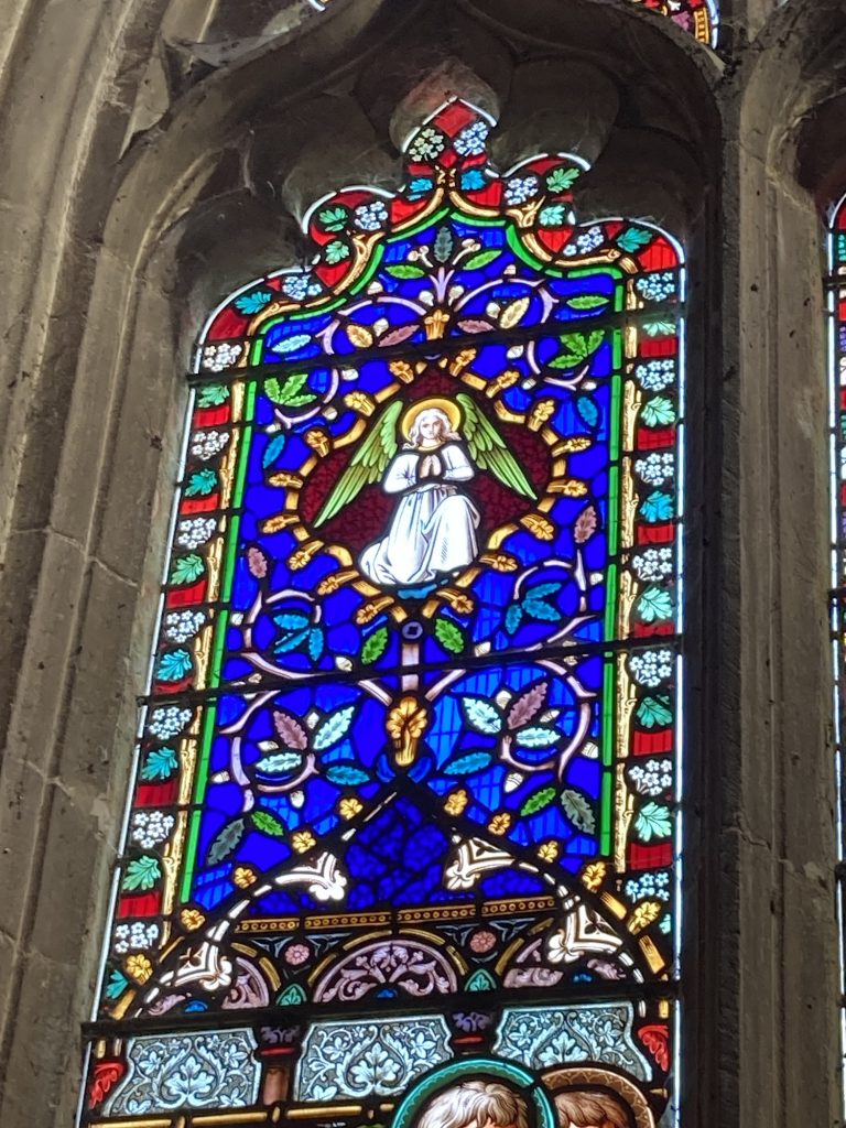
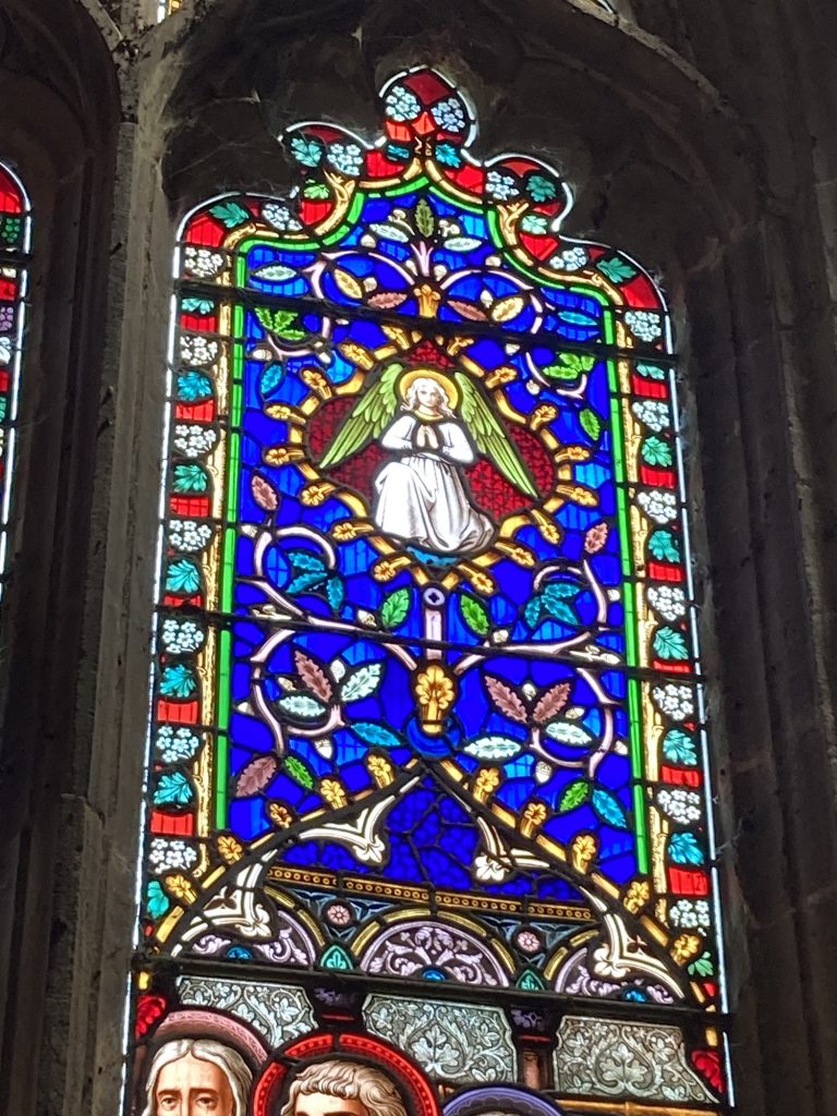
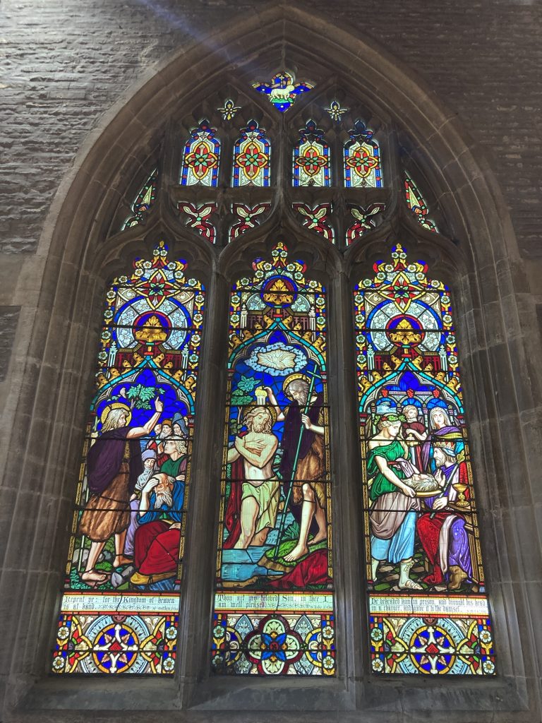
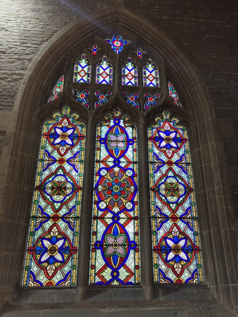
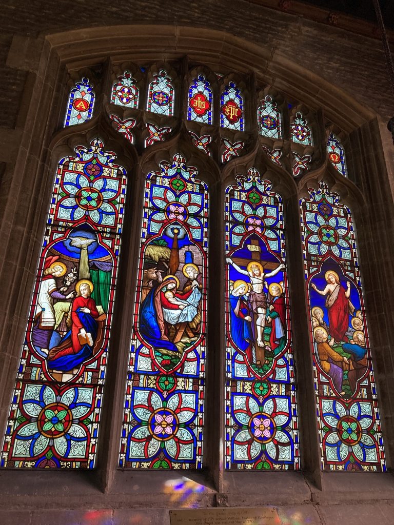
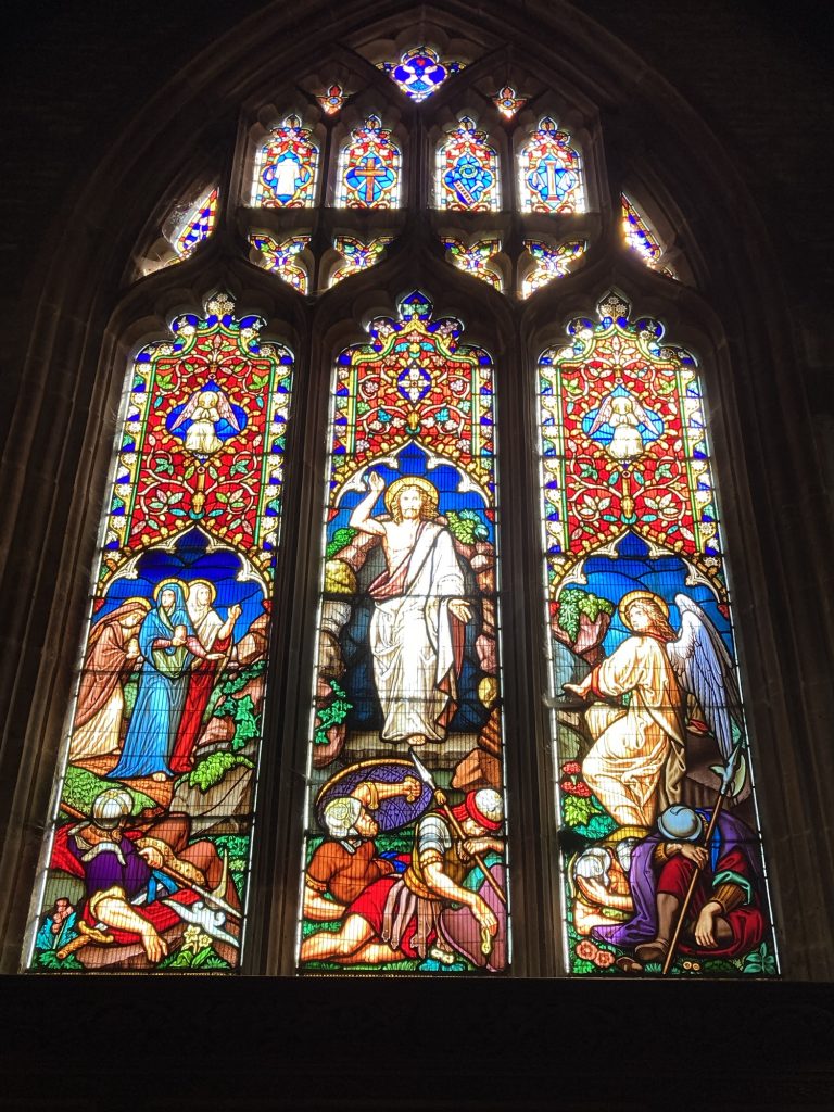
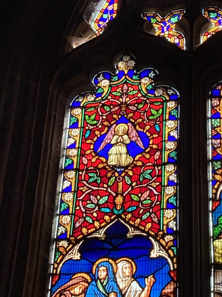
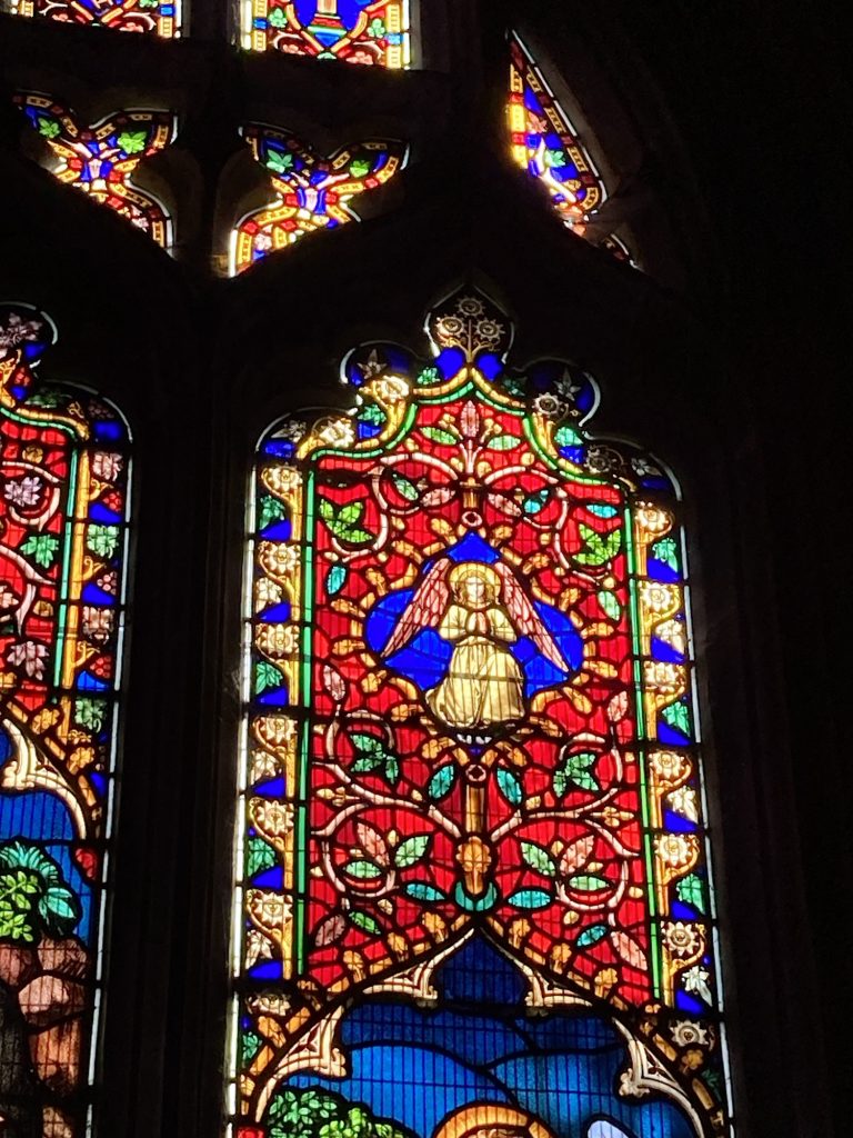
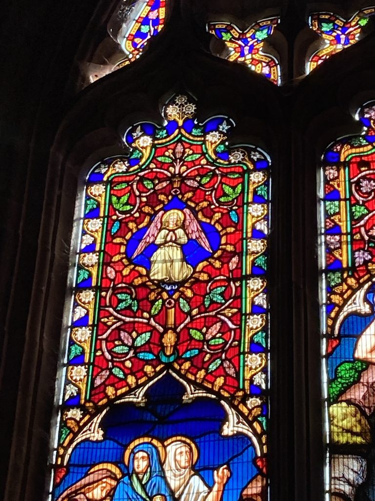
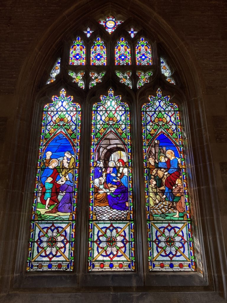
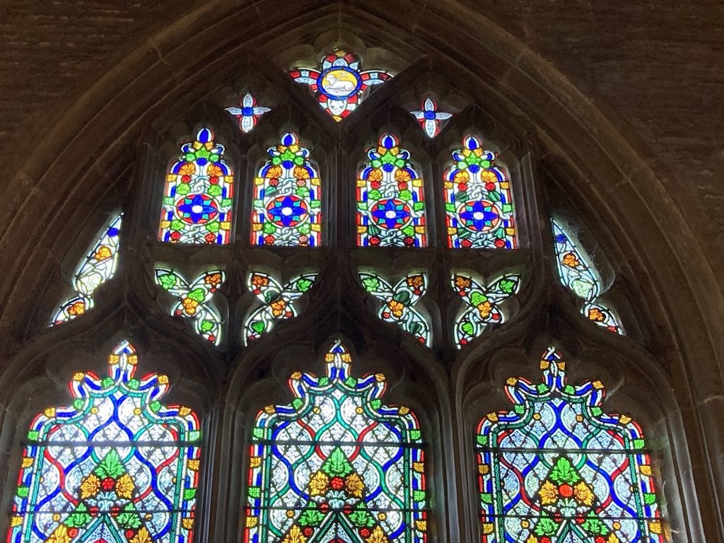
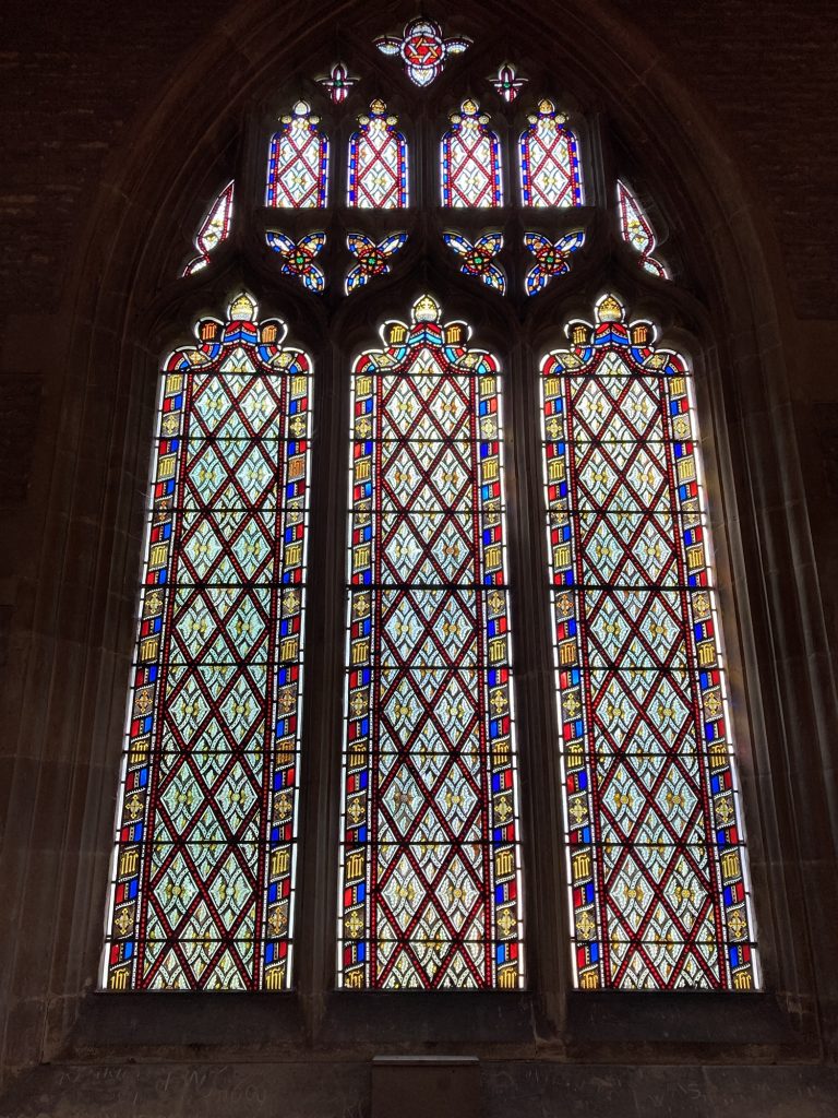
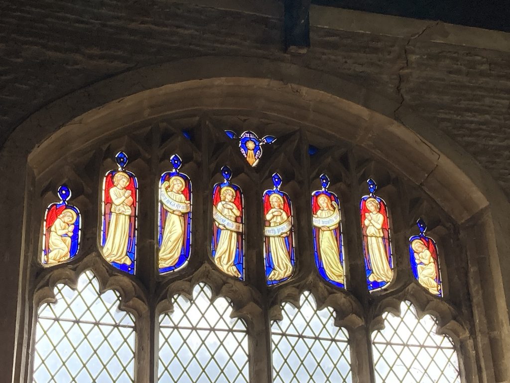
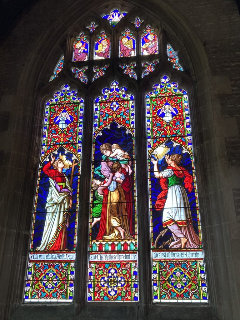
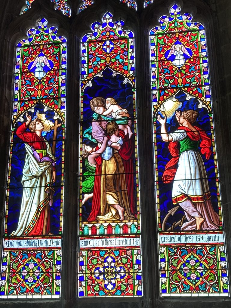
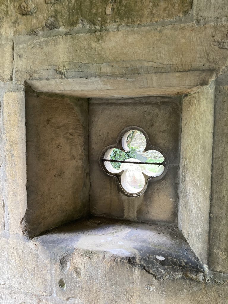
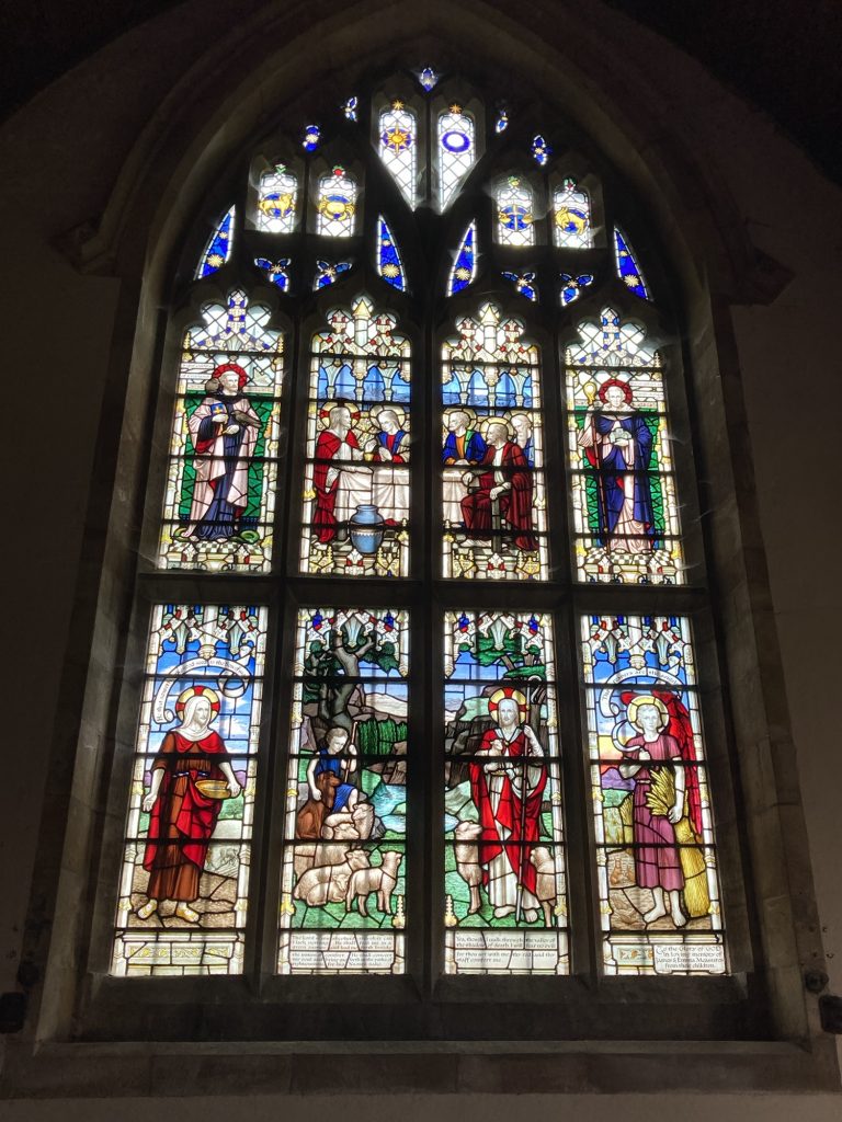
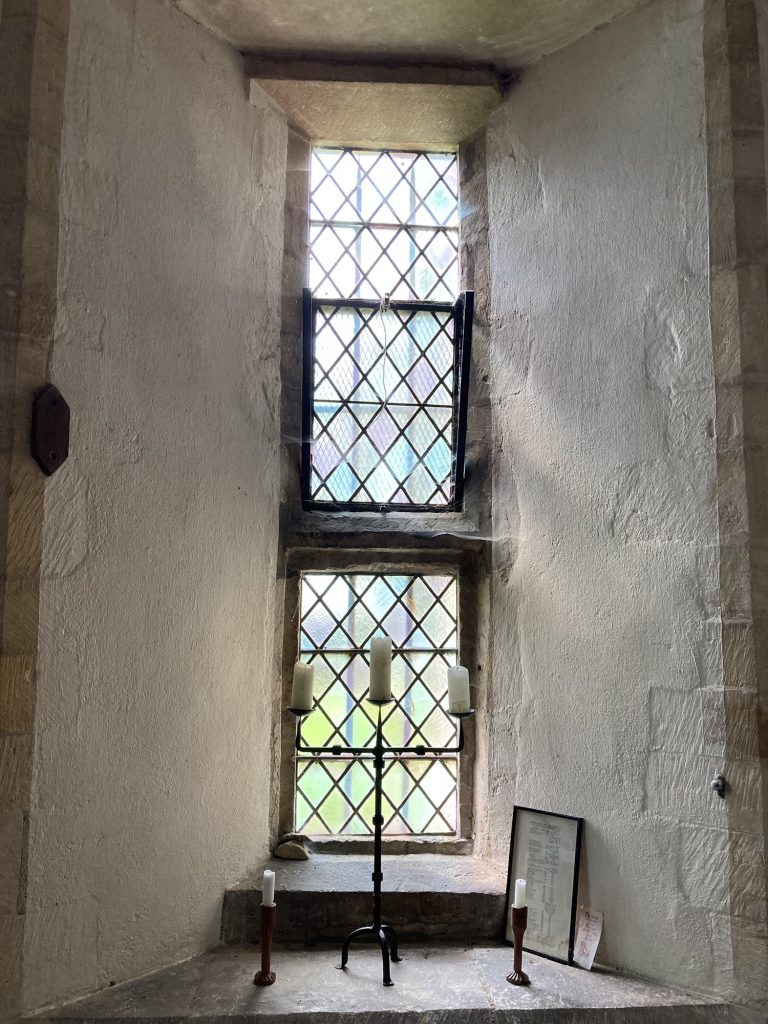
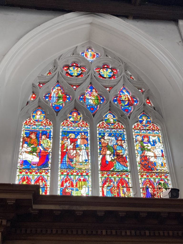
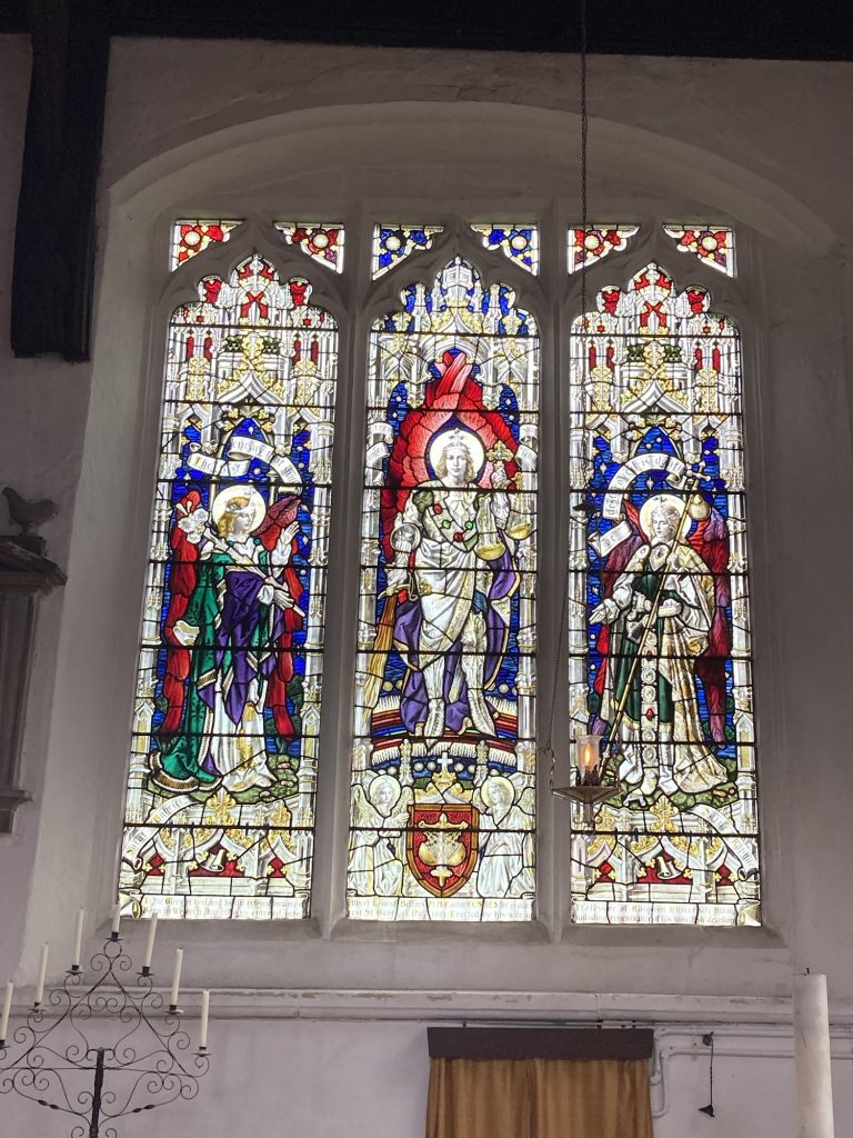
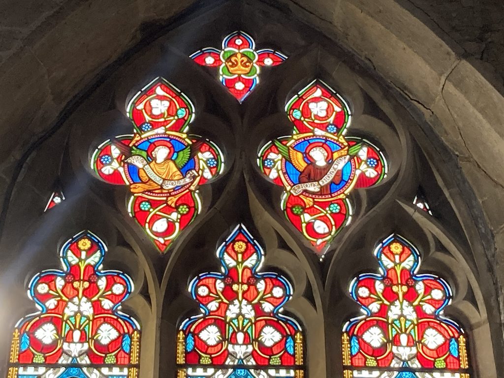
But the best thing about the church overall? Well, it’s a no-brainer. As these photos, I hope, attest… it’s gotta be the stained glass, right?
The ‘lights’ of St John The Baptist’s, Morton, are sublime. They have that intensity of colour and genius of design that numerous windows at Ely Cathedral possess. Can it be they’re the work of the same artist/craftsmen, and/or workshop?
This church was nearby the final drop of my 1st shift. It was locked. Fortunately the local churchwarden, Jill, answered my call, and came and let me in. The first gallery is exterior stuff I shot before Jill showed up.
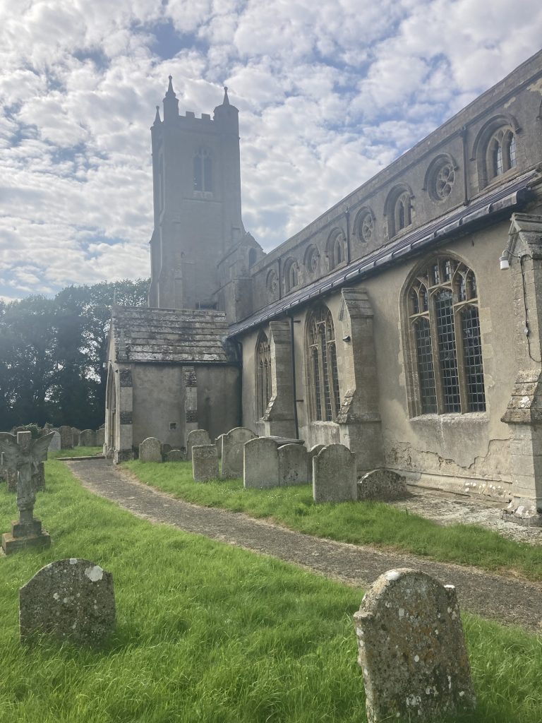
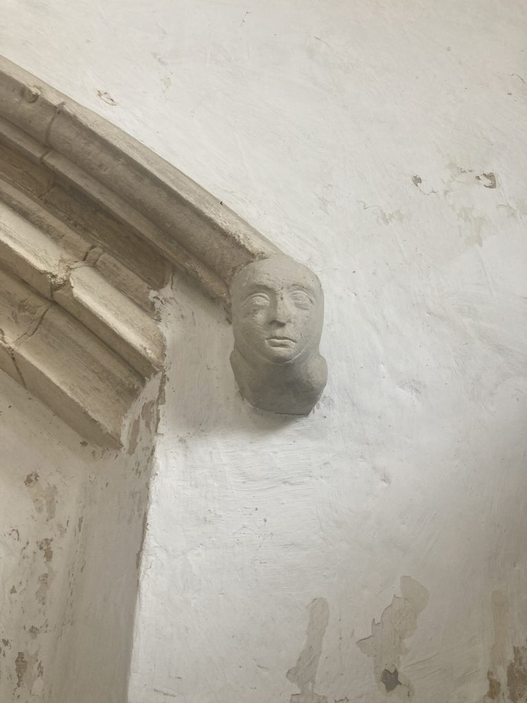
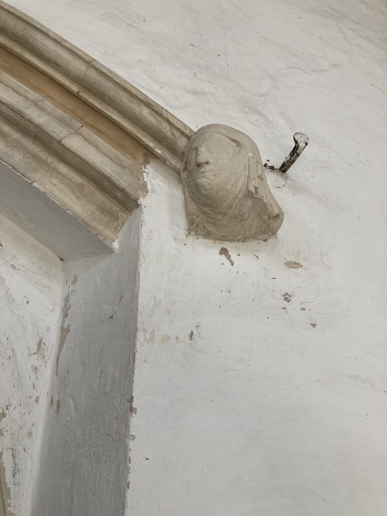
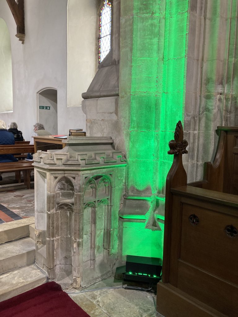
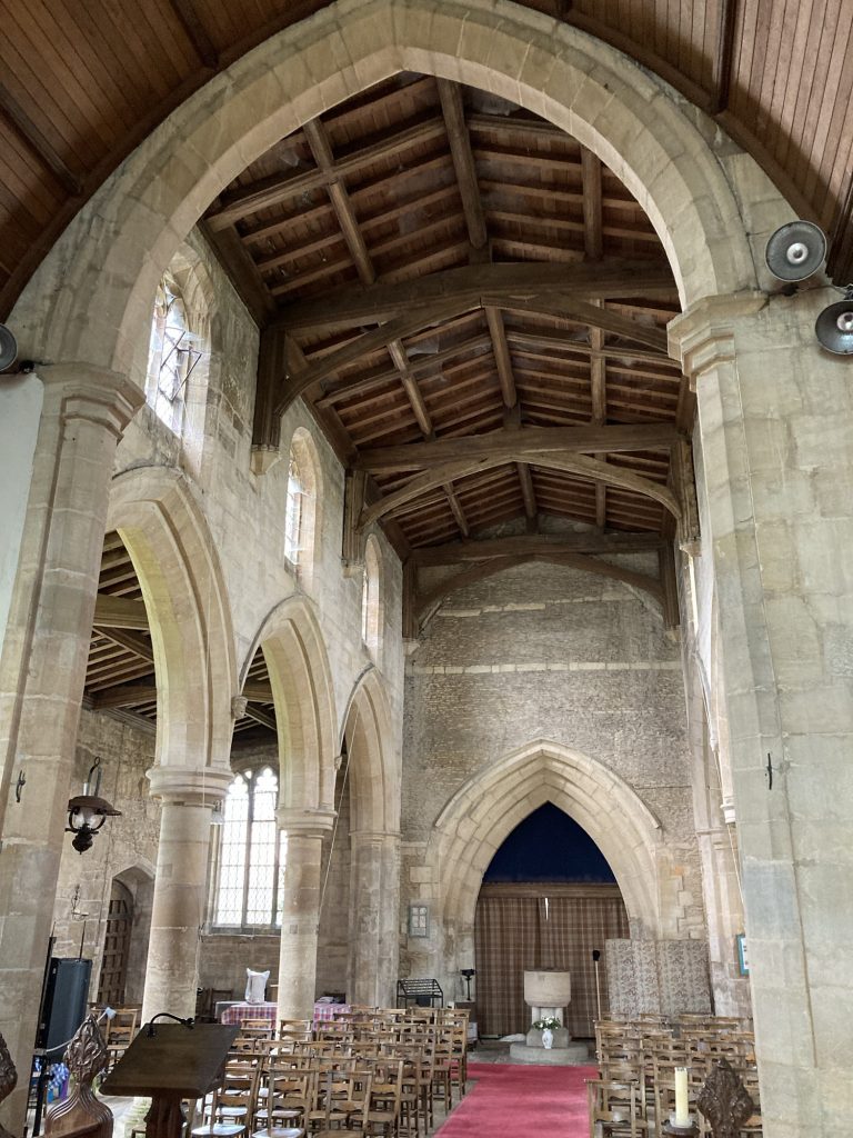
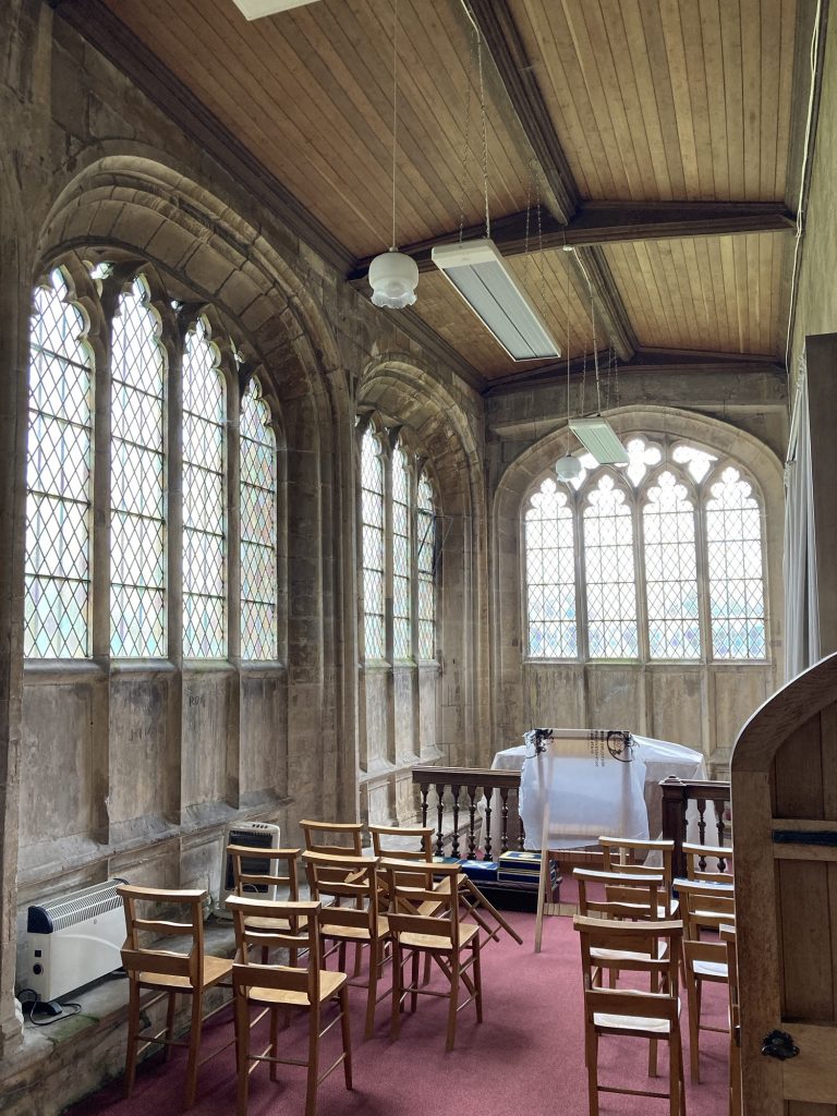
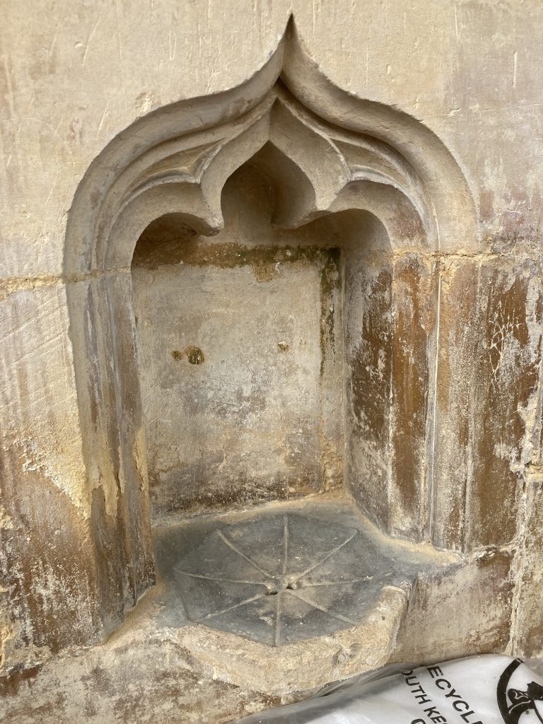
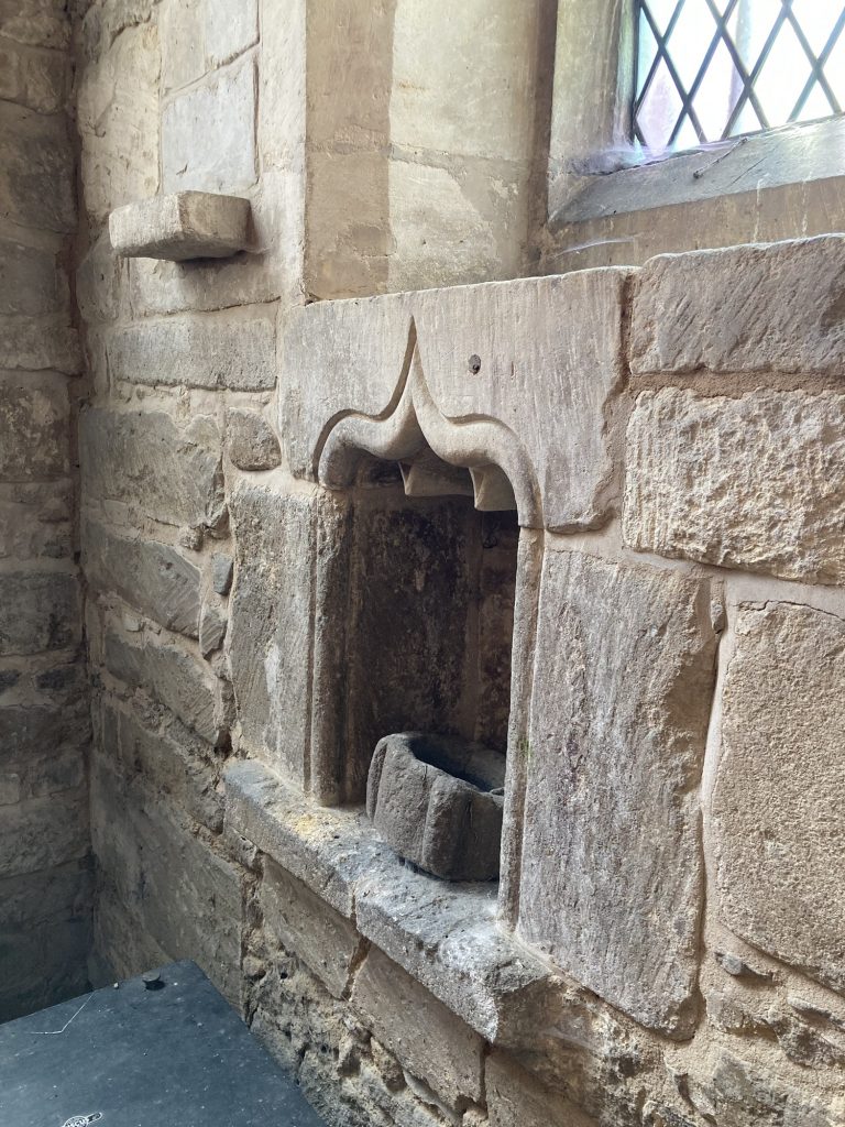
St Andrew’s, Haconby, isn’t a Miss World amongst churches. Rather she’s a bit of a humdrum dowdy ol’ spinster. But like most old churches, keep looking, and you’ll generally find something.
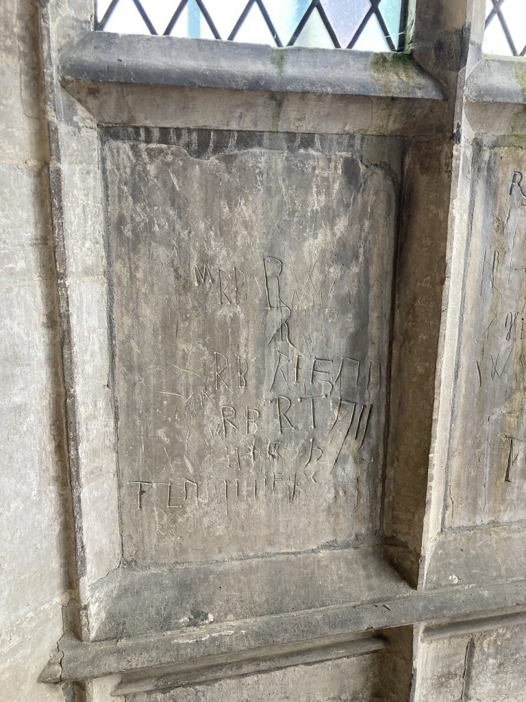
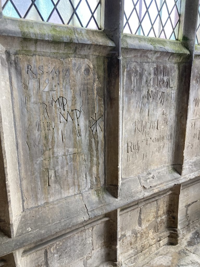
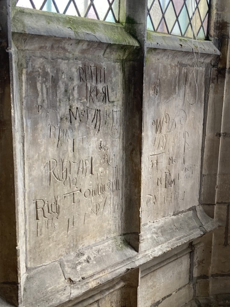
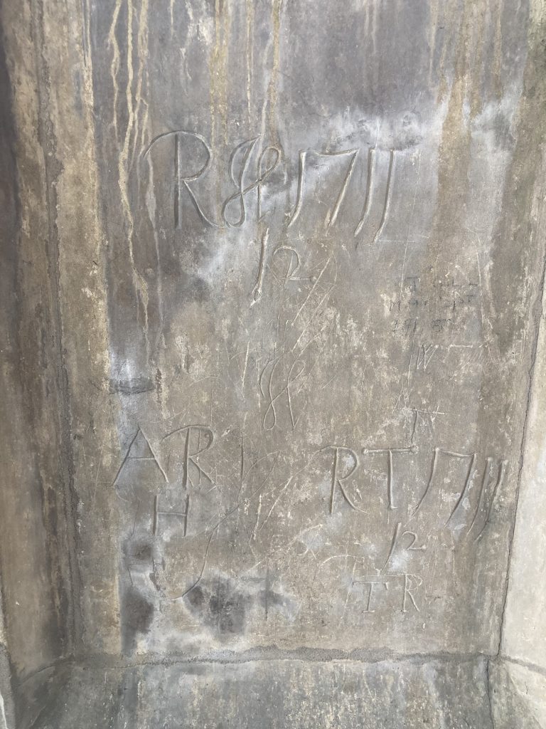
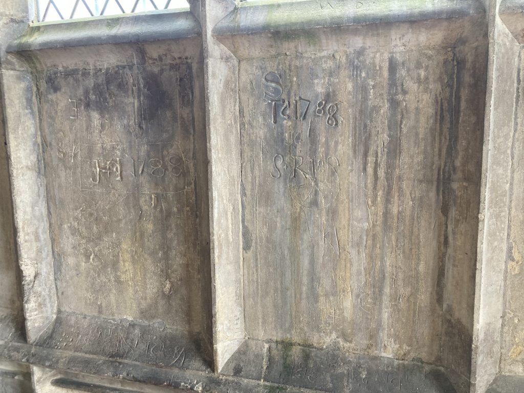
After the splendid glass of (?), St Andrew’s had a lot to live up to. And, sadly, perhaps, doesn’t really rise to the occasion. Nonetheless, there are one or two points of interest. In the next gallery (?)thC. graffiti is visible, scratched into several walls.
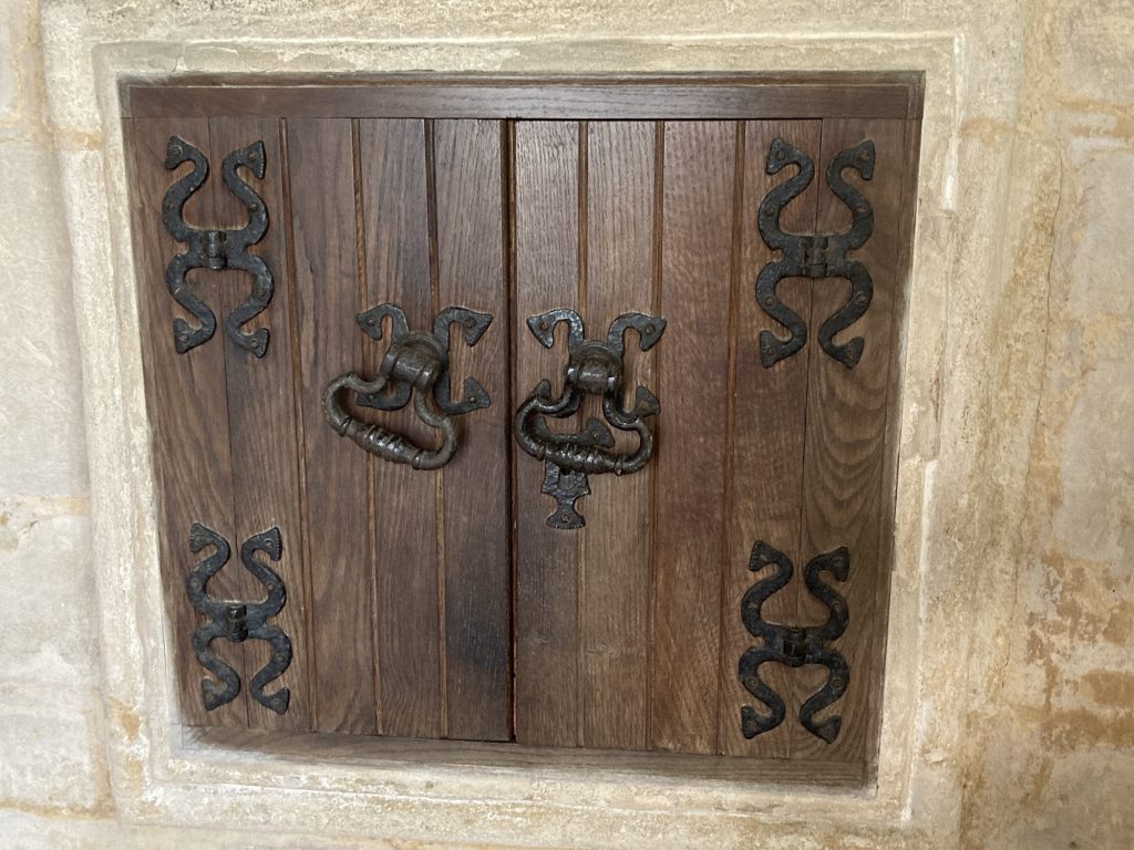
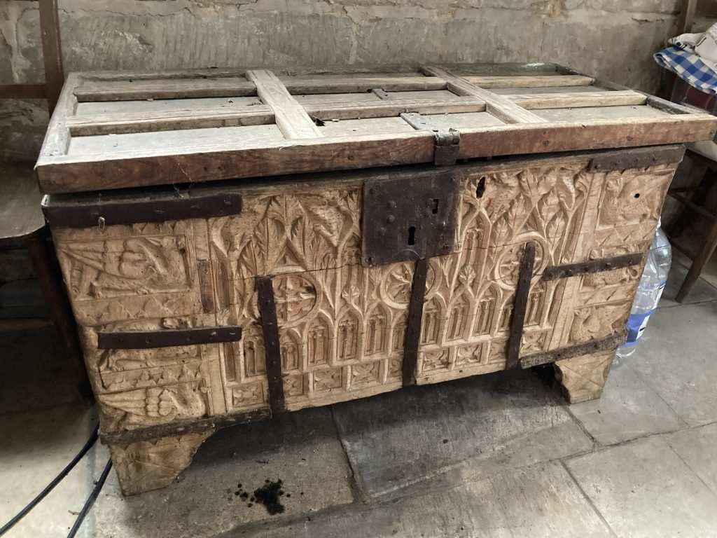
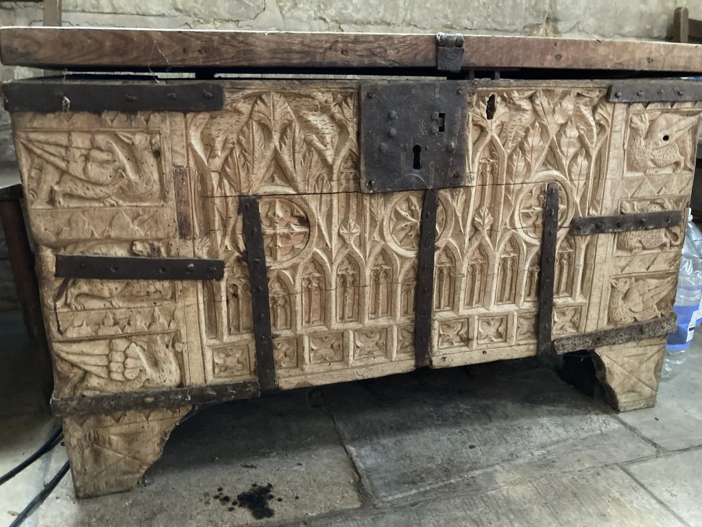
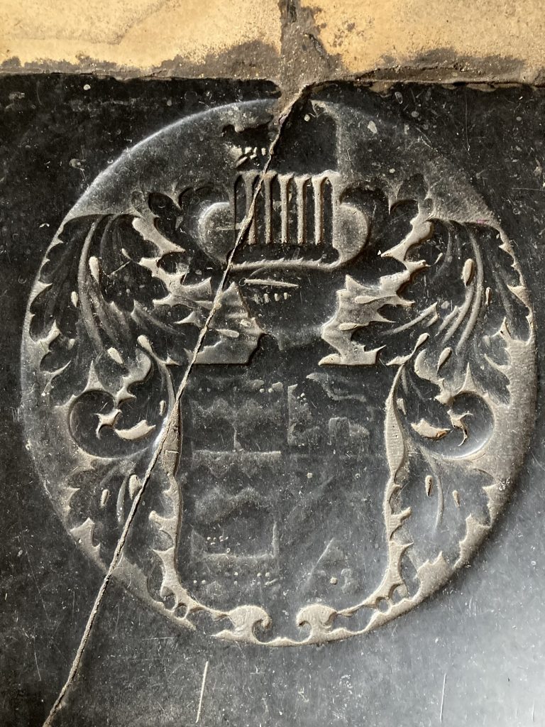
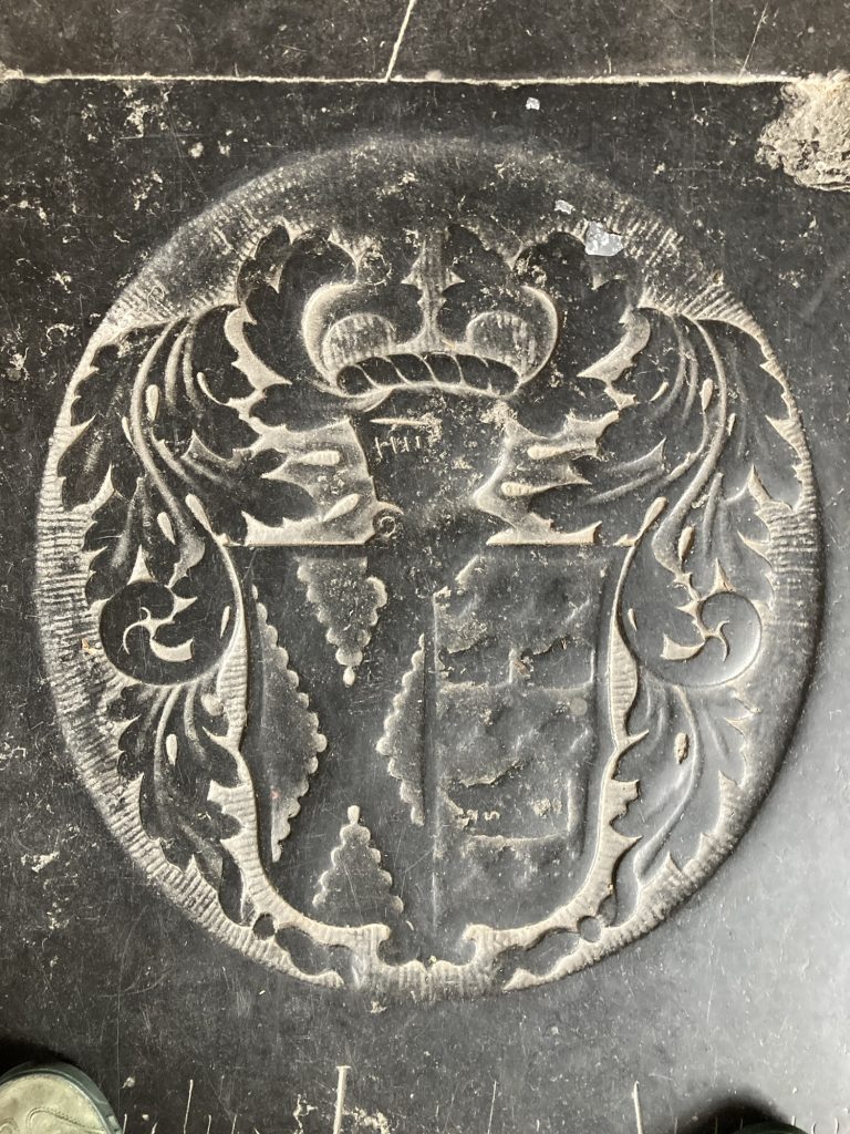
And just as I was getting ready to leave, I noticed an old chest. There was a protective plastic sheet and sundry modern junk on top. I robed these (and replaced them after), so as to get a better look…
An intriguing old chest…… a closer look.
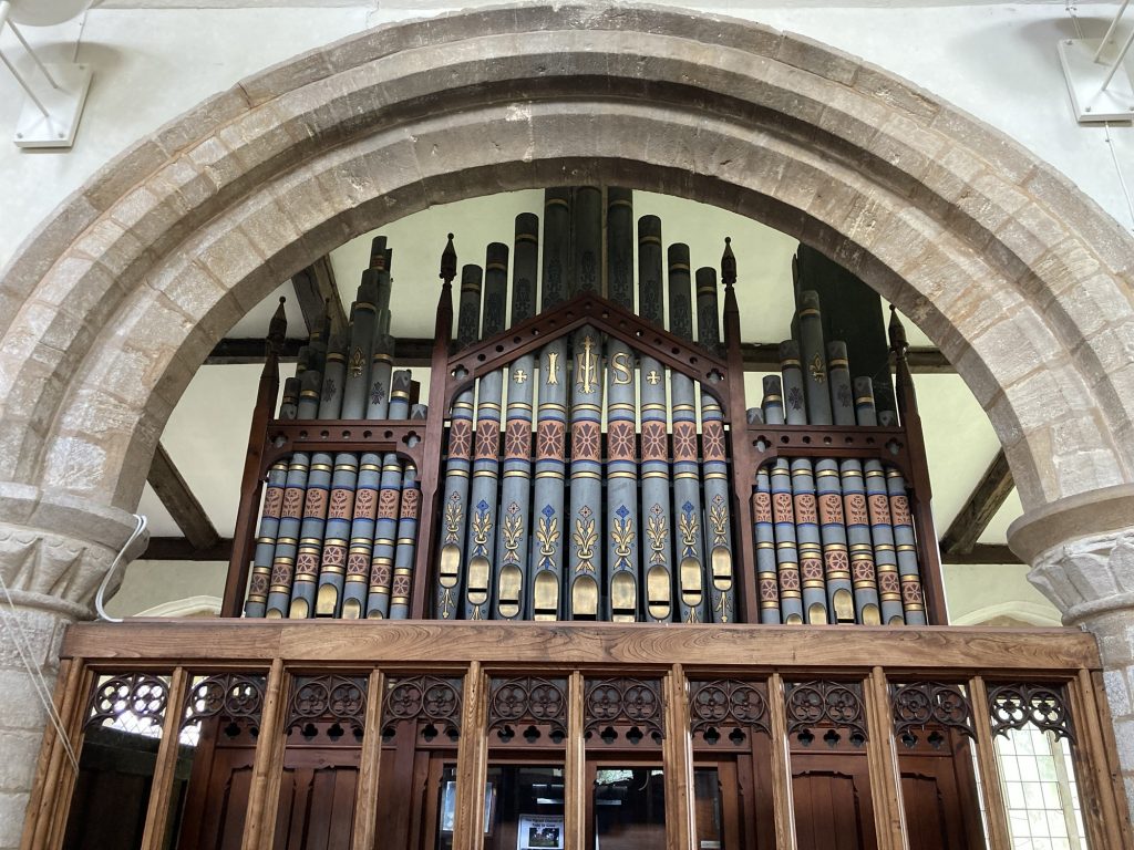
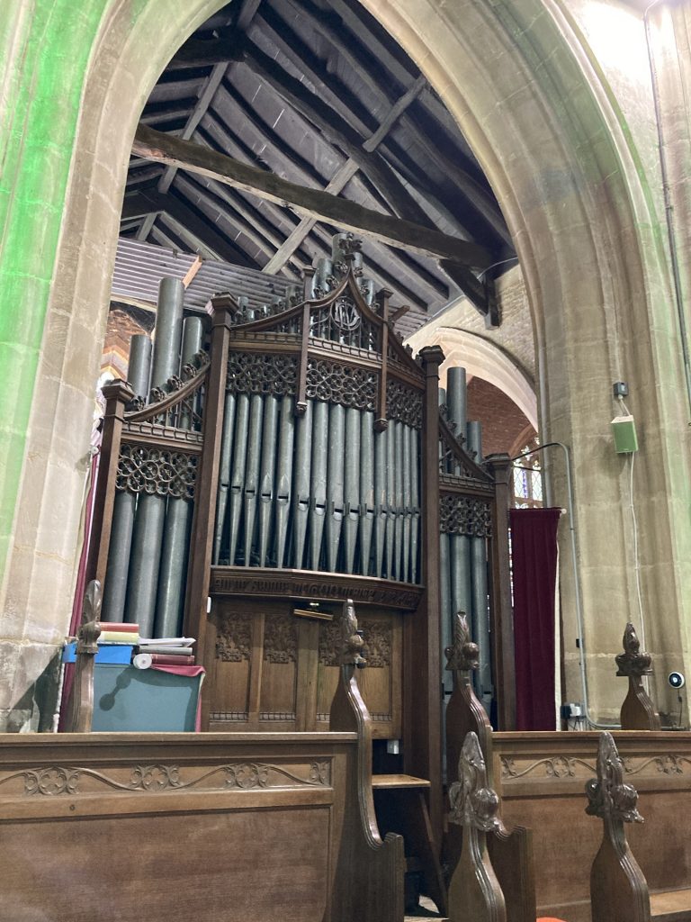
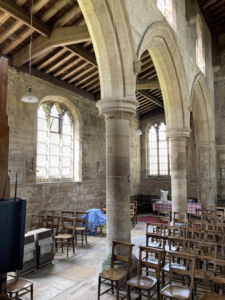
A final snap, with the organ in view. And off I toddled. Returning the key to Jill was a minor Odyssey! Not an earth-shattering or even very remarkable church visit. But, as very much is normal, well worth the look.
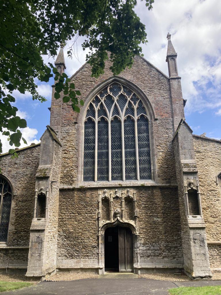
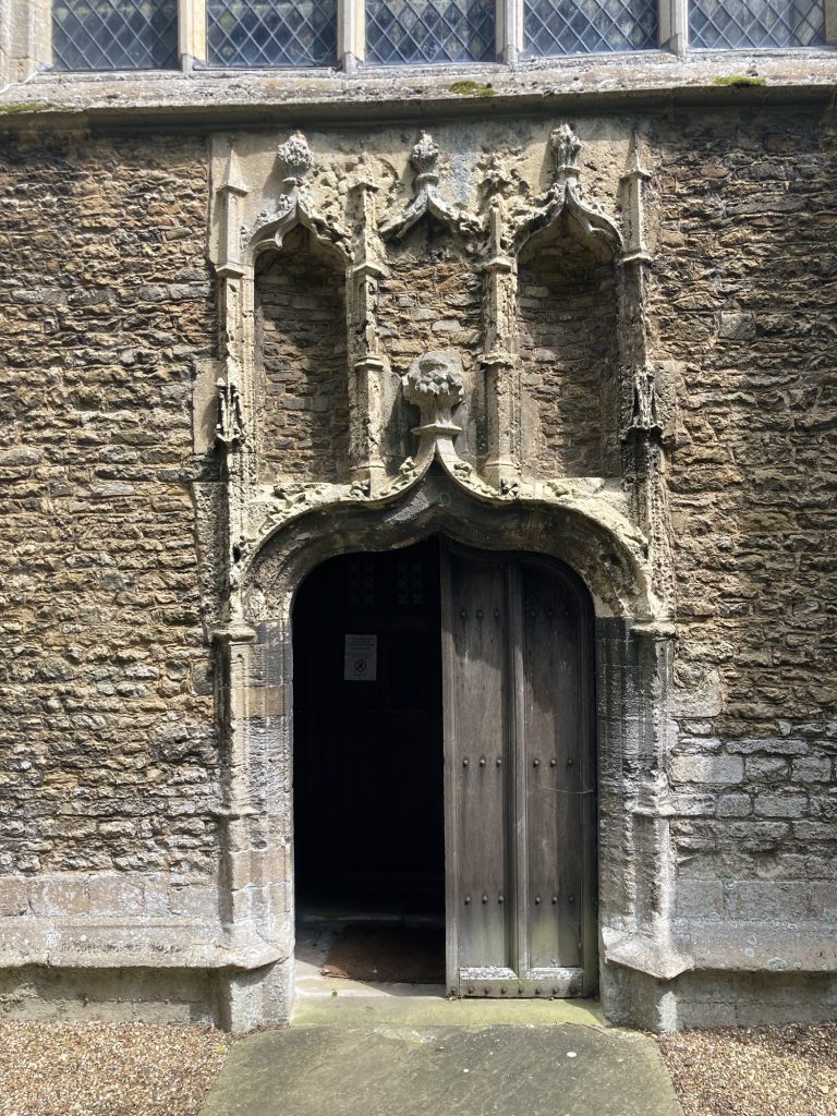
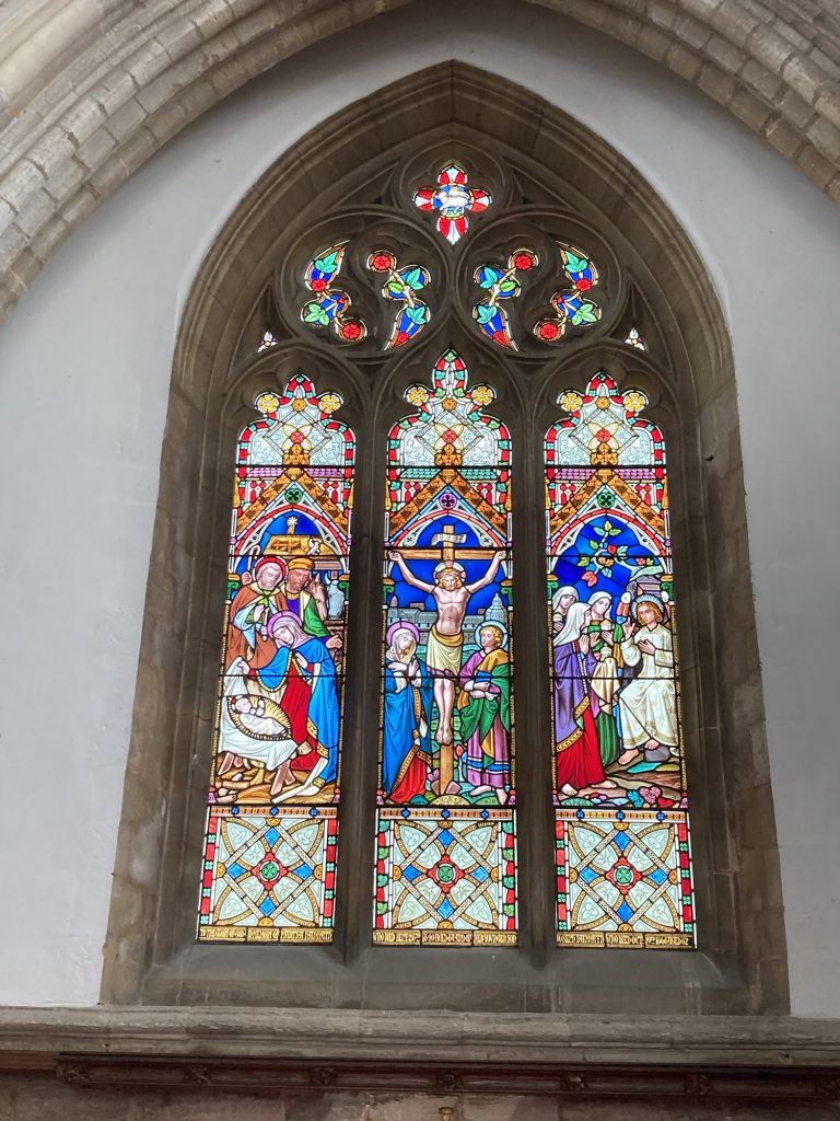
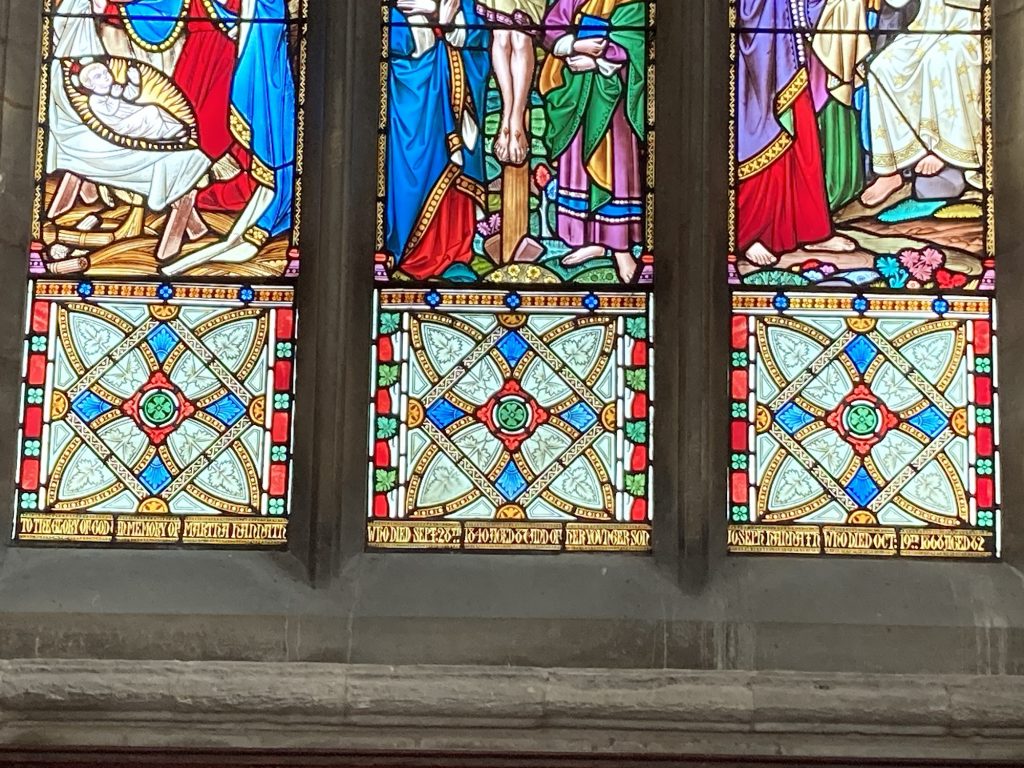
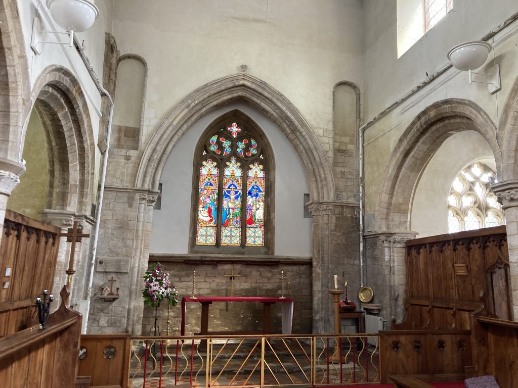
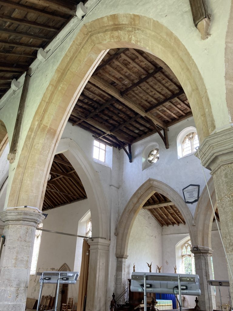
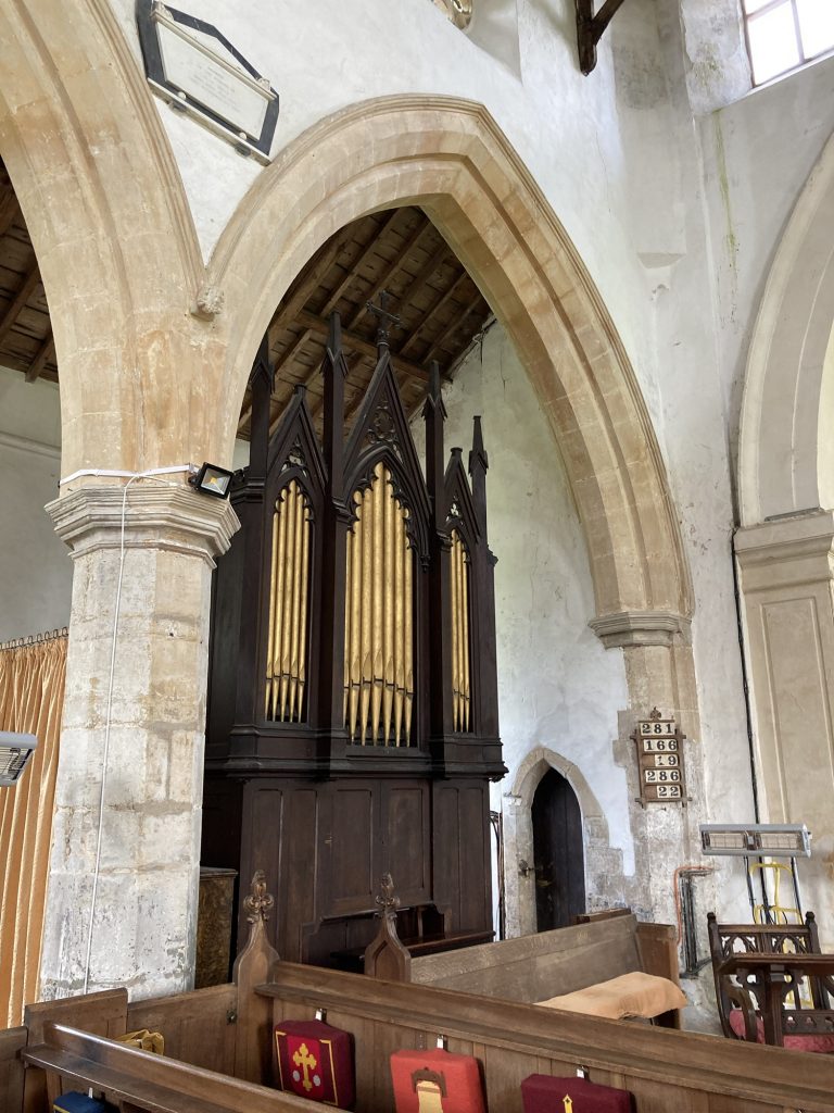
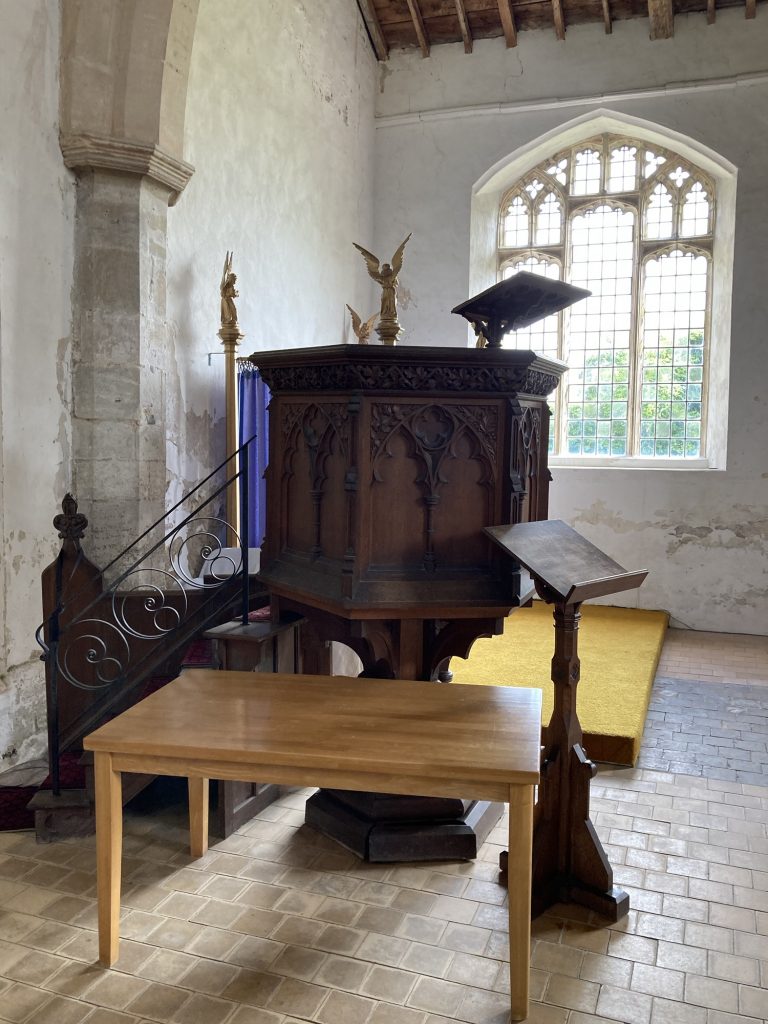
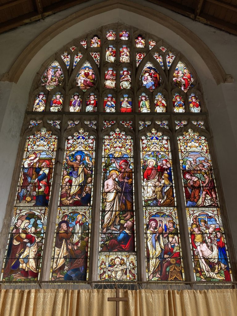
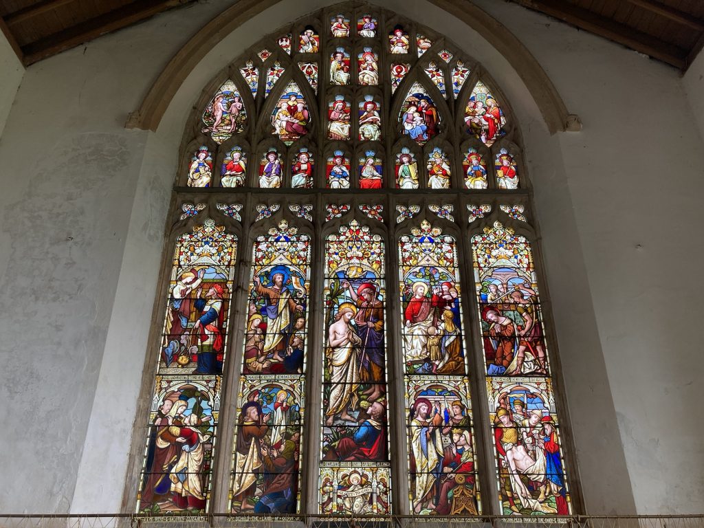
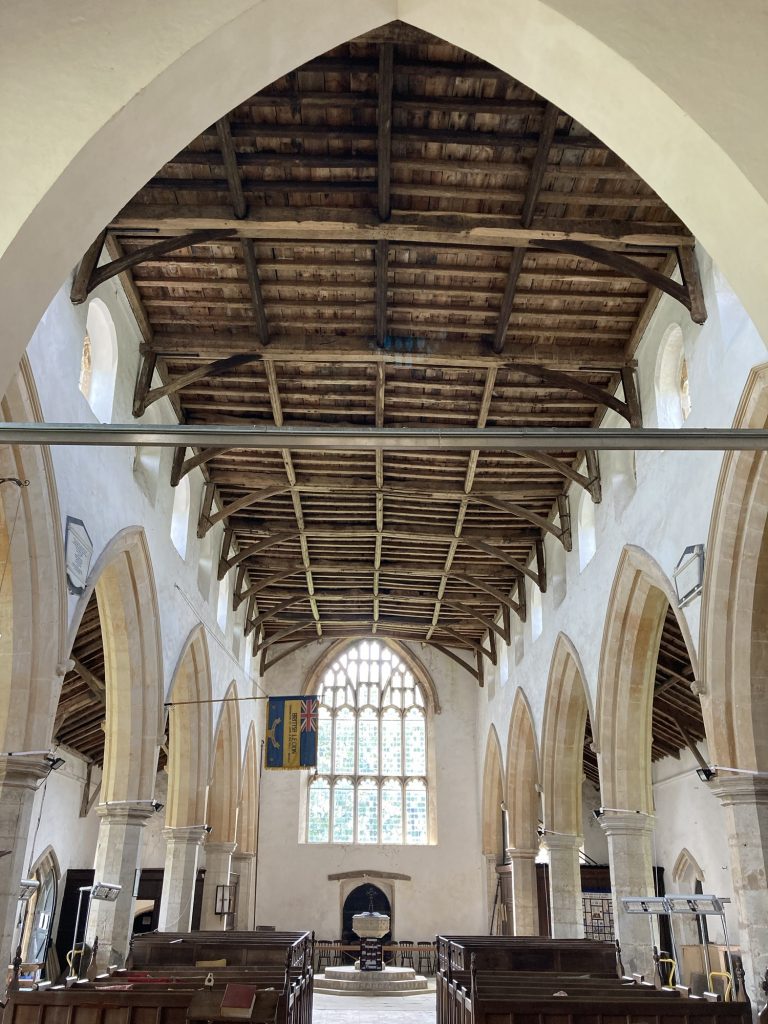
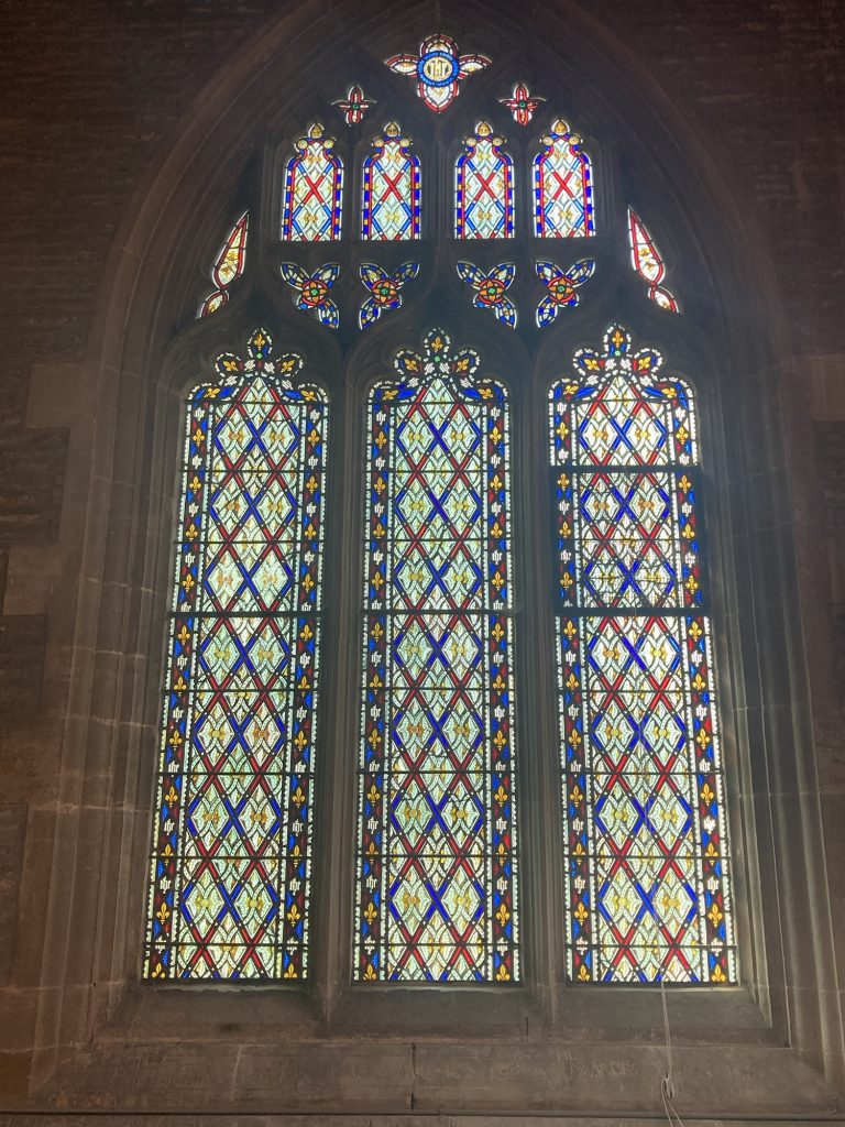
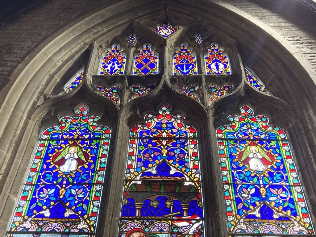
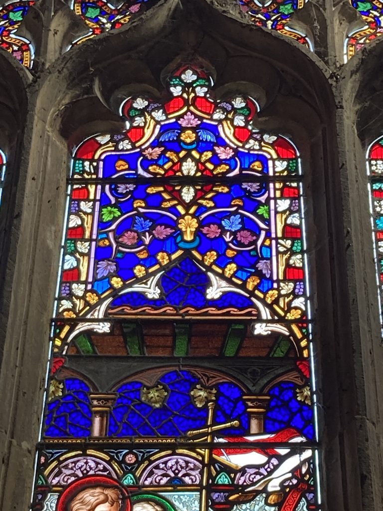
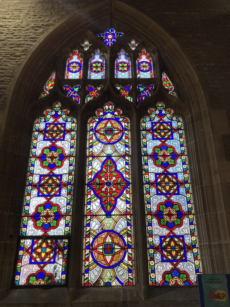
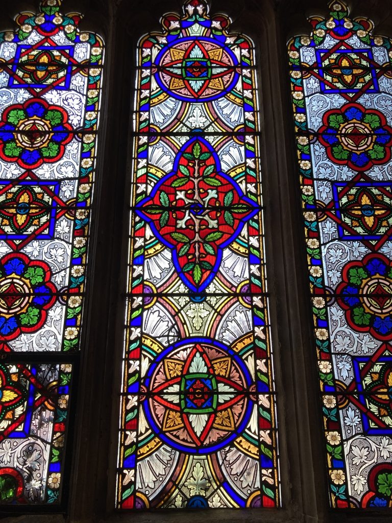
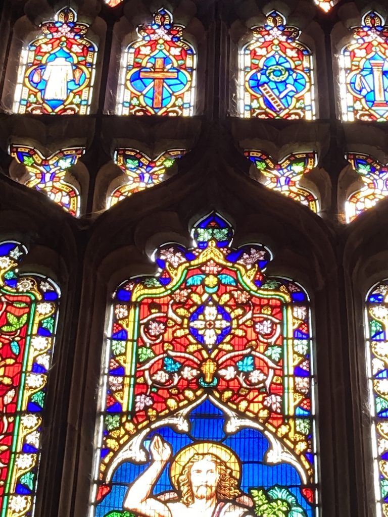
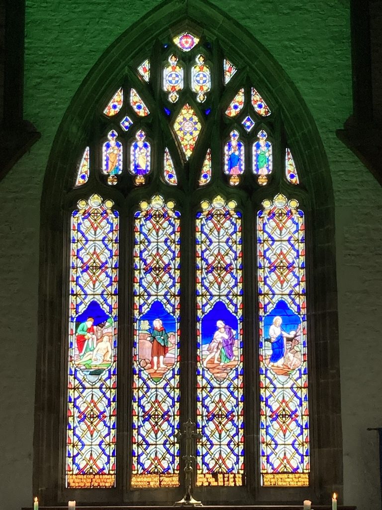
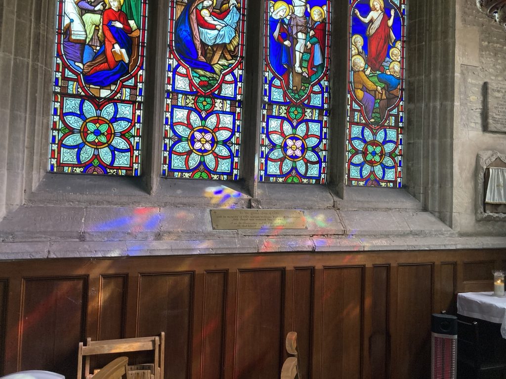
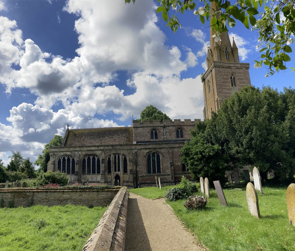
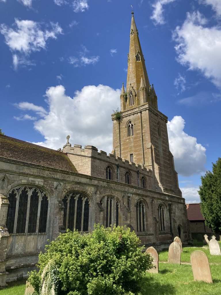
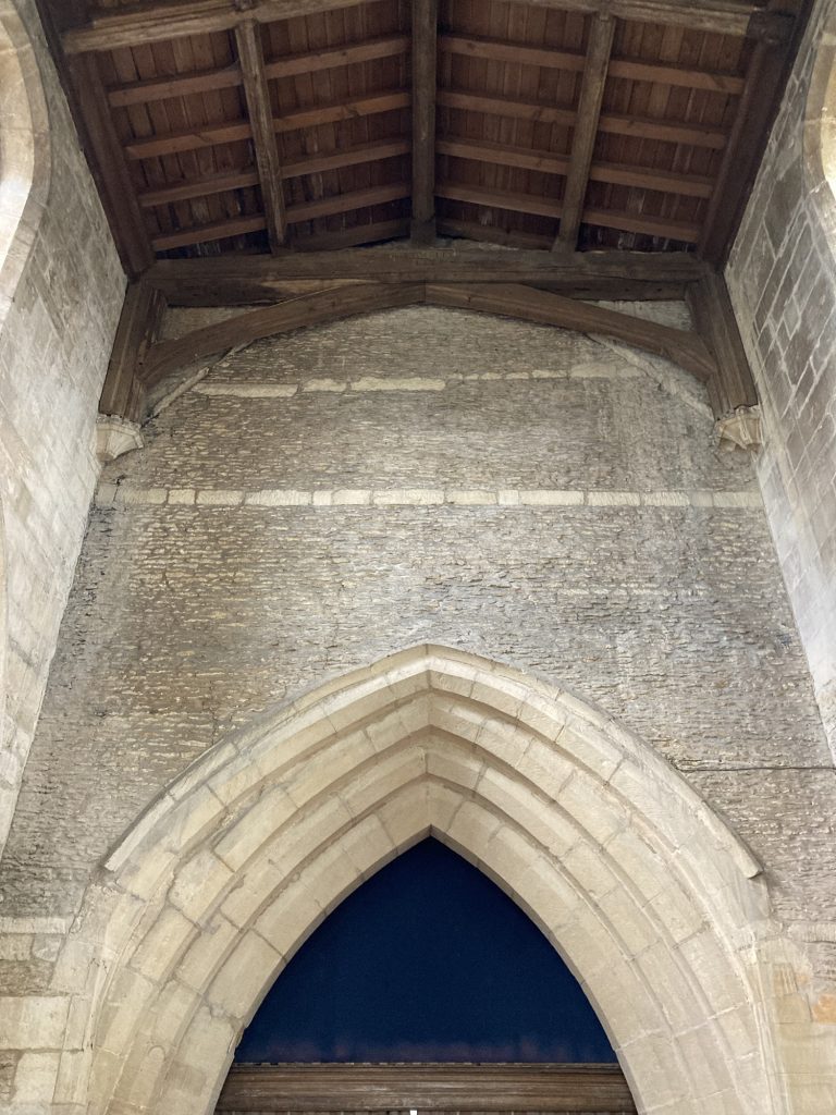
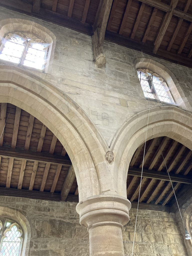
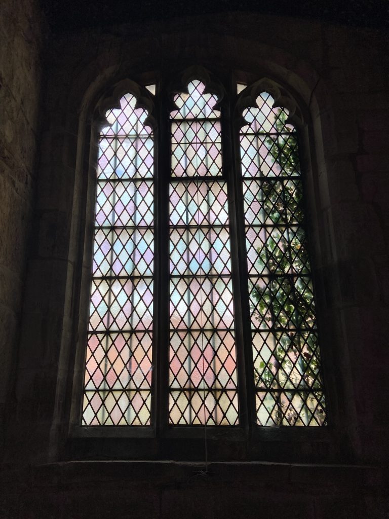
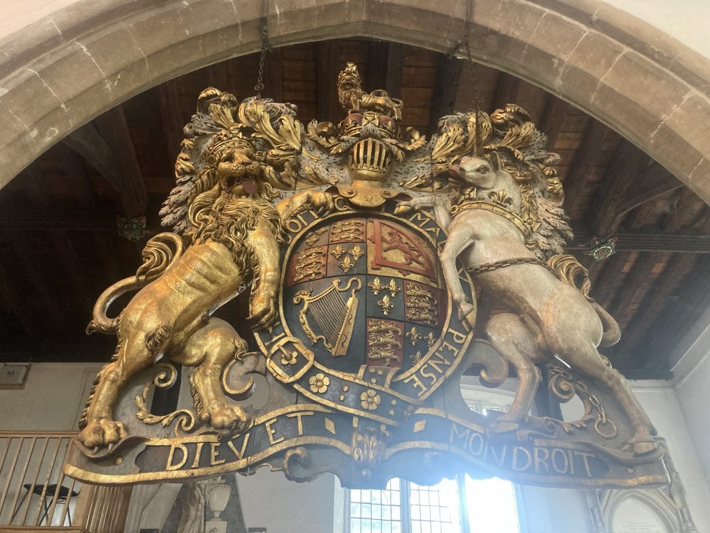
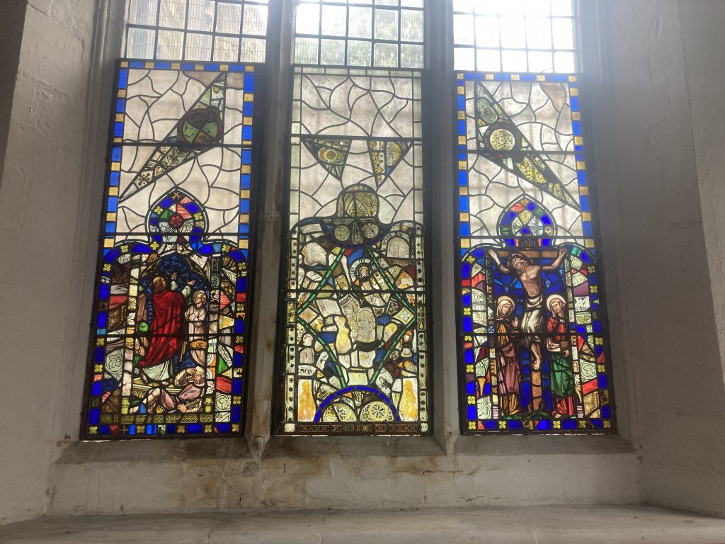
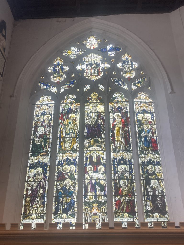
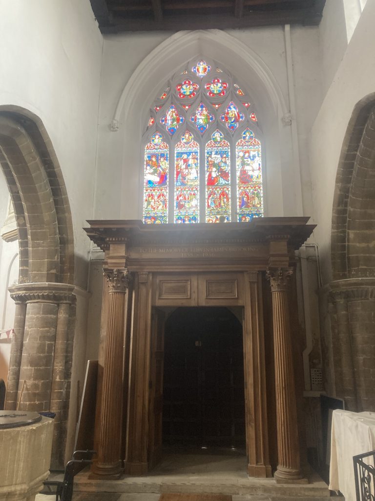
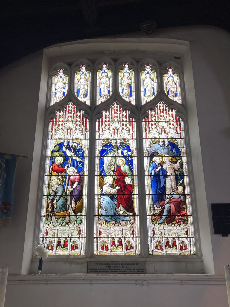
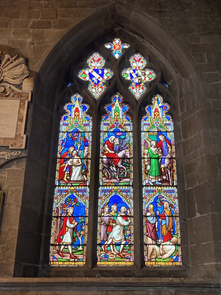
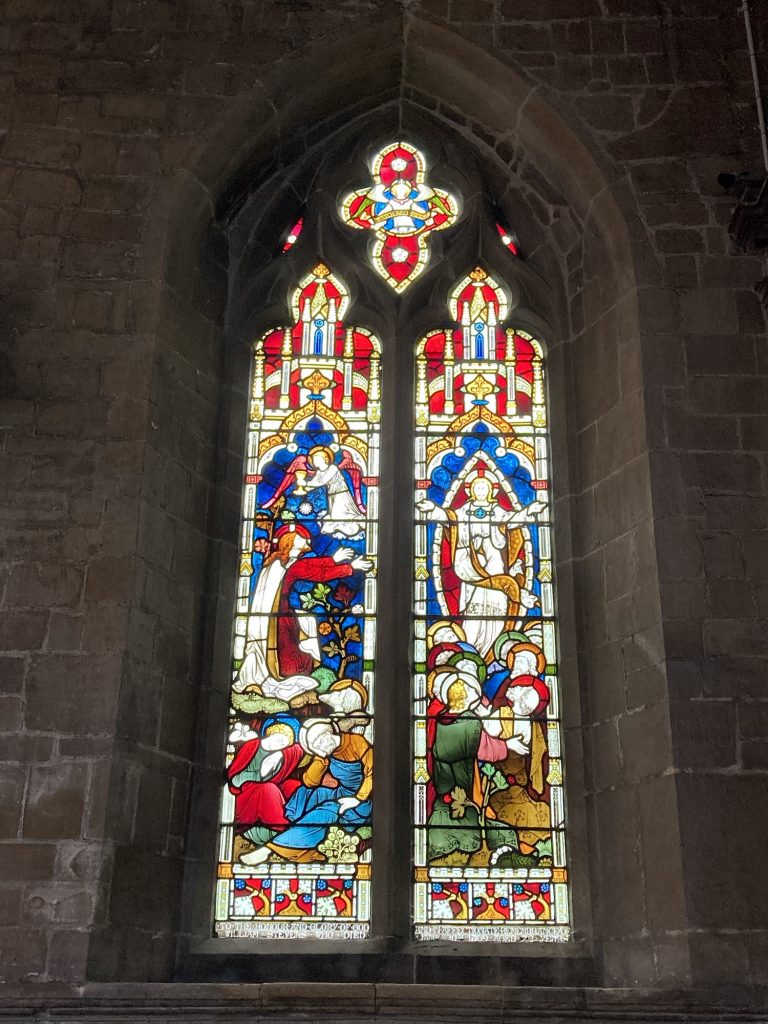
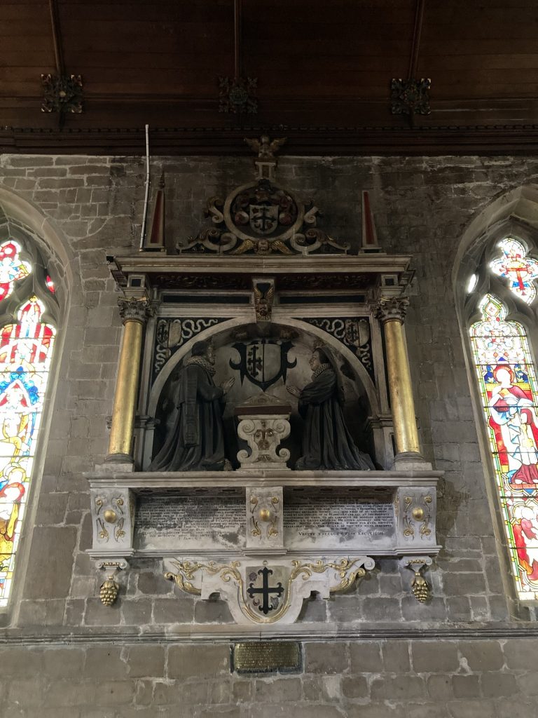
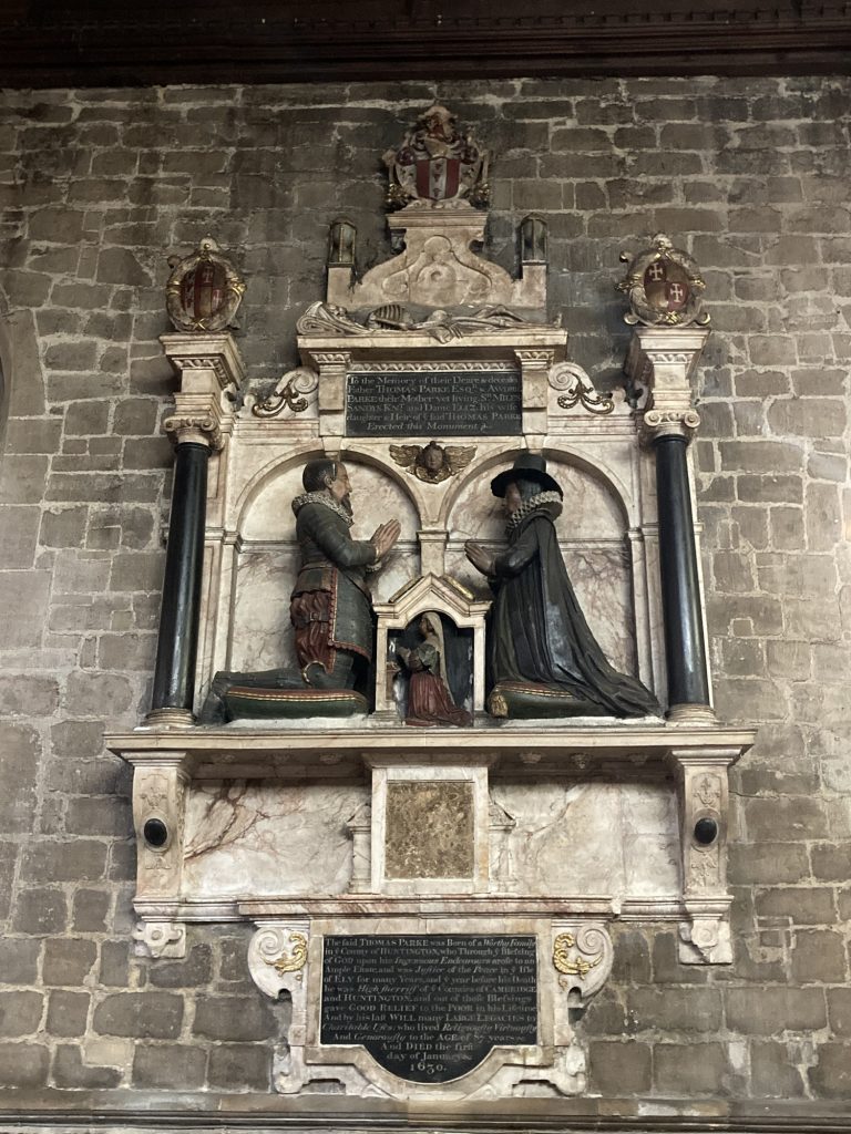
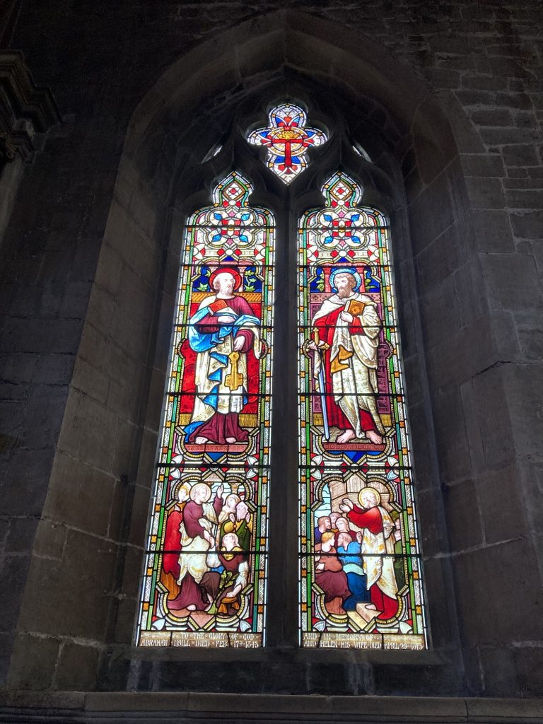
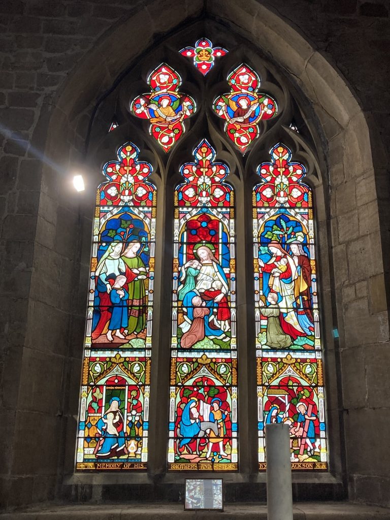
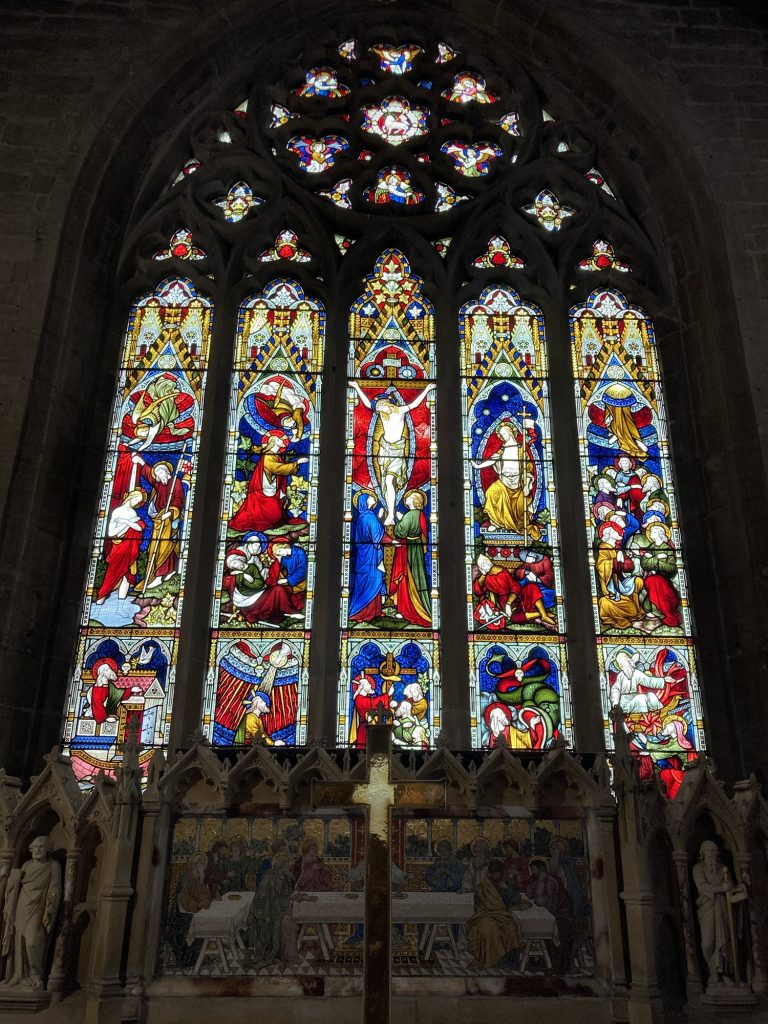
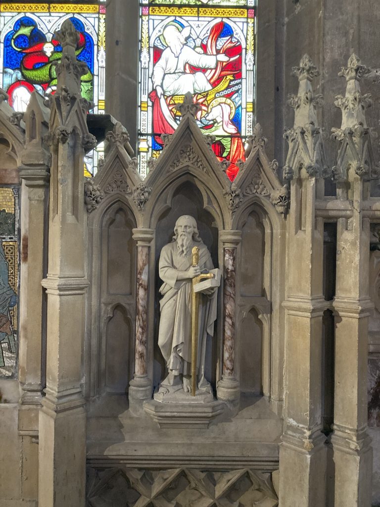
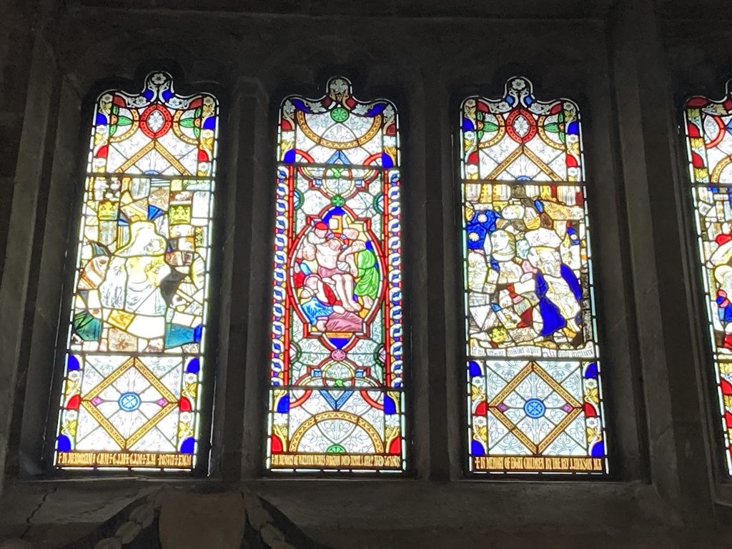
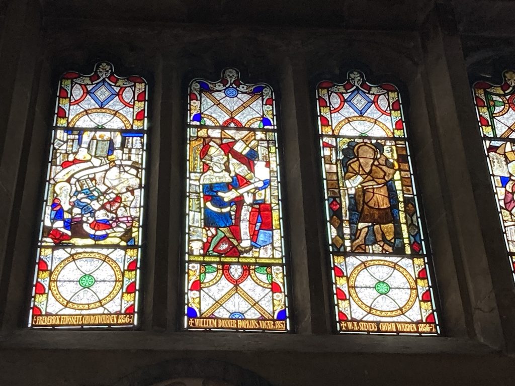
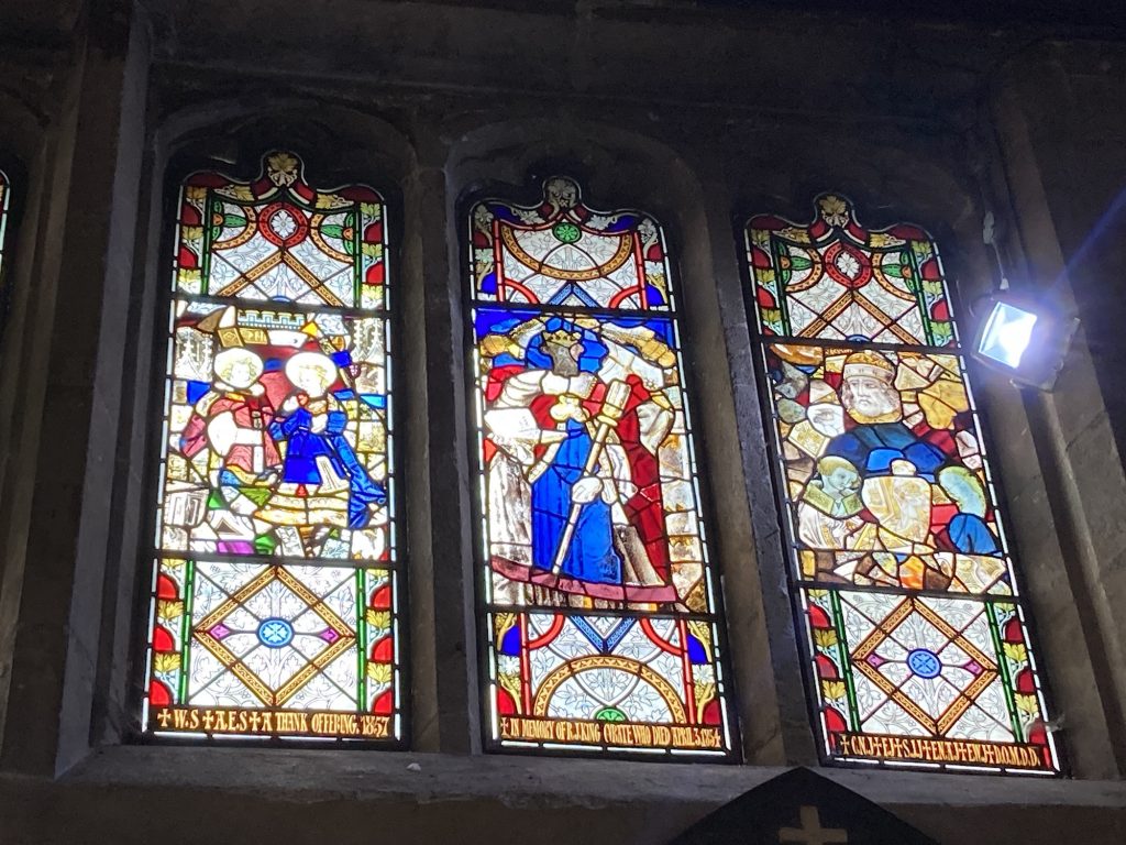
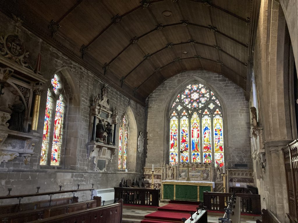
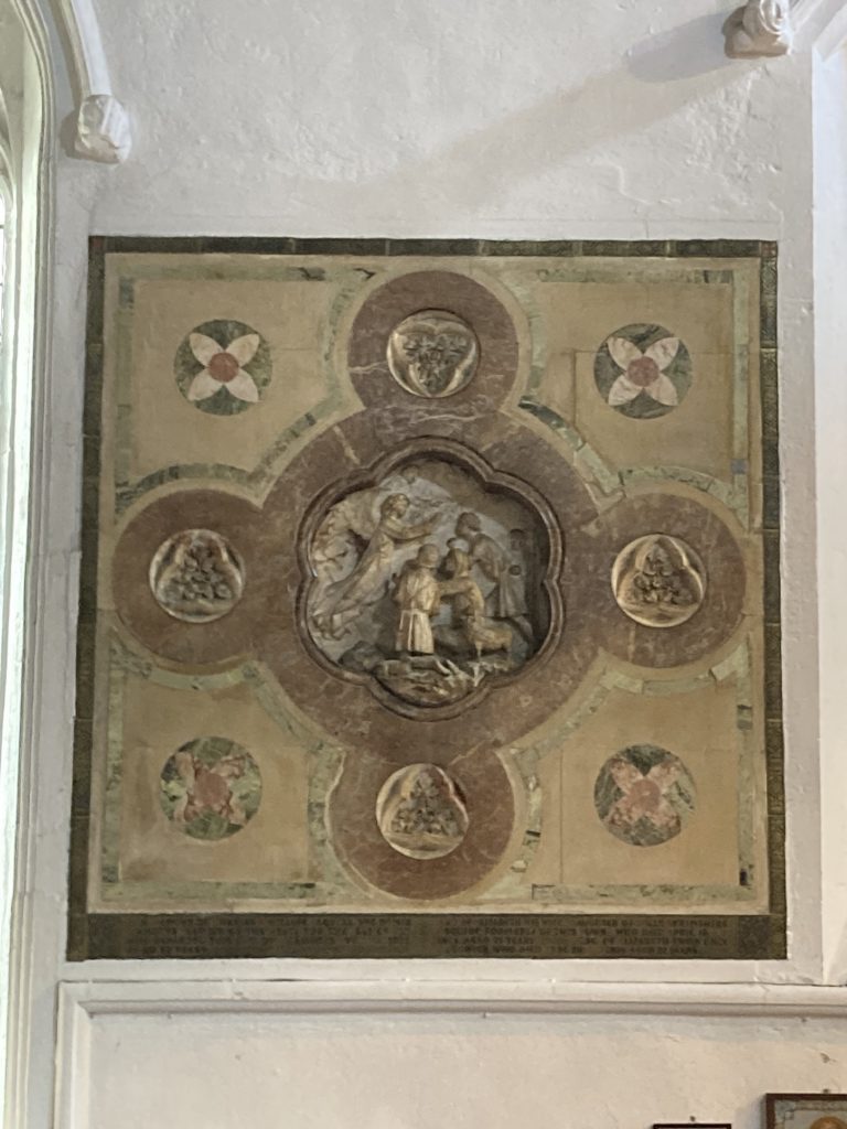
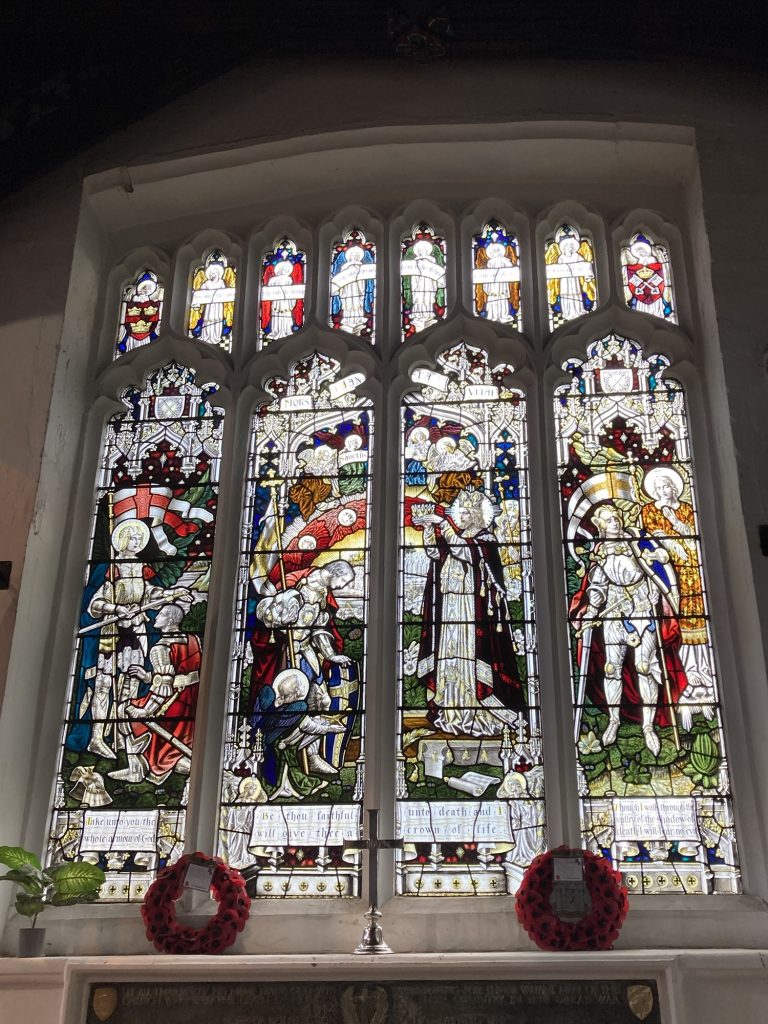
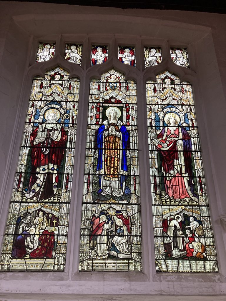
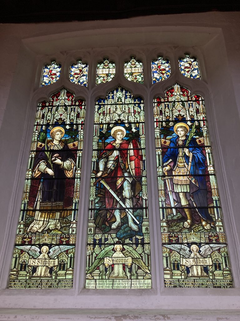
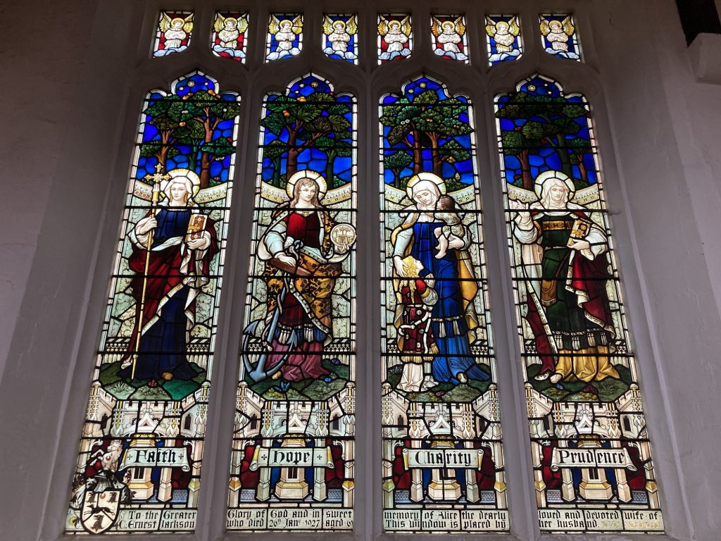
I finally got to look around inside St Peter and St Paul, Wisbech, earlier today. Last time I tried, I’d just missed closing time (2pm!). This time I got there at 1.55pm. They were open (just!). And they had a school event on.
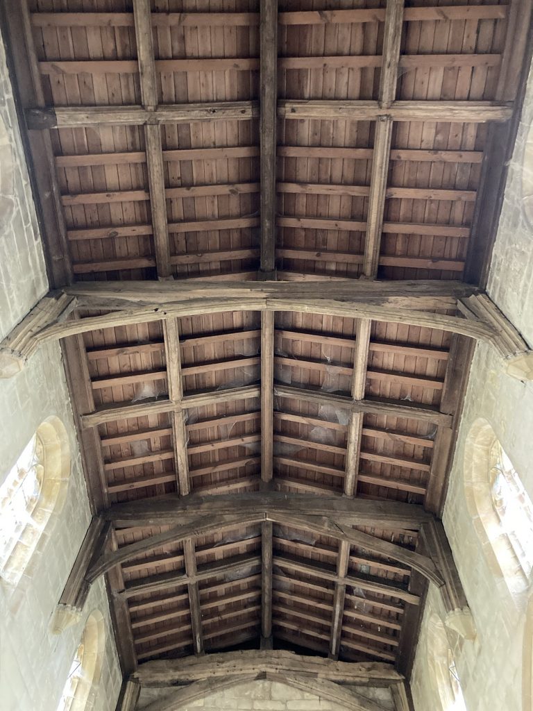
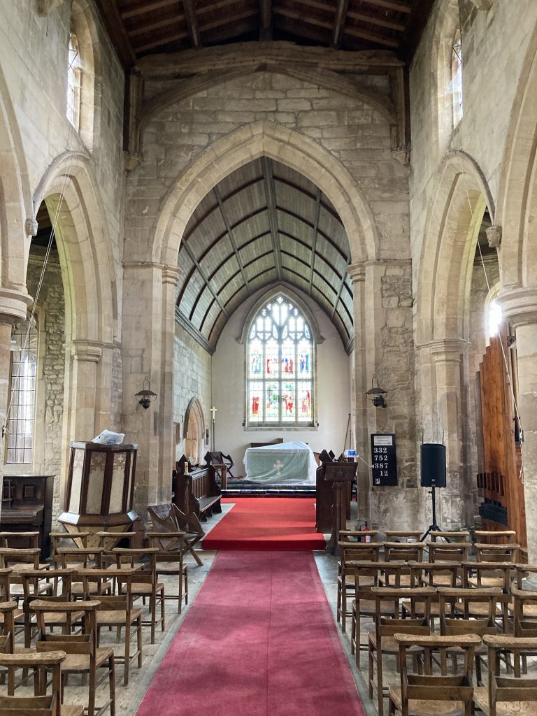
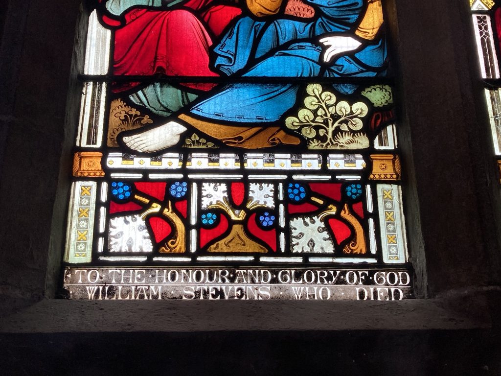
So I wasn’t totally free to snap away as I pleased. But the photos here convey some of what was most immediately appealing. One thing this place is strong on is stained glass.
I had work in the later afternoon. But I went to Wisbech early, specifically to visit this church. Then I got waylaid, visiting CGL, a charity in Wisbech, based near the church, who helped me during my difficulties of this last year and a half, or thereabouts
As the galleries attest. The biggest attractions of points of interest, to me at any rate, are the stained glass windows. There might be more to unearth?
I’ll have to re-visit, well before closing time, and when they’re not doing a school event. Anyhoo, with that in mind, I left…
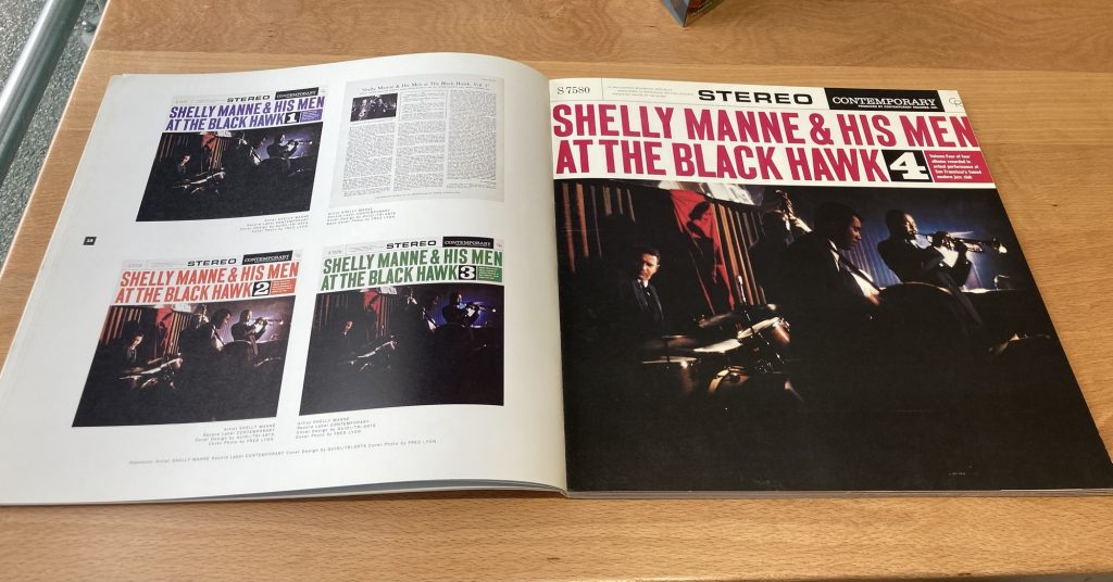
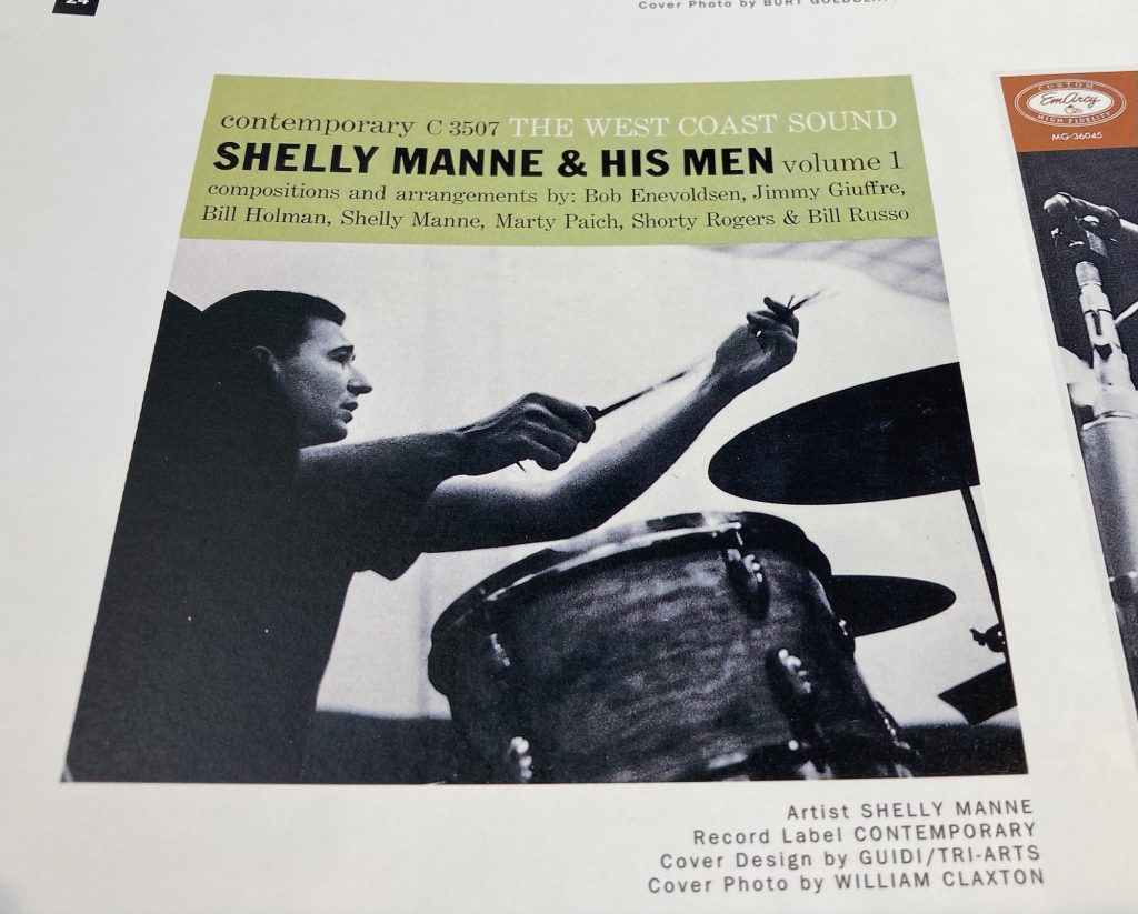
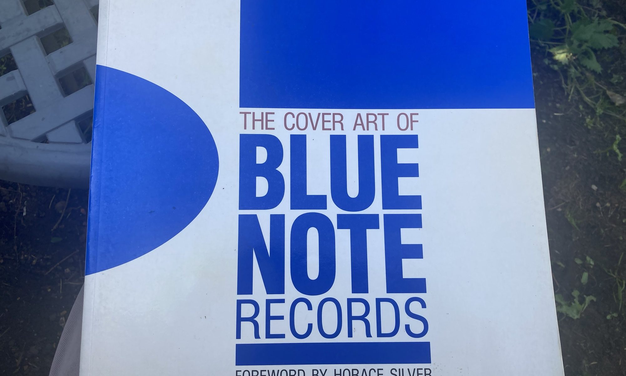
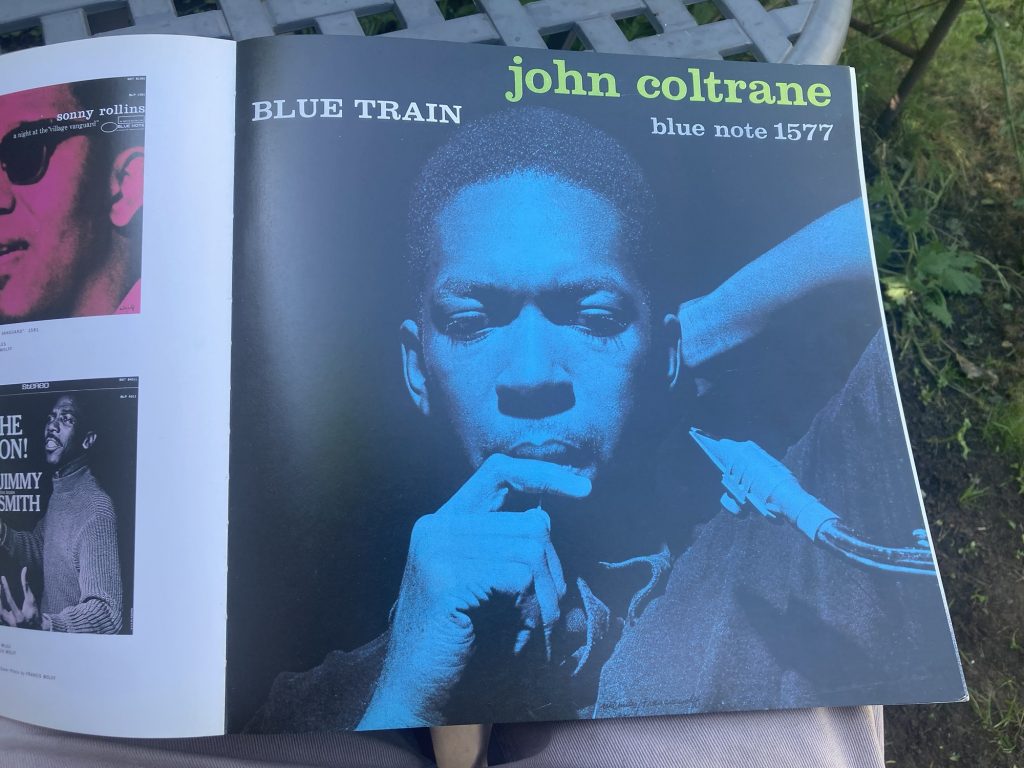
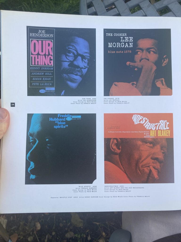
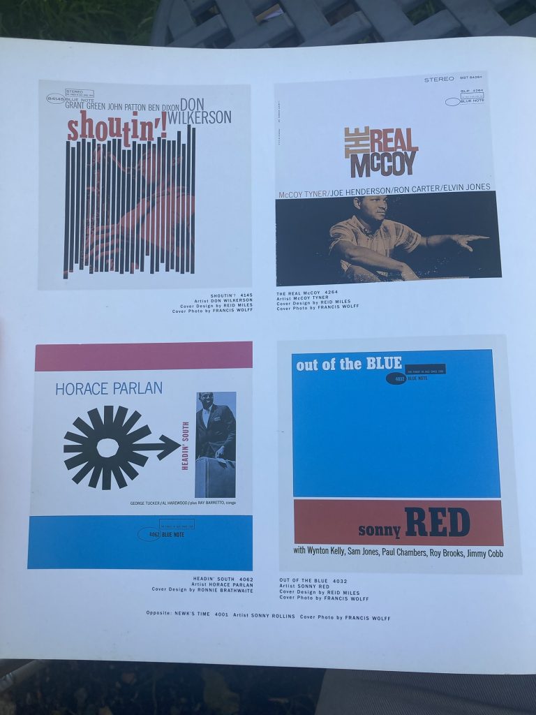
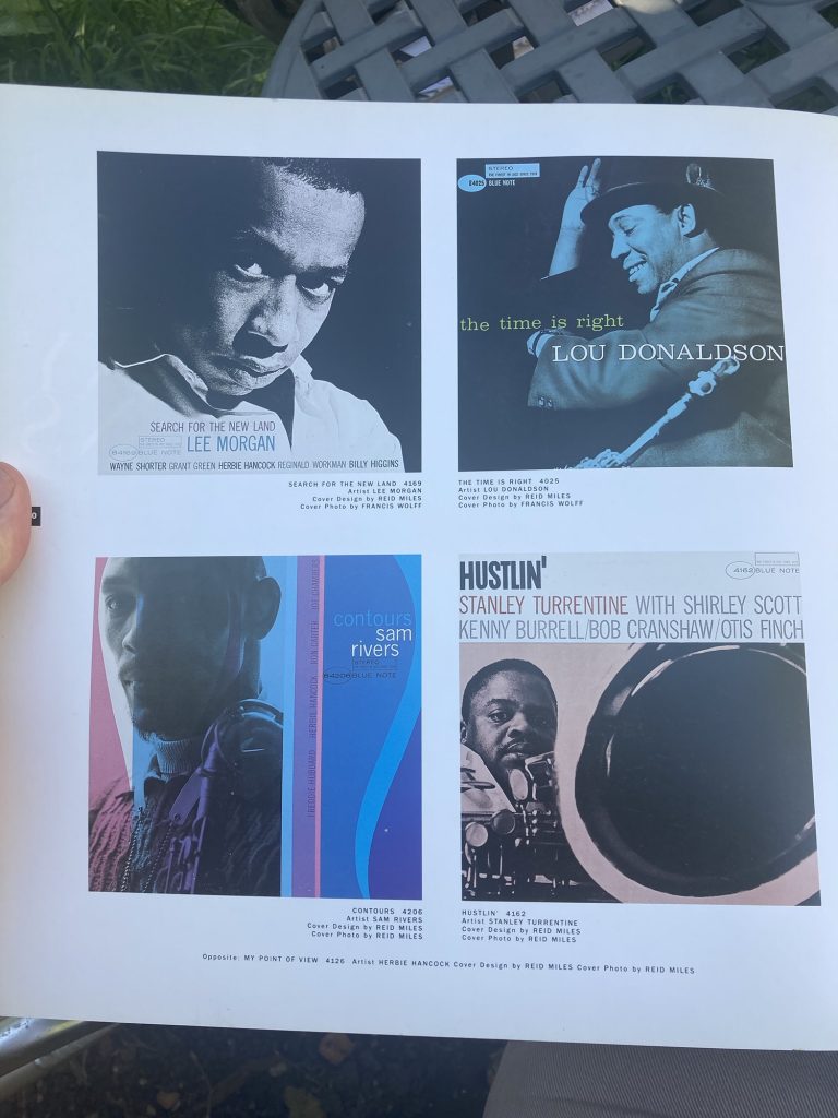
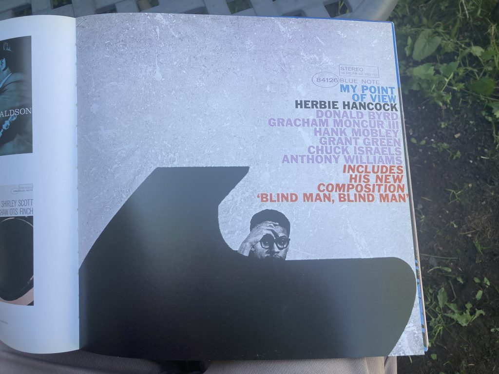
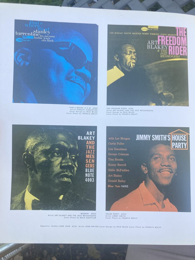
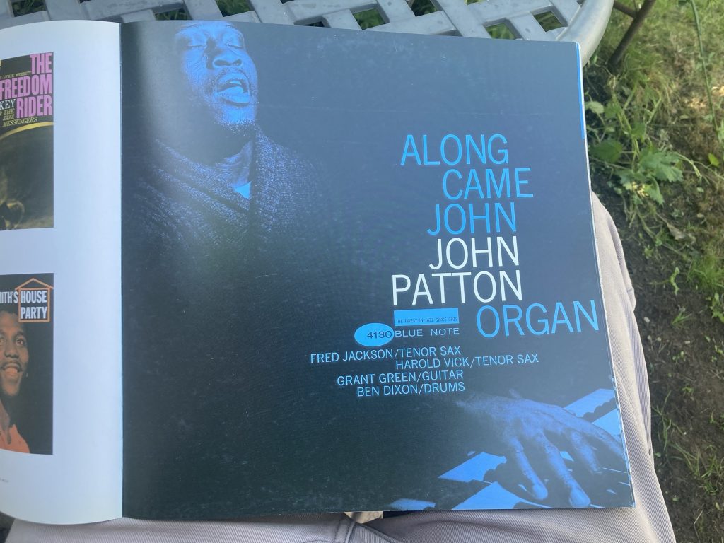
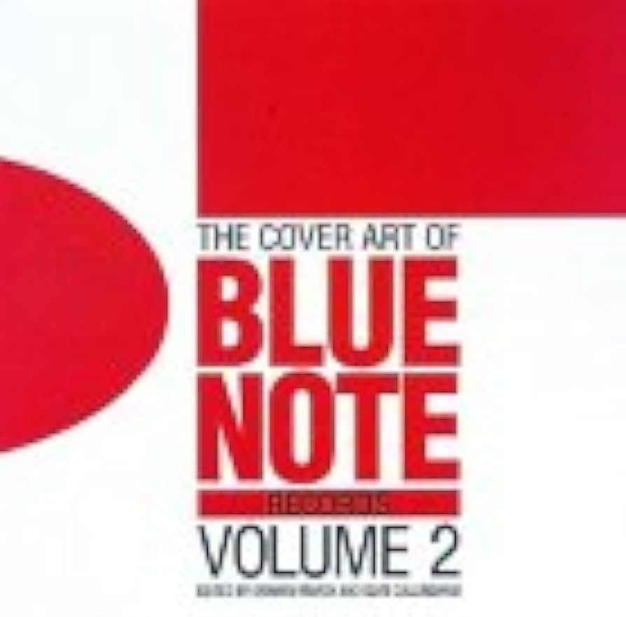
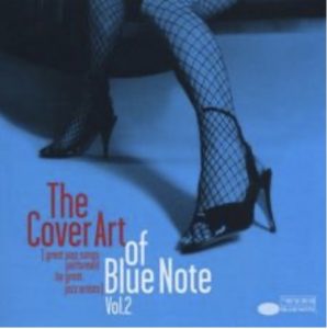
I got this book many years ago. And I’ve always loved it. It’s now just one of three or more books I have dedicated to this most excellent of jazz labels.
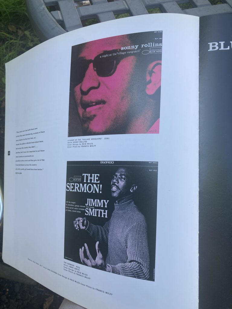
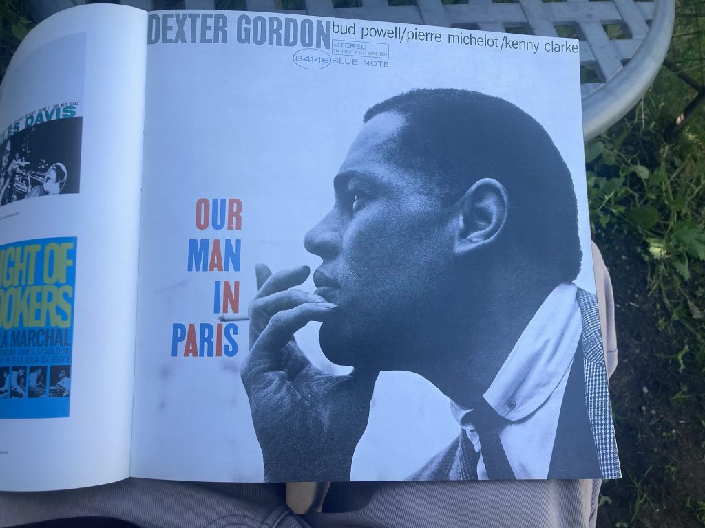
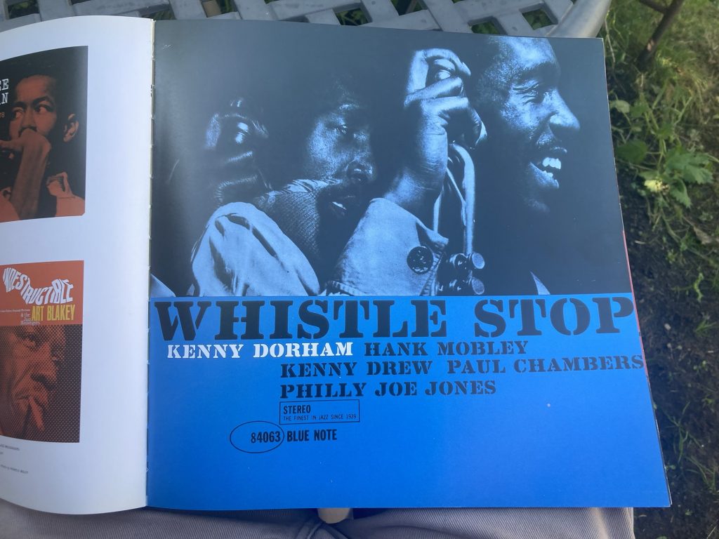
What special about this one – and there’s a second volume I’m keen to acquire as well – is the decent number of large reproductions of album covers, near enough full original size. Plus lots more at smaller sizes.
I’m thinking of buying a second copy of this first volume, purely for cutting out pages and framing a load of them. Indeed, I shall do so. Though I’d better put in an extra shift or two to raise the funds.
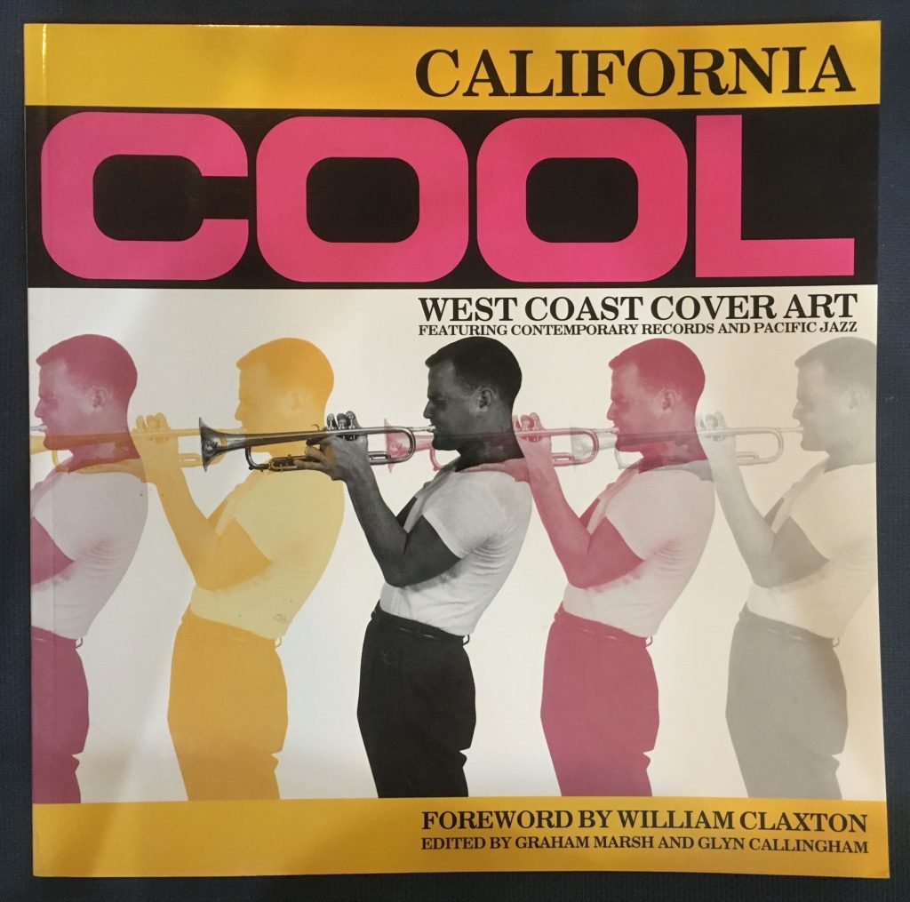
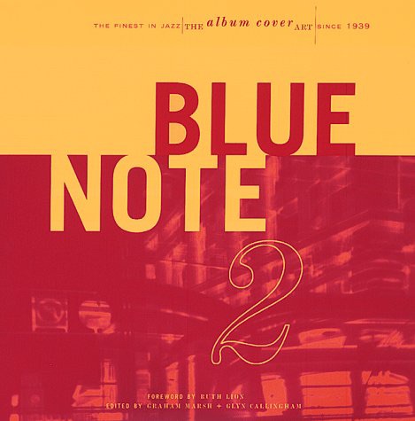
I’ve also decided to pick up a copy of the book pictured below. By the same editorial team. I very much look forward to perusing that, in dew coarse…
Got this on order as well.
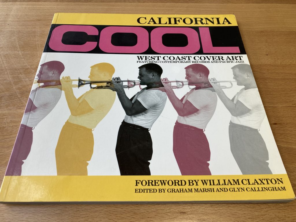
A bit of trivia for the discerning bop-cat? The trumpeter on the cover of California Cool is Jack Sheldon. I know Jack best through two sources/routes: as a talking head on Let’s Get Lost, reminiscing about Chet Baker (he’s great, an absolute card!), and as a featured musician on several sublime Tom Waits recordings, from the latter’s purplest of patches (mid ‘70s to early ‘80s).
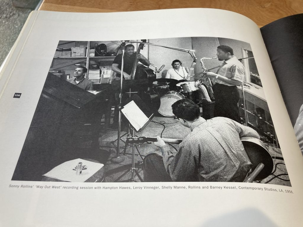
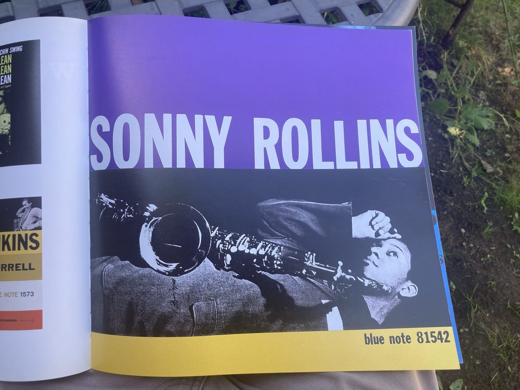
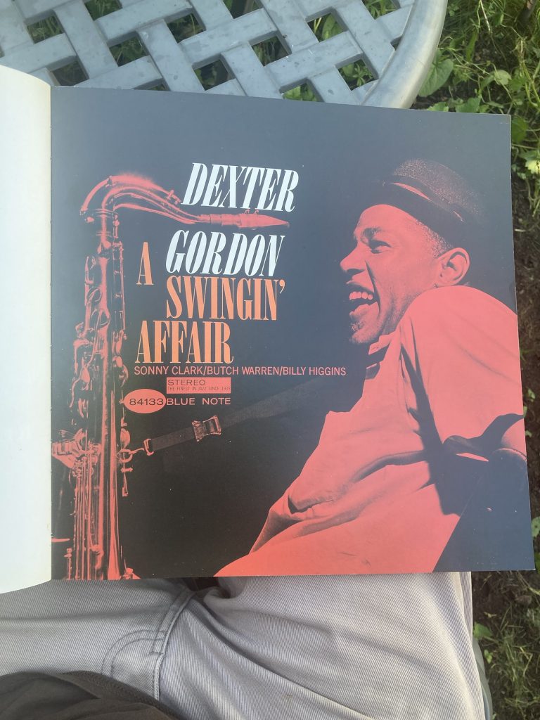
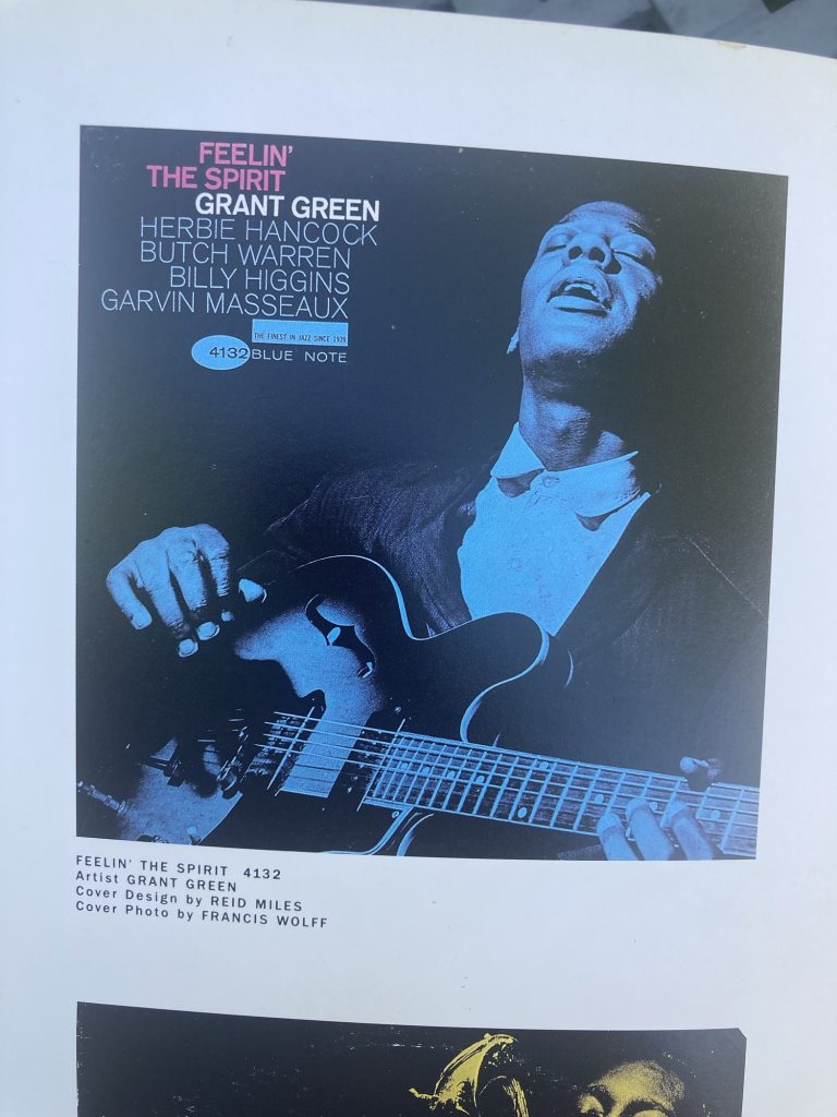
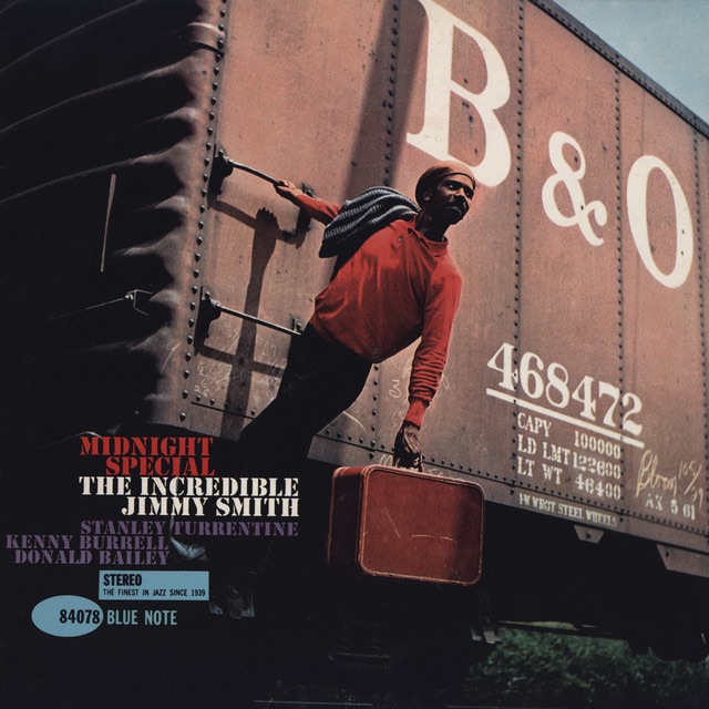
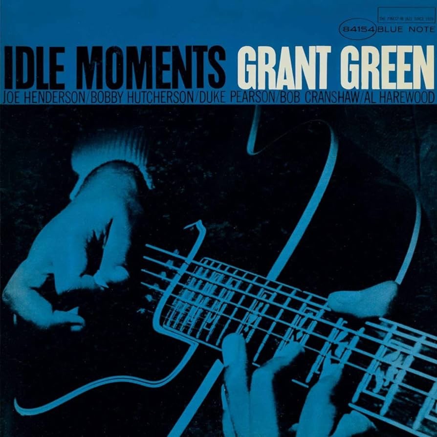
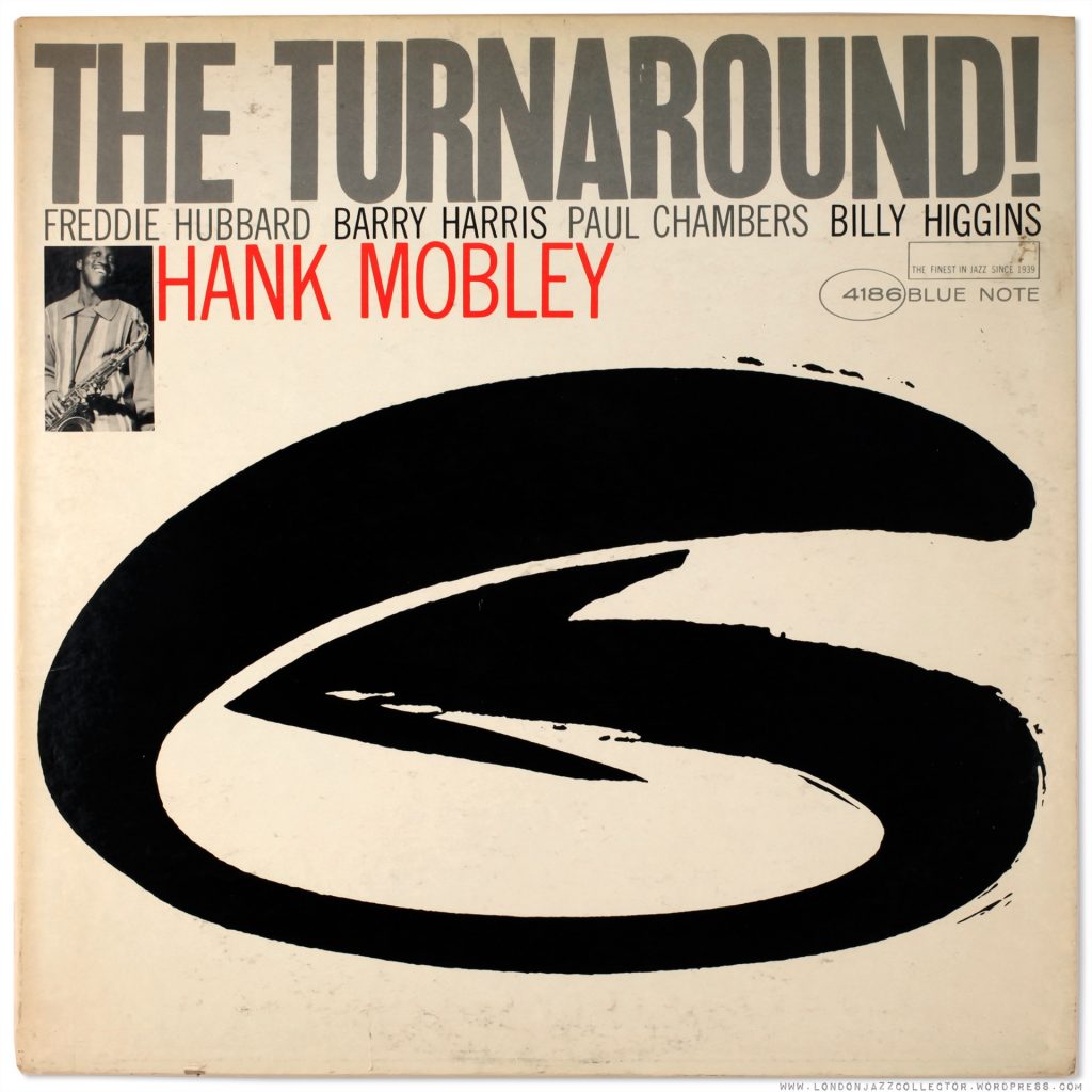
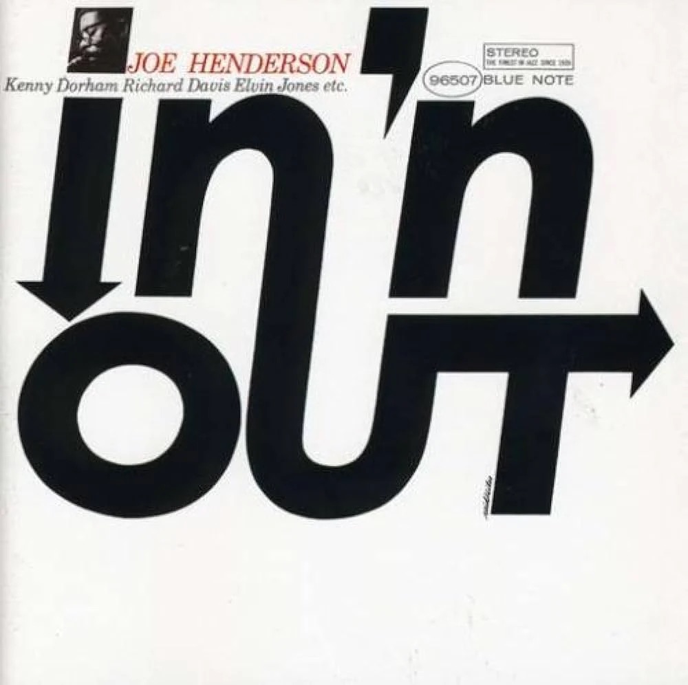
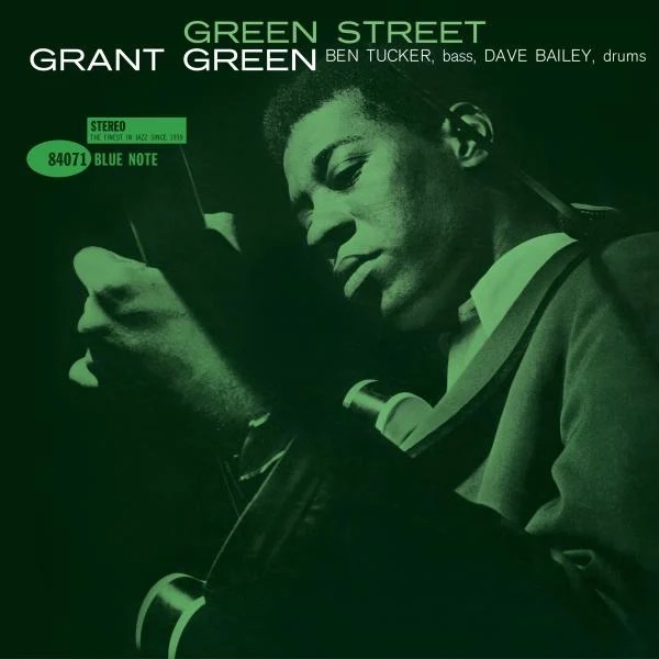
The range of styles across the board is pretty huge. From ‘scenes’, such as the above, to the more typical ‘in session’ portraits, by Francis Wolff, often massively cropped by Reid Miles, such as Grant Green’s Idle Moments…
… to bold typographic or graphic stuff, such as these doozies…
Sadly these personal faves don’t feature:
Love this!And this.
Maybe they’re included in volume 2? R
U.K.A CD, perhaps?U.S.Japan.
Rather oddly, the second volume appears to have come out in several different editions. But hardly any of these are easily or economically available.
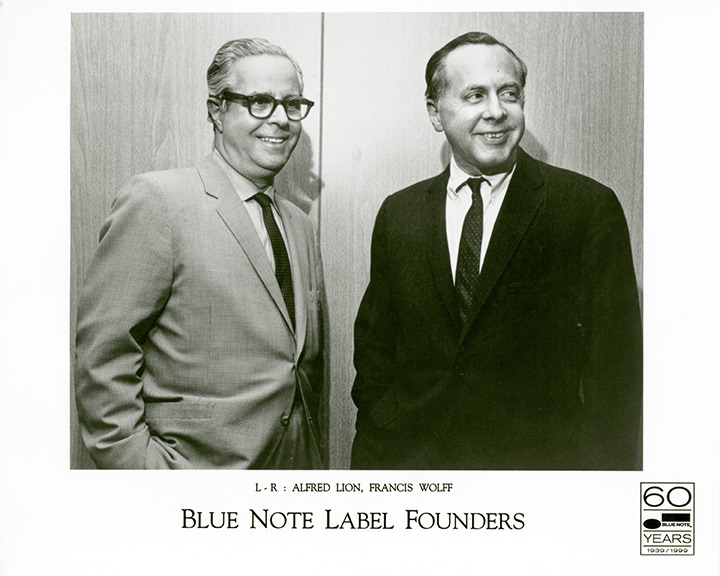
As if the incredible music were not in itself enough, we are truly blessed to have had the combined skills and passion of all at Blue Note. As well as the artists themselves, the vision and passion of guys like Alfred Lion and Francis Wolff, is to be rightly commended and celebrated.
And then there were all the engine room guys, like Paul Bacon, in the earlier years, even (very briefly) Andy Warhol, and of course Reid Miles, the classical music lover whose visual genius has helped make classic Blue Note both a byword for sublime music, and a whole aesthetic, based around albums as total works of art.
Fabulous. Essential stuff!
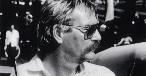
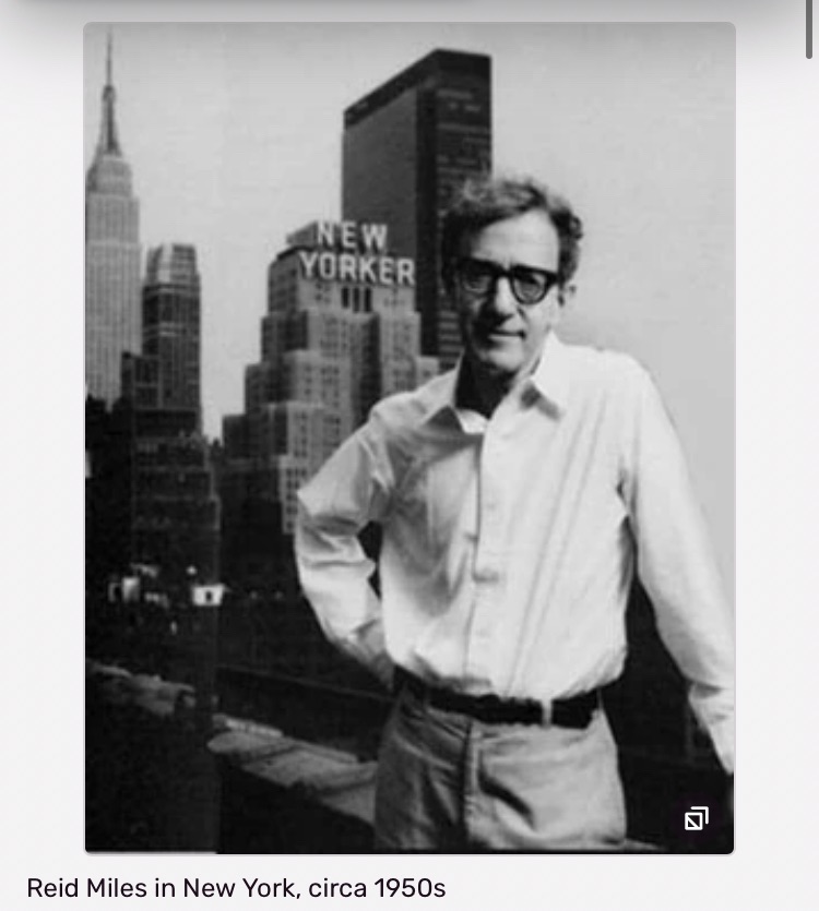
Is this Reid Miles?
FOOTNOTE:
Rather shockingly, it’s next to impossible to source a photo of Reid Miles. I can’t recall where I originally found the above image. But one website – see photo at bottom! – has a mis-attributed photo of Woody Allen!
Apparently this is Reid Miles work, post Blue Note.Say wha’!?
Miles stopped working for Blue Note in 1967. And after that, their album cover design grew ever less uniquely stylish.