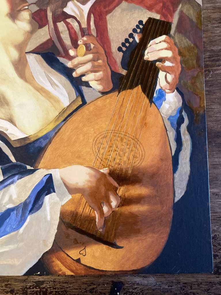
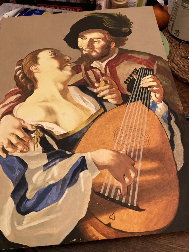
I’ve painted the lute courses, or even pairs of double strings. Not great, perhaps? But they’ll have to do. Next I need to add the frets to the lute. And a bit of shadow, and/or something of interest to the rather bare background.
Hmmm!?
I think I’ll go back to occasional copies of ‘Old Masters’, as a bit more of a regular thing. Good for skill building, and poss’ saleable?
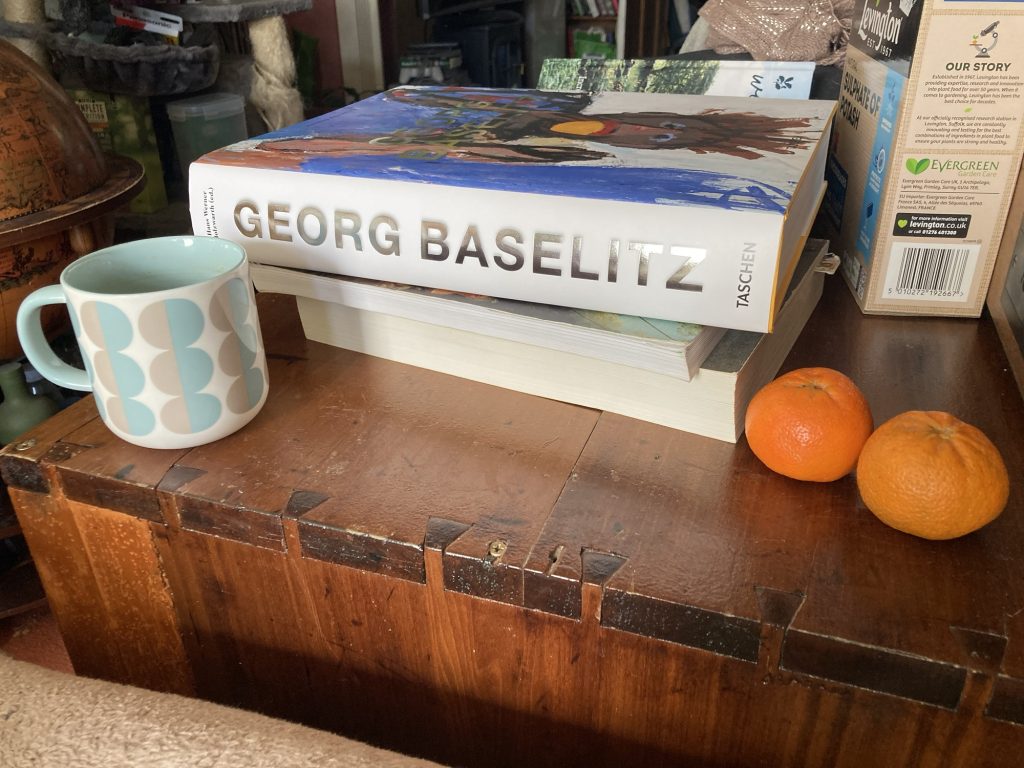
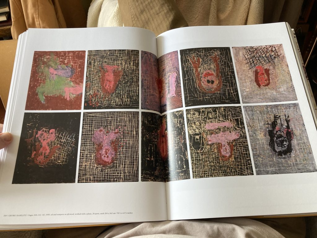
My ol’ pal Ben Carter introduced me to Georg Baselitz, many, many years ago.
I’ve got a couple of other books on him. But they’re neither very big nor very comprehensive. And GB is, like Picasso (although not as Vesuvian), prodigious in his output.
Unboxed and unwrapped…
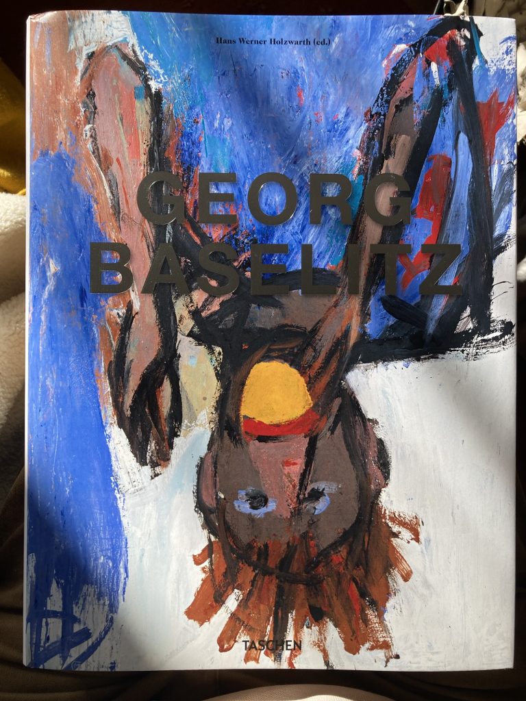
Another thing GB has in common with Picasso is painting a lot of ostensibly ugly or cack-handed stuff.
But I think, in both instances, there are combinations of in-built and cultivated aestheticism, and skills – with line, colour, form, composition (even touch) – and thinking, all of which combine to give the artworks a kind of energy, and even beauty, that I really respond to.
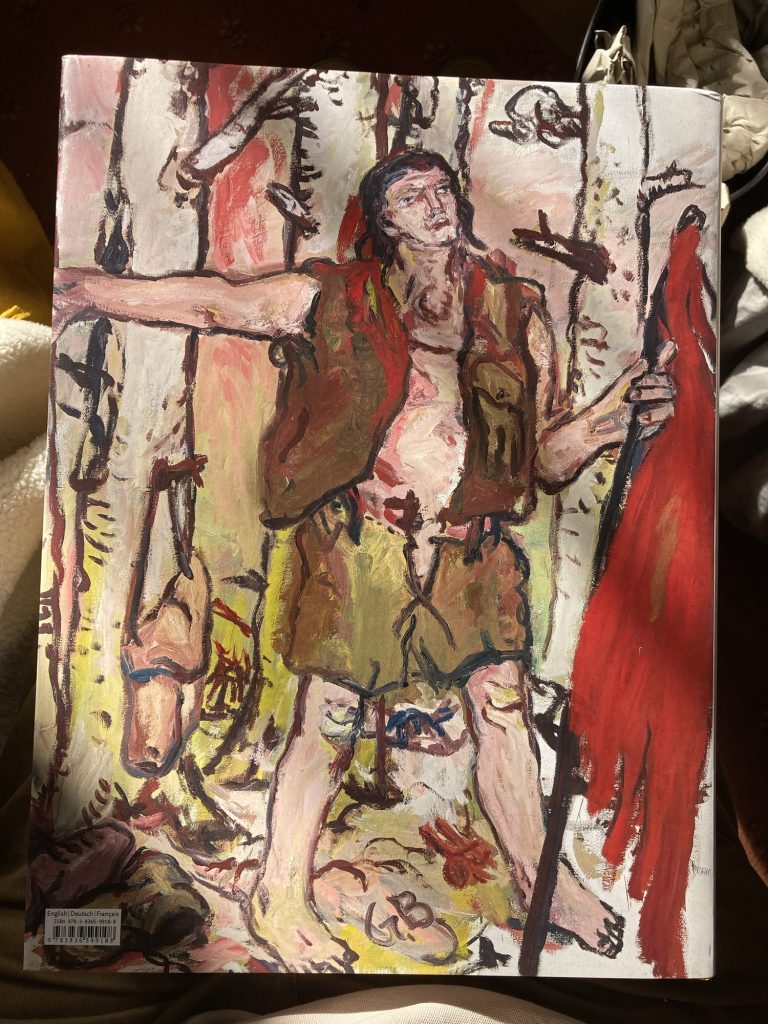
The back.
So far I haven’t read much of the text. Basically I’ve thumbed through the whole thing once, mainly looking – in awe and wonder, for the most part – at the artworks. But what little text I have read, has mostly consisted of GB quotes.
These occasionally rather opaque aphoristic pronunciations remind me a bit of stuff folk like Guston and de Kooning (both artists I love) are alleged to have said. I’m not sure what I make of the verbiage?
I find I like a lot of his work, a lot.
Where such artists are most eloquent is in their art works. And what these say or mean to me may have little or nothing to do with what their creators might talk about. And frankly I don’t care about that.
Rather egotistically, perhaps, all that concerns me, is what these things mean to me.
This slender little volume looks right down my boulevard. Rather slight, at only 36 pages, though. Nevertheless, I think I’ll get a copy at some point soon. If I can.
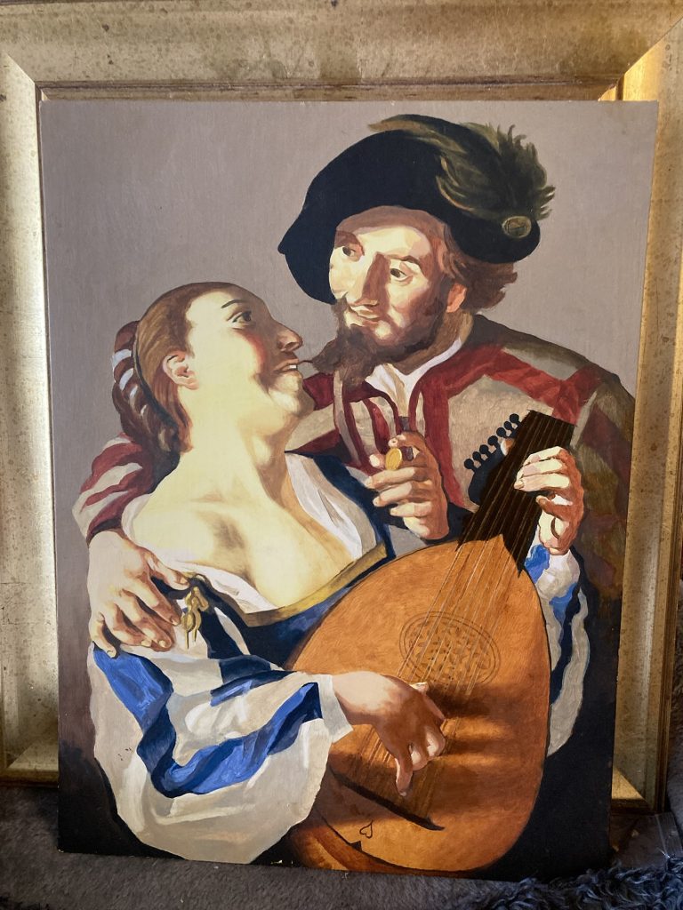
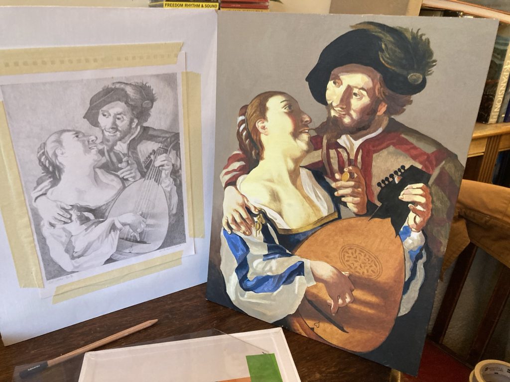
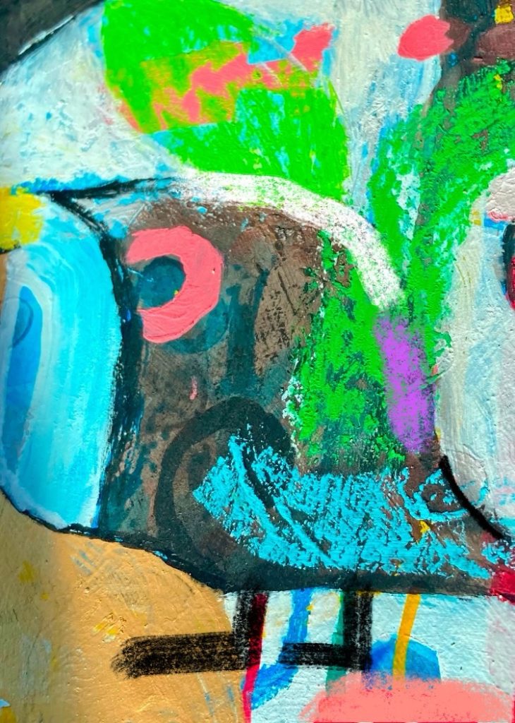
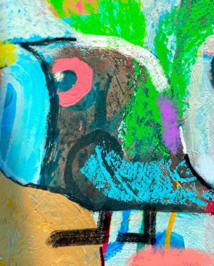
I found this pencil drawing and unfinished oil painting, today. Behind another old artwork (an abstract print), in our lounge!
The reason I call this The Absent Procuress is because in the original there’s an old crone – the titular Procuress – on the right. I left her out. Good riddance!
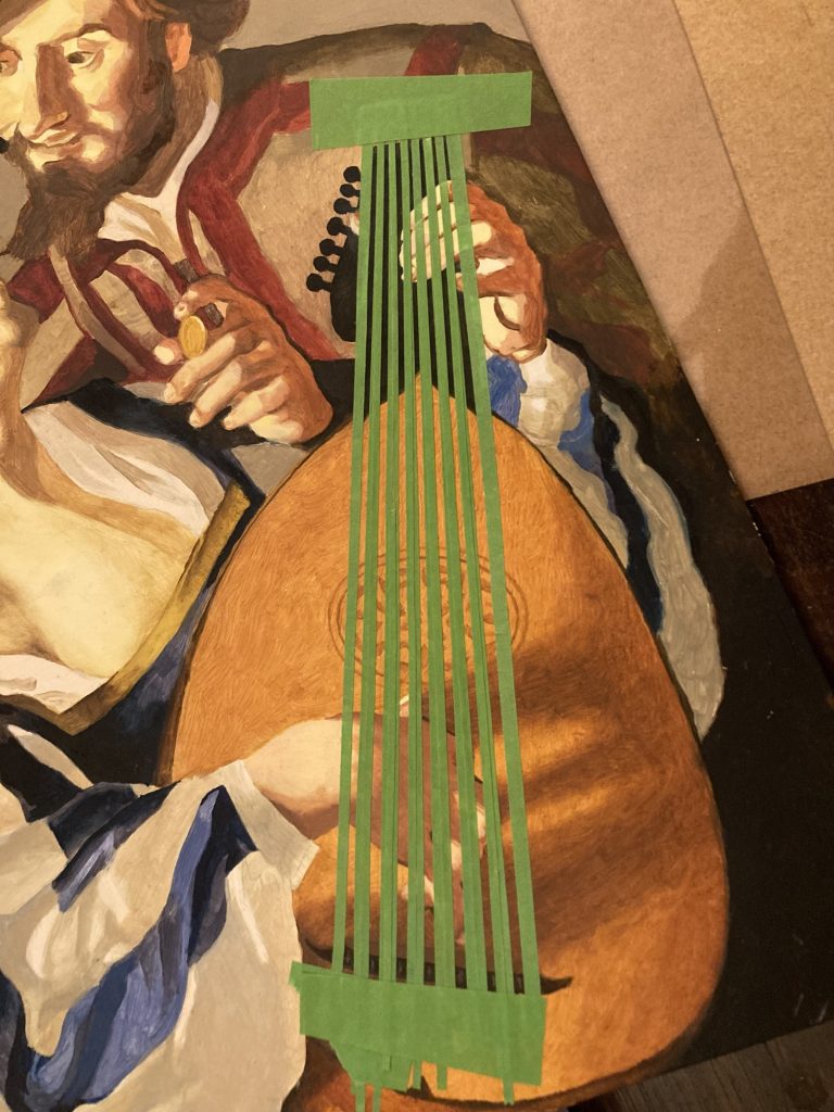
Thought I’d try masking…
This kind of stalled, on the lute strings, many years ago. Anyway, now I’m suddenly doing art again, I figured why not try n’ finish it?
Step one completed.
So I painted the strings in today. Kind of. They need separating into pairs, or ‘courses’ (I think?). And, the way I’ve gone about it, they also need ‘knocking back’, and shadows need redoing, etc. So, there remains quite a ways to go.
Hopefully I’ll do some or all of that tomorrow, when Flo’s MOT forces me to stay home anyway. I’m also expecting the deluxe new Taschen Baselitz tome to arrive in the morning… can’t wait!
Picasso was infamous for his dealers having to prise his work away from him. Else, he’d just keep finagling it! Well, I may not be Picasso. But I can understand his perspective.
Finishing this has been a mother!*
But I think it’s there now. Wherever that may be. I just hope Dad (and co.) likes it!
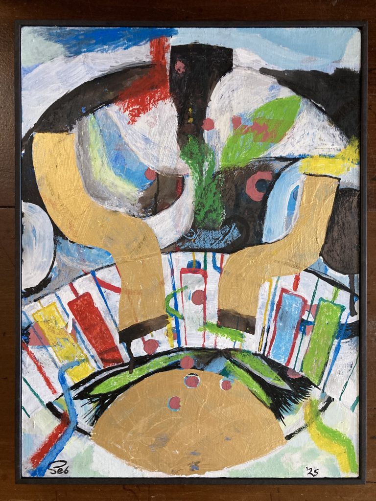
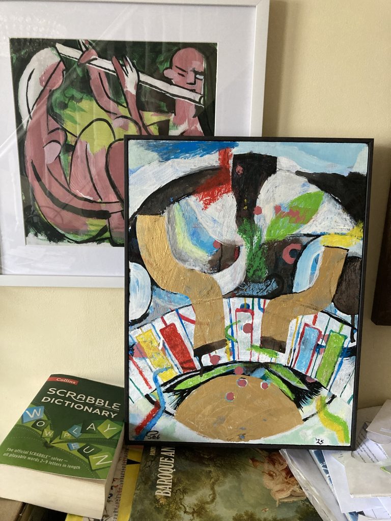
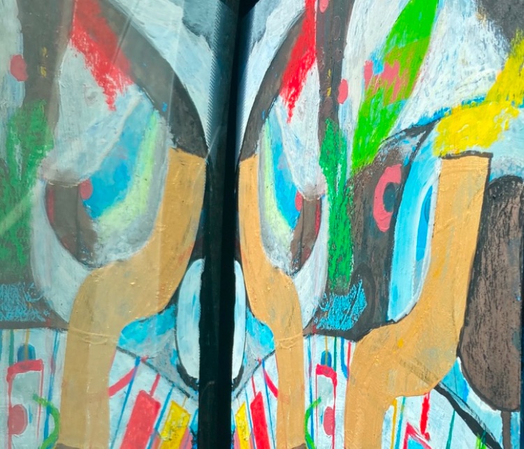
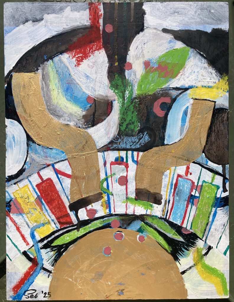
Well, I’m done either way this piece now. Sun Ra at Albert’s House, I’m calling it. I’ve even signed and dated it!
I’m in the process of spraying several layers of fixative over it. And later today I will be delivering it to Rex, at The Granary Studio, to be framed.
Ought I tweak it a bit more, perhaps?
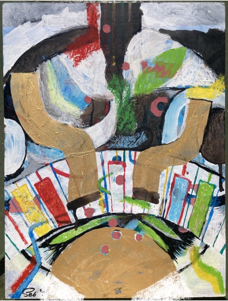
It’s day’s end, and I’m abed. The piece of art is now with Rex, to be framed. I did the above hours ago. It’s another variant… I guess when I get the framed artwork back, I can still tweak it a bit, if I want?
I’ve been tweaking the above on my iPhone, between actually working on the real ‘flesh n’ blood’ article.
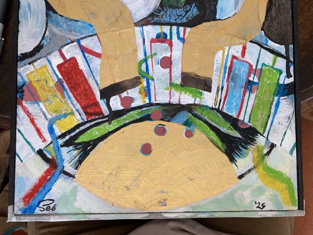
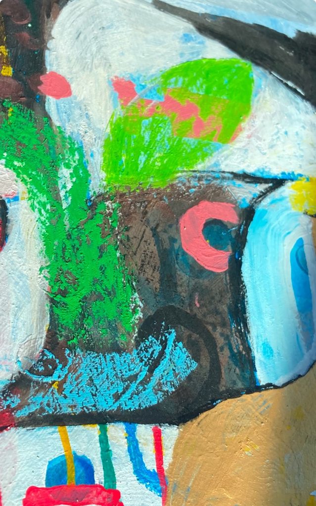
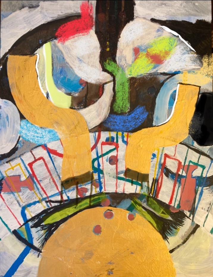
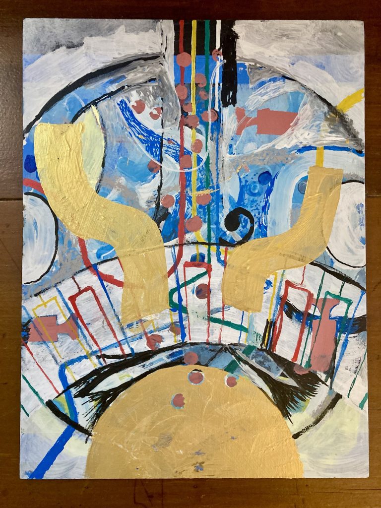
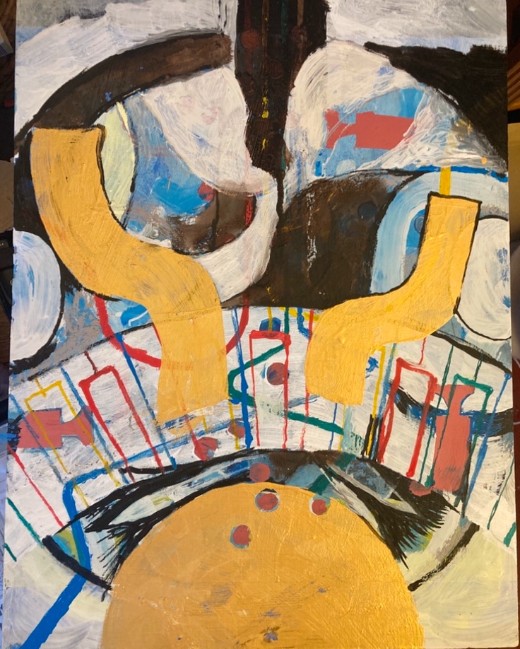
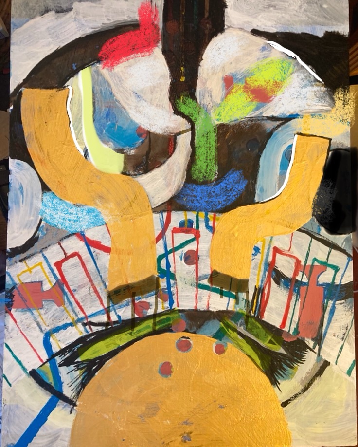
And it’s definitely starting to come together. at one point the bottom half seemed the better part. Now it’s undoubtedly the top half I like best.
The bottom half – the keyboard motif in particular – needs work. Essentially, simplifying and declutterring. Could be a metaphor for my life!?
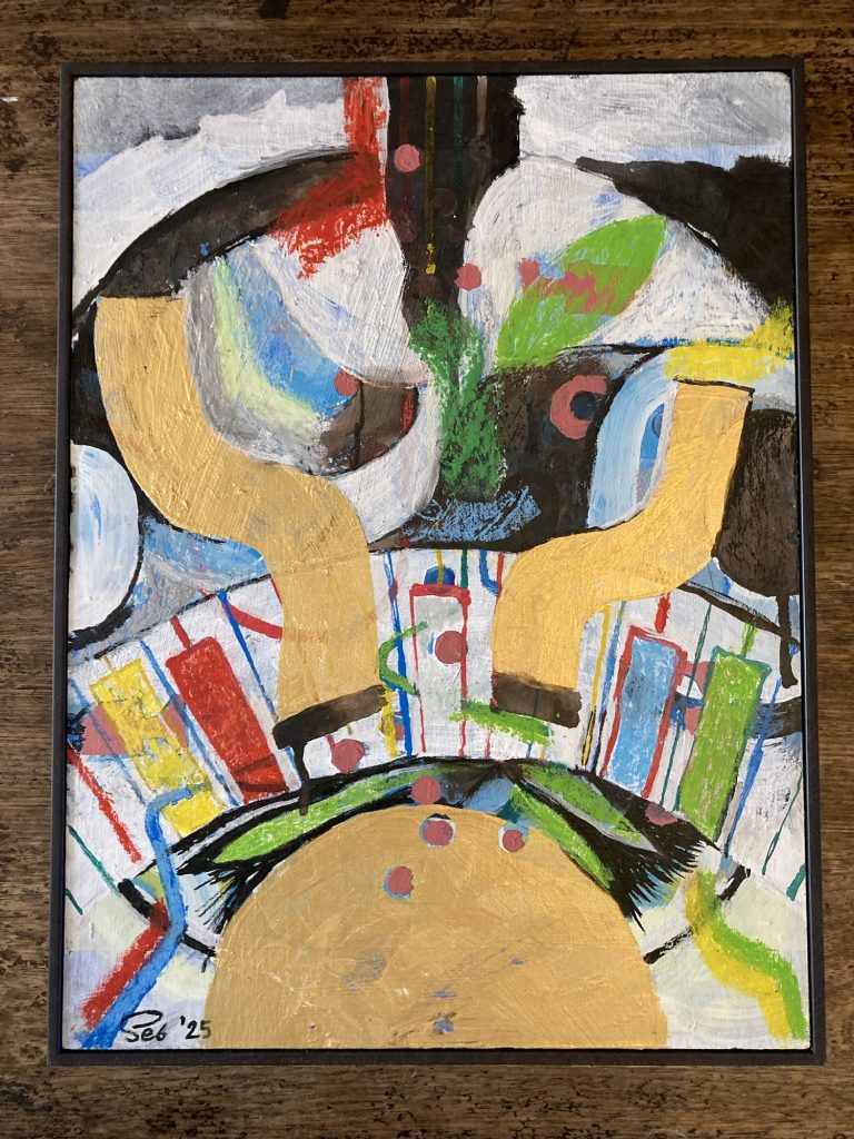
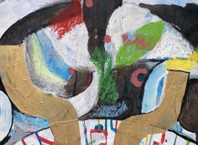
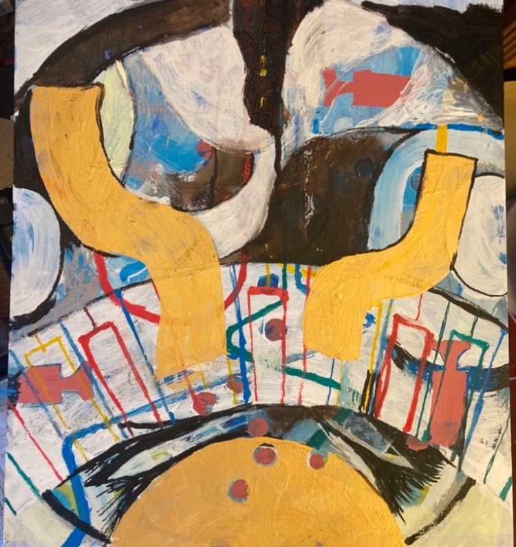
Finally… starting to think this is coming out OK.Yet more tweakage…More fiddling…
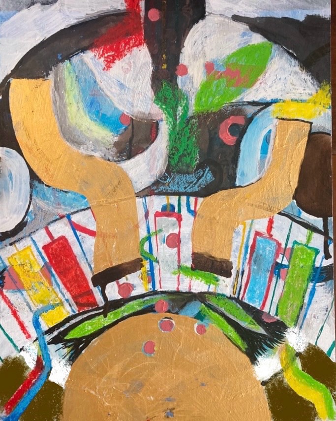
Do I darken (and lighten)in the bottom sections, as per this iPhone edit? Or do I leave as in the pic above that? Either way, I think this is finally nearing completion.
If I’m totally honest, it’s not a triumph. But you can’t win ‘em all. And I have to learn to be more accepting of a broader range of results.
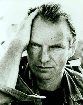
As Sting once sang:
‘To search for perfection Is all very well But to look for heaven Is to live here in hell…’
Well, I’m utterly miserable. Probably a result of the excess of whiskey on Tuesday night. Jeez, what a furkin’ dope I can be, sometimes!
It’s a gorgeous sunny day. And I feel like a stinky turf on someone’s smelly old shoe. Horrid!
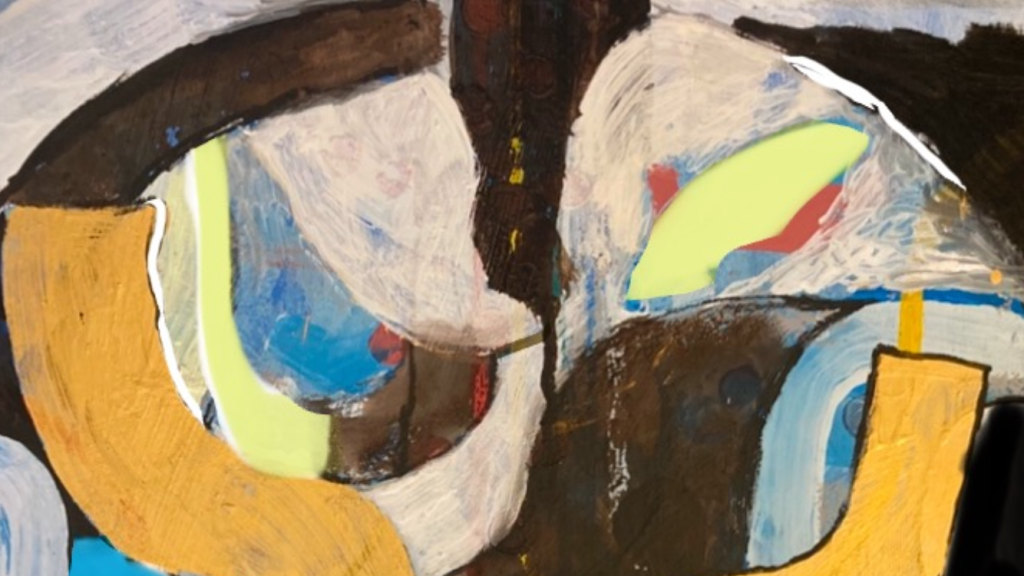
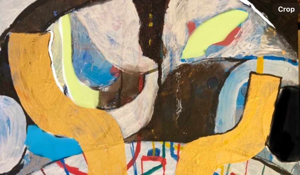
Possible/probable croppage?
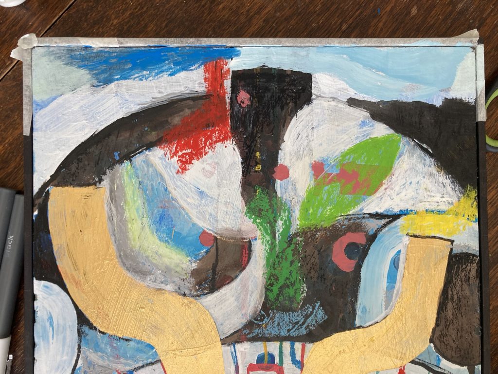
Chester’s pestering for food has been really annoying me. So much so I’ve shut him out several times, to let me get on with Dad’s painting.
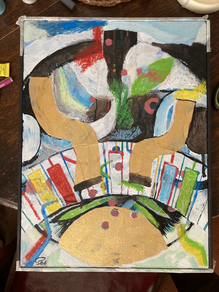
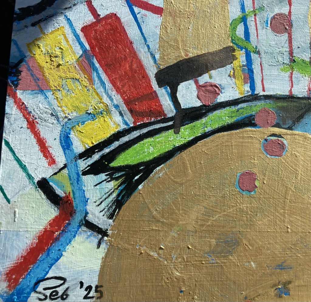
I think I like this lower half?
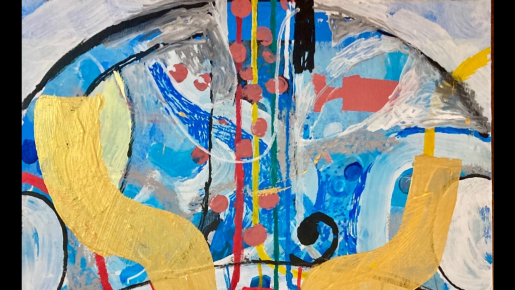
That seems to be going a bit better, in part. Specifically the bottom half. I introduced the ‘keys’ in the arched piano portion of the design. In near primary colours: red, yellow green and blue.
Some black and white line work, with acrylic pens has also helped focus things a bit. But I still feel a long ways from happy with this…
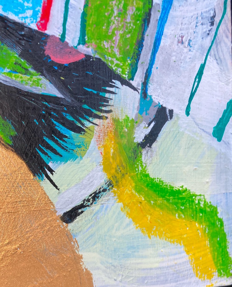
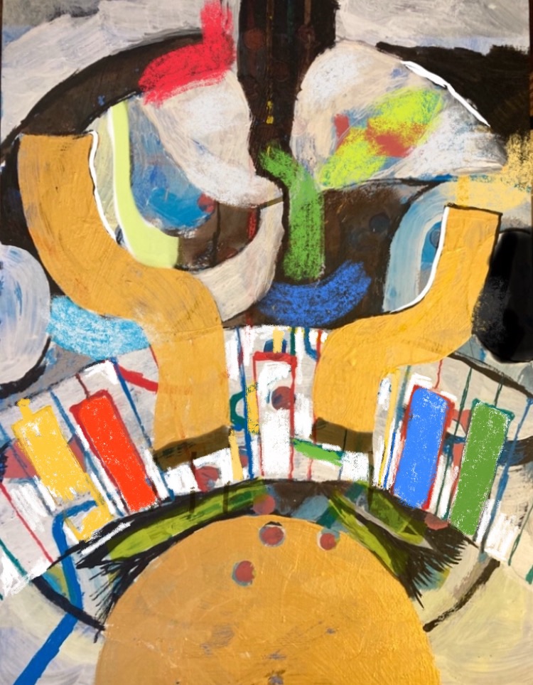
Whereas this upper half is a mess!
I have a few ideas… and, in true jazz style, it’s all about improv’.
Am I finally getting there!?
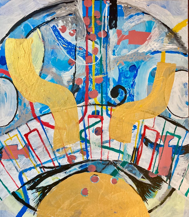
Hmmm!? I think this is finally starting to hang together a bit better. Due to immense simplification. Somewhat to my own surprise, going almost black n’ white in the top half, has really helped.
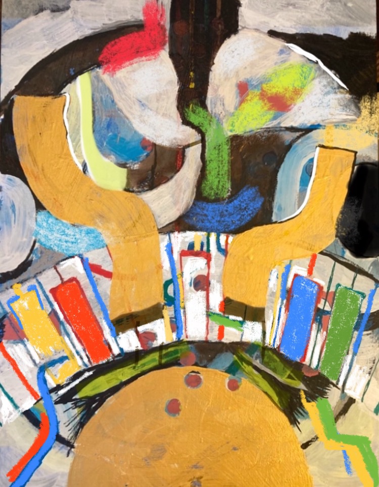
Even better when cropped…
Dialling down the noise and complexity is key, as well. I’d like to work towards arriving at more bold simplicity quicker. Rather than via the slightly tortuous layering I often currently resort to.
MUCH LATER…
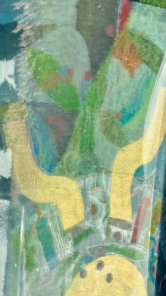
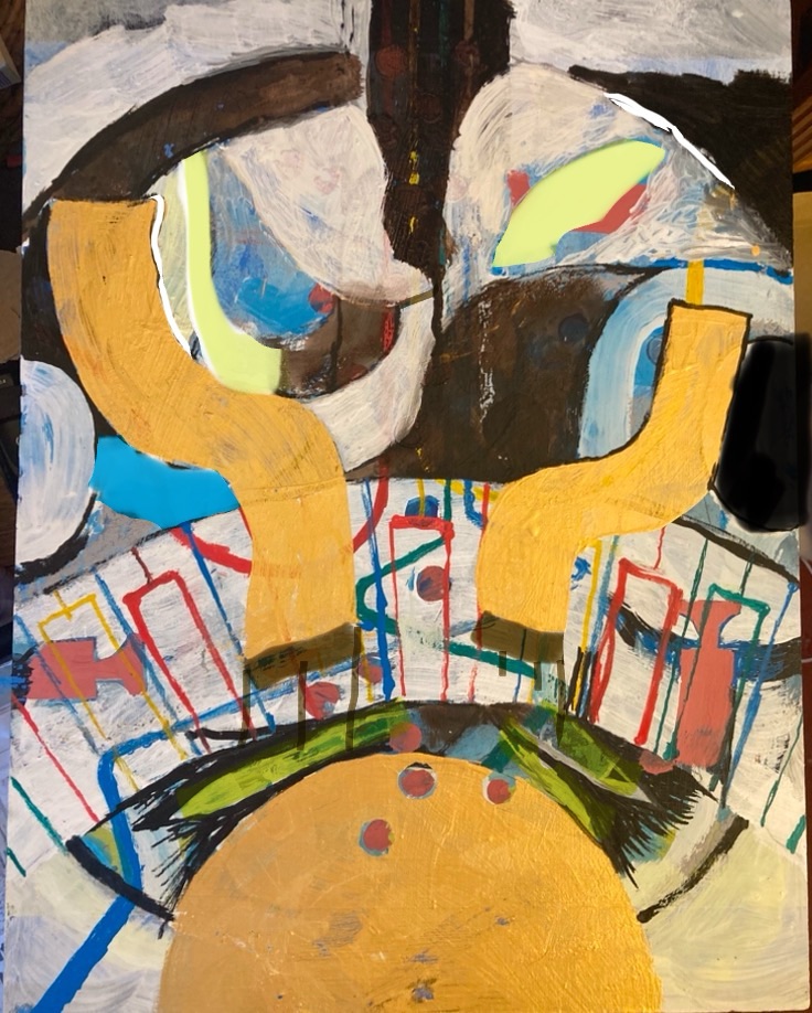
Modified on my iPhone…
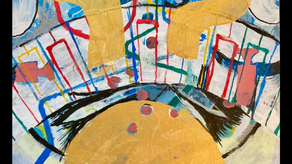
Oh my God… I can’t stop ‘worriting’ this image! I’ve fiddled around with editing it on my iPhone a few times now. The above is the latest example of that.
I like this…
I’m almost starting to like the upper half more than the lower half now. Hmmm!? Where on Earth (or Saturn?) is this thing headed?
… and this.Further iPhone editing…
As it nears midnight, I have to stop, and get some sleep. But I feel I am finally getting somewhere.