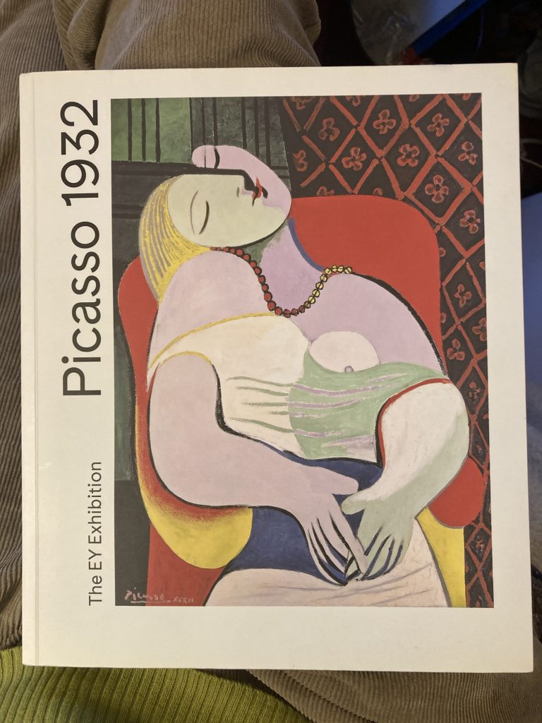
ART: Framing Dan’s Pics & (More) Picasso
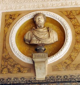
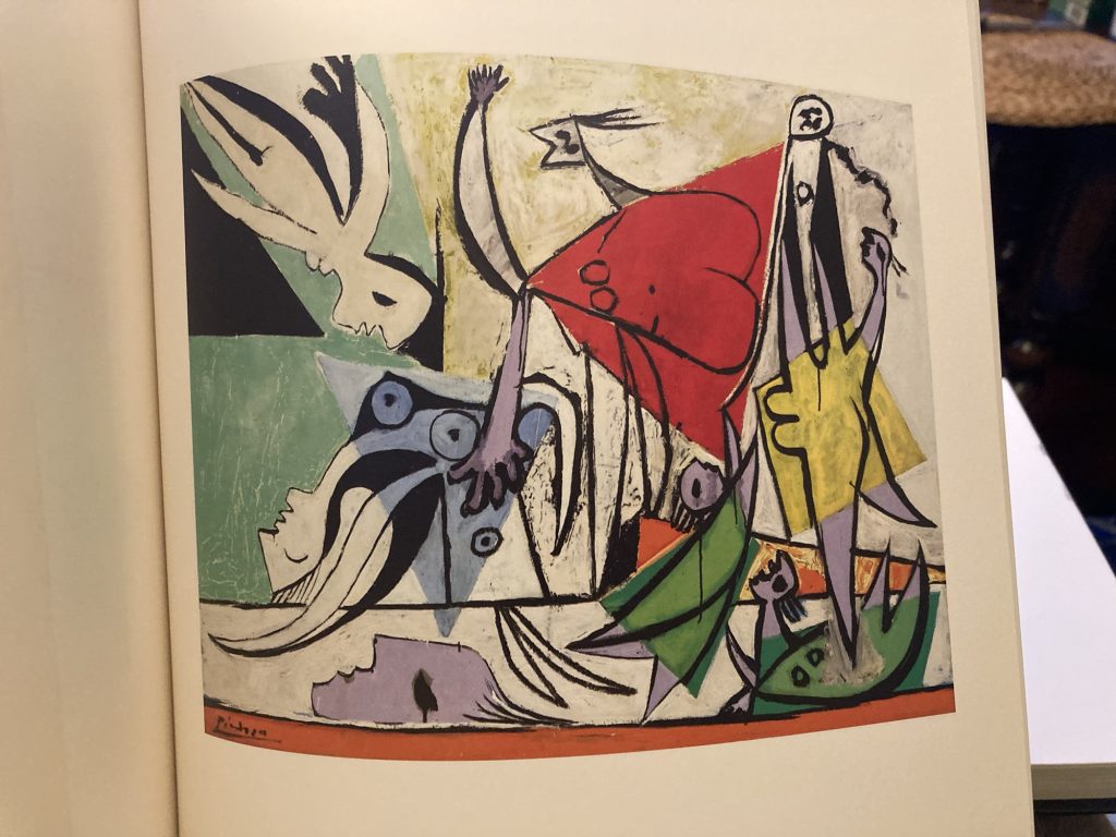
I love Picasso, and his Vesuvian creativity. It has to be admitted, however, that in amongst this Herculean outpouring there is plenty that might be called ugly, even brutish.
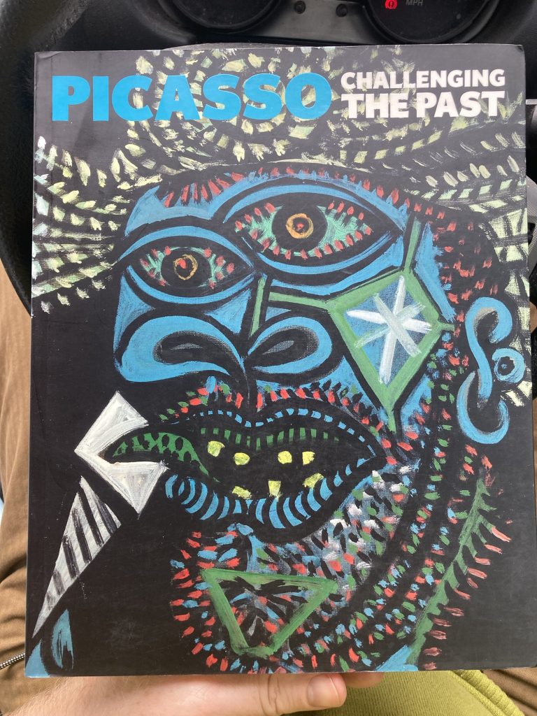
The picture on the cover of this book is, to my way of seeing things, coming from that end of his creative spectrum: it’s not just the yellow teeth, stubbly chin, and bloodshot eyes, it’s also the colours, and the handling of the paint.
But ultimately these facets are just more, amongst so many of the legion reasons I think Picasso is top of the list for candidates of the ‘greatest artist that ever lived’ soubriquet.
This near A4 sized but quite slim volume (mine is paperback), catalogues a National Gallery show on the theme of Picasso ‘Challenging The Past’. Or, put another way, Picasso in context.
Given that Pablo is such a massive influence on me, it behoves me to explore further what influenced him. Of course, I’ve done this before, many times. But there’s no reason not to return to such rich seams. And having a book that focuses specifically on this aspect of his work – and inevitably therefore, of the work of other artists – seems the perfect moment.
Perhaps even more so given my current rebirth of artistic creativity and activity, during which Picasso – as ever, with me – has been such a fundamental inspiration, and resource.
Why, it was only a few days ago I was working on my version of Picasso’s take on Velazquez ‘Las Meninas’.
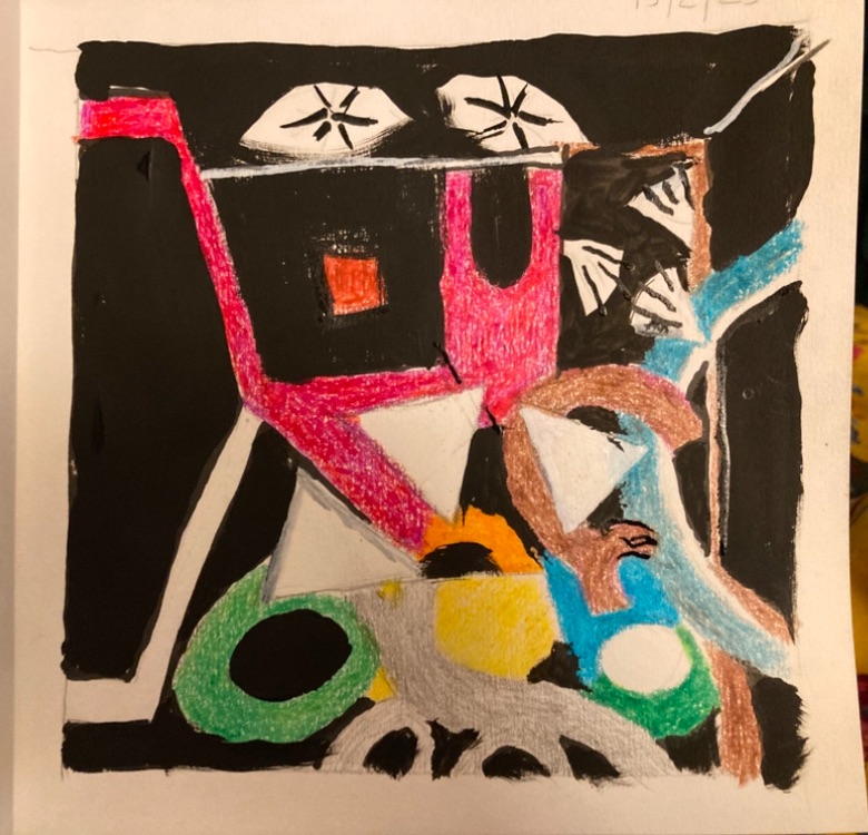
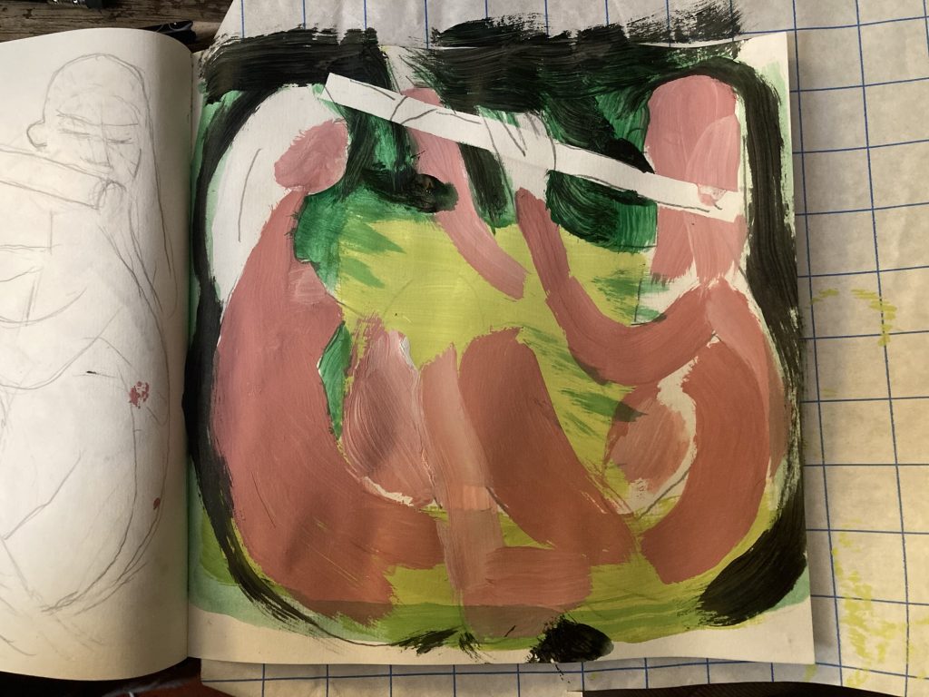
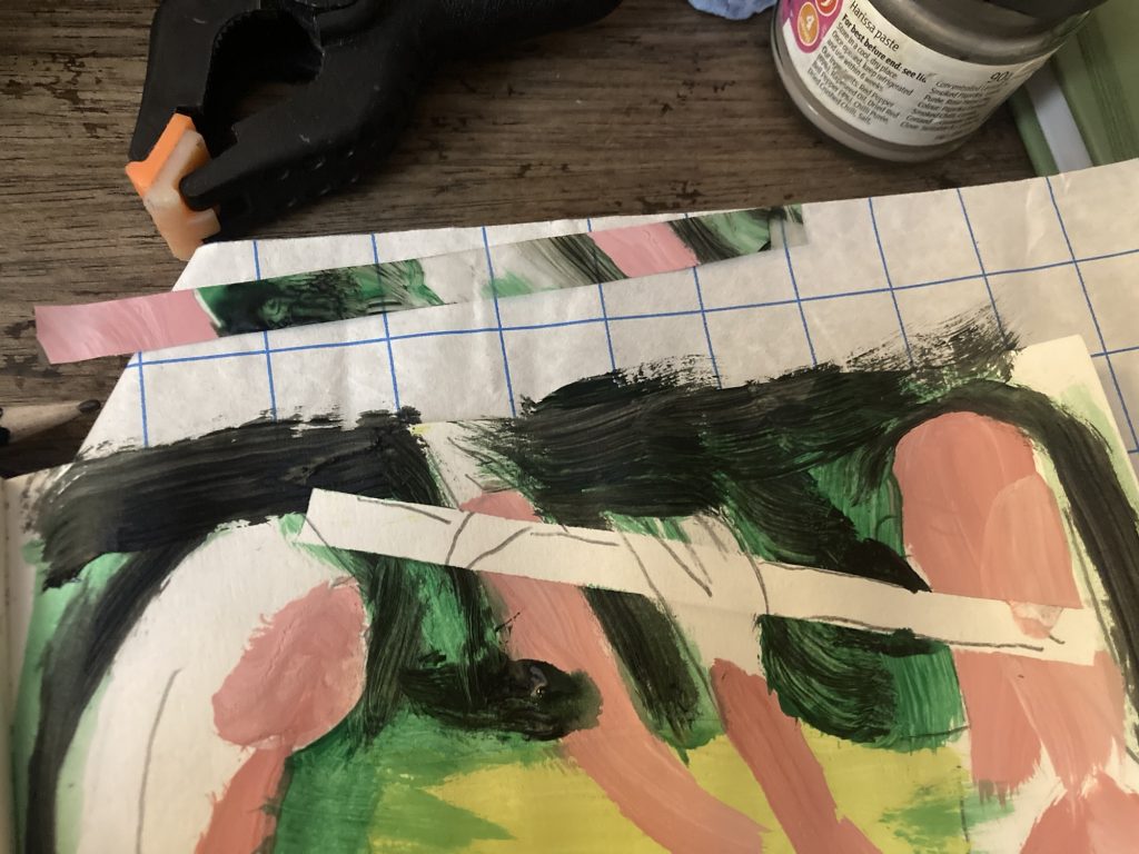
I visited a guy in Christchurch, today, who runs a framing business from his home. He has taken on the job of framing the pictures Dan and Amy selected, from the five or six ‘preparatory sketches’ I did in my sketch pad.
In the end they requested two of those actual pieces. I’d been thinking they’d pick one, and I’d re/do it, slightly larger. But the studies have become the actual artworks! Which is ok with me.
I also had my local print shop run off slightly enlarged prints of the two pieces Dan and Amy selected. So we can have copies framed and hung at home. I bought cheaper off-the shelf frames for these, at the Wisbech Dunelm.
Discussing framing with (?), at The Granary, he revealed that the four fundamental tools he uses – never mind all the consumables and other sundries, etc – were a £5-6,000 investment!
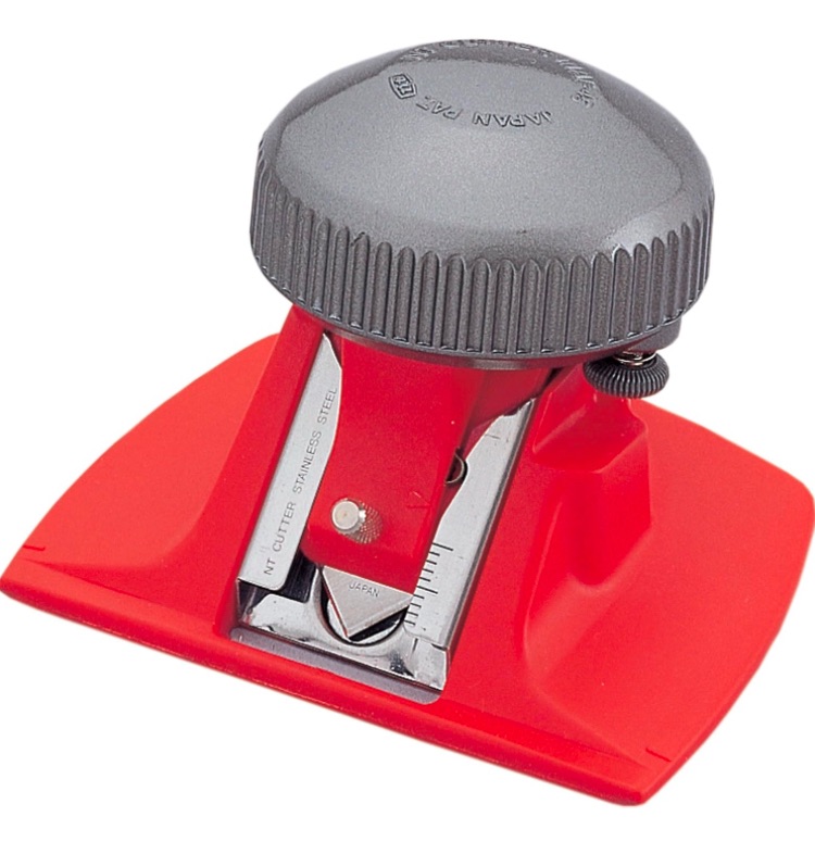
I’d like to be able to do framing myself – and have done, within my limited capacity – to save money. But hey-ho, it’s catch 22, as ever. Still, for now I’ve ordered the red cutter pictured above.
That will at least allow me to customise the card ‘window’ mount bits. Which I’ll need to do with the two slightly enlarged D&A reprints, when framing them.
I have to say, it all feels good, this getting back on the Art Horse!
ART: Dan & Amy’s Pics
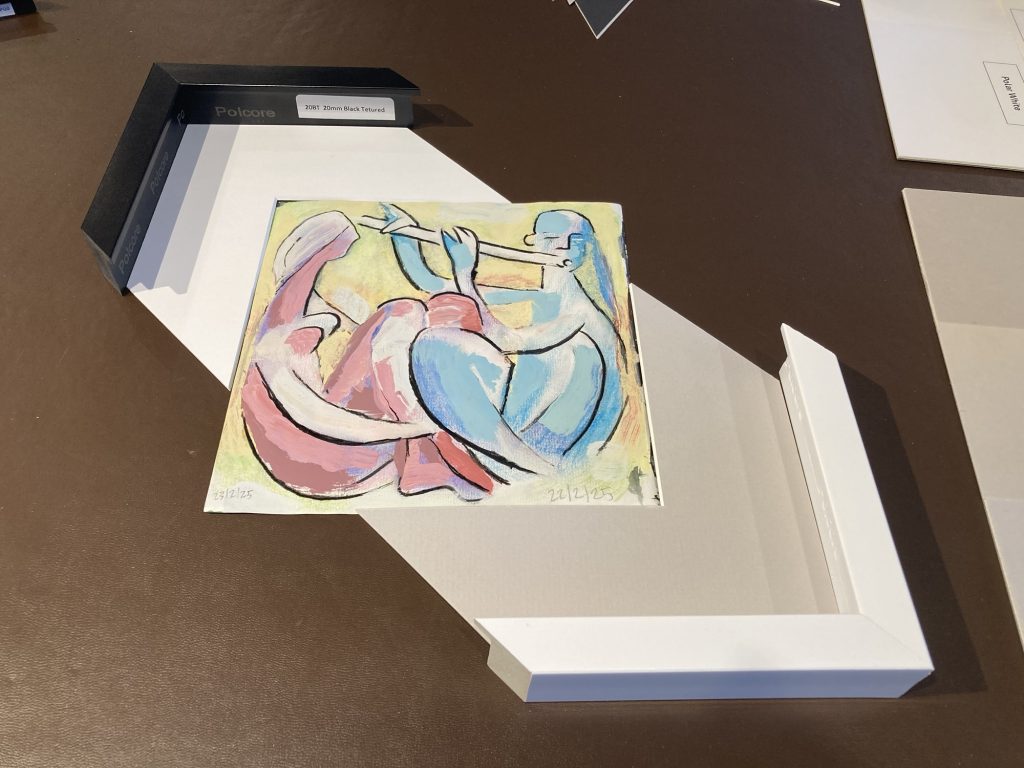
It’s always a little bit traumatic, cutting art works out of a sketchbook. But Dan and Amy wanted two, and wanted the originals, not prints. Nor even a larger reworking.
I’ve scanned all the pics that I’ve removed from the sketch pad. And I’ve got the local printers to do slight enlargements of the two chosen pieces (for Teresa and I to have up at home, possibly?).
ART: Pic For Dan & Amy, Pt. V
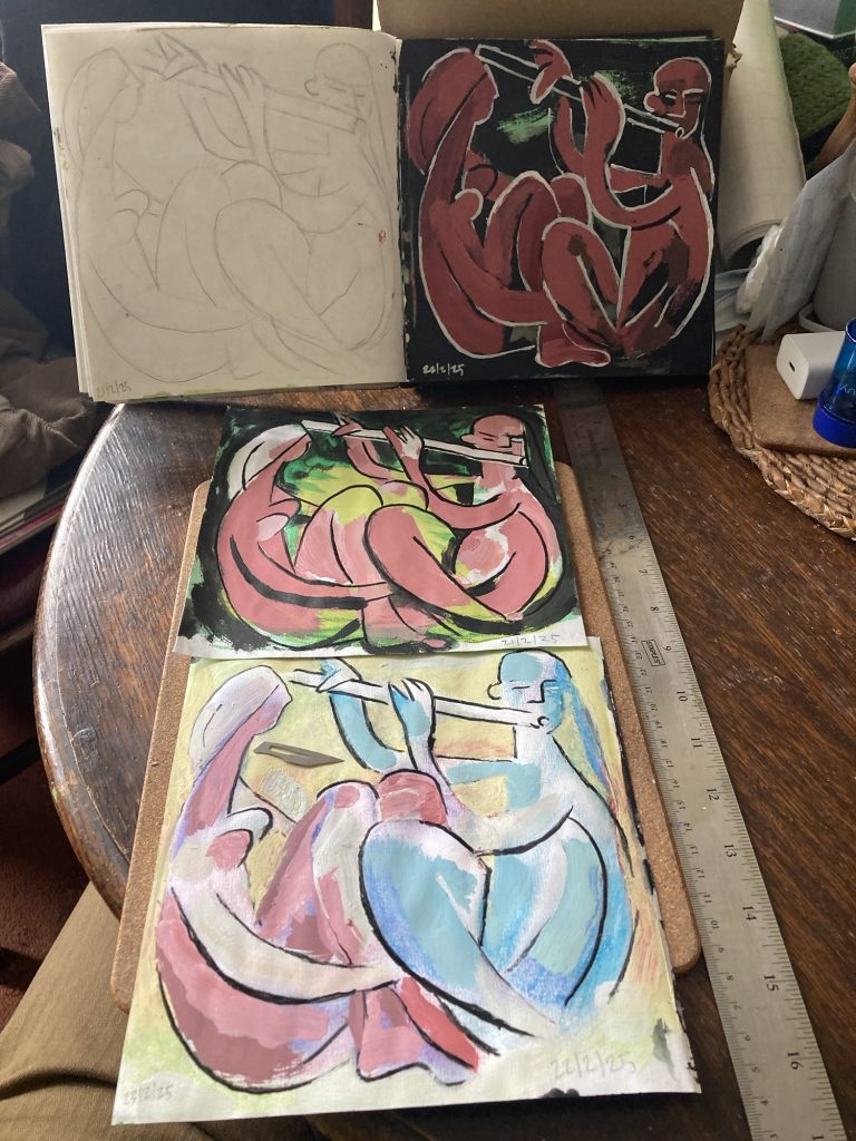
We go to visit Dan and Amy Ellis, today. We’ve got a bunch of flowers for them: daffs and roses. Plus I have my six little artworks.
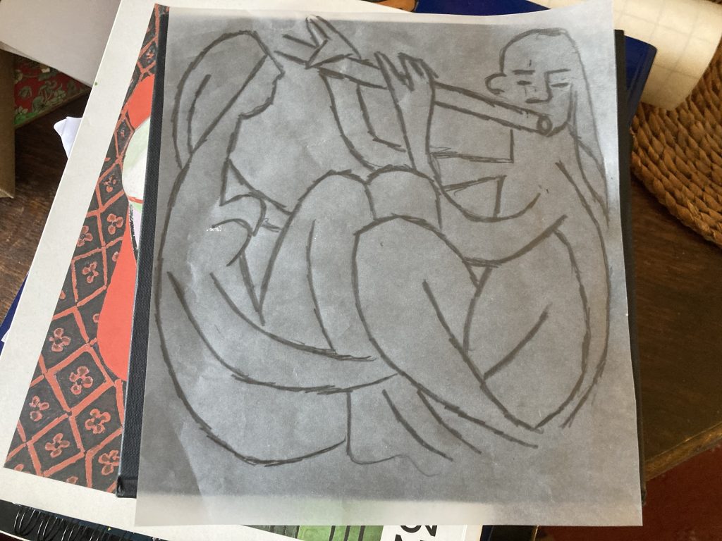
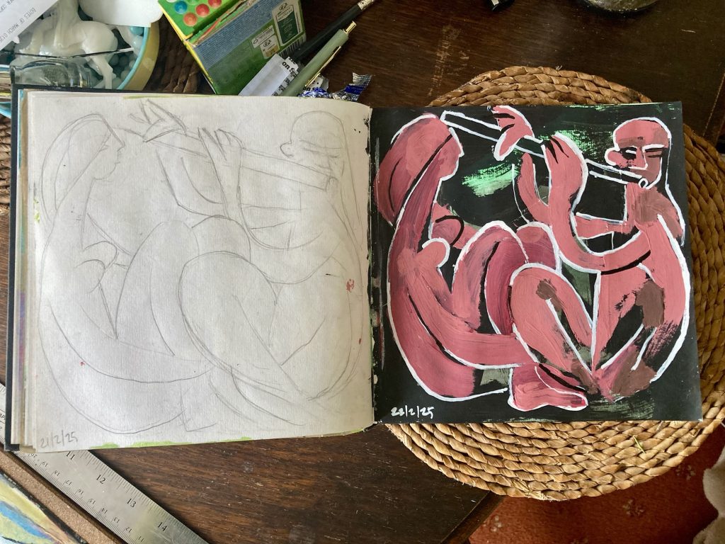
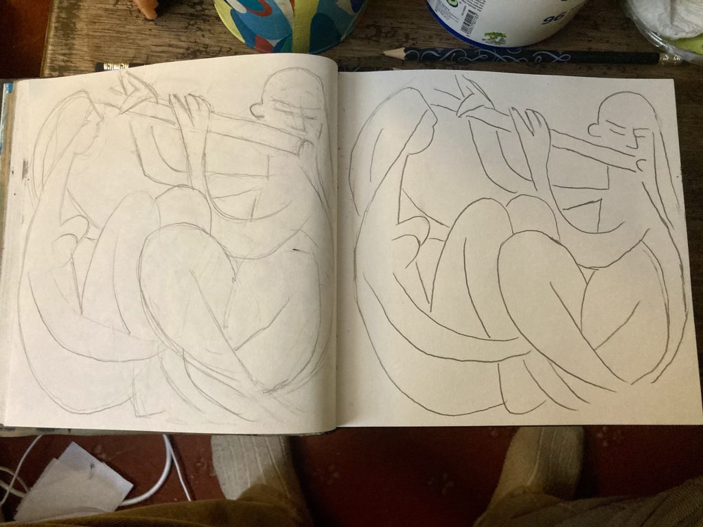
The above is the transcription sketch, on tracing paper, that I used for most of the duplication procedures, in various ways (lightbox, transfer-rubbing, etc).
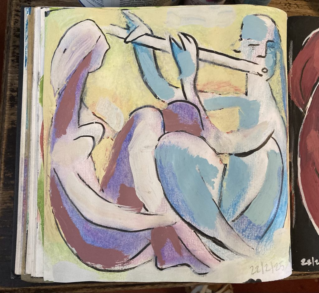
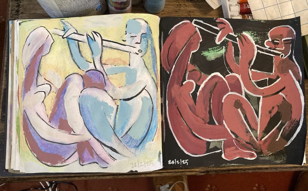
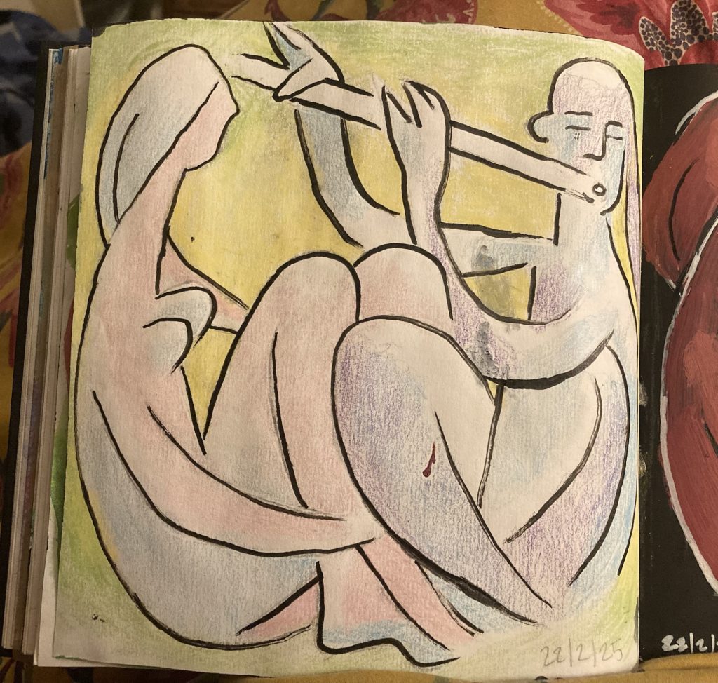
I’ve got a wee bit of time, before we head over, in which to try and work up the least satisfactory variant – the much mooted ‘pastel-hued’ iteration – with some tweaking.
Pale (-ish?) pinks, blues, yellows… that’s kind of what I was going for. But it’s still all darker and heavier than I’d intended. Still, it’s a lot lighter than its opposite number!
I’ll finagle or finesse it a bit more, with some black and white line work. And then it’ll have to do… I do hope Dan and Amy like them!
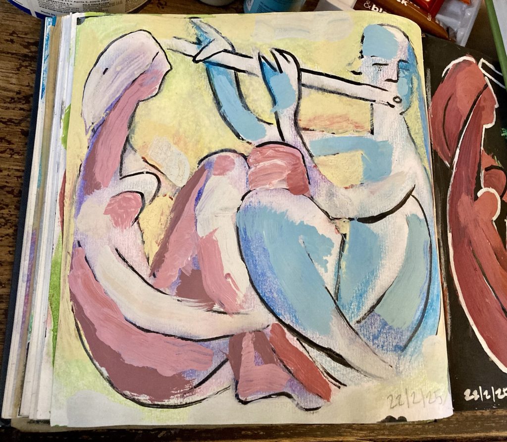
Well, it’s nearly time to go on our visit. And above is how the final piece is now looking. Much improved. But still not my favourite.
And here they all are as a gallery, in the order I did ‘em, from initial pencil sketch, to five ‘full’ designs:


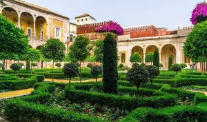
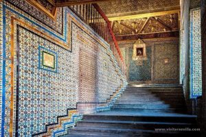
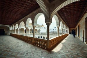
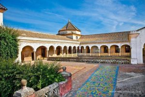
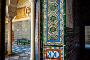
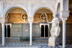
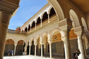
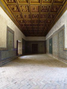
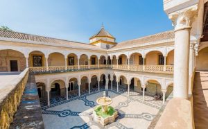
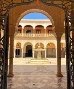
MiSC: Casa Pilatos, Seville
Watching Monty Don’s Spanish Gardens, we learned of the exquisite Casa Pilatos, in Seville.


ART: Pic For Dan & Amy, Pt. IV
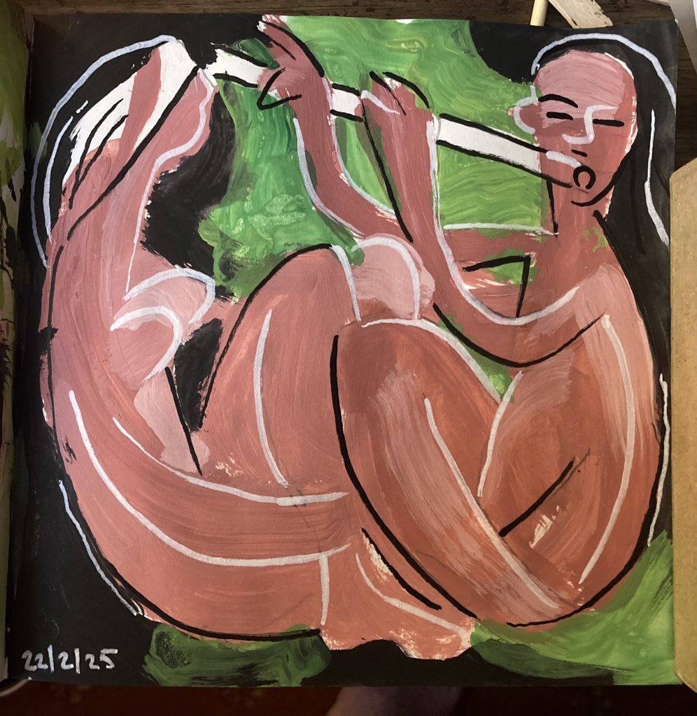
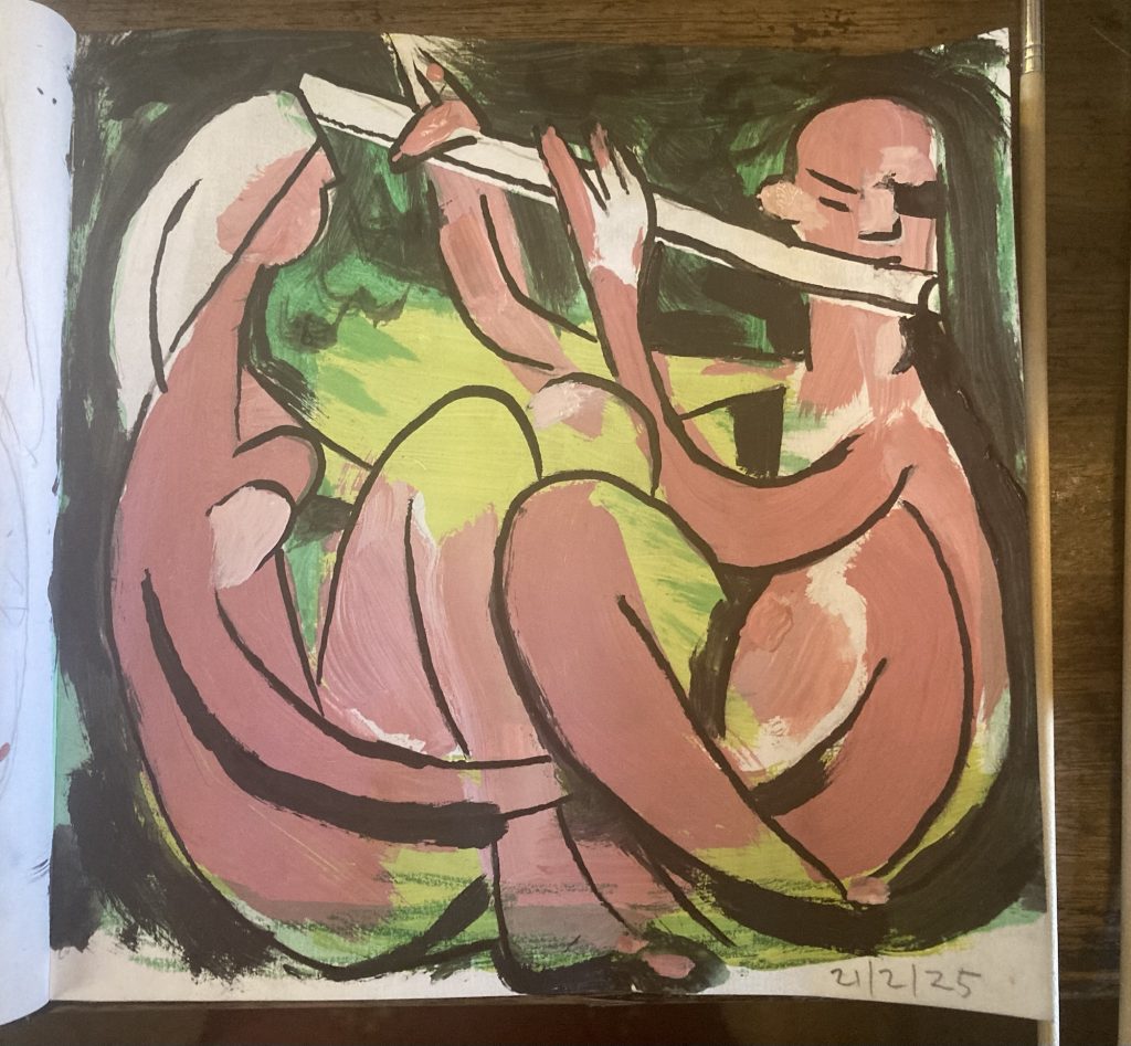
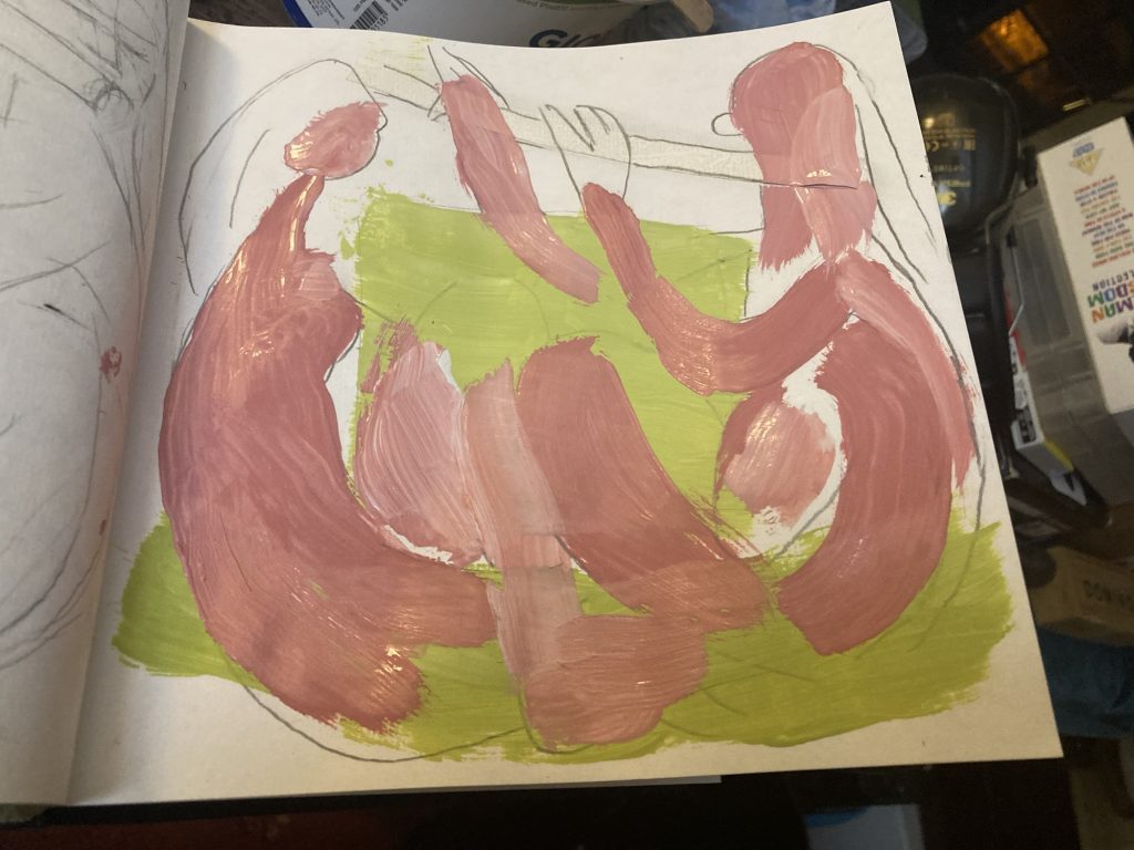
Ironically, given I was talking about doing a lighter, softer, paler version, the first full on alternative I’ve done is the above. A much darker and rougher take on the original idea.
Could it be a kind of pendant Night Time variant of the first lighter more day time version? Hmmm!? We shall see…
I don’t think the above is finalised, or finished. It feels like it’s ’on the way’ to something.
SOME TIME LATER…
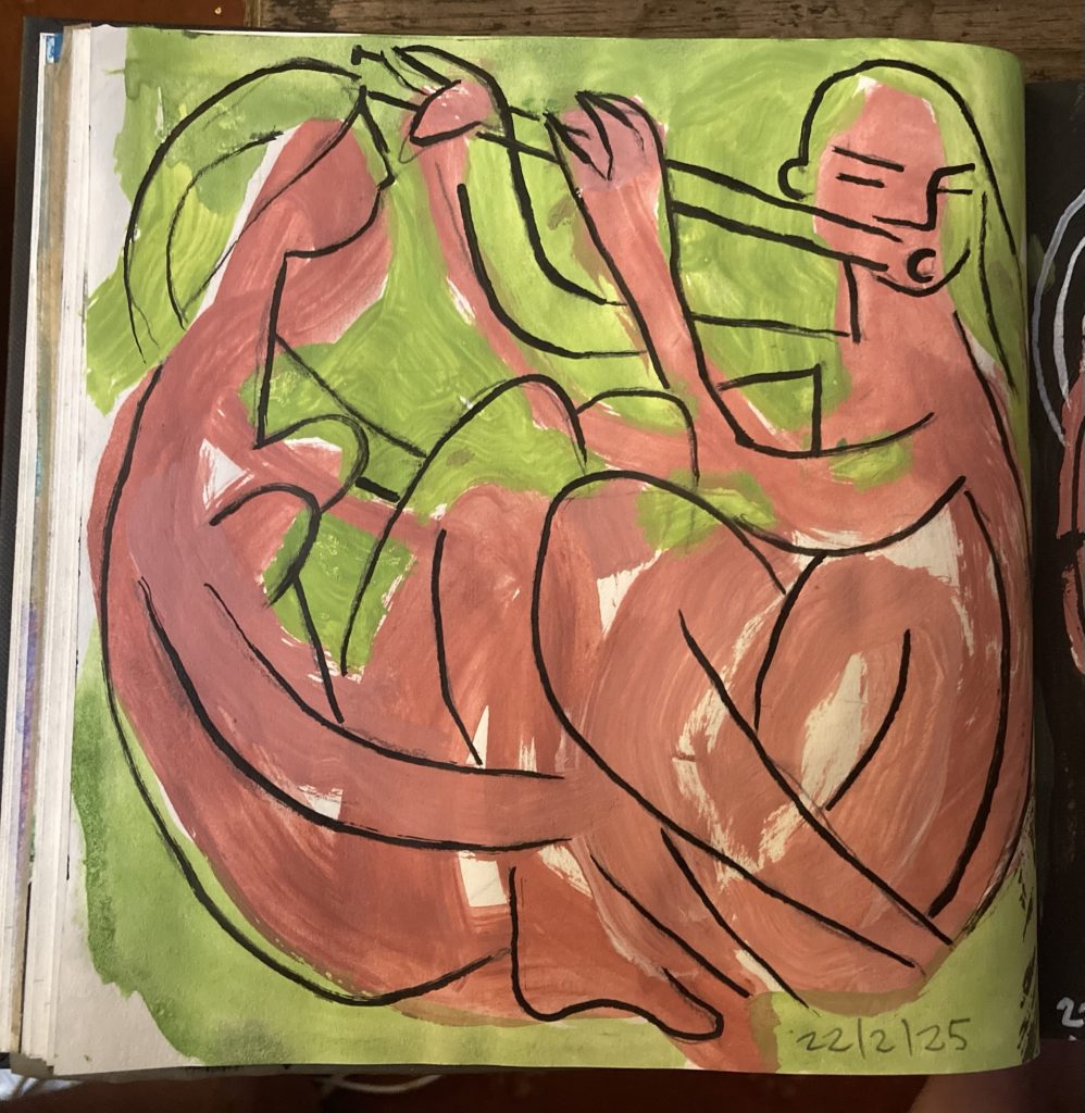
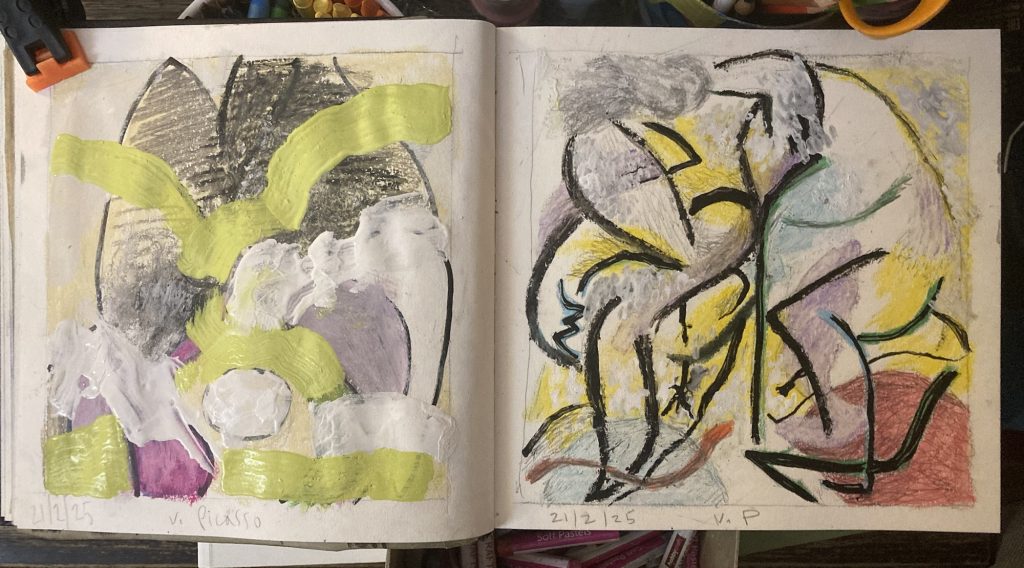
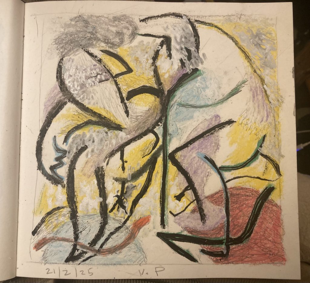
Ok, so I did a bit more to the darker ‘night’ version. And here are the two I like best, so far:

I can’t quite believe how well these two have turned out. Maybe I can combine elements of both in a single larger painting/artwork, for Dan?
I still want to do some more variations. Tonight, if poss’. I wonder how many I’ll have ready to show Dan and Amy, when we visit them tomorrow?
A BIT LATER…

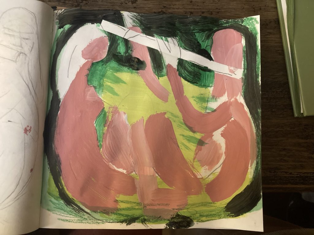
Managed a couple more before sacking out. These are rather simpler. Bold daubs of colour, and more minimal line work.
Of this last pair, I think I prefer the bottom of the two. The one above it is poss’ a bit too simple/minimal.
AND FINALLY…
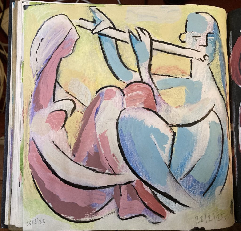
In bed, I finally got around to trying a subtler more pastel-hued version. This one hasn’t come out so well. In my opinion. It’s the final one. At least for today. Giving me six variants in all.
ART: Pic For Dan & Amy, Pt. III
I kind of want to stop at this point. I feel I’ve achieved what I was going for. I’d like to try some other variations; e.g. a more pale pastel-hued version, possibly going for lighter line work.
One of the things I love about making art in this vein, is the combination of chance and control, chaos and design.
Inevitably things happen – or at least they do with me – that are unintended. Indeed, the methods I use are intended to induce the unintended.
Or perhaps that should be unforeseen? However one expresses it, I can always fall back on the Bob Ross’ formula: no mistakes, just happy accidents!
ART: Pic For Dan & Amy, Pt. II
Here’s a gallery of my current WIP, a design for a painting for Dan & Amy. I might well do several other versions. Poss’ explore different colour schemes, etc. We shall see!


That’s it for today. Time to turn in. Hope I sleep better tonight. Last night wasn’t fun. Woke about 2:30 am. Ended up getting up/dressed, and sitting downstairs, reading, etc.
ART: Hmmm!?
More Picasso mining… It’s funny how sometimes stuff just falls into place. And other times? Well, these two feel like ‘other times’.
I’ve felt pretty happy with almost all the recent artworks, up till these, today. I s’pose you can’t win ‘em all? And it’s okay to just plug away, sometimes.
Besides? These are studies, and works in progress. They might come good…
Having said that, the right hand one is pretty much done, I reckon?
Well, whatever… as folk say these days. They is what they am. And I’ll leave them as they is, for now. Mayhap I’ll grow to like ‘em? Or else I might work further on ‘em?
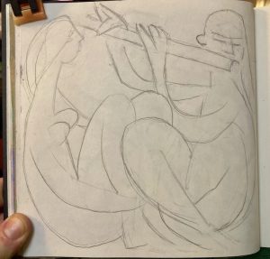
ART: Picasso… & Pic For Dan & Amy, Pt. I
I thought I’d take a Picasso book with me to our pub brunch. So I took this smaller more portable one, above.
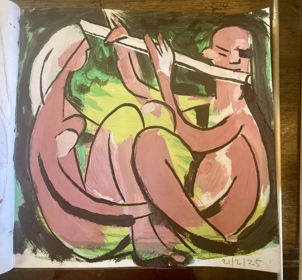
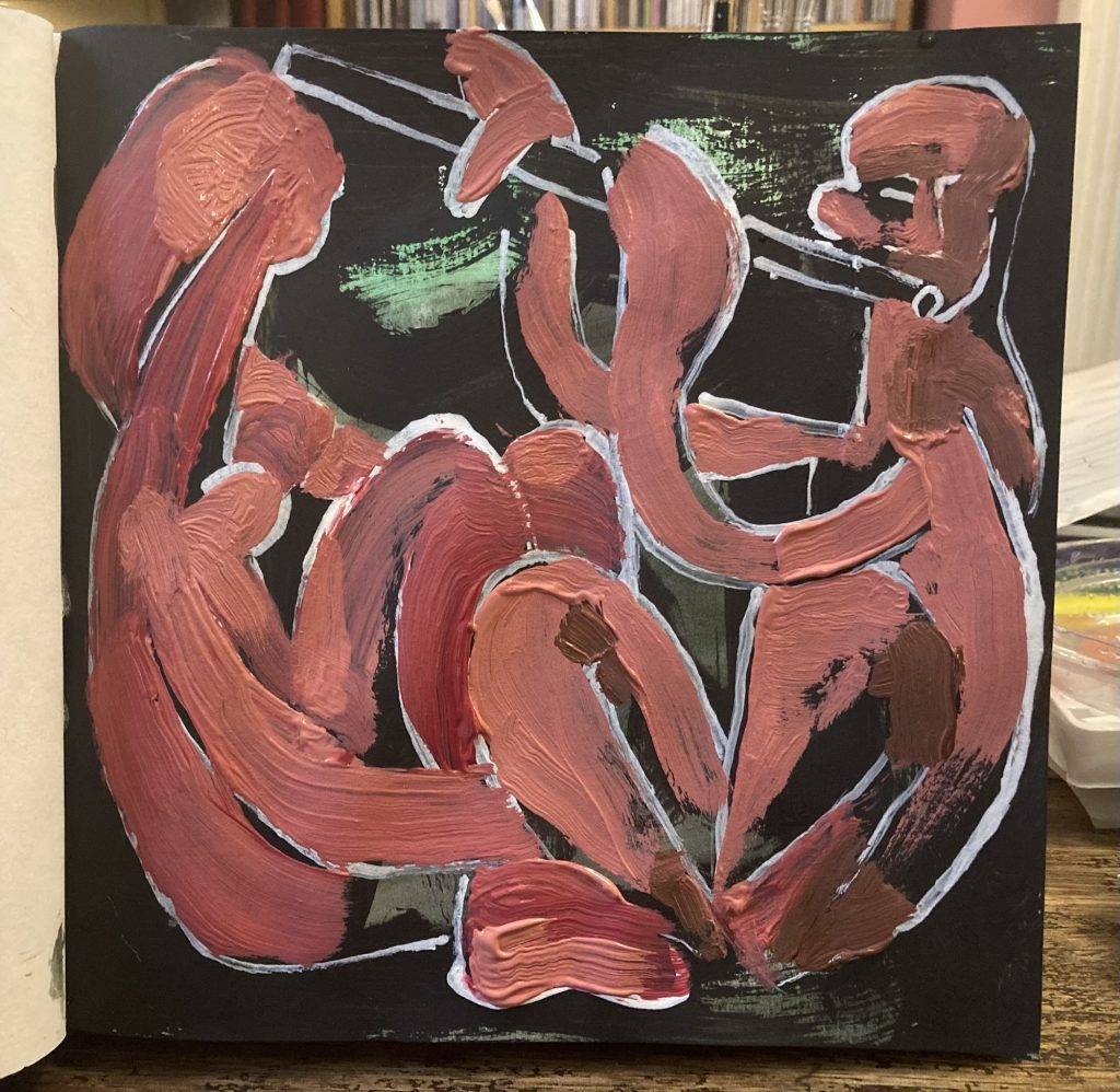
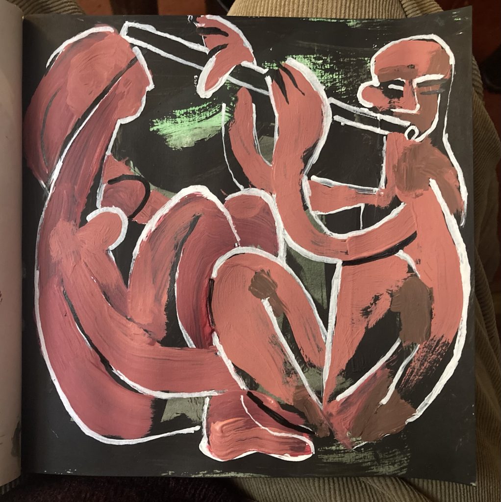
A conversation this morning, with my ol’ buddy, Dan Ellis, got me thinking I’d like to make him a piece of art. And gift it to him/them. I only hope I can do something they might actually like!
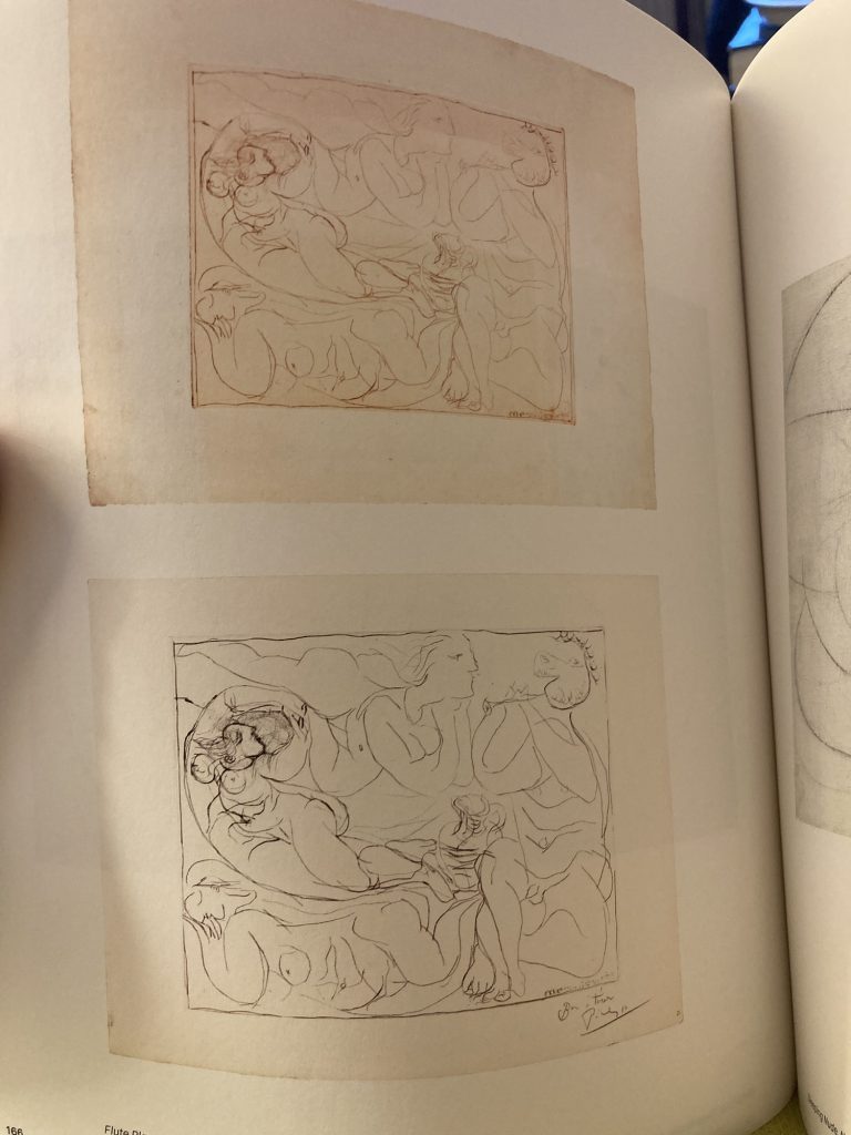

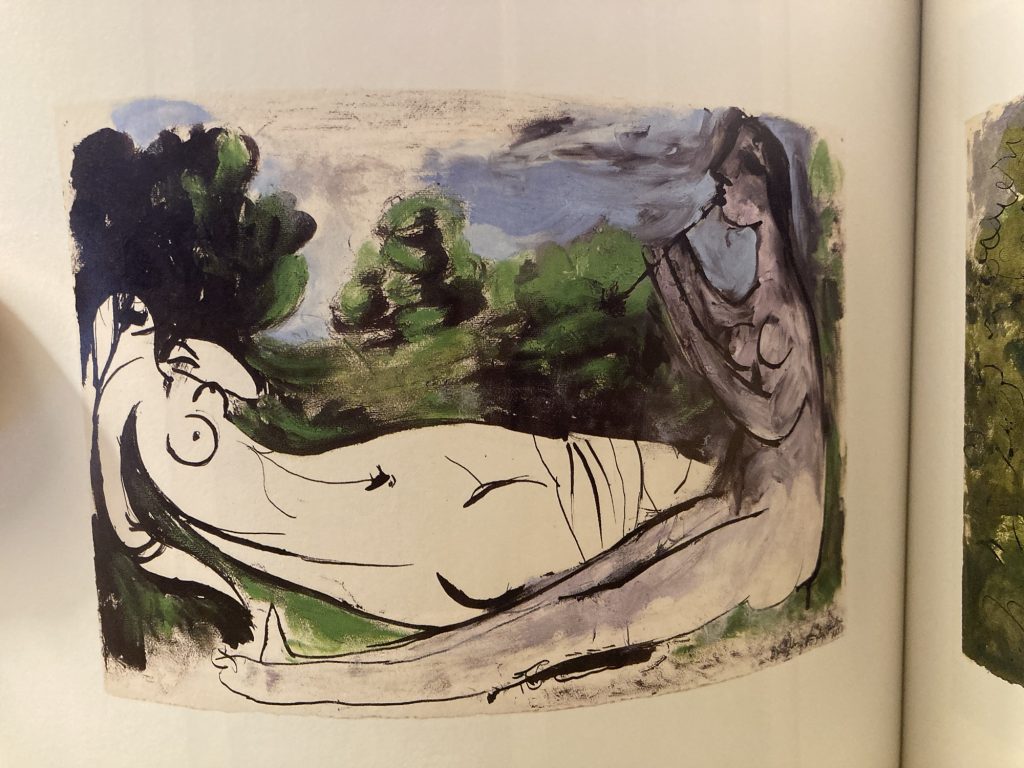
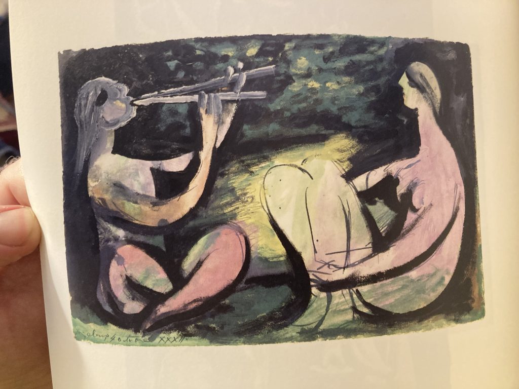
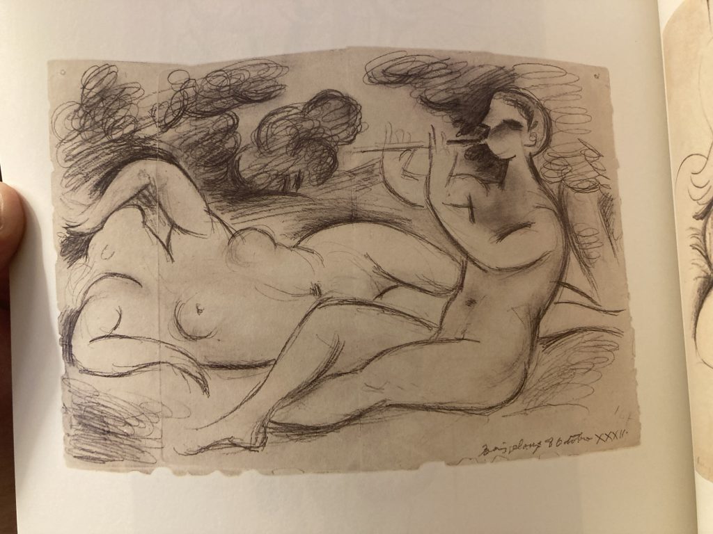
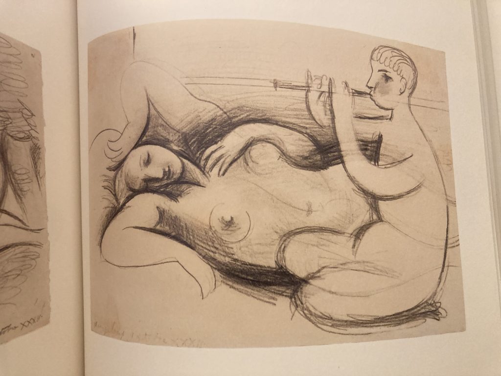
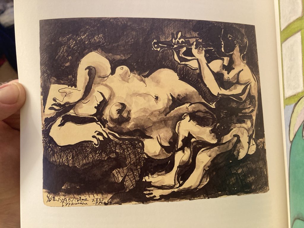
We gifted him/them a Japanese print, a while back. I’d wanted it to be a flute player. But I couldn’t find one! I’d like to a flautist avec his lady. And the above gallery is some kind of seam of inspiration for me.
Picasso’s prolific energy, the diverse range of his output… its staggering. Literally, to me at any rate, awe-inspiring.
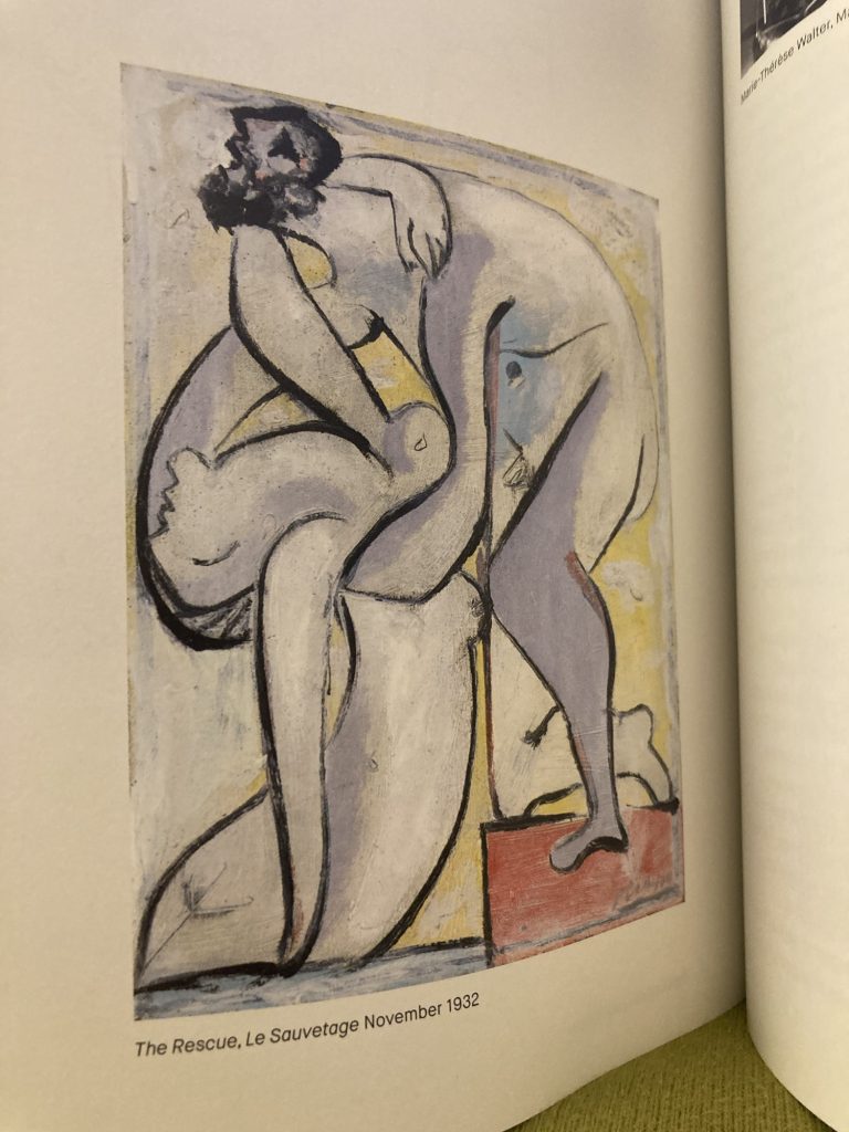
I include the above more for colours, and vibes, as opposed to subject or literal structural design. And I include the painting below simply because I utterly adore it.
Anyway, I hope Picasso will help me channel some artistic vibes, and come up with something Dan (& Amy) might like enough to put up on their walls…
So, to battle…
LATER…

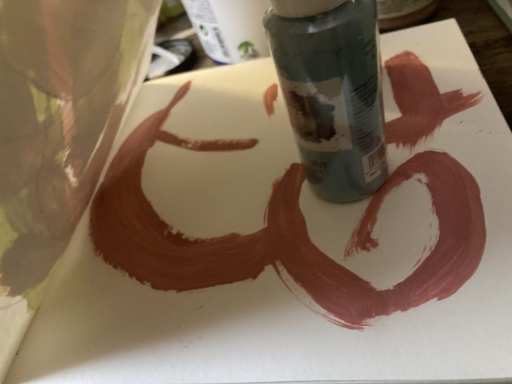
So, I’ve done a first sketch, of flautist and lady. I’ll now try working several versions up, in a variety of ways. I want warm but subtle colours, combined with bold simple lines. Let’s see what I can do…
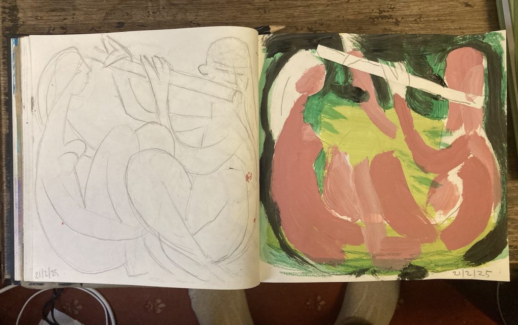
Well, it’s the end of the day. Time for beddy-bye-bumpkins! And I’ve made some progress on the mooted Dan & Amy artwork. I’ve got a line drawing I’m happy with. And I’ve even started in on a colour version.