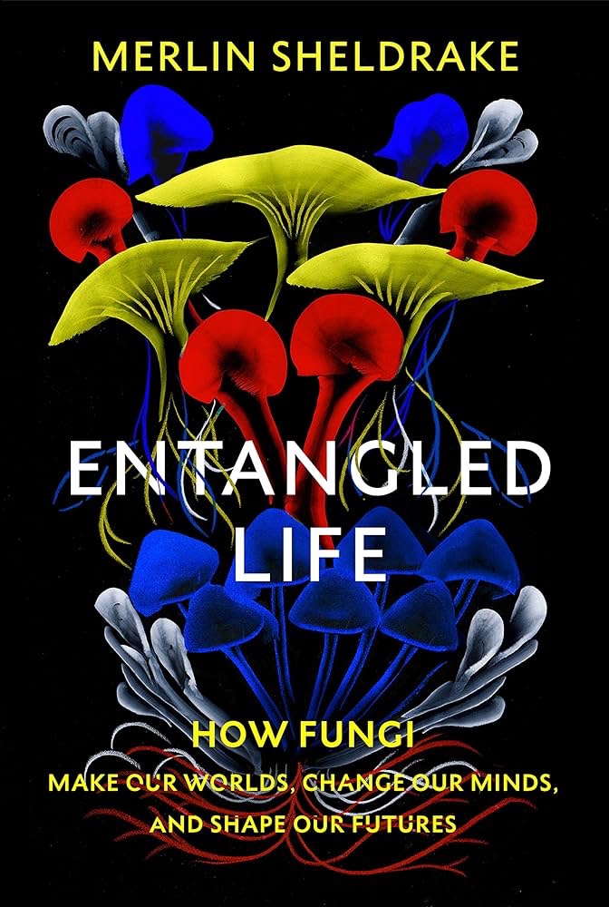
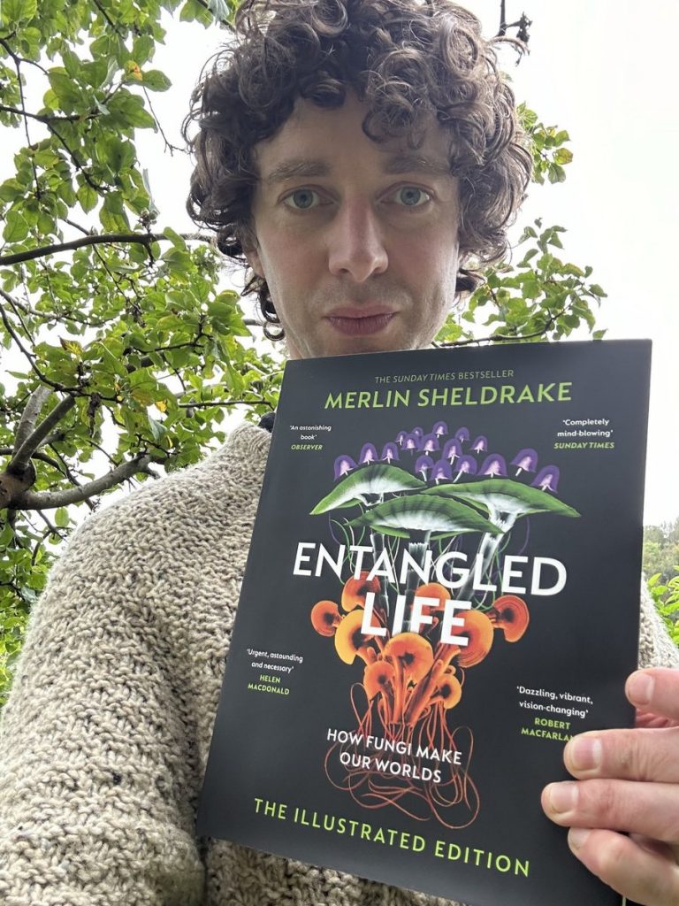
ART: Marine Art of the Van de Veldes

At the time of first posting this, it’s really just an image dump. I’ve discovered that I really love the two Willem Van de Veldes – father and son – especially, perhaps, the Younger.

I hope to collect a gallery here, of as many of their works as I can. As both reference and inspiration. And then at some point I’ll start adding the pertinent info: attribution, title, year, and maybe even sources (for my images).

I’d like to make some copies of some of these paintings, in the fullness of time. I don’t see that happening all that soon, for various reasons. But hopefully it will eventually come to pass!

Willem Van de Velde, the Younger.
Willem Van de Velde, the Elder.

ART: Naval Marine Painting

After our recent trip to the National Maritime Museum and Queen’s House, both parts of the Royal Museums Greenwich, I have a consuming passion for naval maritime painting.

I recently ordered a very cheap copy of The Art of the Van de Veldes, which arrived yesterday. I have to admit to being somewhat disappointed in this. It’s actually pretty decent, for what it is. But it’s far from what I really wanted.

Looks handsome enough, doesn’t it?

This latest addition to my portfolio of interests has been brewing up a while now. I’ve had some great books from Pen & Sword, via some of their maritime imprints, such as Glasgow Museums, The Ship Models, and Warships of the Napoleonic Era, by Robert Gardiner (my review of the latter can be read here). Plus I had already acquired Naval Warfare in the Age of Sail, by Bernard Ireland, and one or two other titles in this line.

A beautiful book full of amazing models.

The issue, and it’s actually a very common one, especially with slightly older art books, is that there are only a very few colour images (and these are neither big nor very high quality), the bulk of the images being black and white.

As is so often the case, in this deeply capitalist society of ours, what I really want proves to be unaffordably expensive! This looks much more like what I’m after:

That said, and given the money folk are asking (mostly around the £300+ mark!) I’d want to be 100% sure these actually have lots of juicy high quality full-colour reproductions! And from what little info’ on them I’ve garnered online, I’m not sure that they do!

CLOTHES: Summerisle T-Shirt

I want one of these T-shirts! I saw a guy wearing one, or something very like, at Salute, a couple of weekends back.

There are many Wicker Man T-shirts out there. But this is easily my favourite, thanks to this fab’ sun!

Most of the alternatives are not to my taste at all. Having said that, I don’t mind this one:

CRAFTY BiZ: Pacey Hassan Model

A Covid-19 era project.

I made a cardboard sports car model during lockdown, pictured above. Just a bit of simple primitive fun. It wasn’t even a real car. Just a kind of amalgamated mix of classic sports car shapes/looks.

My dad recently bought me this book, which was nice (thanks, Pops!):

My reference. Ta, Pa!

I wanted this book because I have fond memories of dad or I (or both of us!) making a card sports car of this type, from a crafting book, when I was a wee bairn. I thought it’d be nice to use it as ref’ for an adult revisitation of this kind of childish fun.

The car I’m going to model my model on!

So that’s what I’m doing, whilst watching the Selby vs. Brecel final, on TV. I’ve selected a car I’ve never heard of before. The Pacey Hassan. And I’ve started working up ‘profiles’ (if that’s what you call ‘em?) to use in scaling up or down the overall shape.

Sketching profile shapes. Rather as with aero-modelling.

I’ll probably transfer these sketches to my iMac. And then tidy them up a bit. For accuracies sake. I’m not being super anal about this. I’m going to keep it all basic and sketchy. We’re not aiming at a perfect replica. Just using this particular Bentley variant as an inspiration.

MUSiC: Fearless Flyers, Live in Amsterdam

Wow! Brilliant.

With guest spots from Louis Cole and Candy Dulfer, and covers by The Dan and Stevie Wonder (Reeling In Years and Signed, Sealed, Delivered), this is a fabulous film of the Fearless Flyers in all their awesomely funky finery.

At just shy of an hour and a half, that’s quite a set. Esp’ considering it’s almost all instrumental – only Louis Cole’s viral original Bank Account having vocals – and the short form of most FF tunes as previously released via YouTube.

It’s such a wonderful distillation of music as pure joy. And it’s quite surprising and refreshing to realise that, despite the almost laser sharp focus on stripped down instrumental funkiness, it’s actually musically quite diverse.

From classic blooz to elements of heavy rock, psychedelia, and even garage psych (Running Man), the genre-splicing keeps the whole set fresh, despite almost no vocals, and the groove taking precedence over showboating or solos.

That said, all concerned are fabulous musicians. And each gets a turn or three in the spotlight. Unlike on quite a few of the FF YouTube tracks, there are no horns at all, except when Candy Dulfer guests, playing alto on Hero Town.

Cory Wong is the current undisputed King of ‘chicken scratch’. Mark Lettieri shines on baritone guitar, and brings both the rawk and some virtuoso fire. Joe Dart, well, we all know about the love he earns for his low register mastery (and Olympic neck-work!). And Nate Smith shows just how goddam fierce and funky a drummer can be with just kick, snare, and sock-cymbal (and some incredible hand percussion).

Both Louis Cole and Smith get solo drum spots. It’s really interesting – perhaps especially to a fellow drummer like me – to hear how much musical character each displays. Playing around with some similar ideas, on similar set ups, yet sounding so individual. Wonderful!

Have these guys (n’ gal[s]) been to these Benighted Isles? If so, how did I miss it? And if not… please come and shower us in funky goodness. Lord knows the UK needs some mojo right now!

SNOOKER: Selby’s Historic 147

I’m a big fan of Mark Selby. So it was extremely gratifying to watch him make the first ever maximum break in a Crucible final yesterday.

Cool as the proverbial cucumber, and despite trailing to his adversary, Luca Brecel, Selby negotiated the break with the quiet steady aplomb that is one his (several) trademark qualities.

Was that MC and überfan Rob Walker, shouting ‘get in’ when Mark potted the final and tricky last red, along the cushion, to keep the break going? It certainly sounded like him.

It was lovely to see Brecel and referee Brendan Moore hugging the jubilant Selby, afterwards. This particular 147 was a first on several fronts: the first in a Crucible final; at Brecel’s first time past the first round. And it’s ref’ Moore’s last Crucible final, making a hat-trick. A nice way to bow out!

Only Kyren Wilson might be unhappy about it, as he also scored a maximum, earlier in this Championship, and will now have to share the prize money with Selby.

MEDiA: Not Again!? Gurt Spectations, on’t Beeb

Jeezuz wept/slept… again, already!?

This is the sixth time the BBC will have serialised Great Expectations for TV. Six times!?* Talk about flogging a dead horse. Having read the book and seen several film and TV adaptations, I have absolutely no desire whatsoever to watch another re-tread.

This reminds me of a post I did about the over-veneration of the familiar idols, be it the Mona Lisa or The Beatles. It shows a lamentable poverty of imagination and ambition, and it narrows the range of culture that’s being made broadly available.

Indeed, it’s highly symptomatic of the malaise that grips our mainstream culture nowadays. With the Tory party staging a gradual takeover of the BBC, prior to doing away with it altogether (or reducing it, as they’ve been doing with the NHS for decades, to a ‘brand’ to be chopped up and sold off), it’s the result of having bean-counters inserted at every level.

Great Expectations is, like most of Dickens work, a pretty darn good yarn. But is it so good we should remake it every decade? Every time the BBC (or anyone else for that matter) spends millions re-making it, that’s millions not going on something different. Perhaps something more obscure and/or interesting.

As far as I’m concerned it’s a natural outcome of bottom-line capitalist economics. Something’s already popular? Great, let’s keep milking it and flogging it. If our art, literature and music, etc, form a culture that could be a richly diverse orchard, this modern consumer capitalist way has the effect of replacing all of that potential diversity with a bland mono-culture cash-crop.

This latest re-boot is by Steven Knight, whose most recent successes are Peaky Blinders and Taboo. Neither of which interest me remotely. In fact Peaky Blinders (which got Knight a CBE) annoys me, as I like ‘newsboy’ flat-caps ‘cause of Tom Waits, not Cillian Murphy and co.

Teresa watched some of Taboo. I tried. But couldn’t hack it. So much modern media culture – Peaky Blinders and Taboo both fall foul of this – partake of a shallow yawn-inducing pseudo-Goth graphic-novel style vision of masculinity and criminal culture, in a way that signposts the UK following the US into a MAGA/hillbilly hell of deluded machismo, tattoos and poor sartorial choices.

Even if this were to be the best ever reinterpretation of Gurt Spectorations, I wouldn’t be up for it. It’s already been done to death. And a cursory glance, as Teresa watched it, reveals any such hope to be massively unlikely (the visual design and colour palette show it to be very much a product of our times, and as far from original as one could imagine).

Defenders of it might say, well, it’s not aimed at you. Fine. Understood. But I’m entitled to my view. And I still massively resent that the BBC, an institution I cherish, should be, like all ‘commons’, under attack by the philistines of Toryland.

The BBC ought to be boldly expanding the reach of our media culture, educating, enlightening and inspiring. Not just spewing out the same old same old, just because the bean counters, whose minds are as straitjacketed as their suits, think it might sell.

* In 1959, 1967, 1981, 1999, 2011, and yet again now. That’s nearly every decade! Only the ‘70s and the ‘00s escaped!

SNOOKER: Brecel vs. Si, Semi-Final, World Champs, ‘23.

Young guns, go for it.

Wow! That was a stunner, no mistake!

First 20 year old Chinese newcomer Si Jiahui blasted the odds-on favourite for this match, Belgium’s Luca Brecel (himself only 28), off the baize, streaking to a commanding 14-5 lead.

Si initially breezed into the lead.

But Luca came back at him, swinging, taking 11 consecutive frames! The match, initially a best of 33, lurched wildly, in terms of dominance. And at 14-14 became a best of five. But Luca’s winning streak kept going. Astonishing!

It looked, at 16-14, like Si had finally crumpled, perhaps belatedly realising how unlikely his run to this point had been. For a spell his mojo had clearly left him. But in frame 31 he finally got back in the saddle, winning it to zero.

Si dominated the first half.

But by that point Luca only needed one more frame. And he duly took it, winning the 32nd frame and the match. The contrast ‘twixt this’n, and the Selby vs. Allen match was, or rather is, chalk n’ cheese!

It’ll be interesting to see who makes it through to the final from the latter. Will Brecel face Selby, or Allen? should be interesting either way. But what a match this Brecel vs. Si game proved to be. Unquestionably a Crucible classic.

Brecel dominated the second half.

Commentators and snooker deities Dennis Taylor and Stephen Hendry were clearly loving it as much as us mere mortal viewers, Taylor highlighting that Brecel’s fight back marks the biggest comeback in Crucible history. The crowd quite rightly gave the two gladiators a well deserved standing ovation.

What it meant to Luca!

CRAFTS: Popeye Shrinking

Before shrinking.

I r thing I’ve learned going this is that the simpler the shape the better and more uniform the shrinkage.

Large complex shapes, with thin sections and appendages, tend to get very warped and misshapen. And in this instance, there are cracks as well.

After shrinking.

Bummer!

I also left some ‘connecting tissue’, which looks a bit shite after shrinkage. If I do any more of this – and it is great fun! – I’ll keep the shapes much much much simpler.

FAMiLY & FUN: Crafty Stuff

The gals get weaving.

I made some very primitive weaving looms for the girls. Four A5 pieces of hardboard, with 18 holes drilled in a straight line at each end. One each for Teresa, Hannah, Ali and Sofi.

Ali and Sofi showed me this pretty cool ‘keychain’ stuff they have. You make a picture, on this plastic sheet, using acrylic paint pens. This is then cut out and heated in the oven at 150° C for a couple of minutes, which causes it to shrink (and thicken up).

Here’s a little rainbow heart ear-ring Sofi made:

And here’s one I made, Penfold, from Danger Mouse:

The ‘keychain’ started out the same size as the sketch!
I need to varnish the acrylic layer.

I’d quite like to make a Popeye!

I yam wodeye yam!

The plastic side of these doodads is probably the display side. But I prefer the ‘back-side’! Can you see why?

The shiny plastic side. A bit distorted.

We also had homemade pizza. Which was lovely! We’re stopping over the night. I’m doing a shift for Amazon Flex tomorrow, out of Cambourne.