I’m following Kurt Vonnegut’s advice, as per my previous post, and writing a poem. Here it is:
Classroom Crush
She’s a beauty And no mistake Long brown hair A fine filly With a luxuriant mane Just enough jewellery To suggest sophisticated decadence Sat with her peach of a derrière On the edge of her desk.
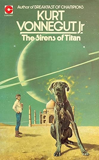
A green velvet jacket A colourful batik silk scarf Enchanting hazel eyes A voice that’s refined Commanding obedience Oh so willingly given Long elegant fingers Rest on a copy Of Sirens of Titan.
Oh, Mrs Martin Your Mona Lisa smile Always baffled and beguiled I wonder how many Boys hearts you quickened Or maybe broke? Sat in the ranks Of hideous brown plastic chairs I secretly loved you.
I have to thank a secondary school English teacher (Mrs Martin?), for introducing me to Kurt Vonnegut. Truth be told it was her sex appeal – a bright and beautiful young woman, with a fascinating looking book – as much as the literary appeal that first took me. Ah, Mrs Martin, where are you now?
The edition Mrs Martin had.
Well, today, on FB, he was quoted by one of those weirdly intrusive ‘you might like this’ meme-things. I reproduce the quote below, keeping the bit about homosexuality that they omitted:
‘If you want to really hurt you parents, and you don’t have the nerve to be gay, the least you can do is go into the arts. I’m not kidding. The arts are not a way to make a living. They are a very human way of making life more bearable. Practicing an art, no matter how well or badly, is a way to make your soul grow, for heaven’s sake. Sing in the shower. Dance to the radio. Tell stories. Write a poem to a friend, even a lousy poem. Do it as well as you possibly can. You will get an enormous reward. You will have created something.’
According to online sources this quote comes from Man Without A Country. I must get/read that!
I recently read something on radio DJ Ken Bruce going from the BBC to Hits Radio. The ‘key note’, or take-away (eugh!) point was money. Bruce is just the biggest shiniest cog in the wheel of what is essentially a money-making machine, built on advertising and listener spending.
At one point the article says words to the effect of ‘the main purpose of such radio stations is to generate money through advertising’, or something similar. Well, yes. That’s so transparently obvious. It’s part of what makes so much ‘mainstream culture’ so utterly shite, and lacking in, um, well… culture.
As a model for how to live ‘the good life‘, such a state of affairs sums up, for me, the malaise of ‘advanced capitalism’. It has no soul. Indeed, if it has any spirit it’s the avaricious spirit of piracy. In such a society, or rather ‘marketplace’, culture is just an arbitrary interchangeable ‘token’, to be used to extract more cash.
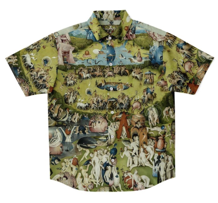
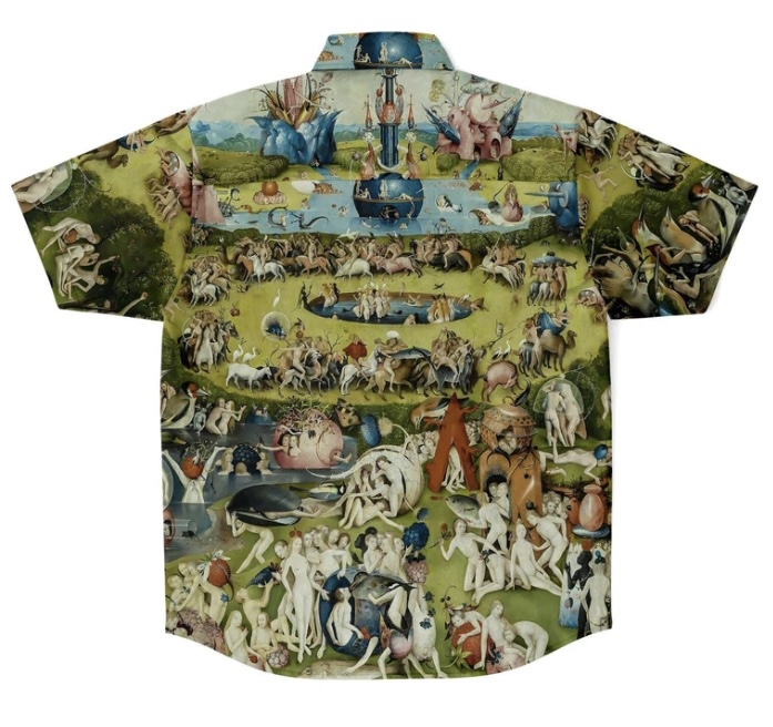
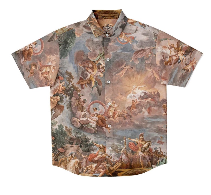
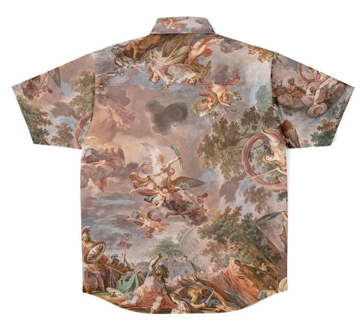
Not sure who the artist is here…… but I do love the shirt.
With such cheery thoughts in mind, the constant assault of advertising via social media (and elsewhere) takes on a darker more forbidding aspect. And yet, despite my loathing and aversion, I’m often suckered. For example, the artsy shirts pictured in this post, which appeared in my FB feed, are very tempting.
There are many more designs than the two I’ve shown here. Some modern (Kandinsky), some older (Caravaggio). Some I like, some I don’t. But just take a look at some of the other stuff that comes up via Facebook:
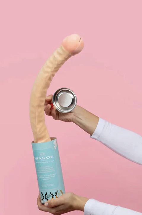
The ‘ISAKOK Penis Prank’!
Want a bigger willy? Very few men don’t wish they had a bigger cock. Howzabout 2’6”? Maybe the ISAKOK Penis Prank is for you? Or perhaps you don’t have enough hands/digits to tell everyone to fuck right off simultaneously? No problem. There’s the Fucktopussy!
The ‘Fucktopussy… I kid you not! Fo’ real!
Walk through a busy British town centre nowadays, and you’ll be hard pressed to find any free amenities. But you’ll be relentlessly assaulted by messages urging you to purchase tat you really don’t need. That’s the sort of ‘choice’ delivered by Thatcherite Toryism.
Probably like most of those of us whom Western Civilisation has turned into social media approval junkies, I’d prefer to be using my blog (and other ‘social media’) to showcase what an interesting and successful person I am.
Sadly, at present, it’s operating more as a journal/confessional, in which I can let off some of the pressure that comes with the introvert’s tendency to internalise suffering.
As things currently stand, I’m unable to communicate directly with my mother. We had a bit of an emotional scene last week. It could’ve been a breakthrough, or it might’ve just been a breakdown? And since that time I simply can’t take any more of what’s gone before.
So, not knowing who to turn to in such a situation (I have shared this with my dear sister, Hannah*), I’m posting this:
Mum seems of incapable of offering help without at the same time attacking/slighting or otherwise belittling me. I’m not sure she’s even aware she’s constantly doing it.
I can’t take it any more.
I’ve got enough on my plate without having someone who I feel ought to be supportive whispering in my ear constantly ‘it’s all your own fault’.
It’s sapping me of the tiny reserves of energy I have left. Someone needs to have words with her, as it’s having a very powerfully negative effect on me.
* Which, of course, I feel bad about, as she has enough on her plate without me adding to it!
I’m not actually listening to this Lennon-penned Beatles number, except for strains of it that are playing in my mind. But the lyrics are particularly resonant for me right now.
When I wake up early in the morning
Lift my head, I'm still yawning
When I'm in the middle of a dream
Stay in bed, float up stream (float up stream)

Please, don't wake me
No, don't shake me
Leave me where I am
I'm only sleeping

Everybody seems to think I'm lazy
I don't mind, I think they're crazy
Runnin' everywhere at such a speed
'Til they find there's no need (there's no need)

Please, don't spoil my day
I'm miles away
And after all
I'm only sleeping

Keepin' an eye
on the world going by
my window
Takin' my time

Lyin' there
and staring at the ceiling
Waiting for
a sleepy feeling

Please, don't spoil my day
I'm miles away
And after all
I'm only sleeping

Keepin' an eye
on the world going by
my window
Takin' my time

When I wake up
early in the morning
Lift my head,
I'm still yawning

When I'm in
the middle of a dream
Stay in bed,
float up stream
   (float up stream)

Please, don't wake me
No, don't shake me
Leave me where I am
I'm only sleeping
Over the years I’ve thought a fair bit about why I often prefer sleep to wakefulness. On some levels it’s a rather worrying phenomenon. Basically I’d rather be unconscious than conscious.
And it ties in with the suicidal and/or self-destructive aspects of my nature, I guess. Death being ‘the big sleep’, n’ all that. Preferring oblivion to existence does seem rather bleak!
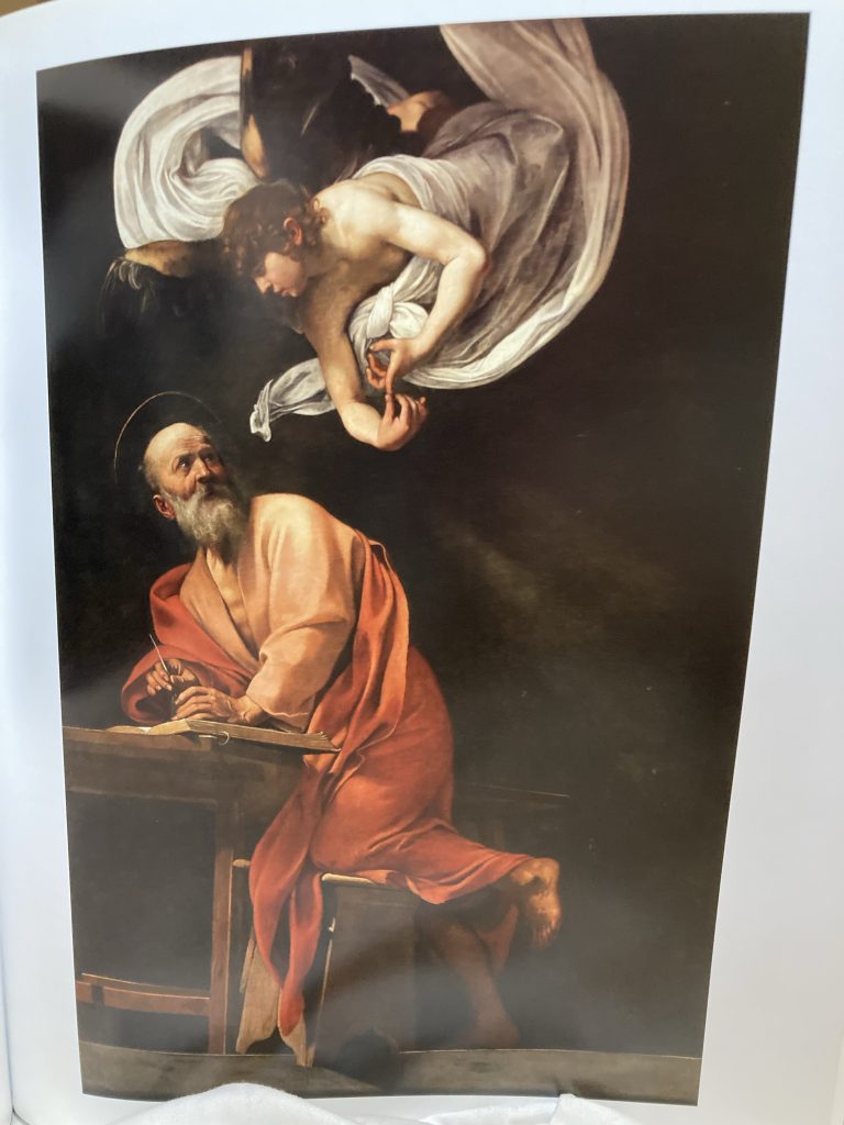
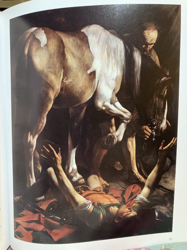
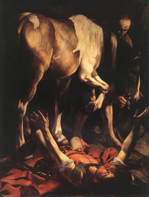
Mention of Caravaggio in a recent post set me to poring over a couple of art books we have on this incredible artist. I recently mentioned in another post having sketched a pencil version of The Conversion of St Paul years ago. But I’d like to try and paint it, as well.
But whilst perusing Gilles Lambert’s Taschen 25th title on Caravaggio just now, it was Saint Matthew and The Angel that really clocked me one upside the head. What an incredible composition! Flat and empty to the point of being almost frieze like. Yet rich with light, shade, colour and volume.
The rendering has the strength of sculpture. And yet is richly vibrantly colourfully alive. Caravaggio’s eye and aesthetic sensibility imbue his art with an intensity that I can only reach for poetically: chestnuts, leather, velvet, red wine, red meat, incense, lace or muslin, the scent of candle wax and smoke.
Incredibly dramatic!
In both St Matt and The Conversion the pictorial space, whilst rendered with surreal photo-realist clarity, remains so shallow as to be effectively flat. I love that! It’s simultaneously modern, and timeless. It lives in the present.
As many have said, including my hero, Picasso, the best art of any era is most potently alive in whatever ‘present’ the viewer sees it. Great art loosens the shackles of short-lived fads, or era-specific parochialism/opacity, and rises above time!
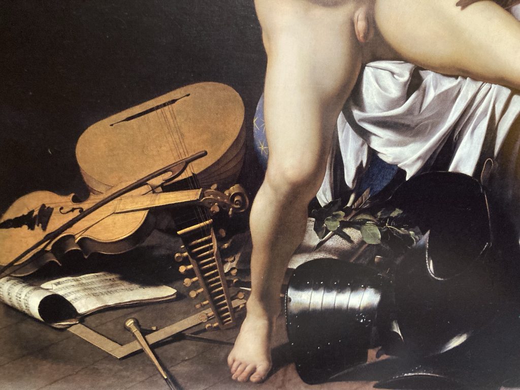
Details of Victorious Cupid, 1602.
Some of Caravaggio’s stuff looks, to my eyes, very blatantly homo-erotic. Check St Paul’s torso in the painter’s two versions of The Conversion. When the subjects are young male nudes of a childlike appearance, that can sit rather awkwardly with current social mores, and indeed laws.
Victorious Cupid is a bit icky, to me. I call it Cupid Scratching His Arse! But it’s still an amazing artwork. And just look at the detail in the lower part of the painting. The musical instruments, armour, and textiles, are like a somber symphony in paint!
Anyway, it’s great to be nourished by fabulous art. I am very grateful for the luxury of being able to indulge in such a hedonistic yet refined pursuit!
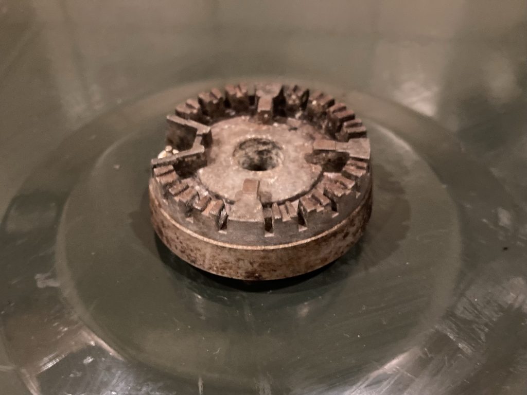
Oh, but when it rains, it doth pour, eh? Today our gas hob suddenly decided to start clicking constantly, which I suppose is a continual triggering of the ignition(s)?
Sometimes all four hobs were sparking continually, sometimes one or another. But the clicking was, more or less, constant, from around midday or lunchtime, till now (9pm)
Of course I first tried solving it myself. This has happened once before. On that occasion I switched off everything (electric and gas*), and cleaned all the hobs. Cleaning can involve liquids, and liquids can short the spark circuitry! But I got everything as dry as I could. And, lo! Everything worked just fine.
* Or so I thought! Turns out I only knew how to switch the gas off for the hobs. The fuse on the main fuse board only switches off the oven and grill, not the hobs! More on this shortly.
Did the same this time, albeit ultimately spending much, much, much more time cleaning, but no dice. No change whatsoever! Clicking and firing continued unabated. Every now and again it’d lessen or stop. Only to start all over again.
World’s most thrilling video… awesome!
Anyway, having gone back and forth, Googling the issue, and trying very hard to really clean out all the parts – the hobs comprise three components, plus the little (ceramic?) ignition ‘nipples’ – hoping it all might eventually dry out or summat, and stop firing, it was all to no avail.
I called a Gas Safe engineer at about 8.30pm. He arrived around 9.20pm. He determined we had no gas leaks. He also helped me identify the correct power socket for the hobs. I thought I’d done so. But apparently not. Whatever it was I’d found, it was the wrong power outlet!
Once the right power source had been identified, it became apparent that it did (the other lead/wall socket didn’t) have a switch. Mercifully, when this was flipped, the eternal and infernal clicking finally stopped.
I have strong memories of recently packing away another four-hob cooker top. I think with a view to eventually installing it in our mooted Hobbit Hole guest accommodation? I tried to locate that today. But failed! We have way too much stuff, and way too little storage, so most of our stuff is in a cluttered state of disarray.
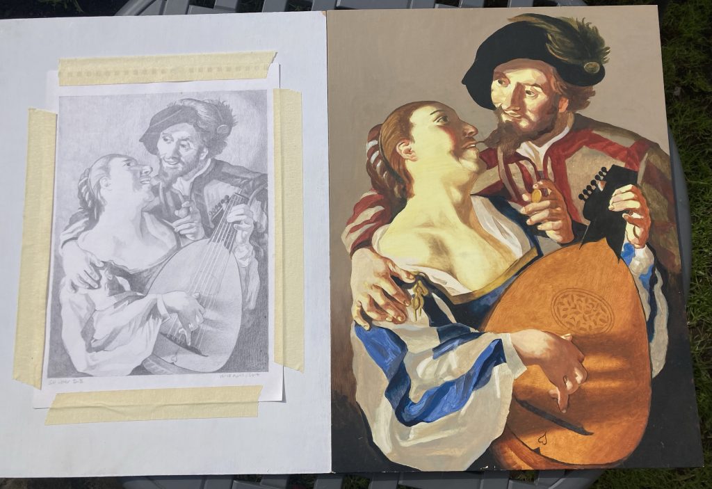
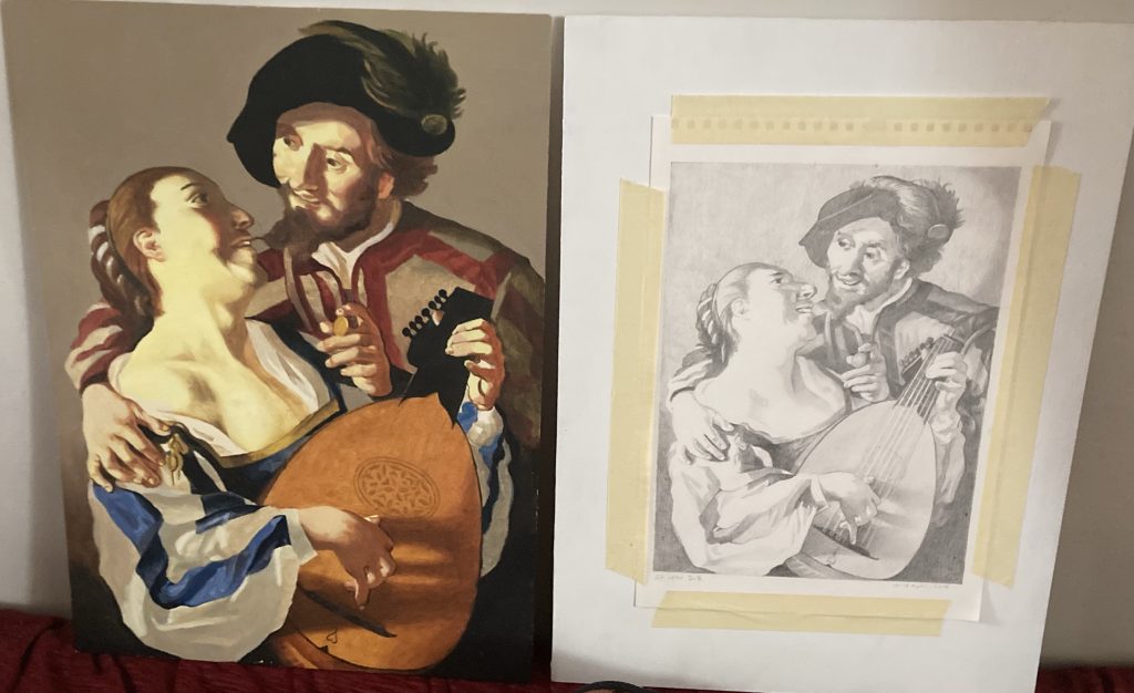
When I found these two art works recently, whilst putting yet more stuff into our attic, I brought them down, to have a fresh look at ‘em. And I’m pleased with how they look.
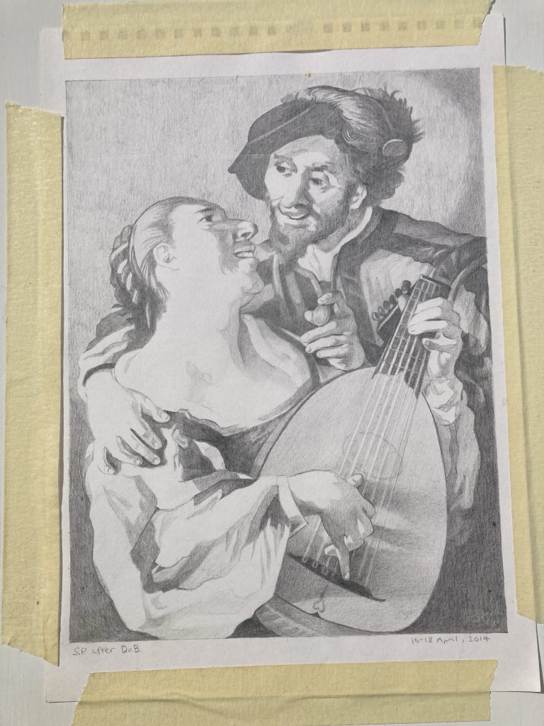
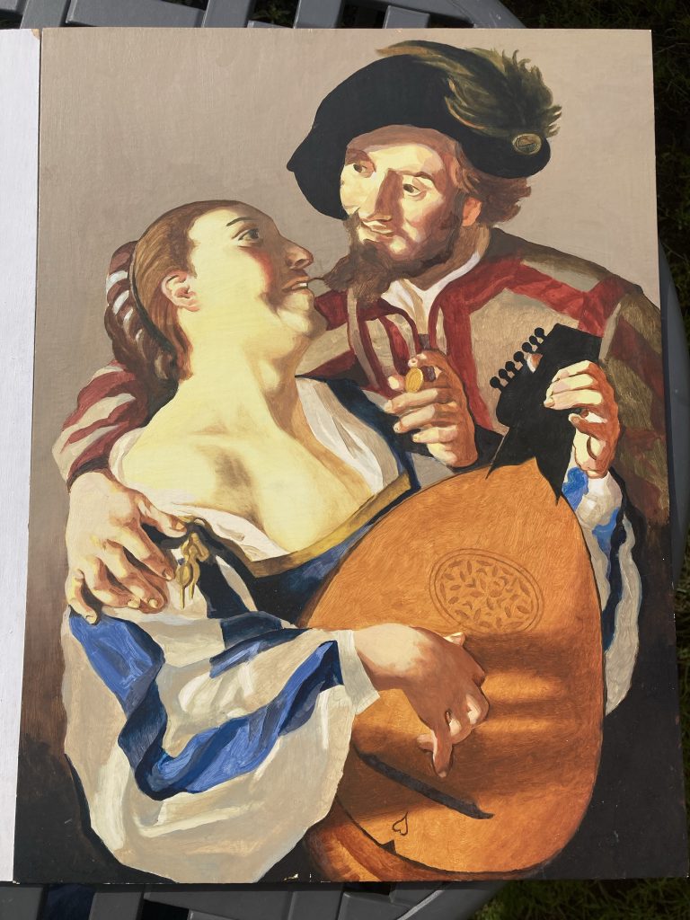
The pencil drawing was my first look at reproducing Dirck van Baburen’s The Procuress. I actually chose to leave the Procuress herself out of the picture, which also changed the overall format of the piece (from off square to a portrait type rectangle). Instead we have just the young dandy and his lute-plucking lady.
A terrific book! And the source of this project.
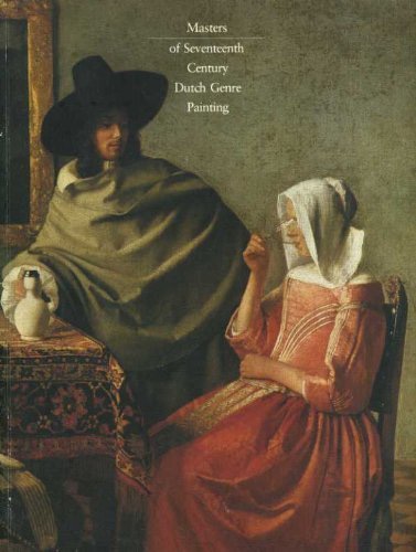
I found van Baburen’s The Procuress in this rather lovely book. It’s an old’un, but a good’un! My mum had a copy back when’s he did her degree. I think I’ve posted about this book here before? But I’ve not found that post, so can’t link to it yet!
16-18th, April, 2014.
Here they are individually, for a bit of a closer look. The pencil drawing is finished. But the oil stalled before completion. So I need to finish that off.
These two pieces are both for sale, should anyone want either. The pencil drawing for £89, and the oil painting for £239. That’s unframed. I can frame them as well, if required. Or a buyer could do it themselves.
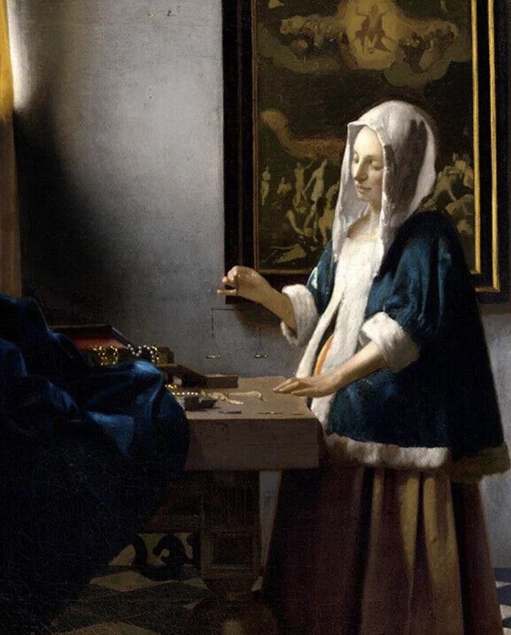
Woman Holding Scales, Vermeer, 1664.
I’m planning to do more in this line, as I enjoy it, and it teaches me a lot. I have a few favourite paintings I’ve long wanted to reproduce, such as Vermeer’s Woman Holding Balance, and Caravaggio’s very theatrical St Paul.
Caravaggio’s dramatic vision of St Paul.Together again. Indoors this time.
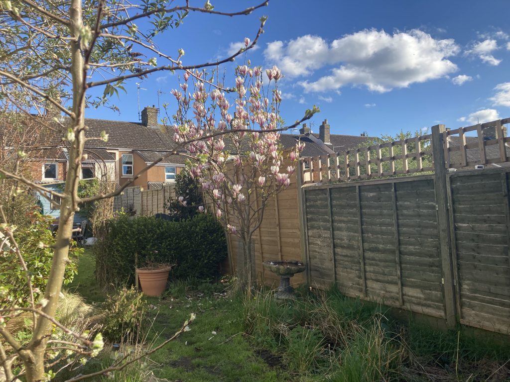
The first three pics of my efforts, further up this post, were taken outside in the sunshine. These last were shot indoors. But all the pics in this (and almost all my blog posts) are taken on my iPhone. So, hardly pro/ideal! But hopefully they get the idea across?
Phew! What a bonkers day. I had another meltdown today. Outright panick is starting to kick in, occasionally. Not good!
A brief break from home and ‘my shit’ seems a basic medical necessity to me, right now. But our one night away, that we’ve been looking for’ard to for a while (to join in the celebrations of Teresa’s cousin’s wedding), Monday/Tuesday next week, has – like all our other forlorn attempts at holidays in the last four-plus years – fallen through. This time due to not having a road legal car available.
Quite aside from the crap that’s at the root of recent depressions, meltdowns and whatnot, the trip away issues are enough right now to send me über the edge. But sadly communications with my mum have been less than ideal for some time. And, on occasion recently, have gotten worse.
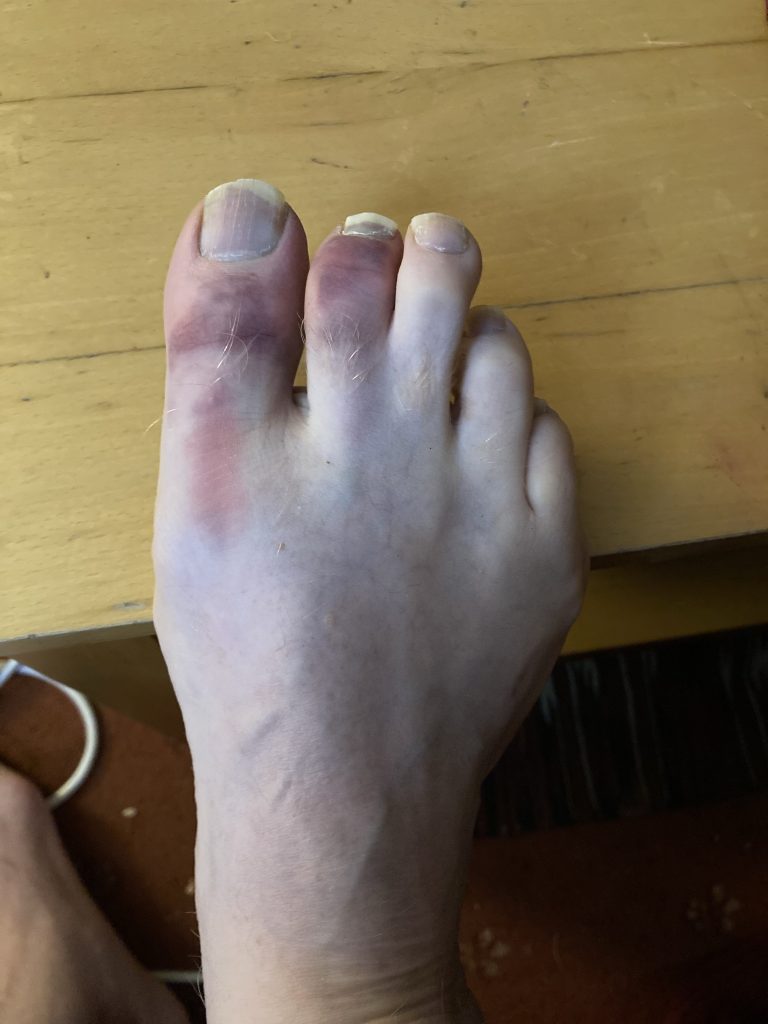
Ouch! Two very sore toes…
This last development, in a series of straws that have been conspiring to break this camel’s back, really knocked the stuffing out of me. And today that, and the failure to find a way to get to this wedding – plus everything else, frankly – just got to be too much.
So I had a bit of meltdown! Shouting, or rather screaming, as loud as I could, and hurling stuff around. Oh dear! In fact I’ve injured my right foot. Something I only realised much later, when having a bath: ‘Oh, right… that’s why my right foot has been feeling a bit odd all day!?’ I must’ve kicked something quite hard!
Perhaps my recent minor dalliance with Tears For Fears, via Scary Pockets sublime reworking of Everybody Wants A Gladstone Bag, has a deeper meaning for me? They were big into Papa Panov, or whatever his name was (Janov?), the Primal Scream dude. Hence Shout:
Well, having vented a bit, and despite all the shizzle not going away, Teresa and I got a fair amount done. We were originally due to be at Hannah’s today. Whilst we’ve loved and will miss looking after Ali and Sofi – Hannah starts a new job soon, with different hours – being at home this time was actually good from several perspectives, including the vantage point of just getting stuff done.
Utterly against my wishes, we’re preparing to let our spare room. Because needs must. It has functioned mostly as a dumping ground in recent years. Occasionally I’ve done some model-making type hobby stuff in there. But now we’re clearing it out, tarting it up. And, hopefully (!?)* we’ll be generating income with it soon.
* The irony here being that I really don’t to be sharing our home with strangers. But as already stated, needs must.
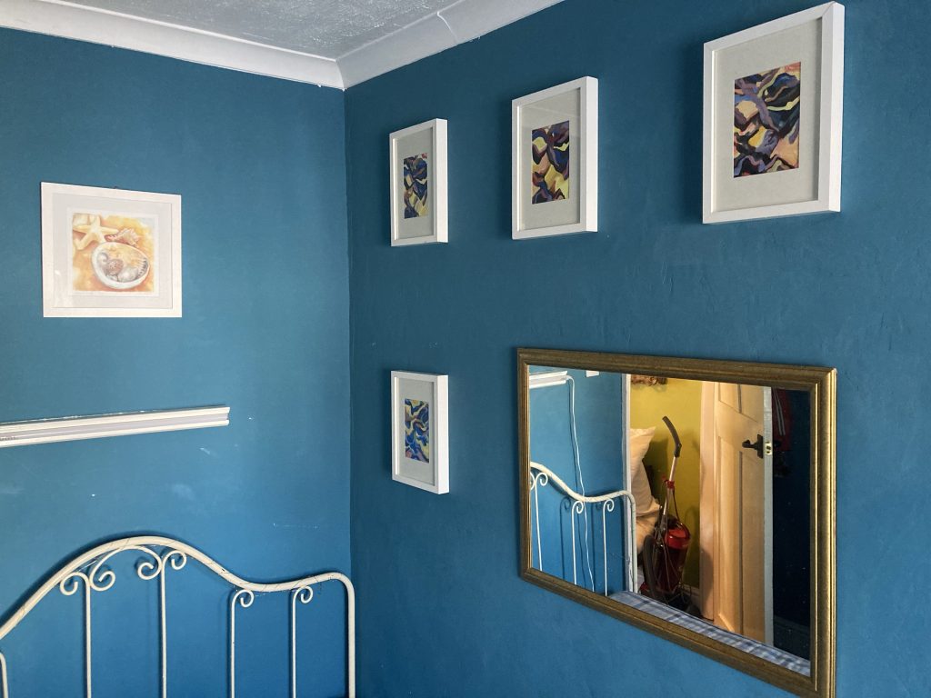
In order to blitz the guest or blue room clean – numerous previous attempts had failed! – I had to basically do a mega-dump (chortle!), out of it, and into any space nearby. Which meant dumping tons of stuff on the bed, in our bedroom. The blue room is still full of stuff that needs removing before we can think of letting it.
We put up some art, and a mirror.
Anyway, we got a lot of stuff out of the blue room, and a good deal of that either up in’t loft, or elsewhere. A fairly large chunk of art related gubbins is migrating towards the ‘new’ art-studio.
This latter is in fact the old shed/workshop. And it’s humongously cluttered, and in flux, as stuff is moved out, in turn, to the newer bigger workshop.
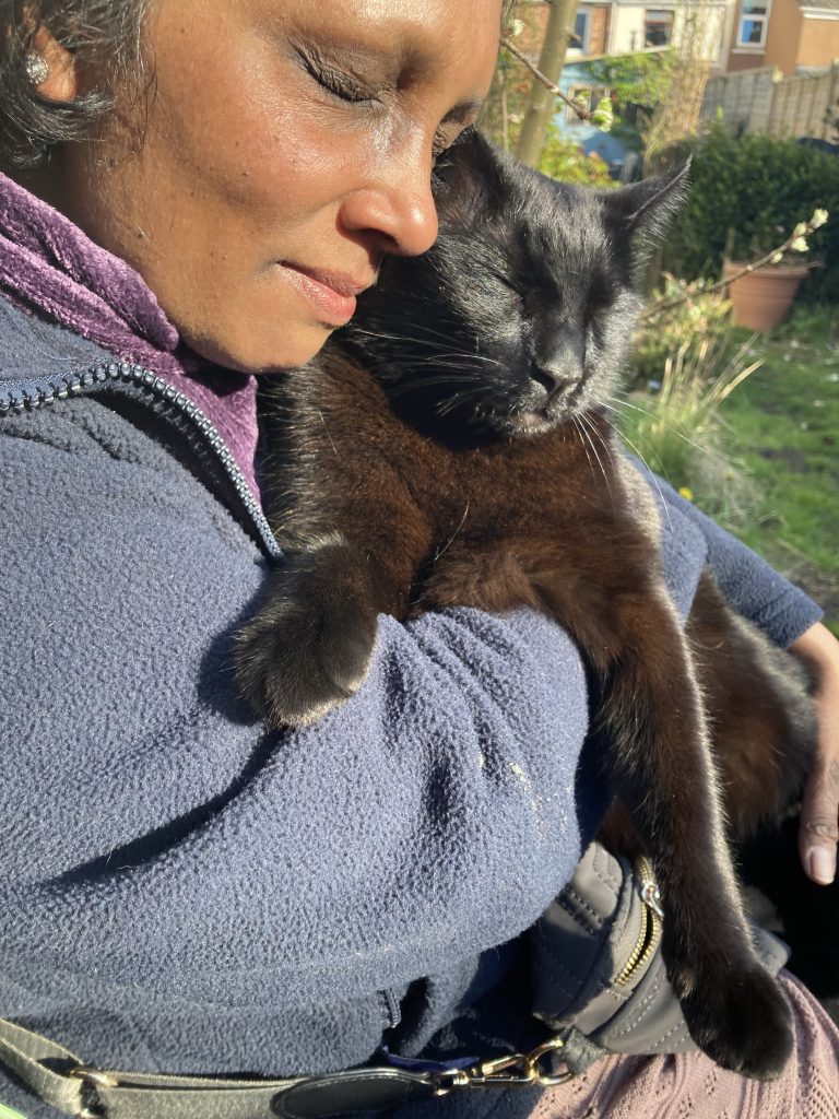
Teresa n’ Chester enjoy quality time, dans le jardin.
Since the ‘year of Covid’, now just over three years ago – lockdown kicked in, March 23, 2020 – Teresa and I have not had much in the way of holiday.
The only real break we’ve had – and by break or holiday I’m talking specifically about time away from home – was a short family trip (four or five nights?) to Wales, in October, 2022. The only reason that one actually happened, as opposed to all our cancelled plans, was that Simon and Claire paid for it. We just had to get there.
Every single break – mostly just one or two nights away – that we’ve attempted to take (and there have been precious few, four or five attempts, perhaps?) has had to be cancelled. Except for one or two occasions – like now – when lack of transportation added to our problems, this has been solely due to lack of funds.
The latest in this small but frustrating string of disappointments is a night away this Monday coming, for Teresa’s cousins’ wedding. On this occasion the chief reason is no wheels (my car is in for repairs; and we’re getting it back later than anticipated).
To add insult to injury, we usually lose a bit of money when cancelling our AirB&B reservations. Plus we have to beg the host not to blacklist us as bad AirB&B folk!
We can’t afford car hire or public transport. I’ve asked family and friends (the latter via Facebook) if anyone has a vehicle we could borrow. No dice.